By Kent R. Kroeger (Source: NuQum.com, April 15, 2020)
Key Takeaways: At this point in the 2009–2010 coronavirus pandemic (9 April), the country-level variable that most strongly correlates with the incidence rate of coronavirus-related deaths is the number of hospital beds relative to population size.
Curiously, or perhaps not, there is also tentative evidence that countries with the most political freedom are experiencing higher numbers of coronavirus-related deaths per 1 million people, all else equal.
This could be a function of such countries having a harder time implementing restrictive, yet effective, mitigation and suppression policies — such as travel bans, stay-at-home orders, and business closures — due to public resistance, or…
…it could be because countries with political freedom are aided by law, economic means and/or cultural norms to be more forthcoming with accurate mortality figures.
And, of course, both statements could be true.
Accurate record keeping on deaths will be critical to our understanding of the coronavirus pandemic of 2009–2010. It is, somewhat sadly, a record keeping function governments do fairly well.
Governing authorities have collected vital records on births, marriages, and deaths for centuries. Among the earliest was China’s Xia Dynasty (2070 BC — 1600 BC), which instituted household registration as part of a larger effort to pacify the Great Floods along the Yellow River that annually devastated Chinese agriculture.
China’s Han Dynasty has the oldest surviving census data in the world, collected in 2 AD when China’s population numbered 57.7 million in 12.4 million households.
When European monarchs and aristocrats during the Middle Ages found such data collection threatening to their privileged status, Church parishes picked up the slack by keeping records on births, marriages and deaths — and in the case of deaths, it was often no more than a ledger entry acknowledging that the deceased’s family paid the Church for burial fees.
More relevantly, the World Health Organization (WHO) has been periodically measuring the completeness of cause-of-death documentation in 112 countries since 1990, with scores ranging from 0 (no cause-of-death information) to 100 (complete information on cause-of-death).
In the most recent WHO data, a little over half of all countries (including most of Europe) achieved a perfect score, and around 70 percent of countries earned a score of 90 percent or better. The countries with the lowest scores (all scoring under 60 percent) were Kuwait, United Arab Emirates, Dominican Republic, Peru, Jordan, Albania, Malaysia, Qatar, and Saudi Arabia.
While there are good reasons to suspect the numbers for national-level confirmed coronavirus cases are not unbiased measures of the virus’ actual incidence within these populations — as the number is also a function of test availability — there should be slightly more confidence that the number of coronavirus-related deaths is a more reliable outcome measure when comparing countries.
As many government experts and social scientists have already warned, the coronavirus numbers being reported by the WHO (for cases and deaths) are not unbiased and are especially difficult to compare across countries. In fact, impossible to compare across countries when there is wide variation in the implementation of mass testing, says economist Derek Scissors.
Nonetheless, there are questions that need to be answered — such as the role of political freedoms in implementing effective coronavirus mitigation and suppression policies — and we have abundant, though flawed, cross-national data to help answer them.
Statistics professors love to warn their students about the dangers of “garbage-in-garbage-out” statistical models. But I consider the dangers of “nothing-in-nothing-out” statistical models to be equally problematic.
It is possible to work with and learn from messy data, if presented with the proper caveats. And such is my attempt here.
The Research Question
What national-level factors independently correlate with the relative number of coronavirus deaths so far experienced by countries worldwide? Factors tested in this analysis initially included:
- National wealth (2019 GDP per capita)
- Income inequality (GINI coefficient)
- Political rights (Freedom House Political Rights Index — PRI)
- Medical capacity (Hospital beds per 1000 people, Doctors per 1000 people, Nurses per 1000 people, Pulmonary Admissions per 1000 people)
- National Demographic and Health Characteristics (Percent Smokers, Percent Overweight, Percent Diabetic, Percent Over 65 years old)
- Geographic location (Latitude, Longitude)
- Presence of a national universal health care system (1 = Yes, 0 = No)
- Coronavirus Testing Frequency (as of 9 April, according to OurWorldInData.org)
- Day Since First Coronavirus-related Death (based on WHO data)
The Dependent Variable
The number of coronavirus-related deaths per 1 million people (as reported to the WHO) as of 9 April 2020. The total population numbers were obtained through The World Bank Open Data portal. Due to this variable’s skewed, non-normal frequency distribution, its logged value was used in the statistical models.
The Countries Analyzed
As so often is the case, it is hard to find complete data for all countries — and even if we did, is it actually helpful to include the Faroe Islands or Nauru when the central inquiry is more about China’s Cultural Revolution-scale virus suppression and mitigation strategies (e.g., hundreds of thousands of volunteers checking people’s temperature, logging their movements, and overseeing quarantines) than if or why small North Atlantic or Pacific islands are able to avoid the coronavirus pandemic?
Therefore, for my analysis here, I limited the countries to those with at least 3 million people which were also categorized as upper-middle-income or upper-income by The World Bank. The three million population cut-off eliminated many of the countries with large amounts of incomplete data.
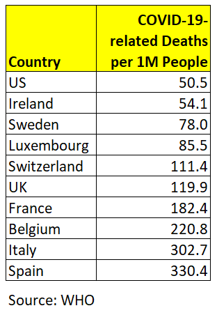
Within these 91 countries there is significant variation (as of 9 April) in the number of COVID-19-related deaths per 1 million people.
The 10 countries with the most COVID-19-related deaths per 1 million people (as of 9 April) are:
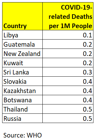
The 210 countries with the fewest COVID-19-related deaths per 1 million people (as of 9 April) are:
After dropping any remaining countries with too much incomplete data on the key variables, I was left with 91 countries for the linear model estimates. I also repeated the model estimates using only the upper-income countries (n = 48), losing most of the non-democratic countries from my original sample (including China and Iran).
Since the parameter and model fit estimates were only marginally different between the two frames (except for one variable — political rights — which will be discussed in more detail), I will only present the linear model results for the 91 countries. Linear model estimates for the 48-country frame are in the Appendix at the end of this article and diagnostics are available upon request to: kroeger98@yahoo.com.
Estimation Methods and Software
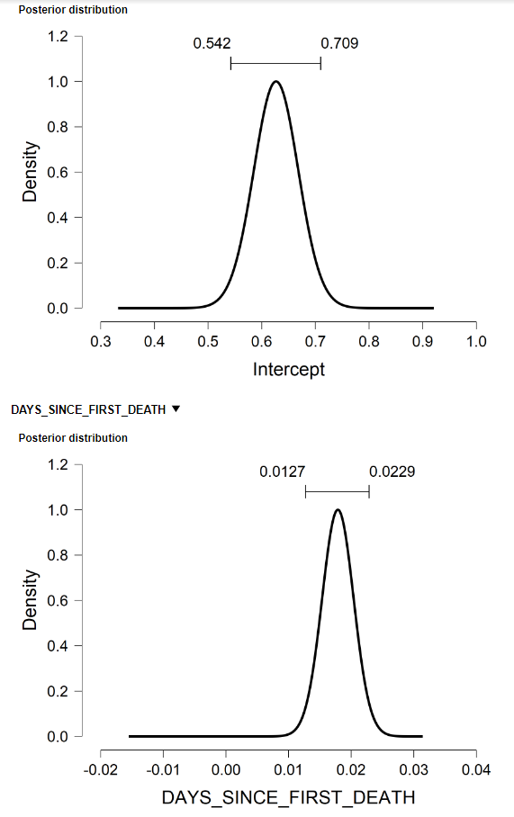
All results presented here were conducted using the software package, JASP, a free and open-source graphical program for statistical analysis supported by the University of Amsterdam. Its easy-to-use graphical interface resembles commercial software like SPSS and includes options for standard (frequentist) and Bayesian linear regression models (see Figure A.3 in the Appendix for some of the Bayesian model output).
The Results
Data on COVID-19 is the foundation on which we understand this pandemic and how it is spreading.
Data equips us to respond effectively to this threat, both as individuals and as a society. More importantly, it allows us to learn the best individual-level and societal-level countermeasures to fight against this threat.
The most important data definitions, therefore, are what defines being a carrier of the coronavirus and its role in a final disease outcome (i.e., surviving versus death).
The World Health Organization defines a confirmed COVID-19 case as “a person with laboratory confirmation of COVID-19 infection.” By definition, therefore, a death resulting from COVID-19 requires a positive test result on the coronavirus. This is the assumption I use when modeling coronavirus-related deaths worldwide.
The first step in understanding the relationship between variables is to look at their bivariate correlation. In the case of coronavirus-related deaths we see some interesting correlations in that regard. Figure 1 through 3 show the bivariate relationship between COVID-19 deaths and the number of hospital beds (per 1,000 people), the number of doctors (per 1,000 people), and the Political Rights Index (as measured by the Freedom House).
Figure 1. Bivariate relationship between COVID-19 deaths and hospital beds per 1000 people.
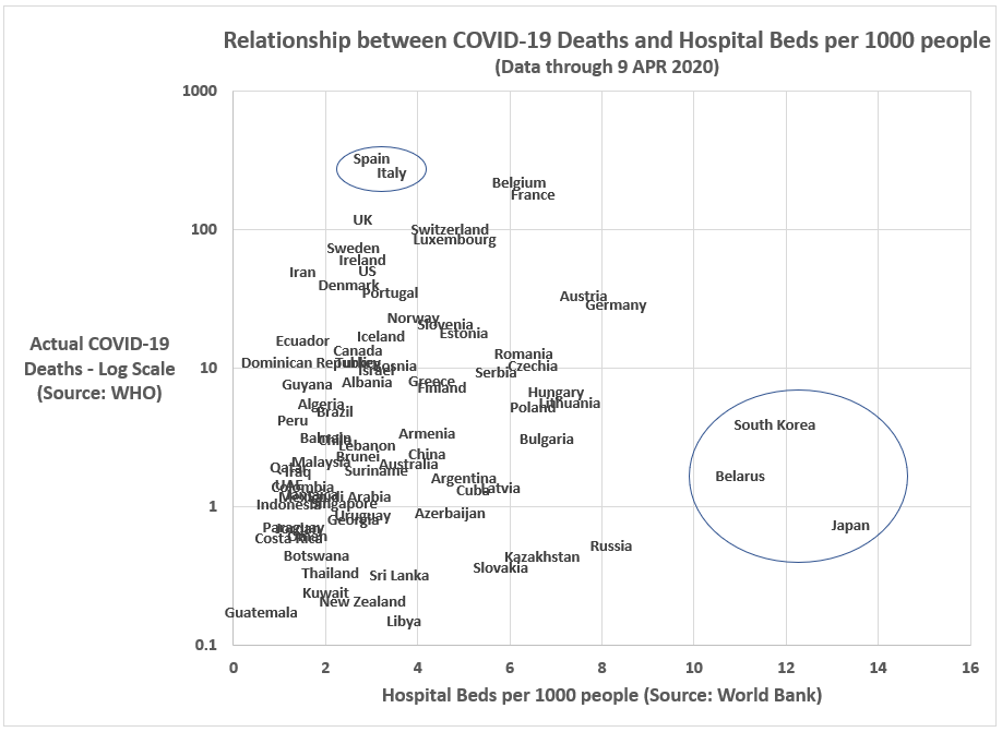
In the case of hospital beds (per 1,000 people), the relationship has some nuance. Overall, there is no clear relationship. But if we focus a subset of countries based upon economic development, there is an apparent connection. Wealthy, high-developed economies with a relatively low number of hospital beds per 1,000 people (e.g. Spain, Italy, UK, Sweden, Switzerland, Belgium, US, Luxembourg, Ireland and France) seem to have a high incidence of COVID-19-related deaths. Whereas, among highly-developed countries with a relatively high number of hospital beds per 1,000 people (e.g, Japan, South Korea, and Russia), the incidence rate of COVID-19-related deaths is much lower.
Figure 2. Bivariate relationship between COVID-19 deaths and Freedom House’s Political Rights Index.
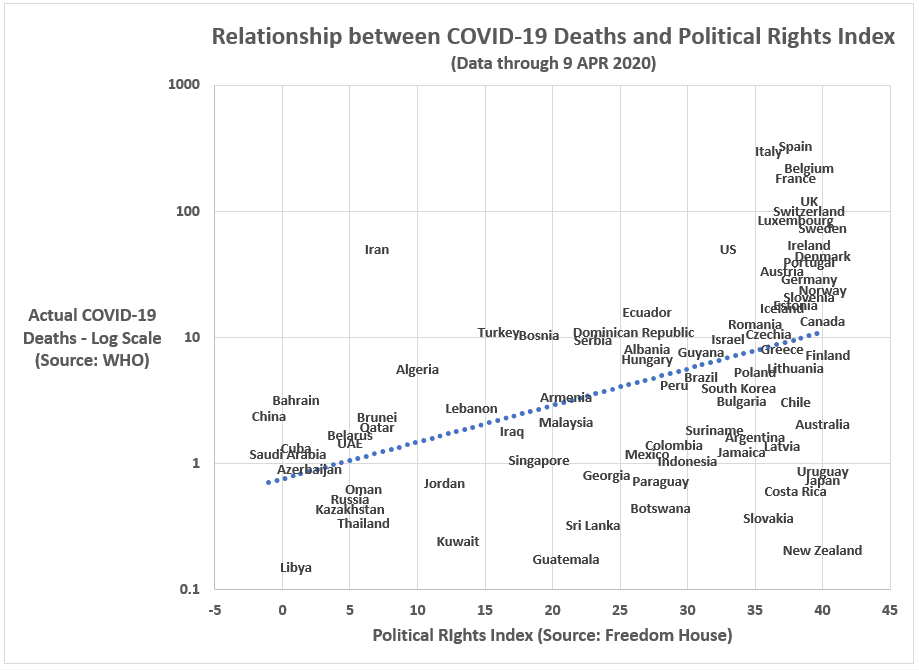
The relationship between political rights and COVID-19-related deaths is similarly nuanced. Within the highly-developed economies (mostly occupying the far-right quadrant of the graph in Figure 2) there seems to be no relationship; however, when adding the upper-middle-income countries, the relationship becomes decidedly positive: countries with the most political freedom are suffering the highest incidence rates of COVID-19-related deaths.
Is this a function of their greater ability of less-free countries to constrain citizen rights in the pursuit of effective coronavirus containment strategies? Or is it a function of the higher quality (and honesty) of data emanating from freer countries?
Figure 3. Bivariate relationship between COVID-19 deaths and doctors per 1000 people.
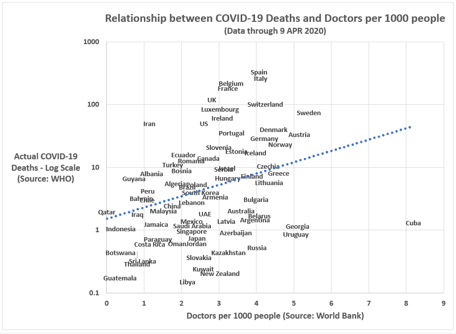
Lastly, in Figure 3, we have the relationship between the number of doctors per 1,000 people and COVID-19-related deaths. As the relative numbers of doctors in a country is correlated with the relative number of hospital beds, the bivariate plot with COVID-19-related deaths is similarly positive in form. However, we do not see a similar subset relationship within highly-developed economies. Unlike the hospital beds graph, we do not see a cluster of highly-developed economies in the lower-right-hand quadrant of the doctors-per-1000-people graph. At least in the bivariate context, it does appear the relative number of doctors in a country is positively related to the relative number of COVID-19-related deaths.
Can a country with too many doctors per capita cause COVID-19-related deaths? Of course not. That is not the conclusion anyone should draw from Figure 3.
What is true is that upper-income countries are experiencing significantly more COVID-19 deaths per capita than upper-middle-income countries. Thus, predictor variables strongly correlated with national wealth (such as Doctors per 1,000 people and Freedom House’s Political Rights Index) tend to be positively related to the number of COVID-19-related deaths. Those are not necessarily causal relationships.
My hunch as to why the relative number of doctors is positively correlated with coronavirus deaths is that wealthy countries with a high percentage of citizens over 60 years old will tend to have more doctors (per capita). Those most vulnerable to the coronavirus (the elderly) are also more likely to live in an advanced economy.
That is what I think is going on.
We learn more when we consider all of the predictors jointly in a linear regression context.
Figure 4 shows the linear model estimates for COVID-19-related deaths using the following independent factors for each country: (1) its latitude (at its geographic center), (2) its political rights index score, (3) its incidence of doctors (per 1,000 people), (4) its incidence of hospital beds (per 1,000 people), (5) its GDP per capita, and (6) the number of days since its first COVID-19-related death (log transformed).
Along with GDP per capita, other independent factors that were not significant predictors of COVID-19 morality rates included: the presence of a universal health care system and the relative frequency of coronavirus testing. Additional, more dynamic, models will need to be tested to determine the how those otherwise important variables might impact COVID-19 mortality rates.
Figure 4. Linear model for COVID-19-related deaths per 1 million people (log transformed) for upper- and upper-middle income countries with at least 3 million people (n = 91).
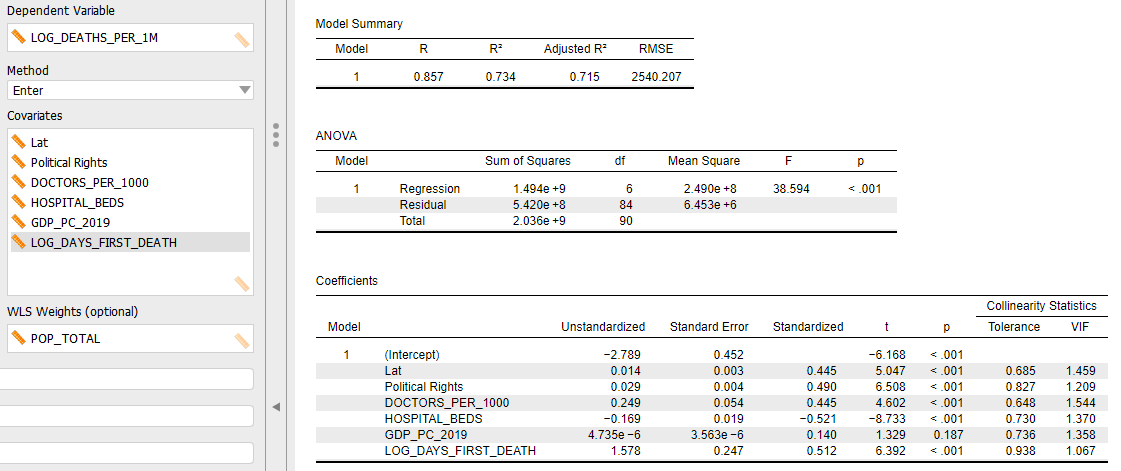
Using the standardized beta coefficients in Figure 4 as an indication of the relative importance of each independent factor, it appears the number of hospital beds (per 1,000 people) is the most importance correlate with COVID-19-related deaths (standardized beta = -0.521), followed by days since first COVID-19-related death (standardized beta = 0.512), political rights (standardized beta = 0.490), latitude (standardized beta = 0.445), and doctors per 1,000 people (standardized beta = 0.445).
The overall linear model offers a decent fit to the data with 72 percent of the variance explained.
[Casewise diagnostics for selected countries are available in Figure A.2 in the Appendix below]
Figure 5 illustrates the impact of standard deviation changes in the predictor variables in which the countries have some control over the factor (i.e., a country can’t changed its geographic location).
Figure 5. How standard deviation changes in the “controllable” predictor variables relate to the number of COVID-19-related deaths.
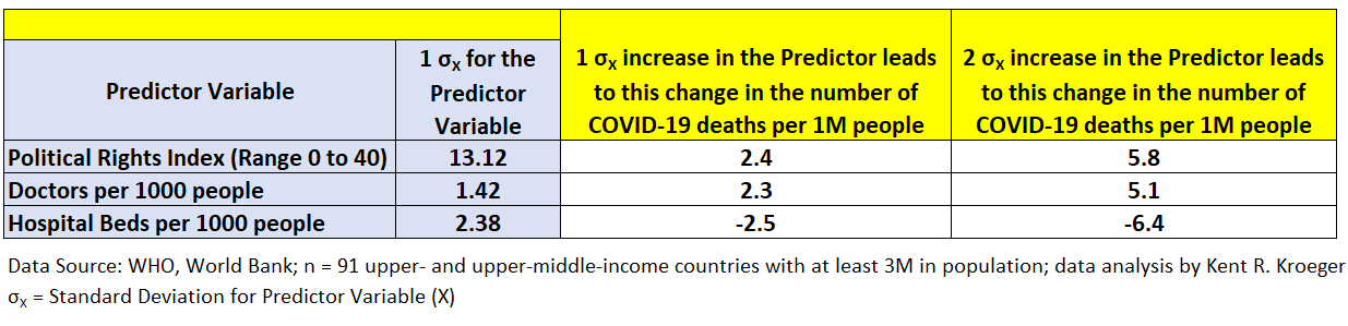
The most notable finding in Figure 5 is how a relatively modest increase in hospital beds per 1,000 people can have a meaningful impact on the number of COVID-19-related deaths (per 1 million people). An increase of 2.38 hospital beds per 1,000 people would reduce a country’s relative COVID-19 death totals by 2.5 people; a 4.4 hospital bed (per 1,000 people) increase would translate into 6.5 fewer COVID-19-related deaths (per 1 million people).
Keep in mind, this is a static cross-sectional (one-point-in-time) model where each country enters the model at a different stage in the coronavirus process. China and South Korea passed through the peak stages of the crisis over a month ago, while Italy and Spain reached their peaks a few weeks ago, and the U.S. is only now moving past the peak of its crisis. For this reason, the variable — days since the first COVID-19-related death — is employed to control for these stage differences. It is an imperfect control, to be sure.
Ideally, the estimated model would be constructed in a dynamic, time-series context in which predictor variable interactions could also be tested for significance. Quite likely, some regression parameters will vary by country-types, for example.
However, for the sake of simplicity, the static model reported here still reveals the relative importance of the independent factors, even without the full dynamic model.
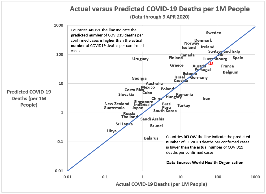
Figures 6 and 7 compare linear model estimates to the actual values for COVID-19-related deaths. Figure 7, specifically, filters down to the major countries in this analysis.
Figure 6. Actual versus Predicated Values from a Linear Model for COVID-19-related Deaths per 1 million people.
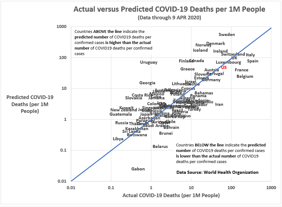
Figure 7. Actual versus Predicated Values from a Linear Model for COVID-19-related Deaths per 1 million people (Selected Countries Only).
One rule-of-thumb in outlier identification is to look for cases with a Cook’s D of greater than 3. As seen in Figure A.2 in the Appendix, China has a Cook’s D value of 38. China is an obvious outlier and a good reason for re-running the linear model using only upper-income countries (which excludes countries like China and Iran and leaves us with only 48 cases).
However, by excluding countries like China and Iran, the statistical significance of Freedom House’s Political Rights Index disappears (probability of t-value = 0.154, two-tailed test), for the likely reason that when eliminating upper-middle-income countries from the analysis we lose much of the variation in the Political Rights Index.
Still, if we split the 48 countries into two groups — Countries with High Political Rights Index scores (PRI > 33) and Countries with Lower Political Rights Index scores (PRI =< 33), a group that includes the U.S., Israel, Hungary, South Korea, Bahrain, Brunei, Qatar, UAE, Saudi Arabia, Singapore, Oman and Kuwait — we can compare the mean number of COVID-19-related deaths (per 1 million people) for the two groups.
The low political freedom countries had an average number of COVID-19-related deaths of 6.9 versus 50.8 for the high political freedom countries. And, as it turns out, the t-statistic for the difference-in-means test (t = 1.718, p = 0.093, df = 46) is still not significant.
Nonetheless, I believe the insignificance of the political rights factor is one of methodology and sample size and not its inherent importance. With a more systematic approach, I expect we will see the significant role a country’s political rights had on how they responded to the coronavirus pandemic.
Final Thoughts
Clearly missing in the linear model results presented here are controls for the types and timing of coronavirus mitigation and suppression policies implemented by each country. Some countries adopted broad, systematic testing protocols early (South Korea, Taiwan, Singapore, Germany) and the end benefit has been that they’ve experienced fewer deaths per capita than countries that came to systematic, mass testing late.
CNN’s recent story on the success of German efforts to control the coronavirus reinforces the findings from the model reported here. Writes CNN’s Angela Dewan, Henrik Pettersson and Natalie Croker:
The difference appears to be the German healthcare system’s huge capacity. Germany is projected to need about 12,000 beds at the peak of this outbreak in the middle of the month, according to projections from the Institute for Health Metrics and Evaluation. It has over 147,000, more than 10 times its need.
In contrast, the US has around 94,000 beds, some 15,000 beds short of its need. Germany has more spare beds in intensive care units that Italy has altogether.
In fact, Germany’s health system has such a large capacity, its hospitals are now treating people for coronavirus from Italy, Spain and France.
Hospital beds are merely a proxy for the real factors that have saved lives during the coronavirus pandemic of 2019–20. With a hospital bed comes the hour-by-hour care of nurses and other health professionals. There is no substitute for a hospital bed. The fact that more New York City residents than usual are dying at home due to the coronavirus should not be a surprise to anyone.
It is all about capacity. Do you — city, state, or country — have enough hospital beds to handle a surge in need? Figure 1 (above) reveals this simple reality. South Korea and Japan (and to a lesser extent, Germany and Austria), have enough hospital beds to handle a crisis like the coronavirus.
You can’t ramp hospital beds late in the game (as China did) and expect to escape a virus’ rampage. There must be planning. As World War II Allied Commander, General Dwight Eisenhower, once said: “In preparing for battle I have always found that plans are useless, but planning is indispensable.”
Such is the lesson of the 2019–20 coronavirus pandemic.
But there are other lessons.
My Russian-born friend, Zhora, an American citizen, recently told me, “Americans do not know how to be sick.”
Americans work when they are sick. They cough on you without consideration or remorse. They are working, after all. Why should they be sorry? Americans wear their illness among workmates like a badge. People at home sick are not working. What good are they? They aren’t getting the big promotion.
A new economic world is forming under our feet. Workaholics aren’t the modern gladiators they pretend to be. Since the coronavirus pandemic, they are genuine threats to the public good.
This is a preliminary analysis. For one, the coronavirus (2019-nCoV) and its associated disease (COVID-19) are still working through the world’s population. And secondly, explaining COVID-19-related deaths requires a dynamic modeling approach (i.e., references to time) to fully understand the process by which this pandemic has played out worldwide so far.
Stay tuned…and stay home, for now.
- K.R.K.
Datasets used in this analysis can be obtained by request to: kroeger98@yahoo.com
APPENDIX
Figure A.1. Linear model for COVID-19-related deaths per 1 million people (log transformed) using only upper-income countries (n = 48).
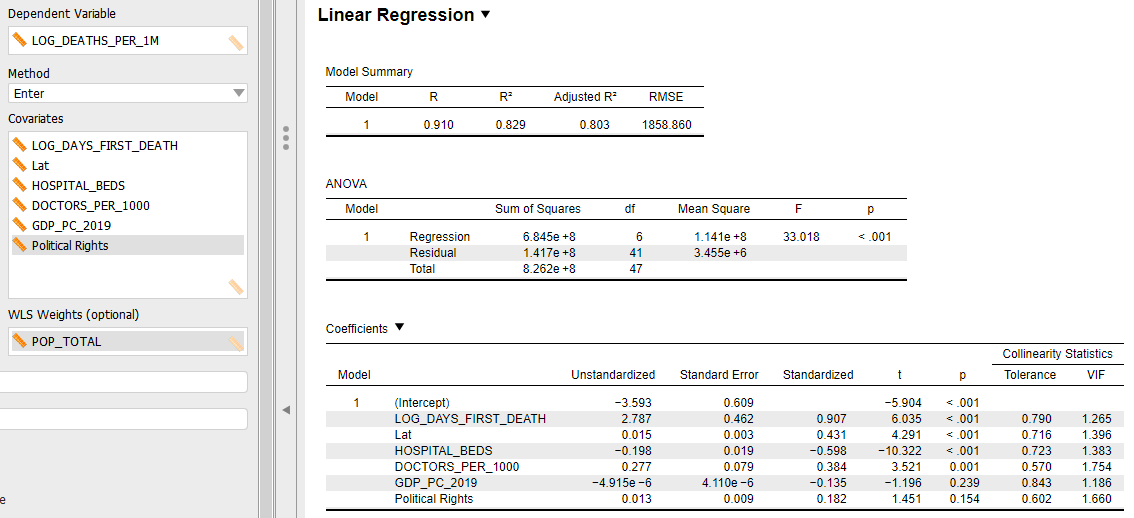
Figure A.2. Casewise diagnostics for linear model of COVID-19-related deaths per 1 million people (log transformed) for upper- and upper-middle income countries with at least 3 million people (n = 91).


Figure A.3. Posterior distributions and credibility intervals for Bayesian regression coefficients in a linear model of COVID-19-related deaths per 1 million people (log transformed) for upper- and upper-middle income countries with at least 3 million people (n = 91).