By Kent R. Kroeger (Source: NuQum.com, April 21, 2020)
Key Takeaways: While it may appear red states are doing a better job than blue states in controlling the spread and lethality of the coronavirus, if we control for population density, the severity of the coronavirus in the state, and the number of days since the ‘first case,’ the conclusion is more complicated.
New York, New Jersey, Connecticut and Michigan, so far, are under performing relative to other states with similar circumstances (i.e., dense urban areas), but other blue states like California, Hawaii, Washington and Oregon are writing the book on how to handle highly-contagious, deadly viruses like the novel coronavirus.
Among states with Republican governors, Tennessee, Florida, Texas, South Dakota and Utah are controlling the effects of the coronavirus better than expected, while Idaho, Iowa, Nebraska, and Oklahoma are not doing as well given their inherent advantage (i.e., less-densely populated).
Whether stay-at-home orders, travel bans, and other suppression and mitigation policies are useful in explaining these differences is an empirical question that won’t be answered definitively until the pandemic is over. Up to now, however, the evidence supporting stay-at-home orders is less than overwhelming.
The national news media could not hide its scorn at how Florida Governor Ron DeSantis, a Republican, allowed many of its beaches to stay open in mid-March to meet the annual demand of spring breakers seeking the warm ocean sun.
A few states away at the same time, Texas Republican governor, Greg Abbott, was resisting issuing a stay-at-home, suggesting the state’s expansive rural areas made such an order impractical. “What may be right for places like the larger urban areas may not be right for the more than 200 counties that still have zero cases of COVID-19,” Abbott said at a March 22 briefing on the state’s response to the coronavirus.
Covering the Florida and Texas coronavirus responses, Los Angeles Times reporters, Molly Hennessy-Fiske and Jaweed Kaleem, asked in their March 23 story: “Will Texas or Florida be ‘the next Italy’? Red states lag blue in stay-at-home orders.”
Governors DeSantis and Abbott eventually issued statewide stay-at-home orders on April 2nd, 14 days after California Governor Gavin Newsom, a Democrat, was the first state governor to issue a stay-at-home order.
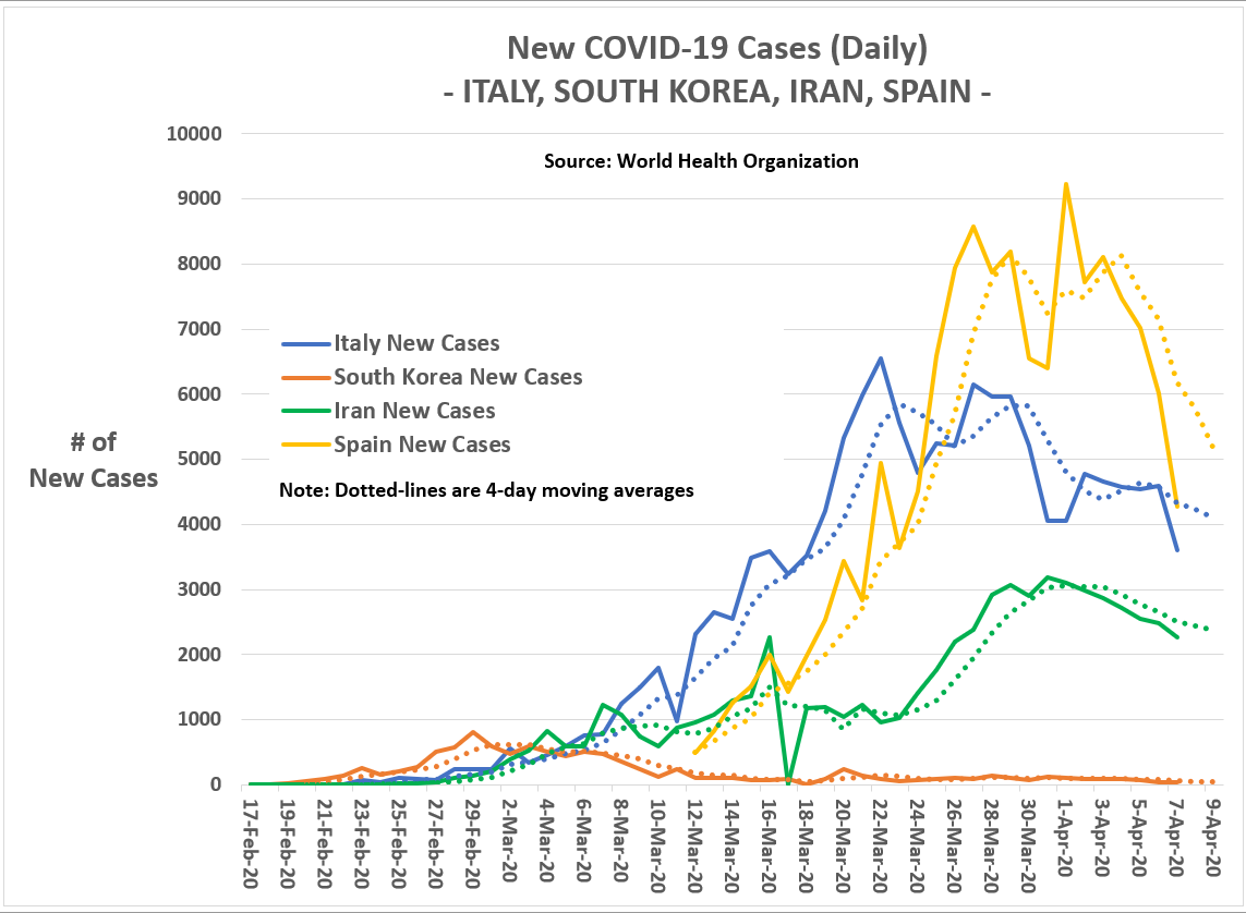
Even with the late conversion of DeSantis and Abbott, the Fiske and Kaleem question remains a reasonable one. By being so slow in their statewide responses, were the Florida and Texas governors putting their states at risk of being the next ‘Italy,’ ‘Spain’ or ‘Iran’?
But it is not just Florida and Texas.
The governors of Arkansas, Iowa, Nebraska, North Dakota, South Dakota, Utah and Wyoming have yet to issue stay-at-home orders. Other Republican-dominated states, like Kansas, Oklahoma, and Missouri — while having issued stay-at-home orders — were relatively late in making that decision.
Given the patchwork nature of how states have handled the coronavirus pandemic — and that fact that not every stay-at-home order is identical — it is hard to answer overly-simplistic questions like: “Are stay-at-home orders effective?” This pandemic is not a controlled experiment where exposure to the intervention (e.g., a stay-at-home order) is randomized.
Yet, if stay-at-home orders and other virus suppression and mitigation policies are effective, shouldn’t we observe a slower spread of the coronavirus — a ‘flattening of the curve’ — and a lower incidence rate of COVID-19-related deaths in states that acted early and comprehensively? States such as California, New York, Illinois, New Jersey, Connecticut, and Louisiana, the first to issue stay-at-home orders — and, as it happens, states with Democratic governors.
The final impact of the coronavirus pandemic has yet to be determined, so any observed differences across states in ‘flattened curves’ or death rates must come with a caveat.
Still, we don’t lack data, thanks particularly to Johns Hopkins University and the World Health Organization (WHO). Unfortunately, with data and statistics come this inevitable controversy: Can we believe them?
State-level coronavirus numbers are not easily comparable (but that won’t stop me)
The there is no data-centric chart I hate more than those ‘spaghetti-line’ graphs that are the news media’s go-to charts during this coronavirus pandemic. Here is mine showing the number of new coronavirus cases each day for a selection of 29 U.S. states and the District of Columbia:
Figure 1: New Daily Coronavirus Cases by State (as of 19 April; 7-day moving average)

Borrowing some phrasing from The Doctor (as played by David Tennant), people assume that the coronavirus is a strict progression of cause-to-effect, but actually from a non-linear, non-subjective viewpoint, it is more like a big ball of wibbly-wobbly, timey-whimey stuff.
I apologize for the scientific jargon. So let me summarize Figure 1 more simply: Once you consider the population size of a state (which determines where along the y-axis the state starts its progression of new coronavirus cases), the states generally follow a very similar trajectory. They have a relatively rapid rise in new cases in the first 15 to 20 days and then it plateaus (or, in some cases, like Louisiana, begin a steady day-to-day decline).
In other words, despite the patchwork of state-level coronavirus policies, states generally follow the same day-to-day trajectory — which I will argue is driven largely by the population density of a state (which a governor can’t change) and the number of days since the first confirmed coronavirus case in the state. This can visibly be seen in Figure 1 in the two states with the most coronavirus cases — the densely-populated states of NY and NJ, at the top of the graph — and two states with relatively few cases (MT and WY, at the bottom of the graph), which happen to be among the least densely populated states in the U.S.
I am not saying state-level policies do not matter. Clearly, they do and can be more easily seen in Figures 2 and 3 below.
Figure 2: New Daily Coronavirus Cases for Notable Large Population States (as of 19 April; 7-day moving average)
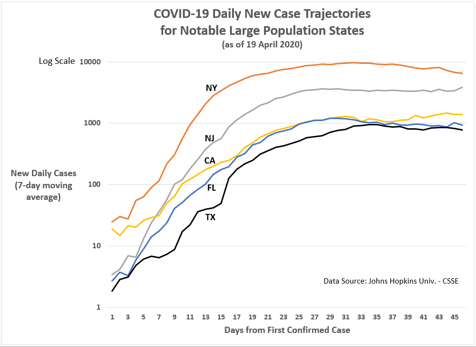
Figure 2 shows California following a distinct trajectory compared to other large states — the state has ‘flattened’ the curve, as epidemiologists like to say. However, it is hard to conclude that stay-at-home orders account for this difference. New York and New Jersey adopted stay-at-home orders 16 days after the first confirmed cases in those states, while Florida and Texas waited 29 days to do the same; and, heretofore, don’t seem to be doing any worse than New York and New Jersey.
Strike one against stay-at-home policies? Not so fast.
While California Gov. Newsom issued stay-at-home orders 15 days after the first confirmed case — not that much sooner than New York or New Jersey — his performance during this crisis has drawn significant praise, even from President Trump.
“They’ve done a good job, California. Now let’s see what happens, because we could see a spike,” Trump said at the end of March, as California’s number of new coronavirus cases appeared to be dropping. “I mean you don’t know. They could have a spike where all of a sudden it spikes upward.”
OK, it was not overly effusive praise, but it was praise nonetheless from a Republican president for a Democratic governor. Compare that to what Trump has tweeted about New York Governor Andrew Cuomo four days ago:
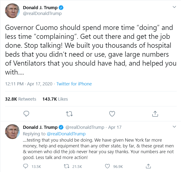
Gov. Cuomo’s response was predictably acidic:
“All he’s doing is walking in front of the parade, but he has nothing to do with the timing of the parade,” said Cuomo, who added that Trump loves talking about big businesses and airlines getting bailed out, but state governments still need funding.
“We’ll show gratitude,” Cuomo said, “How many times do you want me to say thank you? And I’m saying thank you for doing your job. This was your role as president.”
“You want me to say thank you? Thank you for doing your job,” he said. “Thank you for participating in a modicum of federal responsibility in a national crisis, which you know is a national crisis because he declared a federal emergency. So thank you for having the federal government participate in a federal emergency.”
Those two need couples counseling — which, apparently, they are pursuing this week.
Back to a more productive leadership style, The Atlantic’s Todd Purdum recently outlined some of Gov. Newsom’s unqiue actions to address the coronavirus: “Newsom, whose March 19 mandatory stay-at-home order was the first in the country, invoked California’s power as a nation-state to announce that it would lend 500 state-owned ventilators to other COVID-19 hot spots in need, and would use its immense budget surplus to start an almost $1 billion supply chain from China to import 200 million respiratory and surgical masks.”
California has tried to be less heavy-handed in enforcing social distancing and stay-at-home orders and has, instead, put more emphasis on peer pressure and socialization techniques. Nonetheless, at least recently, California is also using its police powers to enforce its social distancing and shelter-in-place policies.
The conclusion might be, therefore, that stay-at-home orders in isolation are probably not enough to ‘flatten the curve.’ Its effectiveness may well require more the complimentary interactions of other ancillary forces (e.g., social pressure, buy-in across diverse communities).
As for the few remaining states that have not issued stay-at-home orders (Arkansas, Iowa, Nebraska, North Dakota, South Dakota, Utah and Wyoming), the impact so far is not uniform or apparent. For one, those states are still a week or two behind coastal states like New Jersey, Connecticut and California that experienced much steeper surges (except California) in new cases over two weeks ago (see Figure 3). But, also, the trajectories for Iowa, Nebraska and North Dakota mirror more closely California’s trajectory than New Jersey or Connecticut.
More troubling for Iowa, Nebraska and North Dakota, however, are the surges in new cases over the last few days. Is this evidence that their lack of action stay-at-home policies is going to haunt, as suggested recently by the national news media?
The good news (or bad news, depending on the outcome) is that we will find out soon if those three states are going to look more like New York and New Jersey (in relative numbers) than California.
Figure 3: New Daily Coronavirus Cases for Selected States with Stay-at-Home orders (NJ, CA, and CT) and three without (IA, NE, and ND) (as of 19 April; 7-day moving average)

On a personal note: My 92-year-old mother is quarantined in a Cedar Falls, Iowa nursing home where the nurses and aides wear masks, but not protective gloves. Barely an hour down the road from her is a Cedar Rapids nursing home facility that has experienced 14 coronavirus-related deaths up to now. Understanding the effectiveness of these state-level policies (like stay-at-home) are not an abstract, academic exercise for me. On an instinctive-level, I believe such strict public policies that impinge on personal freedoms are an inconvenient necessity under the circumstances. But I also understand that livelihoods are adversely affected when business are idled indefinitely, and remedies such as two-thousand-dollar checks (personally signed by Donald Trump) are not enough to make people whole again. People have a genuine and immediate need to get back to work. Therefore, I will never mock intentions or intelligence of anyone protesting stay-at-home orders and mandatory business closures, even if I do believe stay-at-home orders are prudent — though not necessarily effective in their common execution.
In the end, it is the deaths that matter, not the number of cases
At the risk of being banned again from Twitter and Facebook, I beg people not to accept as gospel the coronavirus numbers being released by the World Health Organization (WHO) or the state governments here in the U.S.
These numbers are invariably contaminated with unknown levels of systematic error (not just random error — which is our friend). It is not deliberate malfeasance or the product of a conspiracy. It is the product of this reality: It is hard to get humans organized well enough to keep accurate, consistent records. When I worked for the Defense Manpower Data Center — which maintains the database records of military personnel — we aimed for 2 percent error rates, but had to live with 5 percent. Similar databases I’ve seen in the private sector would kill for 5 percent error rates.
We know already that some states are not testing as frequently as others for the coronavirus, which has an obvious impact on their case confirmation numbers. We also know that an unknown percentage of coronavirus carriers have been asymptomatic and may never know they had the virus.
These data collection flaws create systematic errors, making the highly-aggregated numbers on Johns Hopkins University’s coronavirus tracking website more problematic than assumed.
Until comprehensive statistical models are applied to the coronavirus data near the end of this first (and, hopefully, last) wave, the numbers and statistics reported up to now — including mine — need to be accepted with a grain of salt.
However, I do have a higher level of confidence in the case fatality data being released by the states. Coronavirus-related deaths are easier to quantify than the number of virus carriers, though certainly some deaths could already have occurred that were not properly linked to COVID-19 (the disease caused by the coronavirus), and other deaths may have been erroneously linked to COVID-19 when, in fact, the common flu or some other pneumonia-causing pathogen was responsible. In my experience, these types of errors are more likely to be random (as opposed to systematic) and easier to deal with in an statistical context.
Therefore, I believe the following analyses of COVID-19-related deaths are more useful for assessing the true impact of the virus across states and the effectiveness of their suppression and mitigation policies.
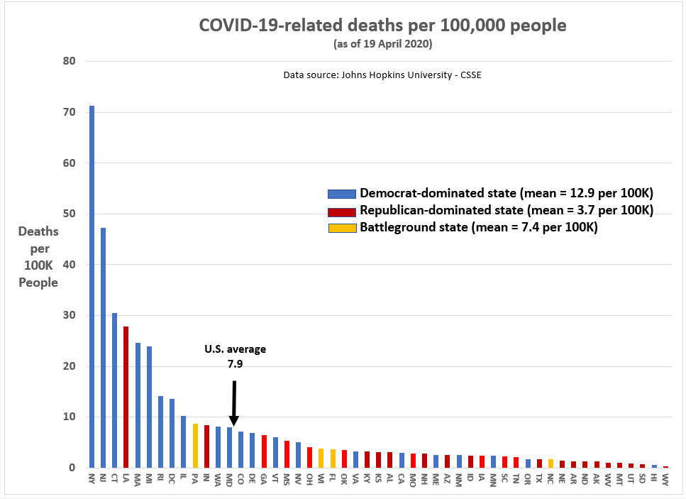
Let us start with a simple state comparisons: The number of COVID-19-related deaths per 100,000 people.
Figure 4: COVID-19-related deaths per 100,000 people (as of 19 April 2020)

I’m not going to make a big deal out of Figure 4 — because I believe it is deeply misleading — but here is the prima facie interpretation: Democratic-dominated blue states are suffering far more deaths from the coronavirus than Republican-dominated blue states. It isn’t even close.
Of the Top 10 states for coronavirus-related deaths per 100,000 people, 8 were blue states, one was a red state (LA), and one was a battleground state (PA) — and my Republican friends are quick to point out Louisiana has a Democratic governor.
On other other end, nine of the 10 states with the lowest relative number of coronavirus-related deaths, 9 are red states — the exception being Hawaii, which has quietly taken the most decisive steps to suppress and mitigate the coronavirus, including a travel ban, a stay-at-home order, and a comprehensive coronavirus exposure tracing program.
On average (as of 19 April), 12.9 people per 100K in blue states have died from the coronavirus, compared to 3.7 per 100K in red states.
All the same, the driver of this sizable difference in death rates is not partisan politics (though you wouldn’t know that if you spend time watching the cable news networks). Rather, the state-level difference is a function of where Democrats tend to be strongest electorally: Densely-populated cities and suburbs. In turn, as I will show, population density and time (i.e., days since first coronavirus-related fatality) are highly related to the relative frequency of coronavirus-related fatalities.
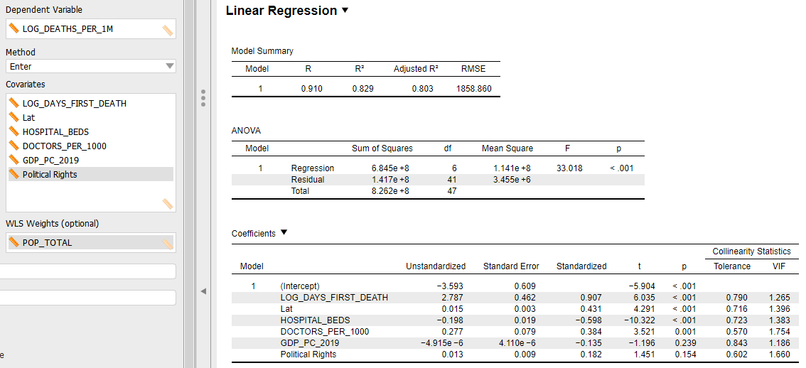
Figure 5 is the linear model output for a one-point-in-time analysis of coronavirus-related fatalities at the state level. By controlling for contextual factors — such as population density and time — the impact of specific public policies are potentially more discernible.
Indeed, some interesting results were obtained on that matter. First, as expected, a state’s population density and time elapsed since first confirmed coronavirus-related fatality are independently and significantly correlated with coronavirus fatalities. For example, on average, for every additional day after the state’s first coronavirus fatality, the state’s fatality rate increases one person per 100,000 people (i.e., Euler’s constant [e] raised by the regression coefficient of 0.047). Likewise, a one percent increase in population density relates to a 0.20 percent increase in the number of coronavirus fatalities per 100,000 people.
Figure 5: Linear Model of Coronavirus-related Deaths (State-level)
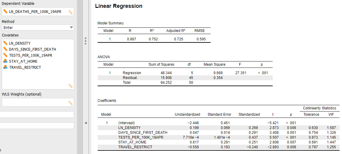
The independent variable that may cause the most consternation among readers is the number of coronavirus tests per 100,000 people, which is positively correlated to coronavirus fatalities. That is, state’s getting hit hardest by the coronavirus are doing more tests (assuming test kits are available on demand) and are also experiencing more fatalities. That should seem fairly intuitive.
However, the significance of this variable DOES NOT mean that state’s can lower their fatality rate by doing fewer coronavirus tests! Understanding that relationship requires more dynamic, time-series modeling. For our purposes, the utility of this variable is used as a proxy for other factors not included but highly correlated with the intensity of the coronavirus epidemic in a state. That could include the shortage of available hospital beds and ventilators and/or the inadequacy of the state’s public health system to care for homeless and indigent populations.
The two remaining variables in the linear model — indicators whether or not a state implemented a travel ban and/or a stay-at-home order — is where the real controversy starts. Starting with the travel ban, the model suggests the presence of a state-imposed travel ban (above and beyond the federal travel ban) relates to a 1.75 person decrease in the number of coronavirus fatalities per 100,000 people. States that had travel bans include: Alaska, Arizona, Delaware, Florida, Hawaii, Idaho, Kansas, Kentucky, Maine, Montana, Oklahoma, New Mexico, North Dakota, Rhode Island, South Carolina, Texas, Utah, West Virginia and Vermont. Details on each state’s travel ban policies can be found here.
I’m not arguing that travel bans work — the evidence here merely suggests an independent statistical relationship. Nevertheless, and despite the general recommendation by the WHO that travel bans do not work, in the U.S. context there is circumstantial evidence that states that adopted limited travel bans also experienced lower fatalities levels, all else equal.
In fairness to the WHO position, a February 29 WHO news release provides a clear rationale for their official position on travel bans:
“WHO continues to advise against the application of travel or trade restrictions to countries experiencing COVID-19 outbreaks.
In general, evidence shows that restricting the movement of people and goods during public health emergencies is ineffective in most situations and may divert resources from other interventions. Furthermore, restrictions may interrupt needed aid and technical support, may disrupt businesses, and may have negative social and economic effects on the affected countries. However, in certain circumstances, measures that restrict the movement of people may prove temporarily useful, such as in settings with few international connections and limited response capacities.”
At the risk of being banned by Twitter and Facebook, I believe the initial empirical evidence in the U.S. context may require further investigation about whether some forms of travel bans can be effective during pandemics.
Finally, we have an indicator variable for stay-at-home orders which can include shelter-in-place directives for households, business closures, and government office shutdowns. Admittedly, one cannot summarize the genuine variation in stay-at-home orders using a simple binary variable. Details on these state-level variations can be found here.
In my linear model (Figure 5), the parameter for stay-at-home policies is significantly positive. In other words, states with stay-at-home policies in place had, on average, higher coronavirus fatality rates. Using numbers, states with a stay-at-home policy in place, on average, have experienced 2.3 additional coronavirus fatalities per 100,000 people.
Does that mean stay-at-home policies have caused additional deaths? Of course not. Just as with travel bans, this statistical significance does not prove the causal direction. And, in the case of stay-at-home policies, the causal direction almost certainly goes in the other direction: The scope and severity of a state’s coronavirus outbreak causes the state to increase coronavirus testing. That, in my mind, explains the positive, independent correlation of stay-at-home orders to coronavirus fatalities.
Yet, the earlier discussion about California’s success in controlling the coronavirus, in part, through its stay-at-home policy, tells me that the timing and the specifics of the order are essential to its effectiveness. If we could run an experiment where the California in our universe implements the stay-at-home policy as it has so far, and then another California in a parallel universe fails to implement a stay-at-home policy, I believe the latter would experience a significantly higher coronavirus fatality rate.
Feel free to prove me wrong.
Not shown in Figure 5 are the myriad of other variables that were tested but found to be insignificant correlates with coronavirus fatalities after controlling for population density, days since state’s first coronavirus death, and the relative level of coronavirus testing . Those factors include: the governor’s party, partisan control of the state legislature, Trump’s 2016 vote percentage, the number of days between the first coronavirus case and the state’s stay-at-home order, the percentage of the state’s population over 65 years old, the state’s relative level of trade with China, the state’s GDP per capita, and the state’s dependence on tourism.
The final graphic (Figure 6) summarizes the linear model in Figure 5 by showing the actual coronavirus fatality rates versus the fatality rates predicted by the linear model. States below the perfect prediction line (actual = prediction) are experiencing more coronavirus fatalities than expected by our model, while states above the line are experiencing a lower number of fatalities per capita than expected.
The implicit assumption in Figure 6 is that a state below the line is ineffectively addressing the coronavirus — perhaps not the fault of the state’s governor, but he or she would have to be a suspect. Conversely, states above the line are doing something right, beyond what is included in the model.
Figure 6: Actual versus Model-predicted Coronavirus Fatality Rates

States above the line
Is it mere coincidence that all of the West Coast states (plus Hawaii) are above the prediction line? While only Hawaii and Washington are statistically significant in their deviation from the prediction line (standardized residuals= -2.67 and -1.97, respectively), Oregon and California are in a consistent direction with their coastal neighbors.
Is there a cultural difference in West Coasters that makes them more amenable to the government restrictions needed to control the coronavirus? Maybe. Are other policies, not considered here, important suppression factors? I would think so.
At a minimum, though, Figure 6 should impel us to, first, look in depth at what Washington and Hawaii have done to control the coronavirus; and to also consider the factors that may have made California, Oregon, and Tennessee successful at this point in the crisis. [Everything could change tomorrow, of course.]
States below the line
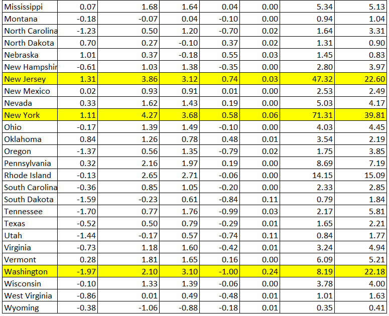
Michigan Governor Whitmer has not done her constituents (or her political career) any favors during the coronavirus pandemic. Though the state has done an excellent job of reducing the number of new daily since its peak on April 3rd — from just under 2,000 to only 576 on April 20th — the state has significantly under performed during this crisis with respect to fatalities per capita (23.9 per 100,000 people, see Appendix).
If I were Gov. Whitmer, I’d start the inevitable the after-crisis investigation now by looking closely at homelessness, poverty and an inadequate healthcare infrastructure in Wayne County, Michigan (Detroit).
These contributing factors predated Gov. Whitmer, but its during her administration when the proverbial sh*t has hit the fan. To be impartial, it is not just Michigan that may have failed in this regard. When this crisis is finally over, the entire nation will likely realize that coronavirus fatalities disproportionately impacted impoverished communities and the elderly. Undeniably, characteristics of the coronavirus itself affects that outcome; but an inadequate private and public health care system and failed public policies with respect to the urban poor most likely contributed as well.
While only Michigan is significantly below the prediction line in Figure 6 (standardized residual= 2.50), there are other states where actual coronavirus fatality rates have marginally exceeded the linear model expectations, such as New York, New Jersey, Connecticut, and Iowa.
In the cases of New York, Connecticut and New Jersey, refer to the discussion above about Michigan’s high fatality rate. My guess is that the issues are similar.
With respect to Iowa, I fear gubernatorial incompetence may be a contributing factor. Whereas Iowa has witnessed 2.4 coronavirus fatalities for every 100,000 people, our model says, based on population density and the time the virus has been observed in the state, Iowa should have only 1.6 fatalities per 100,000 people. That is not a statistically significant difference, but it is dangerously close to being so for my taste.
Being from Iowa, I understand the pitchfork libertarian culture that blooms there. Its a strong, populist undercurrent that dominates Iowa politics. It is why Trump easily won Iowa in 2016.
But as we witness coronavirus cases and fatalities spiking in Iowa right now, I wonder if Iowa Governor Kim Reynolds had ordered a decisive stay-at-home order early in the crisis, perhaps her state wouldn’t be on the precipice of something much worse than it needed to be. Unlike other states that have not implemented stay-at-home orders (Arkansas, Nebraska, North Dakota, South Dakota, Utah and Wyoming), only Arkansas is more densely-populated. Iowa pragmatism — which flourishes along side populism — should have overruled the pro-business, anti-government sentiments of Iowa’s Republican governor.
Stay healthy.
- K.R.K.
APPENDIX: Model Diagnostic Information

