By Kent R. Kroeger (Source: NuQum.com, March 23, 2020)
Health experts continue to warn us that the confirmed coronavirus cases reported by the World Health Organization (WHO) and national health ministries are significantly under-counting the actual number of cases in the U.S. and worldwide.
Earlier this month Dr. Marty Makary, a surgeon and health policy expert at Johns Hopkins University, told Yahoo Finance’s “On the Move” that when the U.S. Centers for Disease Control and Prevention (CDC) was reporting 1,600 confirmed cases in the first week of March, the actual number of infected people could be “between 50,000 and half a million.”
“Don’t believe the numbers when you see, even on our Johns Hopkins website, that 1,600 Americans have the virus,” Makary said. “No, that means 1,600 got the test, tested positive. There are probably 25 to 50 people who have the virus for every one person who is confirmed.”
Dr. Makary’s estimated range of coronavirus cases in the U.S. mirrors my own cross-sectional analyses of the WHO and Johns Hopkins databases.
As of March 21st, I estimate that the actual number of Americans infected with the coronavirus (including those who have died or recovered) numbered between 62,000 and 215,000.
[The methodology I employed for these cumulative case estimates is described here.]
Building upon a country-level coronavirus case estimation model I developed in an earlier article, I added a control variable (NUM_TEST) that measures the number of coronavirus tests conducted by each country through March 18th (53 countries). This variable is being collected ourworldindata.org and, as of today, does not have reliable testing data for a number of important countries, including China, Canada and most South American and African countries.
Writes ourworldindata.org about this coronavirus testing variable:
“To understand the statistics on cases, we would want to know how many people in the world are being tested for COVID-19 every day, and how the available tests are being allocated. Unfortunately there is no centralized WHO data on COVID-19 testing and most countries do not provide official reports on tests performed.
Some countries do provide aggregate estimates on the total number of tests performed up to a specific date, but these are published across individual websites, statistical reports and press releases — often in multiple languages and updated with different periodicity.
Given the large problems with data availability, we did a manual review of data across national reports, and included the most recent estimates that we could find as of 20 March 2020, 18:00 GMT.”
Given the uncertainties with how countries are reporting their coronavirus testing efforts, I report two estimation models in this article: Model 1 (which does not include a control for the number of coronavirus tests) and Model 2 (which does include a control for the number of coronavirus tests).
The Results
With each new day that the WHO reports confirmed coronavirus cases, my original model (Model 1) has increased its ability to explain country-level variation in coronavirus cases. The original March 14th model explained 73 percent of the variance in country-level case numbers and found the following variables to be significant predictors: National income per capita, total population, number of international tourism arrivals per year, percent of annual deaths due to communicable diseases, and an indicator variable for China.
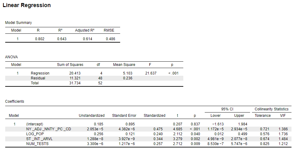
Estimating Model 1 using WHO data through March 21st found that the model now explains 81 percent of the variance in country-level case numbers (see Appendix below for the regression output for Model 1).
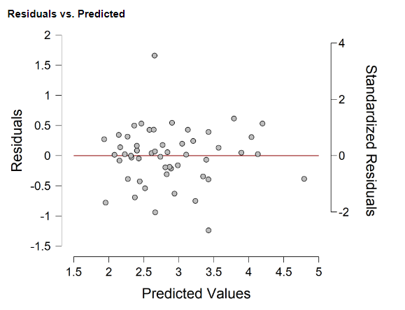
An analysis of the residuals for Model 1 found the model significantly over-estimated the actual number of coronavirus cases in the U.S., Japan, Myanmar, New Zealand, and the United Arab Emirates (see Figure 1).
Conversely, the model under-estimated the actual number of cases found in Iran, Italy, and South Korea.
Figure 1: Residual analysis (Actual vs. Predicted) for Model 1 (data through 21 March 2020; 167 countries)

Why are we seeing these significant over- and under-estimates?
Using the U.S. as an example, Model 1 estimates that the U.S. — given its national wealth, population size, size of its tourism industry, and experience with communicable diseases — should have reported 215,000 coronavirus cases on March 21st. Instead, the U.S. was reporting 25,000 cumulative cases on that date.
Why the big difference?
There can only be one of two answers: (1) The U.S. has made an heroic effort to keep the coronavirus from spreading (e.g., widespread testing, social distancing, self-quarantines, travel bans, local and statewide lockdowns, etc.), or (2) the U.S. has systematically under-counted the actual number of coronavirus cases in the country and is now playing catch-up with its ramped up testing regimen.
I suspect the smart money is on the latter explanation.
But that explanation may not work for a country like UAE — which reported 154 cases (as of March 21st), though Model 1 expected 1,250 cases.
According to ourworldindata.org, the U.S. has conducted 103,945 coronavirus tests as of March 19th (or about 32 tests for every 100,000 people). Contrast the U.S. number to UAE where there has been 1,298 tests per 100,000 people.
Other countries with a high number of coronavirus tests relative to their population size include: Australia (454 per 100,000), Bahrain (1,188 per 100,000), Norway (823 per 100,000), and South Korea (613 per 100,000).
One possible hypothesis: Whereas the U.S. may have missed the opportunity to prevent a large-scale spread of the virus and is now playing catch-up with its recent increases in testing, the UAE, through its aggressive testing regimen early in the outbreak, may have stunted the spread of the virus to the point where the apparent under-count (according to Model 1) is actually the true value.
In other words, Model 1 isn’t properly specified— we need to add a variable measuring a country’s coronavirus testing efforts.
Model 2, therefore, includes the ourworldindata.org collected data for the number of coronavirus tests at the country-level (Model 2 regression output can be found in the Appendix).
Regrettably, inclusion of the number of coronavirus tests variable eliminated over 100 countries — mostly from Southeast Asia, Africa and South/Central America — from the analysis in Model 2. Nonetheless, Model 2’s parameter estimates were fairly consistent with the Model 1 results (see Appendix for model output and diagnostics), though the model fit fell substantially (from 81 percent of the variance explained, down to 61 percent).
Given the loss of data from the southern hemisphere (and China), the Model 1 variable for communicable disease deaths and the indicator variable for China were dropped.
The remaining variables in Model 2 were significant (numbers in parentheses are standardized coefficients indicating their relative importance): National per capita income ( 0.475), population size (0.240), annual number of tourism arrivals (0.344), and cumulative number of coronavirus tests (0.257).
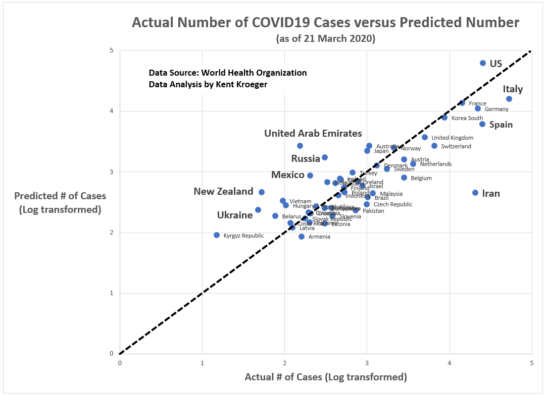
Figure 2 shows that the outlier nations in Model 2 and the direction of that error. Superficially, Model 2 outlier nations look similar to Model 1. The predicated values for U.S., New Zealand, and UAE remain higher than actual numbers; while Iran, Spain and Italy are experiencing numbers higher than expected based upon their population size, wealth, and annual tourism volume.
Figure 2: Residual analysis (Actual vs. Predicted) for Model 2 (data through 21 March 2020; 53 countries)
For now, at least, we can’t explain UAE’s lower-than-expected count of coronavirus cases to their aggressive testing program. Something else explains their low reported numbers.
Instead, Model 2 offers a glimpse into how the WHO reported numbers differ from expectations based on established covariates with the spread of the coronavirus:
Figure 3: Model 2 predictions versus reported coronavirus case numbers

As of March 21st, at a minimum, the U.S. has almost 62,000 cumulative cases of the coronavirus instead of the 25,468 reported to the WHO.
At a maximum, according to the more inclusive Model 1, the U.S. has over 215,000 cumulative cases of the coronavirus.
Either way, the U.S. is seriously under-estimating the extent of the spread of the coronavirus within its borders.
- K.R.K.
Datasets and statistical software used in this article are available upon request to: kroeger98@yahoo.com
APPENDIX:
Variables
Dependent Variable (Source: WHO): Number of confirmed COVID-19 cases as of 21 March 2020 (log transformed)
Independent Variables (Source: World Bank):
NY_ADJ_NNTY_PC_CD = Adjusted net nat’l income per capita (current US$)
LOG_POP = Country’s total populaton (log transformed)
CHINA = Indicator variable (1 = China; 0 = all other countries)
SI_INT_ARVL = International tourism, number of arrivals
SH_DTH_COMM_ZS = Cause of death, by communicable diseases and maternal, prenatal and nutrition conditions (% of all deaths)
NUM_TESTS = The number of coronavirus tests reported through March 18th by each country’s health ministry or national authority (Data provided by ourworldindata.org and can be found here)
More detail on these independent variables (except NUM_TESTS) can be found in the World Bank’s data catalog at: https://datacatalog.worldbank.org/dataset/world-development-indicators
Linear regression models
Model 1 (Does not include a control for the number of coronavirus tests; 167 cases)

Model 2 (Includes a control for the number of coronavirus tests; 53 cases)
Residual plots
Model 1 (Does not include a control for the number of coronavirus tests; 167 cases)
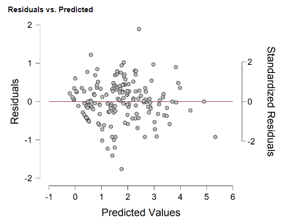
Model 2 (Includes a control for the number of coronavirus tests; 53 cases)