By Kent R. Kroeger (Source: NuQum.com; September 20, 2020)
[The data used in this essay is available on GITHUB]
The answer to the headline question is an easy one with a simple look at the international COVID-19 data: The countries hardest hit by the COVID-19 virus were forced to pursue the strictest suppression and mitigation (S&M) policies.
In causal language: The strictness of coronavirus policies increased as the crisis increased.
The national and international news organizations have continued to ignore this question and its answer under the assumption it encourages some — especially those of the conservative persuasion — to conclude such policies are ineffective, perhaps even counterproductive.
In hoping to protect us from “misinformation,” the news media is neglecting its role in explaining the most dangerous worldwide pandemic since the 1918 Spanish Flu Pandemic, and in doing so, is stunting an important public discussion on coronavirus S&M policies options.
As the data below within the most advanced economies tentatively shows, there is strong evidence that coronavirus S&M policies do work — though they may not have been pursued early or long enough to counterbalance the undeniable potency and elusiveness of SARS-CoV-2 (“the coronavirus”) and its associated disease (COVID-19). According to the evidence presented below, it takes at least three weeks for S&M policies to have an impact on containing the coronavirus.
In many cases, however, countries begin easing their S&M policies soon after new COVID-19 cases start declining.
The Stringency Index
Ourworldindata.org provides a lovely time-series data resource on the coronavirus S&M policies that have be pursued by countries since the pandemic’s start. For this analysis, I selected the Government Stringency Index, compiled by Oxford University’s OxCGRT Project (Thomas Hale, Sam Webster, Anna Petherick, Toby Phillips, and Beatriz Kira, Oxford COVID-19 Government Response Tracker, Blavatnik School of Government)
They describe their Government Stringency Index as follows:
The OxCGRT project calculate a Government Stringency Index, a composite measure of nine of the response metrics.
The nine metrics used to calculate the Government Stringency Index are: school closures; workplace closures; cancellation of public events; restrictions on public gatherings; closures of public transport; stay-at-home requirements; public information campaigns; restrictions on internal movements; and international travel controls.
You can explore changes in these individual metrics across the world in the sections which follow in this article.
The index on any given day is calculated as the mean score of the nine metrics, each taking a value between 0 and 100. See the authors’ full description of how this index is calculated.
A higher score indicates a stricter government response (i.e. 100 = strictest response). If policies vary at the subnational level, the index is shown as the response level of the strictest sub-region.
It’s important to note that this index simply records the strictness of government policies. It does not measure or imply the appropriateness or effectiveness of a country’s response. A higher score does not necessarily mean that a country’s response is ‘better’ than others lower on the index.
What makes the Stringency Index particularly helpful for policy analysis is that it is measured over time, giving analysts the ability to examine the dynamic relationship between government S&M policies and coronavirus outcomes (e.g., confirmed cases and deaths).
Figure 1 shows a summary of the Stringency Index for 29 countries. It should be noted I have not included mainland China in this analysis over questions about data quality. As most of the analyses below are at the within-country level, this exclusion does not affect my conclusions.
Figure 1: Summary of the Stringency Index for 29 countries (weekly data, 30 weeks)

Over 30 weeks of coronavirus data (obtained through Johns Hopkins University – CSSE), the Portugal, Italy, U.S., U.K., and Spain have, on a weekly average, maintained the strictest S&M policies. It is not a coincidence that these countries have also experienced the worst coronavirus outcomes (see Figures 2 and 3 below).
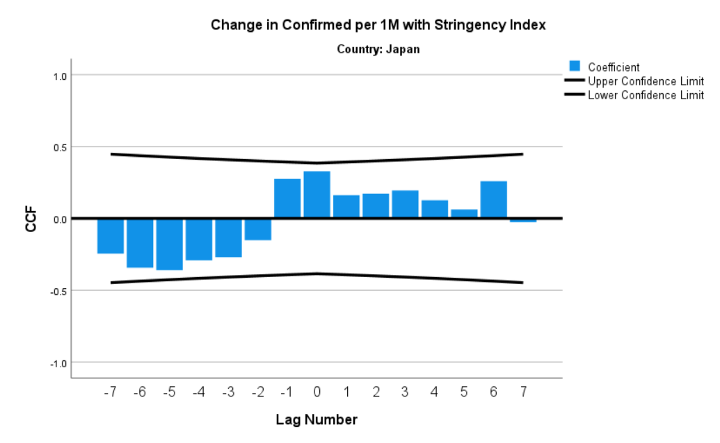
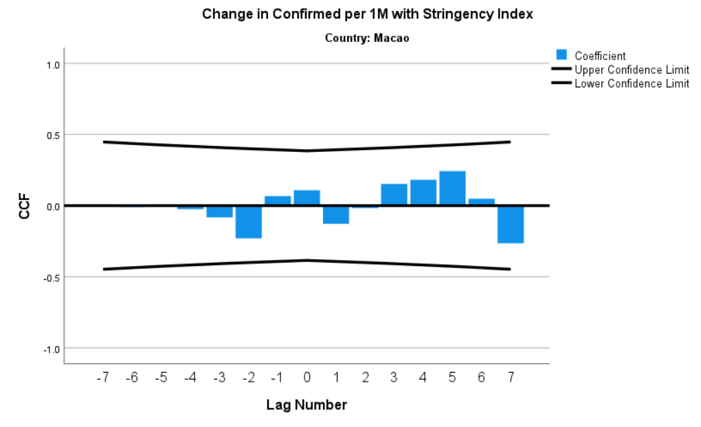
Conversely, Taiwan, Macao, Japan, Sweden, and Iceland have pursued the least strict S&M policies over the same period.
Figure 2: The Relationship between the Stringency Index and weekly changes in COVID-19 Confirmed Cases (per 1 million people)
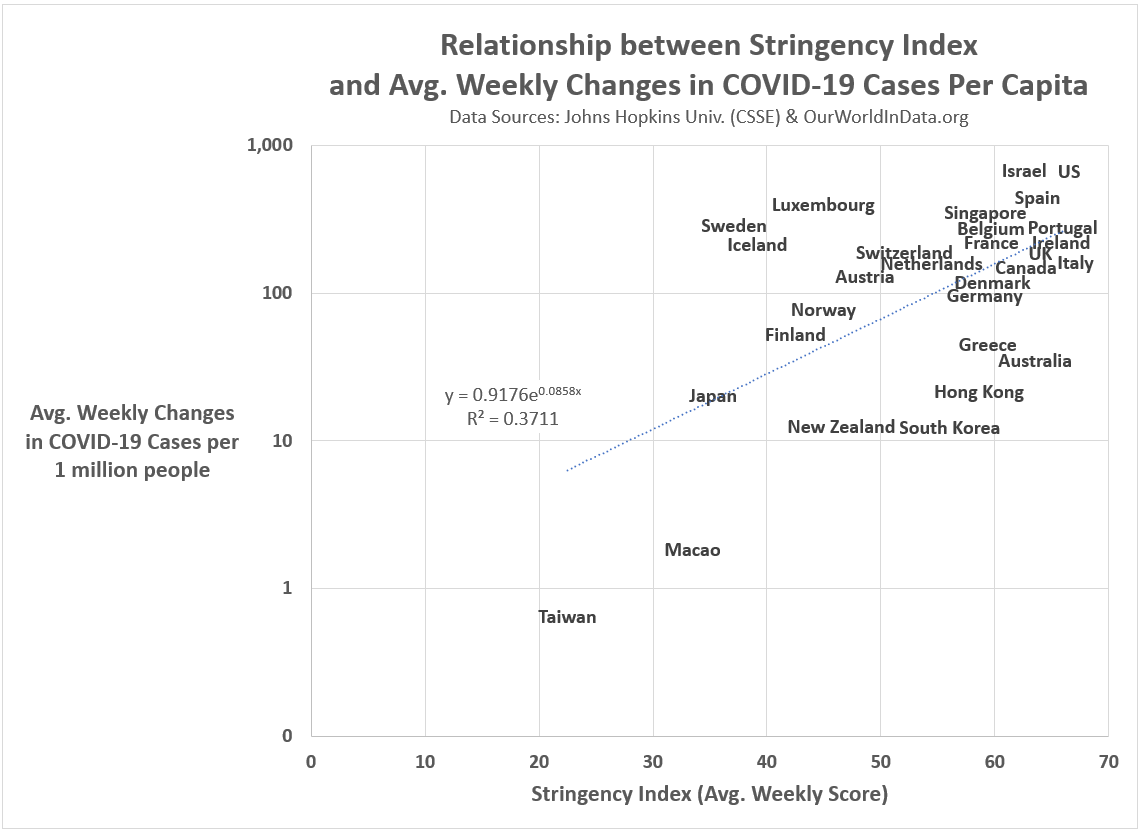
There is a weak but statistically significant positive relationship between the strictness of coronavirus S&M policies and weekly changes in per capita COVID-19 confirmed cases, even with Taiwan and Macao removed from the analysis.
This does not mean strict S&M policies cause a rise in new COVID-19 cases. It merely reflects that countries hit hardest by the virus were impelled to adopt stricter lockdown policies. As the coronavirus continued to rise in the midst of those policy adoptions, countries respond accordingly by increasing the strictness of those policies.
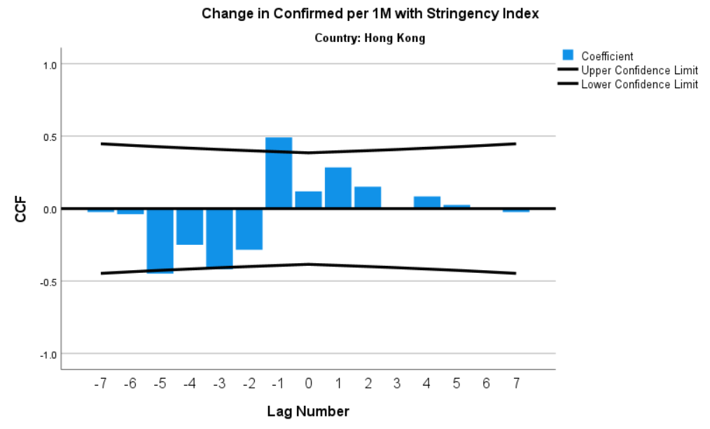
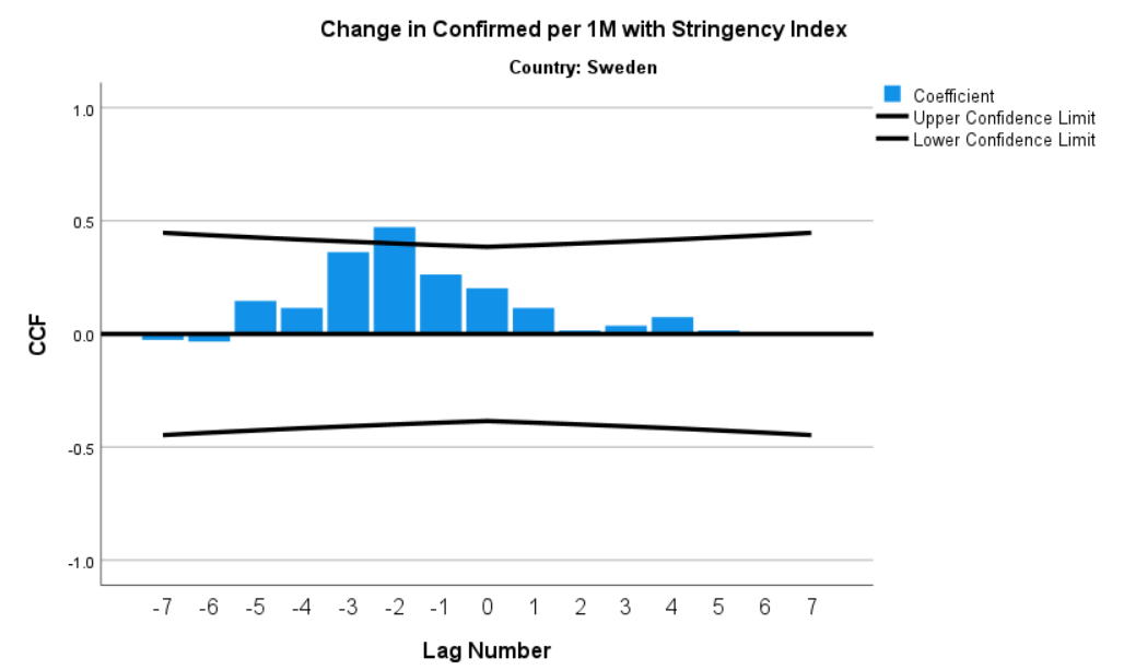
Figure 3 below shows a similar pattern between the Stringency Index and weekly per capita changes in COVID-19 deaths. Though not statistically significant, it is interesting to note that Sweden is an outlier in this graph. Sweden chose a less strict S&M path and experienced coronavirus outcomes no different than some countries that pursed must stricter policies. In contrast, New Zealand, South Korea, Hong Kong, and Singapore chose strict S&M policies and achieved fewer coronavirus deaths per capita. [Soon we will better know the differences in economic outcomes in these countries — which may or may not offer some rationalization for Sweden’s deviant policy choices.]
Figure 3: The Relationship between the Stringency Index and weekly changes in COVID-19 Deaths (per 1 million people)

While the data like that in Figures 2 and 3 are often used by lockdown cynics to argue against such policies — and, full disclosure, I believe the final words on the effectiveness of lockdown and other S&M policies have not been close to being written — these charts tell us nothing about the impact of these policies.
We need to look at the data over time (I choose weekly-level data to eliminate some of the noise inherent in the coronavirus daily data) and see if there are statistically significant relationships between the strictness of S&M policies and coronavirus outcomes. For this effort, I focus mostly on weekly changes in COVID-19 cases (per 1 million people) in countries known to have eventually implemented sophisticated, wide-scale testing COVID-19 testing programs.
S&M Policies & Changes in COVID-19 Cases
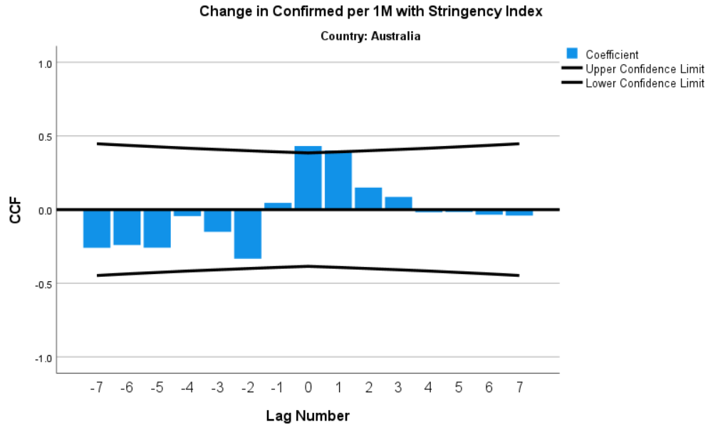
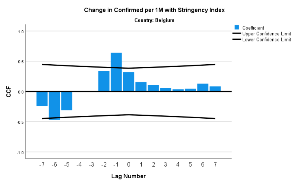
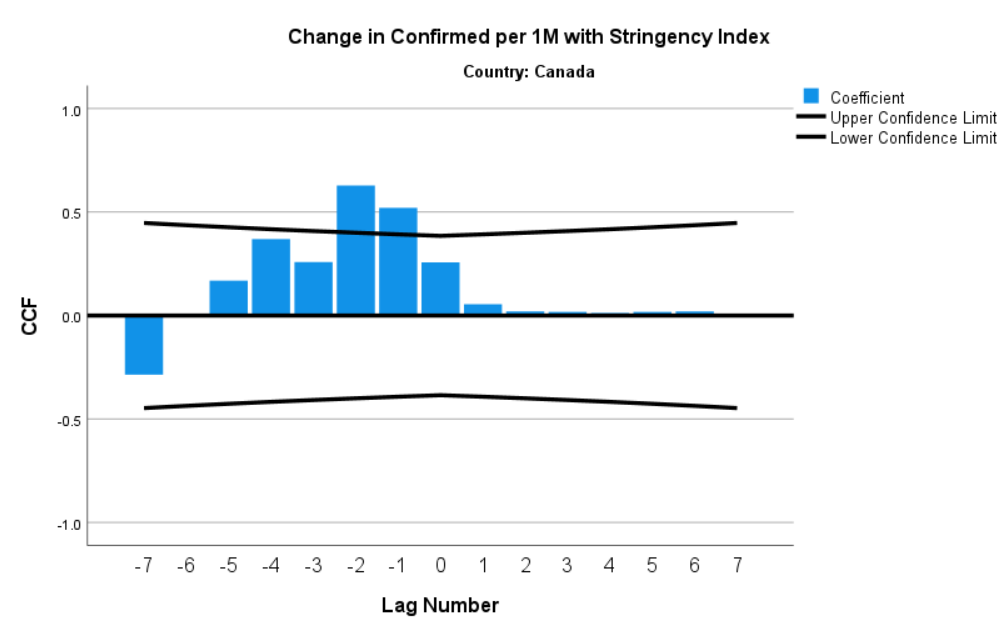
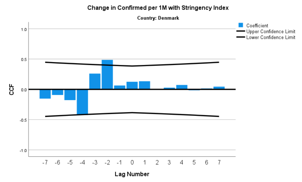
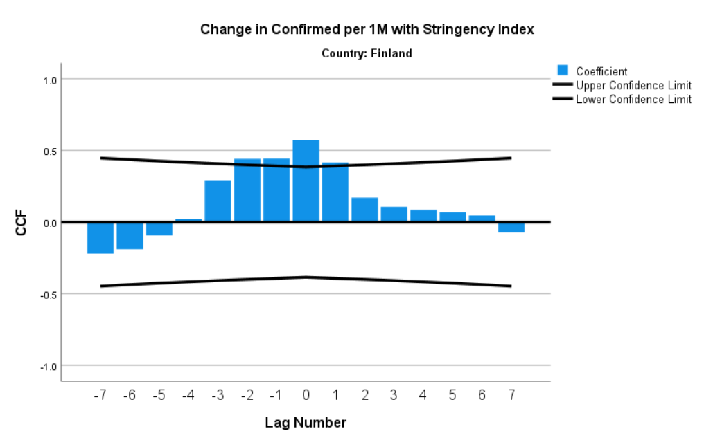
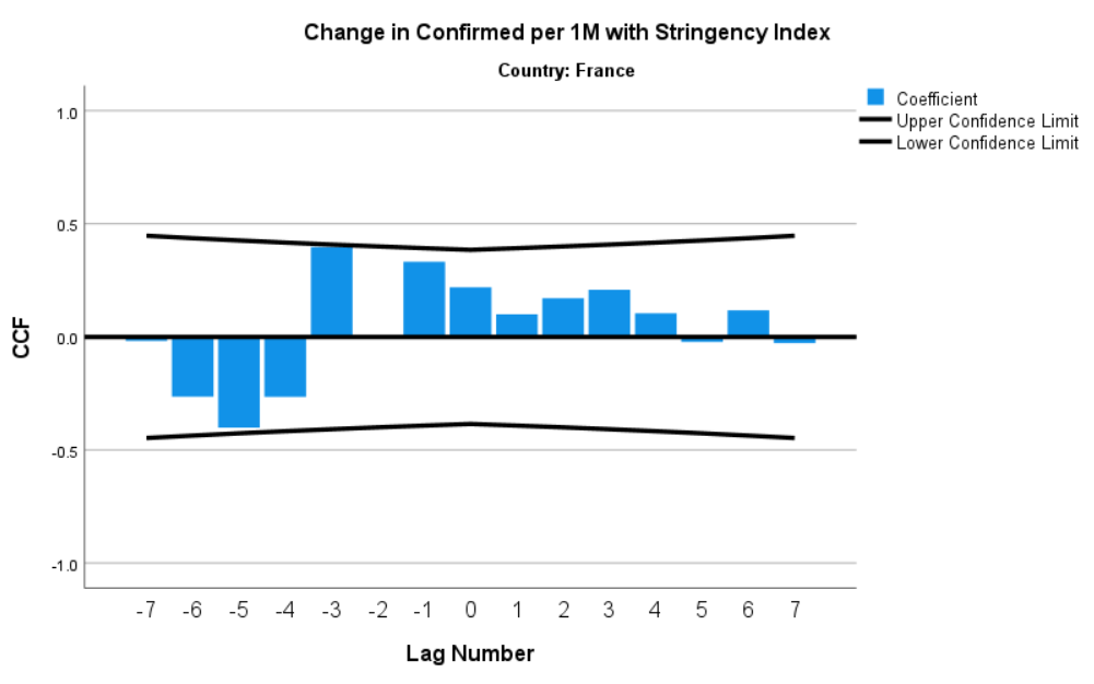
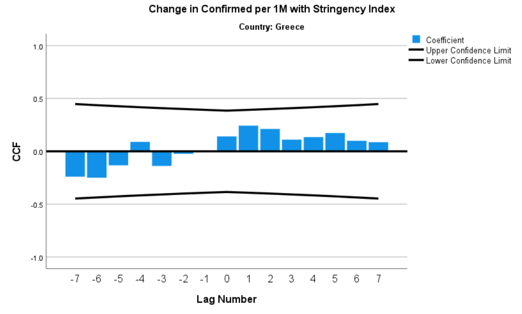
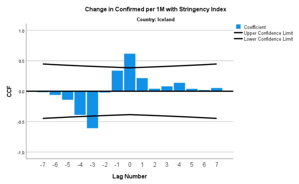
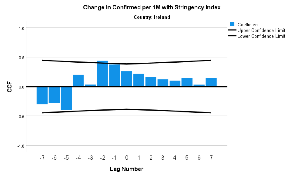
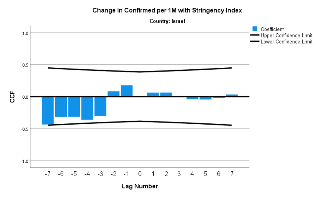
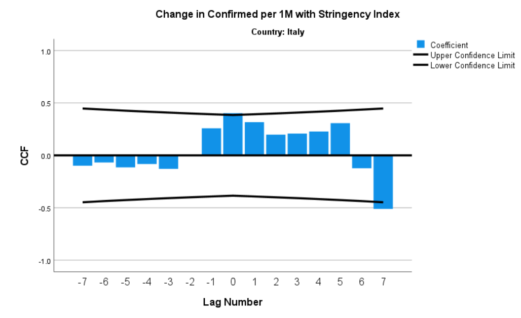
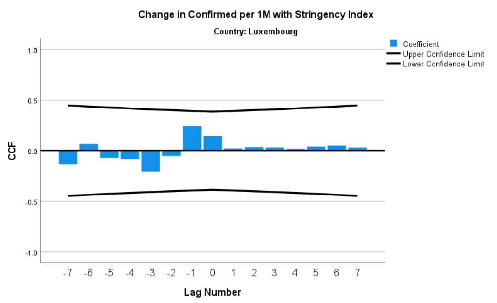
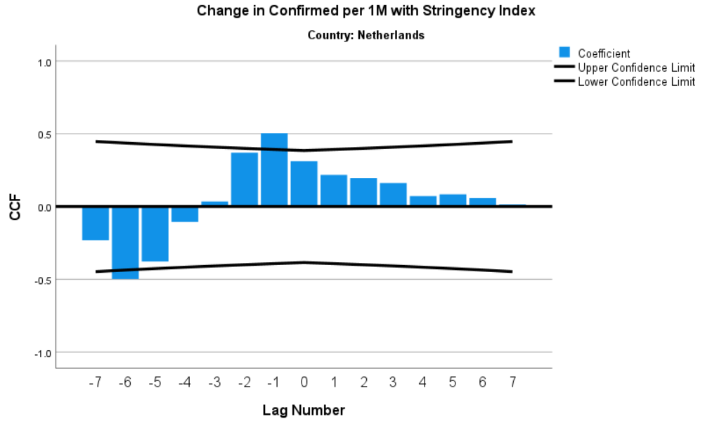
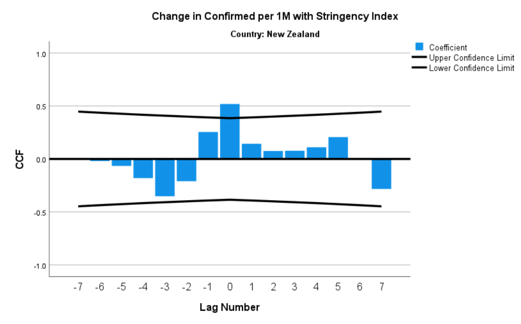
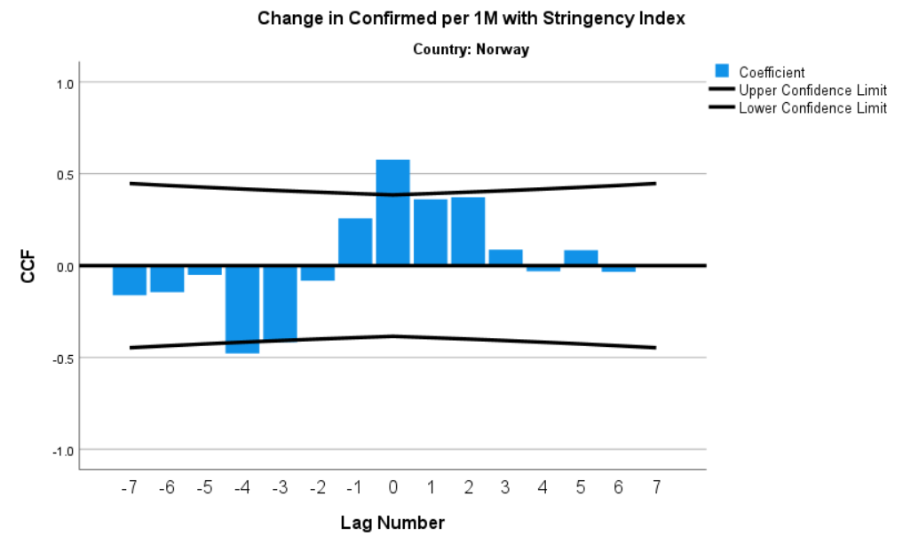
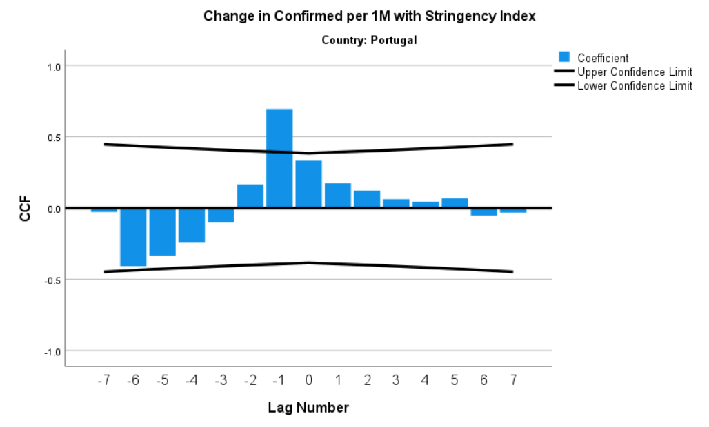
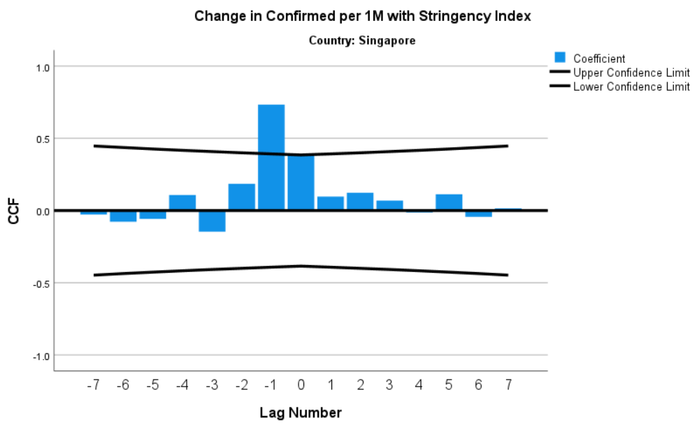
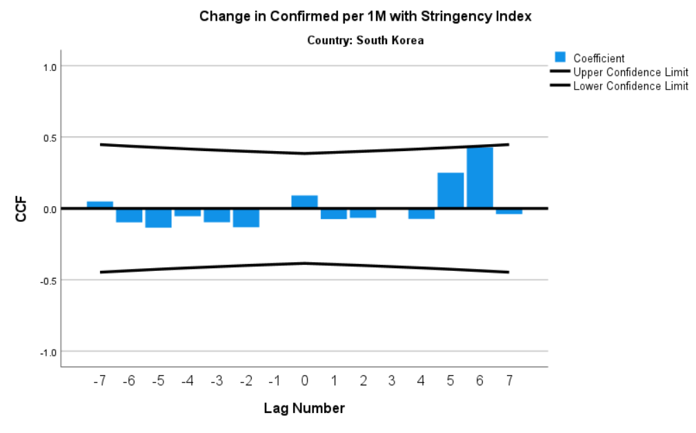
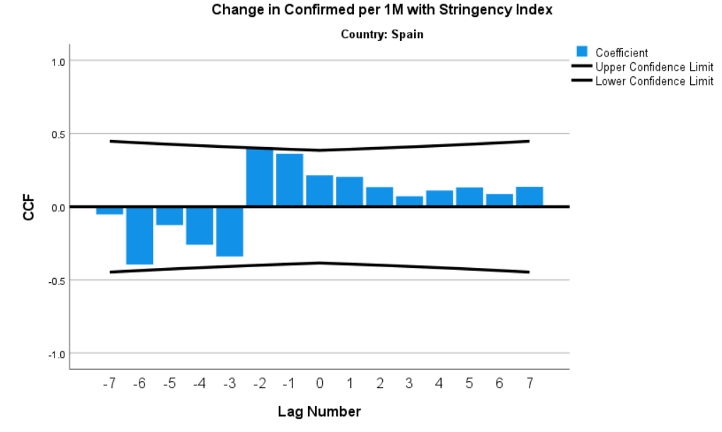
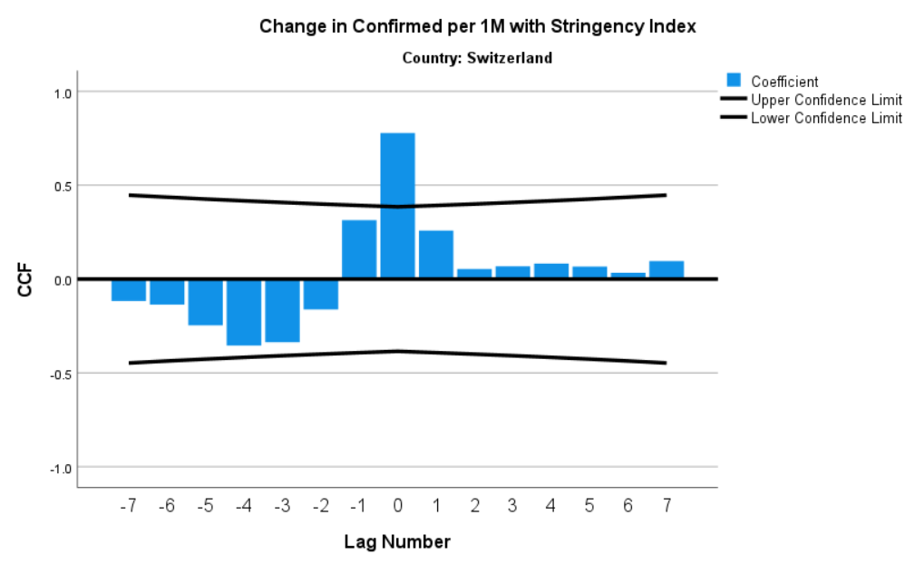
The Appendix (below) contains cross-correlation function (CCF) plots for time lags in the Stringency Index and weekly changes in COVID-19 cases per capita for all 29 countries. However, for this essay I will highlight those countries most illustrative of this common relationship in the data: There is a contemporaneous, positive correlation between the strictness of government S&M policies and changes in COVID-19 cases.
But there is also another consistent feature in the data: Changes in COVID-19 cases are negatively associated with the strictness of government S&M policies around three weeks prior.
We can’t conclude for certain these government S&M policies are causing these declines in COVID-19 cases, but that is the clear implication. We also can’t say anything about the relative size of this impact, assuming it is causal.
How to Read CCF Plot: The cross correlation function is the correlation between the observations of two time series Xt and Yt, separated by k time units (the correlation between Yt+k and Xt). In this analysis, Y is the change in confirmed COVID-19 cases and X is the level of the Stringency Index. We use the cross correlation function to determine whether there is a relationship between two time series. To determine whether a relationship exists between the two series, look for a large correlation, with the correlations on both sides that quickly become non-significant. This plot also requires that the series are stationary and one is white noise.
The change in confirmed COVID-19 cases (Y) and the level of the Stringency Index (X) variables were first differenced prior to running the CCF plots in order to make the series stationary.
Figure 4: CCF Plot for Total Sample of 29 Countries (Change in Confirmed Cases and Stringency Index)

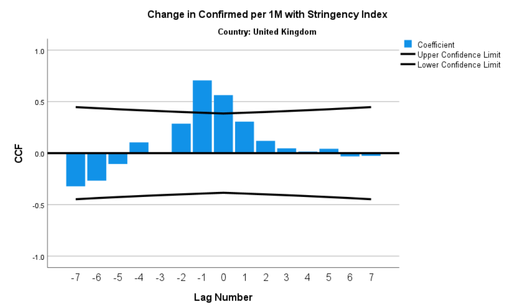
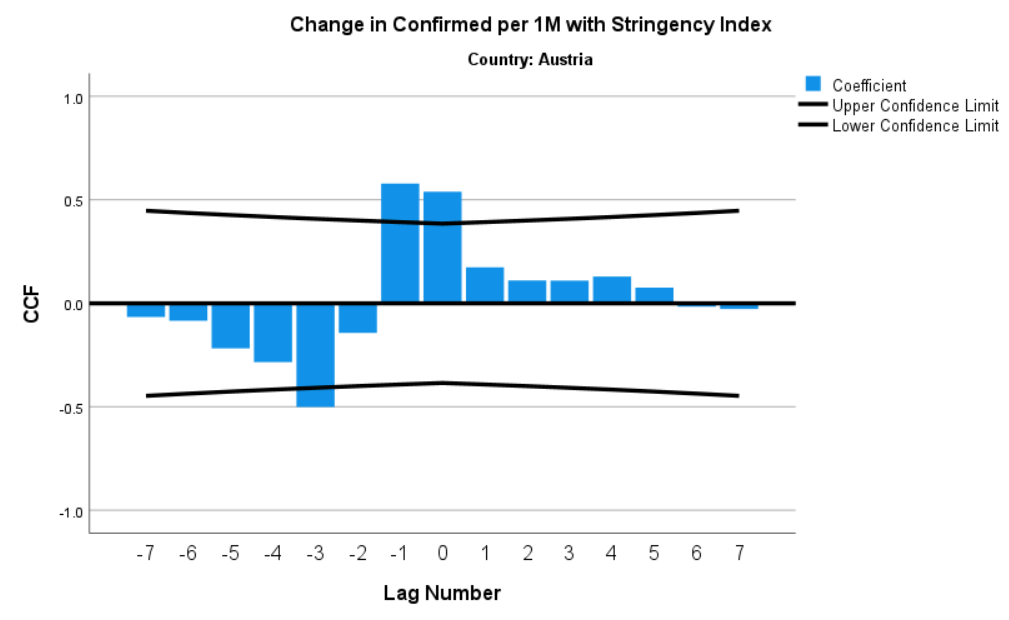
The CCF plots for Germany and Austria demonstrate this relationship at the country-level and that is roughly seen to various degrees for most of the 29 countries (see Figures 4 and 5).
Figure 5: CCF Plot for Germany (Change in Confirmed Cases and Stringency Index)
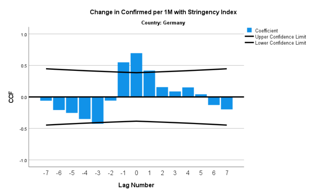
Figure 5: CCF Plot for Austria (Change in Confirmed Cases and Stringency Index)
While the CCF plots are suggestive of a meaningful relationship between S&M policies and changes in COVID-19 cases, we don’t know the strength of that association relative to other factors or the specific S&M policies that are most effective in containing the coronavirus.
Those questions won’t be definitively answered here, but we can get some clues.
Utilizing the panel data structure of our dataset (i.e., repeated measures of the same countries over time), I estimated a panel regression models with changes in COVID-19 cases as the dependent variable and the Stringency Index (lagged 0 and 3 months) and time (in weeks) as the independent variables. Dummy variables were also included for each country.
Figure 6 shows the statistical code used to generate the linear model and its output (in SPSS).
Figure 6: Panel Regression Model for Weekly Changes in COVID-19 Cases
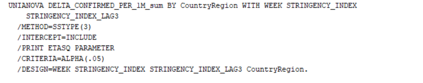
The first table of interest in Figure 6 is the “Tests of Between-Subjects Effects.” All of the independent variables are statistically significant at the 0.05 alpha-level, except for time (WEEK).
The “partial ETA squared” column indicates the effect size for each independent variable and the sum effect of the 29 countries. By far, the sum of the country-specific effects (eta = 0.341) are most powerfully associated with changes in COVID-19 cases. Some countries have simply done a better job than others in implementing their S&M policies. Among the worst performers in that regard is the U.S., whose effect is contained in the intercept parameter (a = 613.2). In other words, compared to the average country in an average week, the U.S. has more 613 new COVID-19 cases per 1 million people.
In America’s defense, we have 50 different states (and the District of Columbia) implementing 50 different coronavirus S&M policies, with minimal central government control (compared to governments in other advanced economic countries).
The coronavirus pandemic may be one case where central government planning is an advantage.
The “Parameter Estimates” table reveals that the significant independent variables are in the expected direction. For example, the parameter for the Stringency Index (lagged 3 months) is negative (b = -0.399). When the Stringency Index goes up, COVID-19 cases go down.
The eta-squared (i.e. effect size) of the Stringency Index (lagged 3 months) is relatively small (eta = 0.061) compared to the country-specific effects (eta = 0.341), but that is in part due to the imperfect measurement of S&M policy strictness contained in the Stringency Index. In other words, an 80 index score in Germany is not necessarily the same as an 80 index score in the U.S. or Spain.
Unfortunately, the overall fit of the model (adjusted R-square = 0.375) also suggests S&M policies do not explain as much of the variation in new COVID-19 cases across countries as we would hope.
Clearly, the spread of the coronavirus is harder to control than governments would like (see Figure 2 above). Among the 29 countries analyzed in this essay, a few governments are doing it well (Taiwan, New Zealand, South Korea, Japan, Australia, Greece, Finland, Norway), and a few others are doing it less poorly (Germany, Denmark, Canada, Austria). But the rest are struggling.
Final Thoughts
With the recent death of Ruth Bader Ginsburg and the political tussle over President Trump’s SCOTUS nominee and resulting confirmation process, few realize another political tsunami may hit on October 2nd — the day the U.S. Commerce Department releases the 2020 Q2 GDP numbers at the state-level.
While no single economic data release can definitely answer the question — How have coronavirus suppression and mitigation policies affected the aggregate economy? — this upcoming data release should offer our best, most comprehensive state-level picture of the coronavirus pandemic’s impact on economic activity. And, inevitably, detailed comparisons of “red” state and “blue” state outcomes will ensue, along with the predictable political noise.
Admittedly and with deep regret, the conclusions drawn here about the positive impact of S&M policies on the spread of the coronavirus do not factor in their significant economic and social costs. Without conducting a fully-specified tradeoff analysis between S&M policies and their economic consequences, policymakers are ill-equipped to select the most effective measures that both contain the coronavirus and allow as much normal economic activity as possible.
Up to now, the news media, scientists, policy analysts, and political elites continue to come up short in this effort.
With the October 2nd release of U.S. state-level GDP data, hopefully this neglect will be reversed, even if the data’s political implications help one party more than the other.
Forgive me if I keep my expectations low in that regard.
- K.R.K.
Comments can be sent to: nuqum@protonmail.com
or DM me on Twitter at: @KRobertKroeger1
Appendix