Russia Secretly Offered Afghan Militants Bounties to Kill U.S. Troops, Intelligence Says.
No, the bombshell information is not that Russians might be paying our adversaries to kill our soldiers. That’s been going on for close to 75 years now. And, truth be told, the U.S. does the same to Russia. The CIA’s Operation Cyclone during the Russian occupation of Afghanistan (1979 to 1989) comes to mind, but sometimes the U.S. just kills Russians directly, as we did in Syria. No middleman or bounty required. Either way it’s called statecraft, and its a dirty business.
Rather, the bombshell news is that the CIA is leaking classified intelligence–probably illegally, as only the President and those he delegates have the legal authority to declassify such information, per Executive Order 12356–in an apparent effort to undermine the Trump administration’s policies in Afghanistan, if not undermine the administration’s overall ability to govern.
If this were done in one of Donald Trump’s shithole countries, we’d call this type of government intelligence activity part of a coup effort. As it was done in the U.S. during the Trump administration, its called the ‘nightly news.’
Whether coincidental or not, the Times story is coming out at the very moment the Trump administration moves forward in brokering a peace deal with the Taliban and the current Afghan government in an effort to end our 19-year war in Afghanistan, the longest in U.S. history.
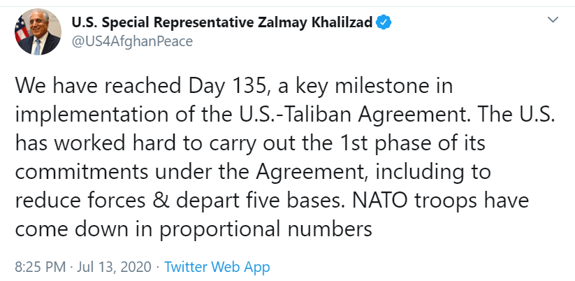
On July 13th, chief U.S. negotiator and peace envoy Zalmay Khalilzad tweeted:
While the Taliban has increased their military activity against the Afghan government in recent months–most likely an effort establish their leverage at the negotiating table–they have not targeted U.S. troops, despite such lazy inferences repeatedly drawn in the U.S. mainstream media from the thinly-sourced Times ‘bounties’ story.
The last U.S. troop deaths in Afghanistan due to hostile activity were on February 8th, from a Green on Blue attack (i.e., an attack by Afghan National Security Forces or an Afghan contractor employed by the International Security Assistance Force–ISAF). These U.S. combat deaths occurred three weeks prior to the signing of the U.S.-Taliban Peace Deal on February 29th.
If there have been Russian-paid bounties on the lives of U.S. soldiers, they have had no substantive impact on the Afghan conflict.
Reports surfaced in 2016 that the Russians were providing weapons to the Taliban to fight ISAF (US and NATO)–weapons used to kill American soldiers. This happened during the Obama administration.
By 2017, U.S. military leaders were openly calling out the Russians for providing military support to the Taliban.
Underlying this reporting–based entirely on anonymous intelligence sources–is the implicit narrative that the Trump administration “ignored” the intelligence, thereby becoming complicit with the Russians and Taliban in the killing of U.S. troops.
The anti-Trump outrage brigade went full speed ahead with the ‘bounty’ story and its innuendo of treason, despite at least one U.S. official working closely on Afghanistan admitted it “is not a big step to see that they (the Russians) were also paying a ‘bounty’ to Taliban commanders” for targeting U.S. soldiers.
Some independent journalists such as Max Blumenthal promptly challenged the dubiousness of the Times ‘bounty’ story—Why would the Russians need to pay the Taliban to do something they already do quite willingly?–claiming that the intelligence leak to the Times possibly represents a U.S. intelligence/military community effort to prolong the U.S. occupation of Afghanistan by sabotaging the U.S.-Taliban peace talks.
Putting aside for the moment any bureaucratic rebellion aimed at keeping the U.S. in the longest war in its history, the validity of the ‘bounty’ is most likely described by one of three explanations:
Explanation (1) The ‘bounty’ story is true and U.S. intelligence caught the Russians red-handed (no outdated pun intended),
Explanation (2) the story is not true and was built on circumstantial evidence, resulting in sincere but flawed inferences and conclusions (probably fitting a preexisting narrative already circulating within anti-Trump forces inside the U.S. government), (3)
Explanation (3) this story is not true and was a willful use of disinformation (or the reckless exaggeration of legitimate intelligence) meant solely to discredit the Trump administration.
With the recent news that some intelligence officials had only “medium confidence” in the Russian “bounty” conclusion—thereby explaining the Trump administration’s decision not to overreact to that intelligence report—I would assign the general probabilities for the three ‘bounty” story explanations as follows: Explanation 1 could be true, Explanation 2 is more likely to be true, and Explanation 3 cannot be ruled out.
Regardless of the ‘bounty’ stories truth, there is legitimate news–if still circumstantial–contained within the media frenzy aimed at further tainting the integrity and credibility of the Trump administration.
First, by refusing to foolishly ratchet up tensions with the Russians and Taliban over the ‘bounty’ story, the Trump administration is showing remarkable focus and leadership in trying to hammer out a viable and lasting peace with the Taliban. Though they may still fail—and, frankly, it doesn’t help that many Volvo Democrats and anti-Trump Republicans are actively working to malign the administration’s Afghan peace efforts—the Trump administration’s intentions do appear authentic.
Finally, the most troubling aspect of the Times ‘bounty’ story is that the U.S. intelligence community is freely leaking classified information (without apparent consequence despite such actions most likely being illegal) with the clear intent of undermining the Trump administration. That our intelligence community for over three years now has never been held accountable for violating one of this community’s strictest legal boundaries—the authorization to collect and analyze only foreign intelligence in service to the executive branch—should alarm every American. By leaking to the news media an accusation that the Trump administration is not acting on classified intelligence is, by definition, a form of spying on the Trump administration.
The “bounty’ story leaker cannot justify his or her actions as a ‘whistleblower’ as the person did not go through the authorized ‘whistleblower’ process. And any justification of the leaker’s actions on the grounds that he or she is exposing the Trump administration’s gross negligence with intelligence ignores the fact that administrations have been ignoring military intelligence since at least 1812 when the James Madison administration ignored military intelligence reports saying the British were planning to invade Washington. Madison’s administration didn’t act on the intelligence until British troops were a mere 16 miles from the Capital.
Even if mostly true, the Times ‘bounty’ story is non-news posing as substantive news. It is a pattern we saw worked with ruthless precision during Russiagate coverage in which non-news stories–such as incoming National Security Adviser Michael Flynn talking privately to the Russian Ambassador to the U.S.–become “blockbuster” exclusives confirming Trump was a Vladimir Putin puppet and signaling the imminent end of the Trump presidency. None of that was ever true and you can be forgiven if you are rolling your eyes at the ‘bounty’ story as well.
In a free society with a free press, journalists have every right to uncover stories like the ‘bounty’ story. But it is dangerous for the public to turn a blind eye to the U.S. bureaucratic state using journalists to facilitate domestic political attacks using information of unknown veracity. Wikileak’s Julian Assange sits in a UK prison because he published classified information about U.S. military actions in Iraq—not one word of which Wikileaks has ever had to retract for being a falsehood.
By Kent R. Kroeger (Source: NuQum.com; July 19, 2020)
Key Takeaways: The science says we will reach herd immunity — the point at our most vulnerable citizens have indirect protection to the coronavirus (SARS-CoV-2) — when 60 to 70 percent of the population has either been vaccinated or has the virus antibodies having survived contraction of the virus.
At present, while the U.S. is seeing a fast growing percentage of its population who has survived this disease (COVID-19) and therefore bringing the U.S. closer to herd immunity, this growth may be occurring too fast given the country’s medical capacity to handle those most vulnerable to the disease. Based on my models, the U.S. has experienced around80,000 more deaths than expected given the country’s general characteristics (i.e., population density, days since the virus became lethal, mean latitude, and historical ability to handle the seasonal flu).
Without disciplined individual behavior (i.e,. face masks and physical distancing), the U.S. will continue to suffer more coronavirus deaths than necessary to reach herd immunity.
The U.S. will be talking for “decades” about what New York did to fight the coronavirus, New York Governor Andrew Cuomo recently declared. To further emphasize that point, Cuomo himself designed a campaign poster touting his state’s titanic efforts to control the coronavirus (I purposely use the term ‘titanic’ ):
Governor Andrew Cuomo’s graphic poster of New York’s efforts to control the coronavirus
Criticism of Cuomo’s splatter graph poster is coming from all political corners.
Says the National Review’s Madeleine Kearns: “I don’t have anything nice to say about it, except that it’s a helpful insight into a singularly incompetent and disorganized mind. It must remain one of the weirdest political stunts to come out of a crisis.”
Even CNN — the broadcast home of Governor Cuomo’s own brother, Chris Cuomo — can’t stomach the inappropriateness and arrogance of the New York Governor’s poster art.
“Cuomo’s whimsical gesture was in poor taste and poorly timed,” writes CNN contributor Errol Louis, “New York suffered a staggering 32,000 coronavirus deaths in the span of just a few weeks, more than 10 times the number of lives lost on 9/11.”
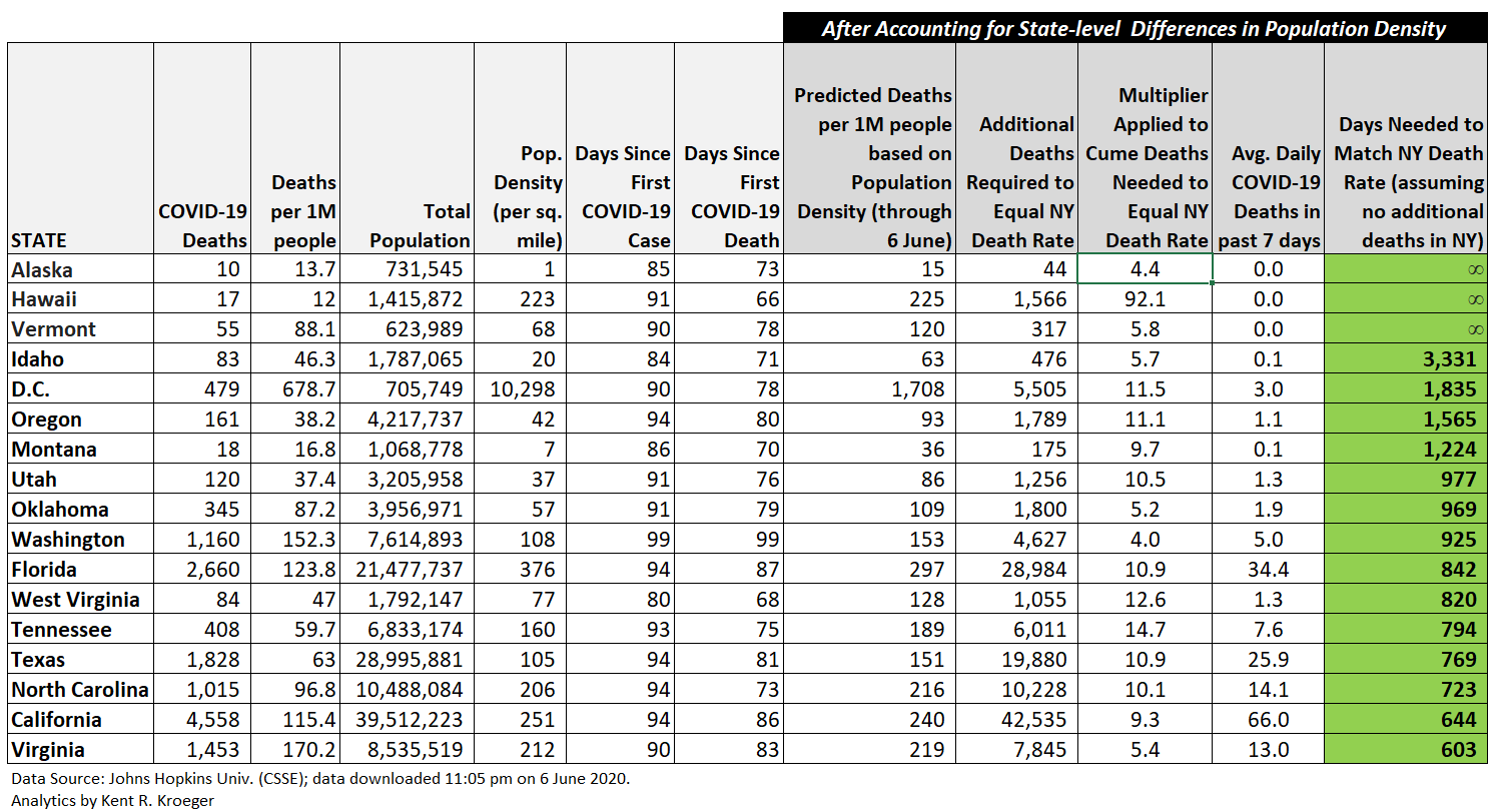
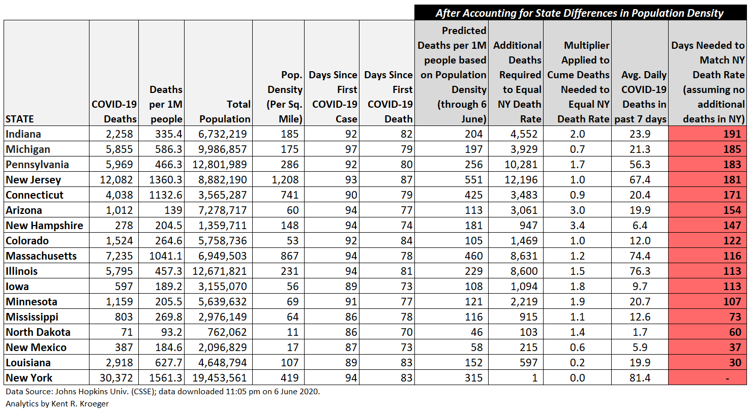
With New York’s coronavirus death rate of 1,670 per one million people, what Governor Cuomo wouldn’t give to have Florida’s or Texas’ death rates (211 per/M and 125 per/M, respectively). Indeed, Florida and Texas could see their deaths rates triple over the next month and they still wouldn’t be close to the carnage experienced in New York (or New Jersey) over a much shorter period of time.
Governor Cuomo is smart to focus attention on the past month of relatively few new coronavirus cases or deaths in his state, as the art of politics has at least one immutable law: when a statistical measure doesn’t give the answer you want, use a different measure.
The Republicans are not innocent
Of course, the Donald Trump administration and the Republicans are no better.
The ongoing pissing match between Dr. Anthony Fauci, Director of the National Institute of Allergy and Infectious Diseases, and Peter Navarro, an assistant to the president, spotlights how the Trump administration is cherry-picking coronavirus data for its own political convenience.
In a recent political event — directly contradicting statements by President Trump promoting the declining case mortality rate of the coronavirus — Fauci said “that it’s a false narrative to take comfort in a lower rate of death” and the country cannot get into a “false complacency” regarding progress made in controlling the virus.
Navarro shot back at Fauci in a USA Today editorial: “Fauci says a falling mortality rate doesn’t matter when it is the single most important statistic to help guide the pace of our economic reopening. The lower the mortality rate, the faster and more we can open. So when you ask me whether I listen to Dr. Fauci’s advice, my answer is: only with skepticism and caution.”
So who is right? Fauci or Navarro?
In truth, they are both right…and both wrong.
As reported weeks ago by myself and others, the falling coronavirus case mortality rates are real and significant. Axios, perhaps the most anti-Trump rag on the web, concluded the decline is a function of: (1) a drop in the mean age of Americans getting infected (i.e., a higher percentage of those infected are healthy and capable of surviving the virus), and (2) the “treatments and therapies for those with advanced coronavirus symptoms have improved in the U.S.”
To the extent the Trump administration can take partial credit for the latter reason is debatable, but there is some merit to the argument. The U.S. buying up a large percentage of the world supply of Gilead’s Covid-19 drug Remdesivir, an effective treatment for the disease, is one example — though somewhat ruthless given that this is a global pandemic, not just an American crisis. America First, I suppose.
Still, by trumpeting (pardon the pun) the declining case mortality rate, the Trump administration is only acknowledging half of the story. The U.S. is also experiencing an unprecedented surge in new coronavirus cases — and that surge is not solely a function of increased testing, as suggested by the Trump administration.
Yes, the case fatality rate is falling (a good thing), but with more Americans getting the virus, more Americans will die (a bad thing) — more importantly, many of those deaths will be needless, as I will demonstrate below.
Contracting the coronavirus is not necessarily a bad thing
The American public is bludgeoned with daily updates on new coronavirus cases and deaths. What the news media rarely does, however, is put those statistics in their proper context.
Not every new case of the coronavirus is bad. To the contrary, there is a strong epidemiological argument that the spread of the virus among healthy people serves the important purpose of advancing society towards herd immunity levels — particularly since, according to the University of Minnesota’s Michael Osterholm, PhD, MPH, one of the nation’s leading epidemiologists, we cannot assume an effective vaccine will be widely available any time soon or that, once available, it will offer anything more than short term protection.
“One of the things we have to understand is that this virus is operating under the laws of physics, chemistry, and biology. It doesn’t in any way, shape, or form bend itself to public policy,” Osterholm told Dan Buettner, founder of Blue Zones, a health-oriented website.
The Trump administration’s assumption this virus will go away as soon as a vaccine is developed is both naive and dangerous. It builds expectations in the public mind that will be impossible to meet.
Vaccines don’t just appear at your local doctor’s office or drugstore overnight. The production schedules, supply chains, personnel training, marketing campaigns, and standing up of vaccination centers on the global scale required by the coronavirus will push the capacity limits of even the most advanced countries.
The U.S. could see the wide distribution of a vaccine later this year and nonetheless need many months to get near herd immunity levels — generally believed to be around 60 to 70 percent of the population. In mid-June, Osterholm told NPR that about 7 percent of the U.S. population had already been infected by the coronavirus.
But critics of the Trump administration, led by congressional Democrats and the news media, are advancing an equally dubious expectation that rational public policy making — such as school/business closures and enforcing face mask and social distancing directives — will stop the spread of the virus; when, in fact, the science tells us such measures can only slow the spread of a virus as infectious as the coronavirus (SARS-CoV-2).
“Protective measures such as limiting travel, avoiding crowds, social distancing, and thorough and frequent handwashing can slow down the development of new COVID-19 cases and reduce the risk of overwhelming the health care system,” according to guidance from the Harvard Medical School.
More ominously, Osterholm’s warning in mid-June that long periods of time with few new cases — such as going on now in the Northeast U.S. — is not necessarily a good thing.
“If cases should disappear over the course of the next six to eight weeks, or at least be greatly reduced, that is not necessarily good news,” according to Osterholm. “It surely seems counterintuitive that we would want cases to happen. I don’t want anybody to get sick, severely ill or die. But if we saw a trough of cases in the next two months, I think that would really tell us that we’re likely to have this big second wave, much like we would see with influenza, which could be much worse.”
“This virus is not going to slow down transmission overall. It may come and go, but it will keep transmitting until we get at least 60 or 70 percent of the population infected and hopefully develop immunity,” adds Osterholm.
In layman terms, it is a good outcome when a healthy person contracts the coronavirus and survives without major health complications — as long as they don’t subsequently pass the virus on to someone who is vulnerable to the disease (i.e., the elderly and those people with serious health problems). In other words, surviving the coronavirus is functionally equivalent to being vaccinated against it. Therefore, the news media’s negative obsession with coronavirus case numbers conveniently ignores the positive aspects of the virus’ spread in the U.S.
However, the alarming number of young Americans in “vacation” states contracting the virus and passing it onto vulnerable Americans should temper any Trump administration assertion that the coronavirus is under control. Without disciplined individual behavior (i.e,. face masks and physical distancing), the U.S. will continue to suffer more coronavirus deaths than necessary to reach herd immunity.
How do the U.S. coronavirus numbers compare to other countries?
Accordingly, I will dispense with the standard recitation of the current coronavirus case and death totals (per 1 million people) relative to other countries. The current numbers can be found at RealClearPolitics.com; and, based on those topline metrics, the U.S. is doing no better or worse than most economically developed countries. But those metrics offer little context or insight.
Are Trump and Navarro right in asserting that the growing U.S. case totals are merely a function of increased testing within the U.S. and the ‘real news’ story is the falling case mortality rate?
Or is Dr. Fauci correct in asserting that the falling case mortality rate is an artifact of the virus’ fast spread and that the metric to watch is the number of new cases?
As the following statistical analysis will try to show, both arguments have merit — but, overall, the relative advantage the U.S. is having in lowering its death rate is being squandered by an excessive number of new cases.
My first statistical model attempts to explain the relative number of coronavirus cases in the world’s most advanced economic countries based on a set of factors known to relate to the spread of the coronavirus: (1) population density, (2) mean latitude, (3) the relative number of coronavirus tests (per 1 million people), (4) number of days since the first confirmed case, and (5) a country’s cultural norms (as defined by Samuel Huntington in his book, Clash of Civilizations).
The linear model results can be found in the appendix below (see Figure A.1).
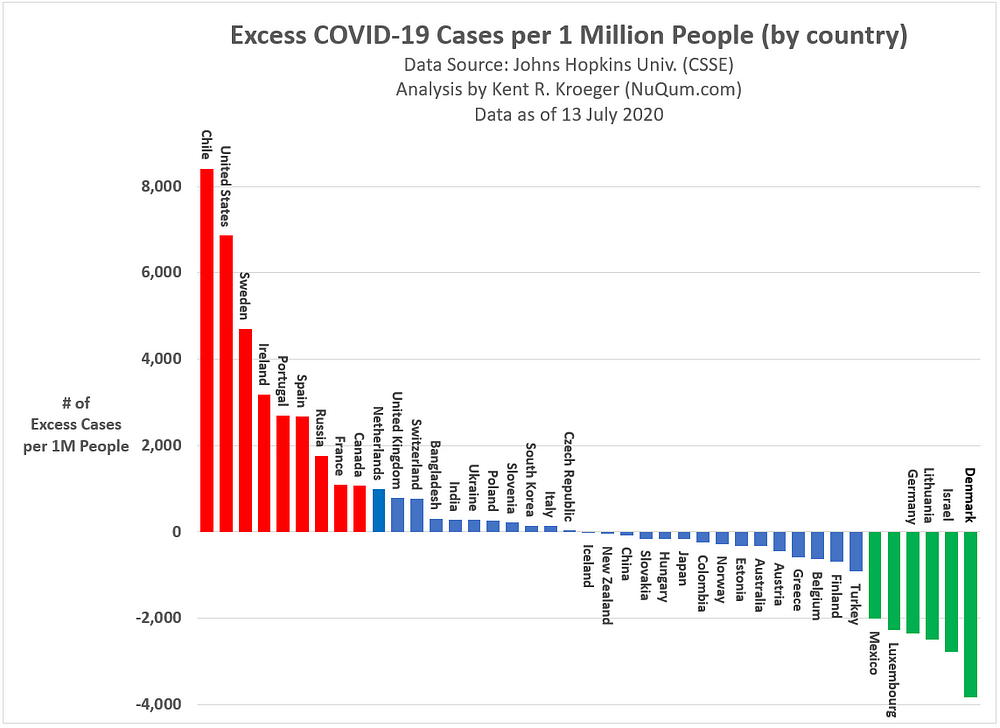
Based on this model, we see which countries are experiencing more coronavirus cases than expected, given their endemic characteristics. After controlling for those factors listed above, my model suggests Chile, U.S., Sweden, Ireland, Portugal, Spain, Russia, France and Canada have all experienced an excessive number of coronavirus cases (see Figure 1).
The U.S. has almost 7,000 more coronavirus cases per 1 million people than expected.
Figure 1: Excess COVID-19 Cases per 1 Million People (as of 13 July 2020)
In contrast, countries like Denmark, Israel, Lithuania, Germany, Luxembourg, and Mexico have experienced relatively fewer excessive coronavirus cases.
The hypothesis that these differences are due to nationwide lockdown policies remains unproven. According to the model presented here, there is no strong relationship between whether a country issued a nationwide lockdown and its relative number of coronavirus cases.
In the U.S. case, the Trump administration contends that the recent increase in coronavirus cases is a direct function of significant increases in testing. The administration is partially correct.
The linear model (detailed in Appendix A.1) shows that the strongest correlate with the relative number coronavirus cases is the level of a nation’s testing for the virus. However, testing alone does not explain the current surge in U.S. coronavirus cases.
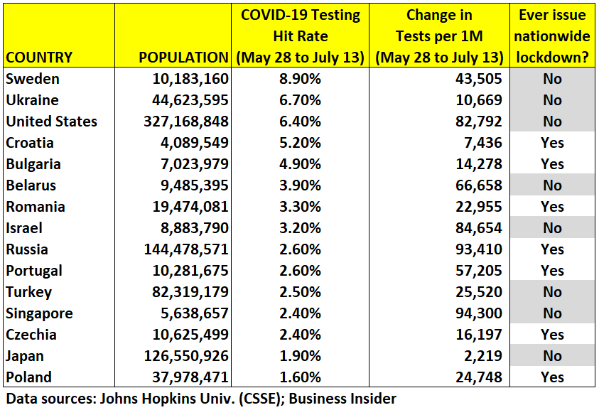
The current growth in U.S. coronavirus cases (primarily in the southern half of the U.S.) is a function of an increase in testing and the relatively high hit rate of this testing (see Figure 2). Since May 28th, 6.7 percent of U.S. coronavirus tests have returned positive. Only Sweden and Ukraine have reported higher hit rates among the advanced economies. In the same period, the U.S. has increased its cumulative number of testing rate by almost 83,000 tests per million people, the 7th fastest testing growth rate among the 41 advanced economies (behind Luxembourg, UK, Denmark, Singapore, Russia and Israel).
Figure 2: Coronavirus testing hit rates between May 28th and July 13th among advanced economies
If we merely focus on the recent surge in U.S. coronavirus cases and dismiss the importance of the country’s falling case fatality rate, as Fauci has suggested, we miss a substantial part of the overall picture.
Yes, the U.S. is seeing a surge in new coronavirus cases — a result in part due to a significant increase in cases among young adults — but a growing percentage of these new cases are within relatively healthy population segments more likely to survive COVID-19. Hence, the falling case fatality rate.
But the problem with the Trump administration resting on the falling case fatality rate as conclusive evidence that the U.S. is “beating” the coronavirus is that this too misses the bigger picture.
What if the rise in new cases far exceeds the rate of decline in the case fatality rate? For example, if the recent surge in cases is also overloading hospital ICUs, it is possible people could be dying that wouldn’t have otherwise, despite the falling case fatality rate.
The two trends — cases and deaths — need to be considered together.
In that effort, my second statistical model attempts to explain the relative number of coronavirus deaths in the world’s most advanced economic countries based on a set of factors known to relate to the spread of the coronavirus: (1) the relative number of coronavirus cases (per 1 million people), (2) mean latitude, (3) number of days since the first confirmed death, (4) historical average of annual flu-related deaths (a proxy for the ability of a nation’s health care system to deal with infectious diseases) and (5) a country’s cultural norms (as defined by Samuel Huntington in his book, Clash of Civilizations).
The second linear model results can be found in the appendix below (see Figure A.2).
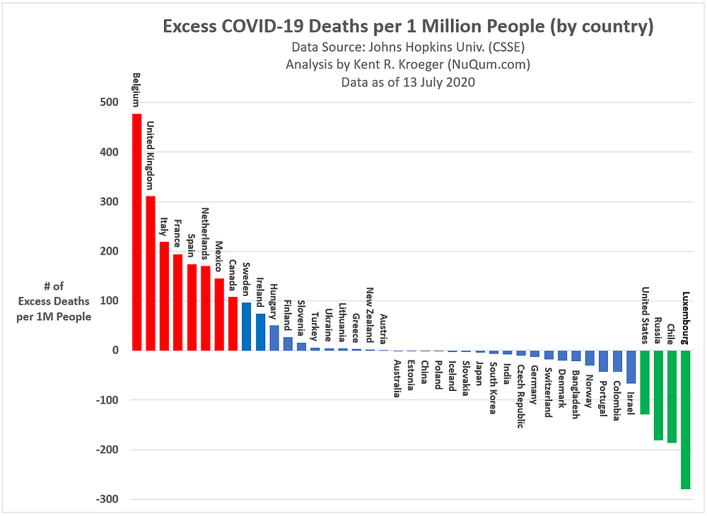
Based on this second model, we see which countries are experiencing more (and fewer) coronavirus deaths than expected, given their endemic characteristics. After controlling for those factors listed above, my model suggests Belgium, UK, Italy, France, Spain, Netherlands, Mexico and Canada have all experienced more than 100 coronavirus deaths per 1 million people than expected (see Figure 3).
Figure 3: Excess COVID-19 Deaths per 1 Million People (as of 13 July 2020)
In contrast, Luxembourg, Chile, Russia and U.S. have experienced more than 100 fewer coronavirus deaths per 1 million people than expected — not coincidentally, three of those countries (Chile, Russia, and U.S.) have experienced a higher than expected number of cases per million (see Figure 1 above).
As the Democrats and Republicans cite the coronavirus statistics that best support their political agendas — the Democrats hammer on the growing number of cases and deaths, while the Republicans dutifully trumpet the improving case fatality rate — it would be more productive to combine information on the coronavirus into more comprehensive metrics.
For example, what if we wanted to know what the U.S. coronavirus death rate would be if the country was experiencing its expected number of cases? Recall, in the first linear model (Figures 1 and A.1), the predicted cumulative number of coronavirus cases for the U.S. was 3,866 per 1 million people. In other words, given its underlying characteristics in terms of population density, testing rate, number of days since first case, and mean latitude, how many cases should the U.S. have right now?).
Thus, if we replace the actual number of U.S. deaths (10,732 cases per 1 million people) into the linear model equation of coronavirus deaths (Figures 3 and A.2) with 3,866 cases per 1 million, we get 178 coronavirus deaths per 1 million people. That is the the number of deaths the U.S. would have right now if the country’ s case rate was normal (i.e., predicted value).
Our actual death rate right now is 424 deaths per 1 million. Expanded over the entire U.S. population, as of July 13th, the U.S. has seen approximately 80,500 more deaths than it should have had it kept its coronavirus case rate near normal levels.
Politicizing the coronavirus is counterproductive
The Democrats can legitimately cite the growing number of cases and deaths in the southern half of the U.S. as evidence that state and federal governments are not pursuing effective policies. Conversely, the Trump administration can rightfully claim the coronavirus (and its associated disease, COVID-19) is increasingly survivable, as seen in the falling case fatality rate.
Sadly, but predictably, the coronavirus has been so recklessly politicized by all sides that it has actually done harm to the the U.S. effort to mitigate and suppress the coronavirus.
The coronavirus has exposed our broken health care system and the systemic dishonesty of our political and media elites.
At the same time, the U.S. will survive the coronavirus pandemic of 2020 and most likely see its economy not just recover but flourish in the next 12 months. The ceaseless march of human progress is not going to reverse because of the coronavirus. No disrespect to those who have suffered and/or died from COVID-19, but this virus is not that scary.
Wear a mask, keep your distance, wash your hands, and stop touching yourself
The news continues to be optimistic for the development of a coronavirus vaccine to be available by the end of this year or early next. Three labs, including the U.S. company Moderna, are currently in Phase 3 testing of possible vaccines. The other two labs are in China and the UK.
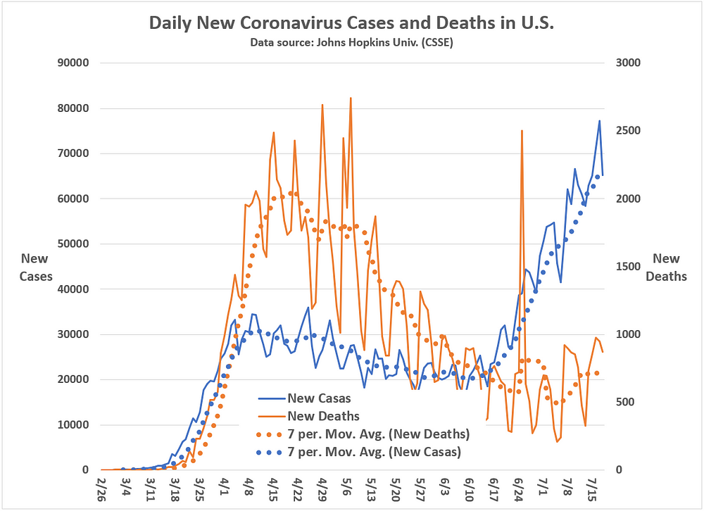
Tempering this optimism, however, is the reality that COVID-19 cases have surged in Arizona, California, Florida and Texas to such an extent that some ICUs are reaching capacity limits as the daily case and death counts are rising again across the country (see Figure 4).
Figure 4: Daily Case and Death Increases in the U.S. (through 18 July 2020)
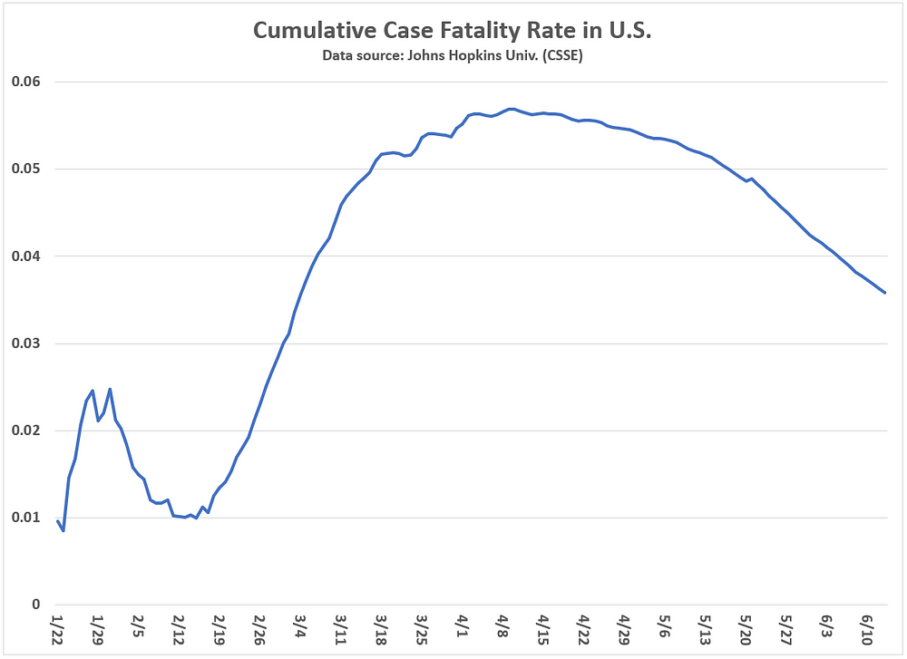
At the same time, as more Americans contract the coronavirus and COVID-19 treatments improve, the cumulative case fatality rate will continue to drop (see Figure 5). That is not a statistical artifact, as suggested by Fauci. It is the result of a virus that is increasingly survivable, as long as we don’t overload our national health care system.
Figure 5: Cumulative Case Fatality Rate in the U.S. (through 18 July 2020)
Osterholm warned at the beginning of this pandemic, make no assumptions about when a safe, effective and widely available vaccine will appear. Besides, vaccines are not 100 percent effective and it is unknown how long the eventual SARS-CoV-2 vaccine will protect individuals once administered. Viruses mutate, after all. Furthermore, it is also not clear the extent or how long the SARS-CoV-2 antibodies protect COVID-19 survivors.
What is clear is that the U.S. is going to reach herd immunity through some combination of COVID-19 recoveries and vaccinations. But assuming the U.S. can prevent SARS-CoV-2 infections long enough for a vaccine to be available is foolish and bad public policy.
The goal should be, according to Osterholm, to flatten out the infection curve as much as possible — and that means enforcing sound physical distancing and mask-wearing policies.
However, it is not obvious that shutting down the U.S. economy is necessary or even helpful. And schools may be able to safely re-open as well if Americans — young and old — systematically change some of their everyday behaviors: Wear masks. Wash hands. And avoid close physical contact outside the home.
This is not hard to do. But as one of my Russian friends living here in New Jersey likes to remind me, Americans do not know how to be sick.
That has to change.
K.R.K.
Send comments to: kroeger98@yahoo.com or tweet me at: @KRobertKroeger1
APPENDIX: The Linear Models for Explaining Worldwide Coronavirus Cases and Deaths (n = 41 countries)
Figure A.1: The Linear Model for Explaining Worldwide COVID-19 Cases (n = 41 countries)
Figure A.2: The Linear Model for Explaining Worldwide COVID-19 Deaths (n = 41 countries)
By Kent R. Kroeger (Source: NuQum.com; July 14, 2020)
I must preface this essay with this acknowledgement: In preparing my visit with my 92-year-old mother, the staff at the Western Home’s Windhaven Assisted Living residence in Cedar Falls, Iowa, could not have been friendlier or more accommodating given the extraordinary circumstances.
I bitched. I moaned. I complained about every rule they imposed on the visit — particularly the disallowing of my mother’s 14-year-old grandson to stand with me behind a Plexiglas barrier that protected her from me.
As it was over 90 degrees in Windhaven’s outside courtyard — where the visit took place — my time with my mother was limited to 30 minutes (though the nurses aide appeared willing to let us go longer, had we requested).
The control measures seemed excessive then; and, in retrospect, they still feel that way.
Even so, I accepted the Western Home’s restrictions (What choice did I have?). As a nurses aide tried to ease my disappointment, she told me, “We can’t take any chances. You understand.”
I understood. I have no complaints with the Western Home. They are stuck between a rock and a hard place. Considering that over 40 percent of U.S. coronavirus deaths are linked to nursing homes, the Western Home had few options. It is easier to protect people from the coronavirus than it is to isolate and eradicate the coronavirus itself. Epidemiologists say, even with a vaccine, the coronavirus (SARS-CoV-2) and its mutation offspring may be with us forever.
When the books are finally written about the 2020 coronavirus pandemic, a large part of the story will be how the U.S. failed its senior citizens, and the blame will cross party lines.
Sadly, New York is not the only state where the nursing home lobby has successfully pressed for legal protections that make it harder for families to sue over negligent COVID-19-related deaths.
If you are wondering why CNN or MSNBC aren’t covering this nursing home liability story more tenaciously, most likely it is because they can’t blame it on Donald Trump. The coronavirus has been so completely politicized by the news media — conservative podcaster Steve Deace perceptively refers to media coverage of the pandemic as ‘panic porn’ — the public is worse off for consuming it. Once more, complicity for this politicization crosses the ideological spectrum.
Western Home’s Windhaven Assisted Living Residence in Cedar Falls, Iowa (Photo by Kent R. Kroeger)
As for my visit with my mother, my biggest regret is that I didn’t lie about my son’s age (he’s 14 and only people aged 18 and older can visit Western Home residents right now).
The visit itself was mostly a positive experience, though its strict limitations were frustrating. Through the inch-thick glass barrier, I could barely hear my mother’s voice (and vice versa). To compensate, we were yelling most of the time. In the end, the 30 minutes I had with my mother on that hot July afternoon felt more like a prison visit.
“Mom, maybe with good behavior they’ll let you out on parole?”
“I’m innocent,” she pleaded back. “I was framed.”
Having raised three boys, my mom has a battle-tested sense of humor.
But, as my visit ended and I began drive away from Windhaven, my wife and son (who had been waiting in the car) begged if they could at least wave at my mother through her apartment window.
I didn’t know her apartment number.
I asked one of the attendants if that would be possible. I could tell he was supposed to say “No,” but he paused for a moment, went into the facility’s office, and soon returned.
“Room 19. North Wing. First level, looking towards the parking lot,” he said. “I’ll let her know.”
My mother looking out her apartment window (Photo by Kent R. Kroeger)
Despite years of clean living and an uncompromising daily exercise routine, my mother’s body has ultimately betrayed her. Osteoporosis has left her wheelchair-bound. A woman that once started every day to either Tae Bo or Sweating to Richard Simmons and the Oldies, can no longer walk. Aging can be cruel enough, but add to that a pandemic-related quarantine and the result is demoralizing for my mother and her family.
The healing power of touch is well-documented in medical science. There must be a better way to protect our seniors from dangerous pathogens without denying the physical contact they need (and their families need) for a decent quality of life.
I don’t know what the solution is, I just know I left the Windhaven nursing home feeling more sad than happy.
By Kent R. Kroeger (Source: NuQum.com, June 30, 2020)
Yes, there is good news in the midst of the current resurgence of the coronavirus in the southern half of the U.S.
Wave 2 of this virus has been discouraging for everyone who believed this pandemic peaked in mid-April in the U.S.
It hasn’t peaked.
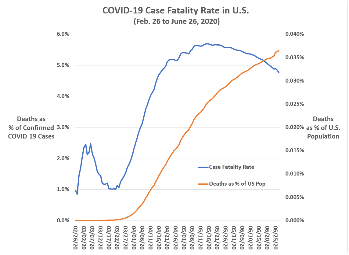
But, in the midst of this, there is some positive news not being widely reported: Case fatality rates in the U.S. (i.e., the ratio of coronavirus-related deaths to the number of confirmed cases) have been in decline since mid-May.
Figure 1: Cumulative COVID-19 Case fatality rate in the U.S. over time
Here are just a few theories as to why this decline is occurring:
(1) It could be a function of increased testing. With more consistent testing nationwide, the denominator in the case fatality rate — the number of confirmed coronavirus cases — is growing more rapidly than the number who are dying. Hence, the case fatality rate is dropping over time.
“It really does appear that doctors have gotten better at treating the disease,” summarized Salt Lake Tribune’s Andy Larsen in his investigative report on the coronavirus’ declining case fatality rate. “It is better to be a coronavirus patient in June than it was in March.”
(3) Has the coronavirus become less lethal?Virologists don’t seem to be on the side of this argument, but it remains possible that the coronavirus spreading at present through the lower half of the U.S. is not as dangerous as the one that passed through the northeast U.S. in March and April.
While epidemiologists know that viruses can mutate, the contention that the coronavirus (SARS-CoV-2) has already mutated at least once during this pandemic has elicited some healthy skepticism from Dr. Nathan Grubaugh, an epidemiologist at the Yale School of Public Health, and Dr. Richard Neher, a biologist and physicist at the University of Basel in Switzerland.
The reported mutation of SARS-CoV-2 “is most likely a statistical artifact,” says Neher. And to determine if SAR-CoV-2 has mutated will require “a nontrivial amount of effort and sometimes takes years to complete,” according to Grubuagh.
As of now, the evidence appears to support Cause #1 (increased testing) and Cause #2 (improved treatments) as the most likely explanations for the dropping U.S. case fatality rate.
Gilead Sciences, the private sector pharmaceutical company responsible for producing the drug, is showing confidence in the antiviral drug’s future by setting its market price at $3,120 (per treatment) for U.S. patients under private insurance and at $2,340 for patients under Medicaid.
Epidemiologists also warn that recent declines in case fatality rates could reverse as deaths are a lagging indicator of the virus’ spread.
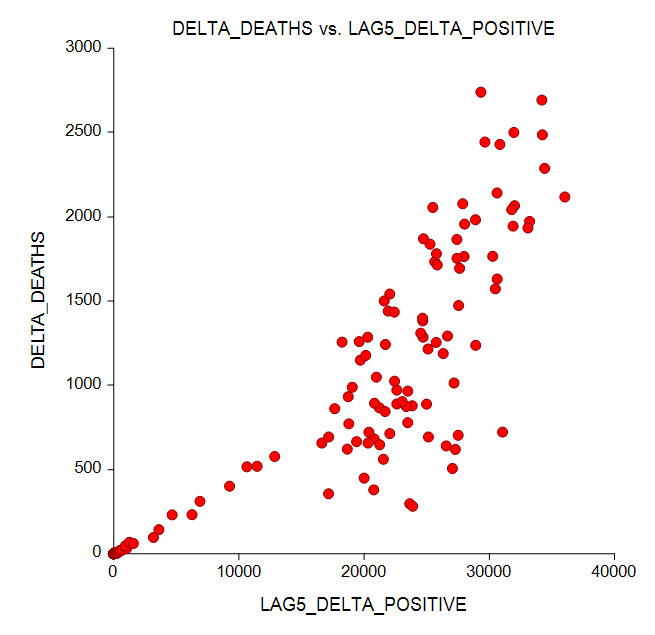
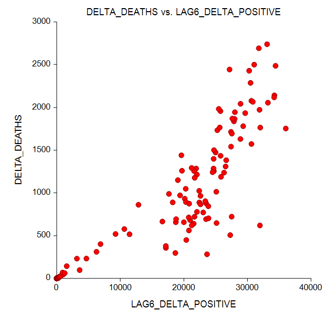
A Poisson regression model for daily coronavirus deaths (DELTA_DEATHS) using lagged values of new daily cases (LAG5_DELTA_POSITIVE, LAG6_DELTA_POSITIVE) found that a surge in new cases on Day 1 is followed by a surge in deaths five to six days later (see Figures 2. 3 and 4).
Figure 2: Relationship between U.S. daily coronavirus deaths (at time t) with new daily cases at t minus 5 days.
Data Source: Johns Hopkins University (CSSE); Analysis by Kent R. Kroeger (NuQum.com)
Figure 3: Relationship between U.S. daily coronavirus deaths (at time t) with new daily cases at t minus 6 days.
Data Source: Johns Hopkins University (CSSE); Analysis by Kent R. Kroeger (NuQum.com)
Figure 4: Poisson regression model of daily coronavirus deaths as a function of new daily cases at time lags of 5 and 6 days.
Data Source: Johns Hopkins University (CSSE); Analysis by Kent R. Kroeger (NuQum.com)
The Poisson regression model in Figure 4 explained approximately 84 percent of the variance in daily coronavirus deaths.
[Note: The current surge in U.S. coronavirus cases peaked on June 26th, at least for now. If the above model is useful, we should expect a surge in coronavirus deaths from July 1st to 2nd.]
Whatever the cause of the declining U.S. case fatality rates, health professionals on the pandemic’s front lines worldwide are noticing, since May, something has changed in a good way with this virus.
Alberto Zangrillo, head of San Raffaele Hospital in Milan (Italy), told the Washington Post in early June that “we cannot demonstrate that the virus has mutated, but we cannot ignore that our clinical findings have dramatically improved.”
Finally, some good news.
K.R.K.
Send comments and questions to: kroeger98@yahoo.com
I hate to pick on a person when they’re down (actually, I don’t), but the story of how Djokovic most likely contracted the virus is what I find dumbfounding.
As reported in The New York Times, Djokovic and his wife, Jelena, tested positive for the coronavirus after a tennis tournament he organized in which “no one wore face masks and social distancing wasn’t enforced in the stands during the series.”
According to the Times story:
“Players mingled freely with each other after matches and posed for photographs with ball kids and tournament officials. There was no systematic testing done for the coronavirus on the participants before the event began, according to the organizers. Besides the Djokovics, at least three prominent players have tested positive: Grigor Dimitrov, Borna Coric and Viktor Troicki, a Serbian whose wife, Aleksandra, also has tested positive along with two coaches. That has prompted fears among the authorities in Croatia and Serbia that the athletes may have triggered a new wave of infections.”
Before we criticize Djokovic, consider what is happening in our own country.
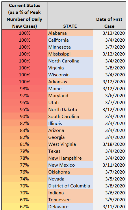
“Hospitals in Arizona have been urged to activate emergency plans to cope with a flood of coronavirus patients. On Saturday, Florida saw its largest single-day count of cases since the pandemic began. Oregon has failed to contain the spread of the virus in many places, leading the governor on Thursday to pause what had been a gradual reopening.
And in Texas, cases are rising swiftly around the largest cities, including Houston, San Antonio and Dallas.”
The coronavirus narrative now dominating the national media says that states (mostly Republican-dominated) where lockdowns have ended and social distancing practices are not widely practiced are experiencing a surge in new coronavirus cases and deaths.
“Nearly half of the states in the USA report a spike in new coronavirus cases, causing concern among health officials as the majority of the country implements phased reopenings.
Oklahoma is one of the 22 states with an increase in daily caseloads as officials debate safety measures for President Donald Trump’s campaign rally Saturday in Tulsa. Florida, Texas and Arizona have seen the sharpest spike.
Florida had another record day Tuesday with 2,783 additional confirmed cases of coronavirus, the largest single-day increase, pushing the state’s cumulative count past 80,000.”
These surge numbers are true and disconcerting, but as is typical with the national media’s coverage of the coronavirus, they miss the real story.
Unless one account’s for the many factors outside of the control of the governors and health officials in these “surging” states, such as population density, one is essentially spreading misinformation about what is behind these second wave surges.
A state’s population density differentiate states on COVID-19
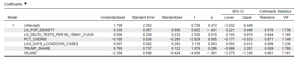
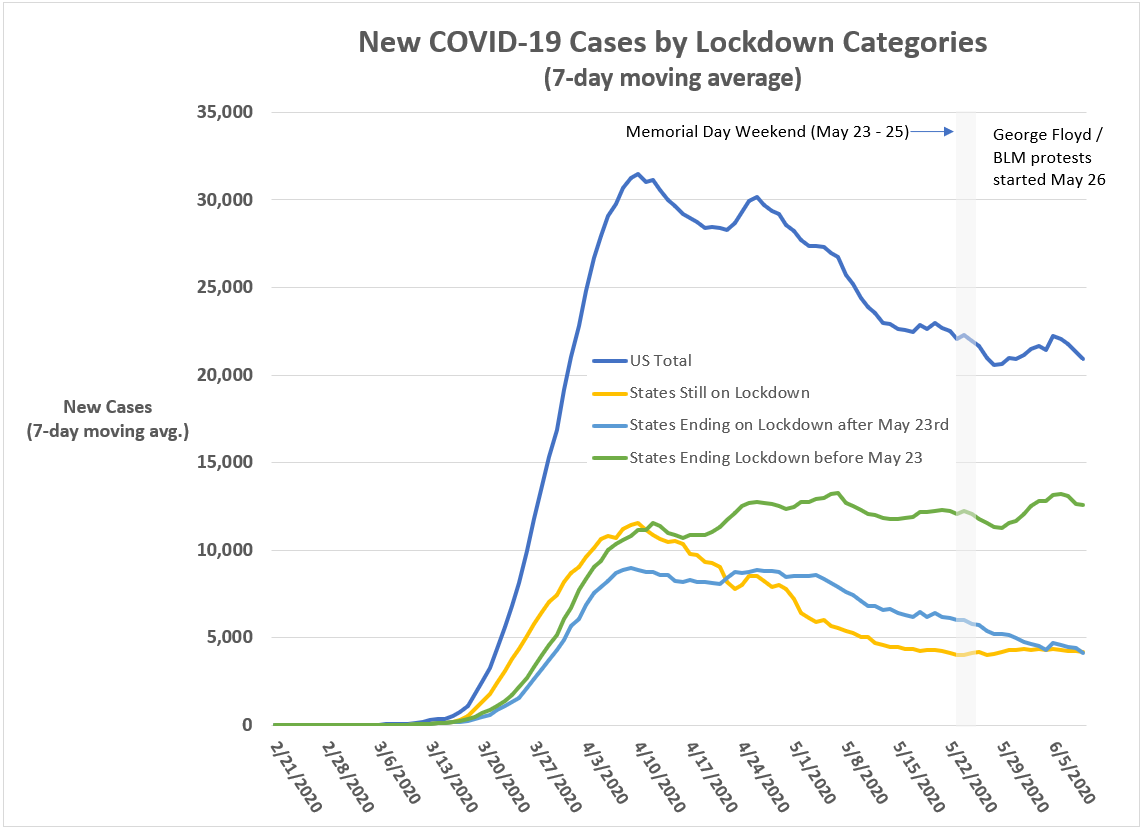
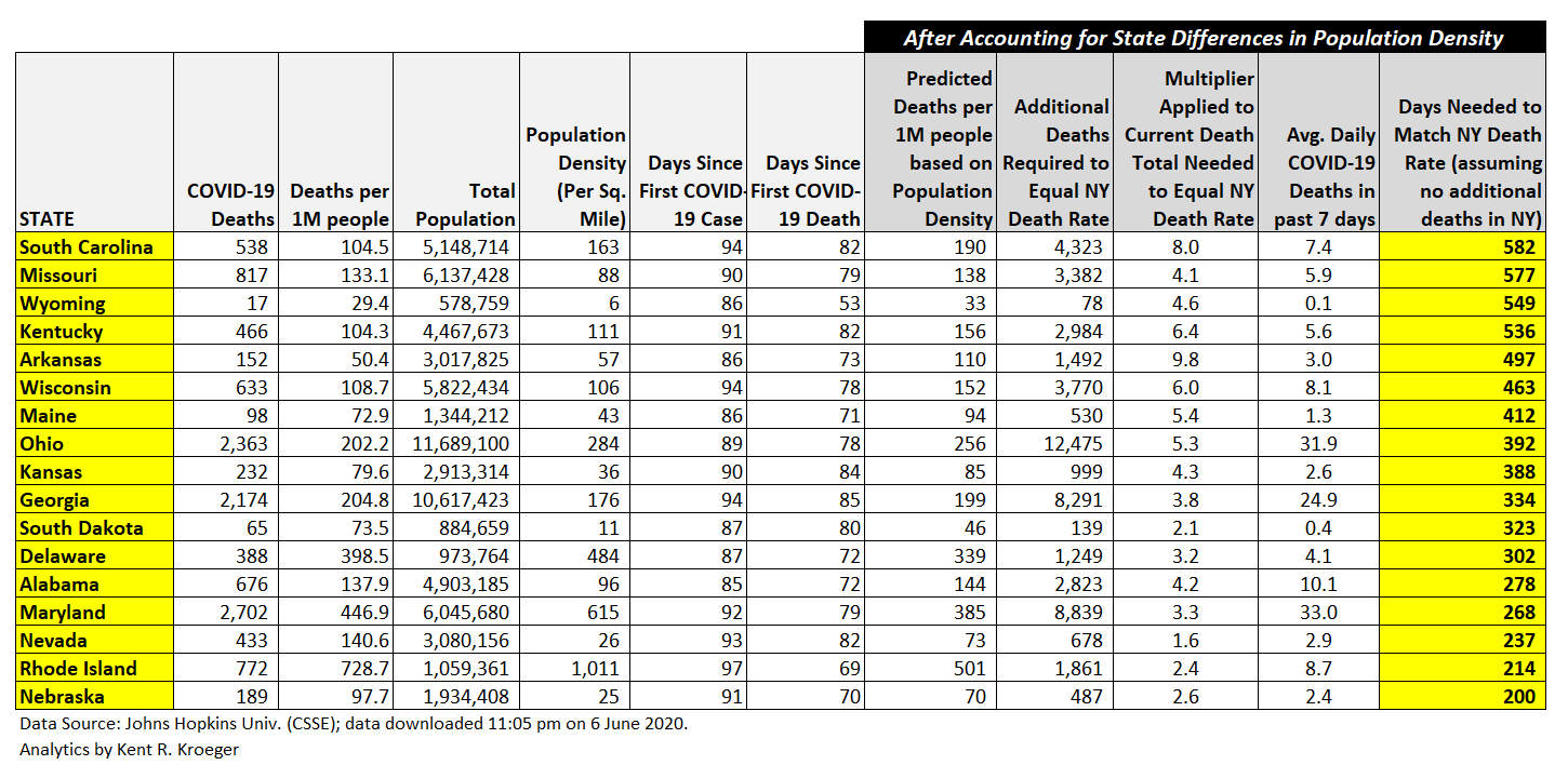
In reality, the dominant factor associated with the past month’s increases in new U.S. COVID-19 cases remains a state’s population density (see Figure 1 and the standardized coefficient column). That factor has been behind the state-level variations in coronavirus cases since the beginning of this pandemic and it is not something any governor or state legislature can control — which may be why the news media seems to ignore its role. It’s hard to blame Donald Trump for a state’s population density.
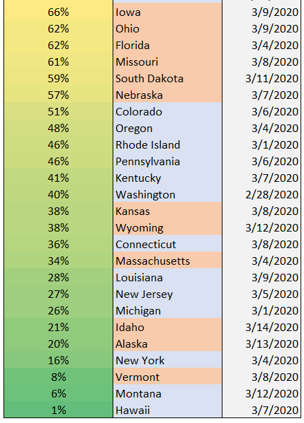
The second most important factor in new COVID-19 cases since May 15th is whether a state is an island. In fact, there is only one state that fits that description — Hawaii — and it continues to be a shining star in the effort to stop this virus. [It helps to be an island. Just ask Iceland, New Zealand and Japan.]
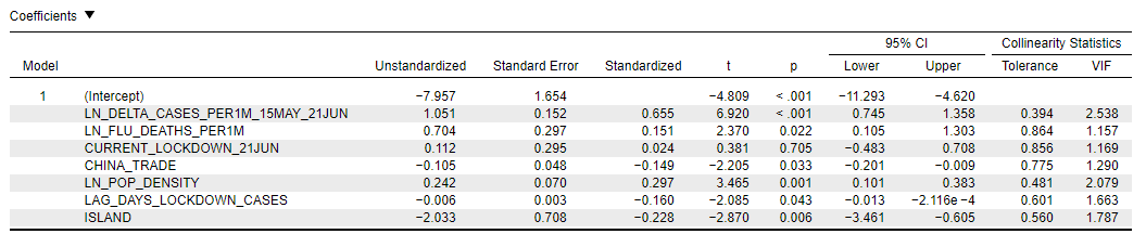
Figure 1: Linear model of new COVID-19 cases within U.S. states between May 15th and June 21st.
Data Source: Johns Hopkins University (CSSE); Data Analysis by Kent R. Kroeger (NuQum.com)
But the governors are not off the hook — particularly Republican ones. The third most significant factor behind the last month’s increase in COVID-19 cases is the lag time (in days) between a state’s first confirmed COVID-19 case and when a state implemented a statewide lockdown policy. There is little question — waiting too long to impose the initial statewide lockdown increased the number of COVID-19 cases within a state.
Lockdown early and the decision to re-open the economy becomes much easier.
The other two factors significantly associated with new COVID-19 cases since May 15th are: (a) the percentage of the state’s population over 65 years old and (b) the change in the relative number of COVID-19 tests within the state. States with a high percentage of older citizens tended to have fewer new COVID-19 cases — likely a function an awareness that protecting our seniors is among our highest priorities during this pandemic. When it comes to testing, one reason we see large increases in new COVID-19 cases in states like Florida, Georgia, North Carolina and Texas is that they are doing more testing than ever.
That should be viewed as a good thing.
But instead, CNN, MSNBC and others in the national news media pump a flawed narrative that the problem is a bunch of fiercely ideological Republican governors and President Donald Trump promoting a ‘business-as-usual’ agenda.
If it were only that simple.
California, Oregon and Washington are experiencing these surges too — and they are controlled by Democrats.
Partisan critiques of state-level coronavirus policies are not just inadequate to explain the recent surges — they are dangerous in that they make us think we could be in control of this virus.
The impact of public policy on the spread of the coronavirus is marginal, at best. Until a reliable vaccine is developed and deployed, we are all sucking swamp water trying to stop this rude pathogen.
This is not, however, a diatribe against lockdowns or strict social distancing practices — quite the opposite, I believe those policies are fundamental to controlling this virus.
But they have limits, and before we kill the American economy in an attempt to save it, we must have a rational discussion about the policies that work and those that make minor or insignificant differences.
As this worldwide pandemic persists, I am increasingly convinced that strict social distancing practices are the key to controlling and eventually stopping this virus.
Japan (see Figure 2) and South Korea (see Figure 3) controlled the spread of the coronavirus without ever implementing lockdown (or ‘stay-at-home’) policies. New Zealand (quite effectively, see Figure 4) and Sweden (not as effectively, see Figure 5) have done the same.
What was their secret sauce? A set of cultural norms that compelled their citizens — without requiring draconian government measures — to isolate themselves when sick and to practice prudent social distancing behaviors during their day-to-day activities. Japan didn’t even need a massive testing or contact tracing efforts to stop the coronavirus spread.
We should care most about the relative number of COVID-19 deaths
It is understandable that the media focuses on the number of new COVID-19 cases since states have loosened their lockdown policies (if they existed at all).
But the outcome measure of greatest importance is the relative number of COVID-19 deaths.
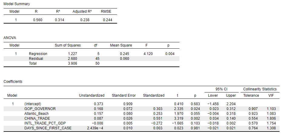
Figure 6 shows the linear model estimates for new COVID-19 deaths from May 15th to June 21st. Not surprisingly, the relative number of COVID-19 cases in a state is the single most significant predictor of new COVID-19 deaths (standardized coefficient = 0.655).
More cases equals more deaths. Not a complicated equation.
Figure 6: Linear model of new COVID-19 deaths within U.S. states between May 15th and June 21st.
Data Source: Johns Hopkins University (CSSE); Data Analysis by Kent R. Kroeger (NuQum.com)
However, like the linear model for new cases, the relative number of new COVID-19 deaths is also a function of population density (standardized coefficient = 0.297) and whether the state is an island (standardized coefficient = -0.228). Two factors politicians can’t control.
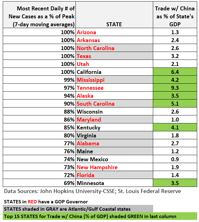
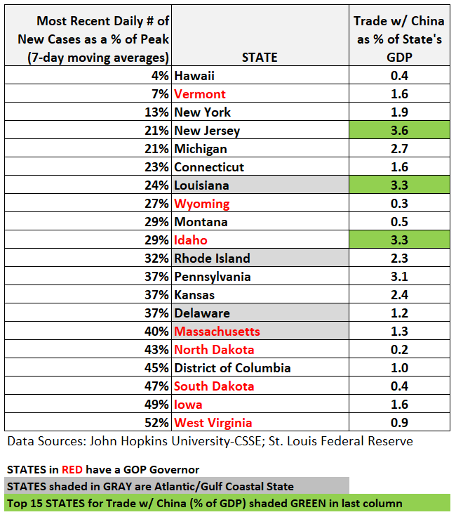
Other significant correlates with new COVID-19 deaths —the lag in locking down a state after its first COVID-19 case, the state’s relative number of flu deaths per year (a proxy for the quality of its health care system), and the percentage of a state’s export-import economy related to China — explain relatively small amounts of variation.
More interesting, perhaps, is that whether a state is currently in a lockdown status (California, Kentucky, New Jersey, and Oregon) is not a significant correlate with new COVID-19 deaths.
Arizona is the real anomaly in new COVID-19 cases since May 15th
The linear models summarized in Figures 1 and 3 allow us to identify states that don’t seem to fit the data very well. Number one on that short list is Arizona (see Figure 7) where our new COVID-19 cases model predicts the state should have seen 1,662 new cases (per 1 million people), but instead saw 5,687 new cases (per 1 million people) in the period between May 15 and June 21st.
Overall, our linear model of new COVID-19 cases since May 15th accounts for 64 percent of the variance across states.
Figure 7: Actual versus predicted changes in new COVID-19 cases in U.S. states between May 15th and June 21st.
Data Source: Johns Hopkins University (CSSE); Data Analysis by Kent R. Kroeger (NuQum.com)
On the positive side, Oklahoma, Vermont and Montana witnessed significantly fewer new COVID-19 case in this time period.
If this model tells us anything, its that partisan explanations for the resurgence of COVID-19 are inadequate.
Something significantly different is going on in Arizona (a Republican state).
But, in all fairness, since the relative number of COVID-19 deaths is the real metric we should focus on, Arizona is actually doing slightly better than expected on this outcome measure (thought not a statistically significant sense).
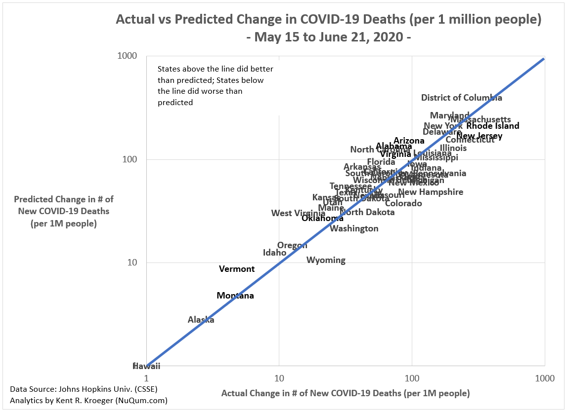
Figure 8 shows how well our linear model of new COVID-19 deaths since May 15th performs. It predicts 82 percent of the variance across the 50 states (plus the District of Columbia).
It is a pretty good fit to the data. There are, in fact, no significant outliers.
Figure 8: Actual versus predicted changes in new COVID-19 deaths in U.S. states between May 15th and June 21st.
Data Source: Johns Hopkins University (CSSE); Data Analysis by Kent R. Kroeger (NuQum.com)
The news media refuses to report this fundamental reality of the COVID-19 pandemic in the U.S. — politics explain surprisingly little of the state-level variations in COVID-19 cases and deaths.
Folks, it is population density!
That said, there are policies that can make a difference, according to the data.
Early lockdowns make a difference.
Additionally, while we don’t have clean measures of the extent to which states are following good social distancing practices, it is likely that lack of these practices is central to these recent COVID-19 surges in some states. Having personally just spent the last weekend along the Jersey shore where at least half of the people were wearing facial masks, it does not surprise me that New Jersey is not — at present — witnessing a surge in new coronavirus cases.
People in New Jersey are rather obedient, believe it or not.
But that is not the case everywhere. There is anecdotal evidence of an arrogance among some people (predominately among the young and Republicans, I fear) that the dangers of the coronavirus are over-hyped.
These dangers are not over-hyped.
I believe re-opening the U.S. economy is imperative, and if the only inconvenience COVID-19 brings to your life is having to wear a facial mask when in public, consider yourself lucky.
K.R.K.
Datasets used in this analyses are available upon request to: kroeger98@yahoo.com
By Kent R. Kroeger (Source: NuQum.com, June 19, 2020)
“Freedom songs are playing a strong and vital role in our struggle,” Martin Luther King, Jr. replied when asked by a reporter during a march in Georgia why singing was so prominent. “They give the people new courage and a sense of unity.”
King considered songs the “soul of the (civil rights) movement.”
And as he prepared to attend a rally for Memphis black sanitation workers striking for equal pay — only minutes before he was assassinated — King would request the song Precious Lord, Take My Hand be played at that rally.
Every progressive movement from the 19th-century abolitionists (Oh Freedom), through the civil rights and anti-war movements in the 50s and 60s (Come by Here, Give Peace a Chance), to today’s ongoing George Floyd/Black Lives Matter marches (Tupac’s Changes) has put songs in the center of the message.
The songs become iconic —programmed into our source code — so subconsciously that we often know the melodies and lyrics without always knowing their origins or meaning.
But who recalls songs featured in politically conservative protests and rallies? Admittedly, the largest protest marches in U.S. history have been almost exclusively progressive in nature — but not all.
There have been massive conservative-led protest movements in U.S. history that included well-attended marches and rallies: anti-suffragism in the late 19th and early 20th centuries, the pro-life movement, the 1978 anti-tax rallies in California, the 2009–10 Tea Party protests, Glenn Beck’s 2010 Restoring Honor rally at the Lincoln Memorial (I attended that one), and the more recent anti-lockdown protests in select state capital cities. And don’t forget every Memorial Day and Fourth of July parade across America which is arguably a conservative, pro-military march and rally.
Yet, we don’t have a strong sense of the songs sung at those marches and rallies. I do recall a particularly beautiful performance at the Restoring Honor rally by Jo Dee Messina of Heaven Was Needing A Hero, but beyond that song and the ubiquitous presence Amazing Grace, I don’t remember the music from that day.
And the more I contemplate conservative protest songs and anthems, the more I realize the effort is fruitless. There are no conservative protest anthems because, throughout American history, the conservatives have almost always been in control — certainly economic conservatives. Why would you protest if you are in charge? You don’t. To this day, the two major parties are controlled by these economic conservatives and if you’ve ever known an economic conservative (pretty much my entire family), most aren’t into meaningful sacrifices for the dispossessed in our society. If, however, you require superficial virtue-signalling with no significant policy consequences, they can spin you at light-speed.
The rallying songs for conservatives are not going to be heard in million-person marches. Instead, they are heard on the radio, on TV, and during Fourth of July parades. They are songs that either celebrate the status quo or bemoan the encroachment of progressives ideas into their daily lives.
I am not putting down conservatives here. I am one. To the contrary, I seek to highlight some of the great music conservatives almost universally embrace, even if they don’t need a protest march to group-sing them.
Therefore, here is my list of the Top 10 conservative anthems…
Number 10: Battle Hymn of the Republic
Mine eyes have seen the glory of the coming of the Lord, is the first line in this timeless masterpiece.
With the words of abolitionist Julia Ward Howe and the music of William Steffe, this song has been the anthem for movements on both the left and right. The music, simple and memorable, combined with its bible-inspired lyrics, this song is the rallying cry of the righteous. If you are uncertain about your cause’s virtue, this is not the song for you.
He is trampling out the vintage where the grapes of wrath are stored;
He hath loosed the fateful lightning of His terrible swift sword:
His truth is marching on.
These lyrics don’t encourage mercy on the wicked. This is an aggressive, militaristic anthem that in contemporary society best aligns with conservative attitudes on war and peace.
Number 9: Father and Son
Yusuf Islam (formerly Cat Stevens), not exactly a darling of American conservatives, wrote one of the most beautiful elegies to military service ever written. It still makes me cry.
The song was about a boy who wanted to join the (1917) Russian revolution against the wishes of his conservative father, who couldn’t understand why his son needed to risk his life just to seek his own destiny.
It is a timeless story many parents face when their children choose military service over other (safer) options.
For that reason, plus the fact the song is the poignant backdrop to the final movie scene in 2017’s Guardians of the Galaxy Volume 2, this song represents one of conservative America’s most important anthems.
And its a wonderful song.
Number 8: God Bless America
This 1918 song has become more divisive with time, largely due to its overt religious tone. Written by one of America’s most iconic songwriters, Irving Berlin, God Bless America combines Christian sentimentality with American chauvinism like few others:
God bless America, land that I love
Stand beside her and guide her
Through the night with the light from above
From the mountains to the prairies
To the oceans white with foam
God bless America, my home sweet home
This song in particular drives atheists nuts and that’s why its number 8 on my list.
Number 7: Jesus, Take the Wheel
I can’t think of a song that gets a more positive reaction from my conservatives friends than this one. Written by Brett James, Hillary Lindsey and Gordie Sampson, and recorded by Carrie Underwood, the song tells the story of a woman seeking help from Jesus after she survives a car crash.
This song is so basic to human experience, had it taken out the ‘Jesus’ part, it would have been embraced across all political ideologies.
But that would be like taking ‘Jesus’ out of the New Testament, which would turn it into a bad Netflix-produced drama series. What do you have left without the Son of God and eternal salvation?
Not much.
Number 6: In America
If I asked my 50-years-old and older liberal friends (of which I have many) to name one band from their adolescent years that most offended their political instincts, one band would rise to the top: The Charlie Daniels Band.
Oh my God. That band is the anti-Christ of modern social liberalism. And their song — In America, written during the 1979 Iran Hostage Crisis— encapsulateseverything liberals hate about conservatives: airtight unity and working-class patriotism.
Well the eagle’s been flyin’ slow
And the flag’s been flyin’ low
And a lotta people sayin’ that America’s
fixin’ to fall.
Well speakin’ just for me
And some people from Tennessee
We’ve got a thing or two to tell you all
This lady may have stumbled
But she ain’t never fell.
And if the Russians don’t believe that
They can all go straight to hell
We’re gonna put her feet back
On the path of righteousness and then
God bless America again.
Establishment Democrats sometimes fake their love for this song, but it was never written for them and they know it. Bill Clinton was never invited to this party.
This song is red-blooded, anti-liberal loathing in the key of E.
Number 5: Sweet Home Alabama
This is a song liberals often pretend to like, because liking it makes them feel open-minded and working class. For conservatives, its one of the few songs played at weddings they think they can actually dance to.
Along with being an extremely catchy song, the Lynyrd Skynrd hit was also the title of a forgettable movie starring Reese Witherspoon and Josh Lucas (who?).
But its historical importance is that it was a hit at a time when conservatives were on their heals over Watergate and the Vietnam War (the song peaked at #8 on the Billboard charts in the summer of 1974).
Along with questioning the importance of Watergate, the song’s second verse took direct aim at uber-progressive Neil Young’s song “Southern Man,” which was an uncloaked attack on southern racists (specifically those living in Alabama).
Well, I heard Mister Young sing about her
Well, I heard ol’ Neil put her down
Well, I hope Neil Young will remember
A Southern man don’t need him around anyhow
With its release in June 1974, Sweet Home Alabama immediately sparked the 70s version of a Twitter feud. Or, at least, people assumed there was a bitter row going on between Young and the band.
As is often the case, the reality was very different. Neil Young loved the song and openly admired Lynyrd Skynrd and its front man Ronnie Van Zant (who tragically died in an airplane crash, along with other band members, in 1977). Soon after Van Zant’s death, Young publicly demonstrated that respect by performing Sweet Home Alabamaduring a concert in November 1977.
Neil Young is many things, but he is no phony. And his respect for Sweet Home Alabama reflects an acknowledgment of the song’s anthem-level quality.
It’s a helluva song.
Number 4: Taxman
Now I go off the reservation a little bit. The Beatles are rarely described as representatives of a status quo, bourgeois ideology, but any rational interpretation of their most biographical lyrics demands at least consideration of that viewpoint.
George Harrison’s Taxman stands as Exhibit №1 in that argument, a song that was played more than once during the Tea Party rallies from 2009 to 2011 — its lyrics making any small-government libertarian squeal in delight:
Let me tell you how it will be
There’s one for you, nineteen for me
’Cause I’m the taxman, yeah, I’m the taxman
Should five per cent appear too small
Be thankful I don’t take it all
’Cause I’m the taxman, yeah, I’m the taxman
If you drive a car, I’ll tax the street
If you try to sit, I’ll tax your seat
If you get too cold, I’ll tax the heat
If you take a walk, I’ll tax your feet
’Cause I’m the taxman, yeah, I’m the taxman
Grover Norquist himself couldn’t have written a more direct anti-tax song.
And the song’s lyrics are as relevant today as they were in 1966.
Number 3: Revolution
Since I’m on The Beatles, I am putting John Lennon’s Revolution in the number three position.
“John Lennon?!”…He’s not even a conservative!
True, but throughout his life Lennon’s working class instincts repeatedly put him at odds with liberal activists and celebrities.
The song Revolution was written specifically by Lennon as an anti-revolution response to anti-Vietnam War groups trying to separate him from his Beatle-millions. Like Harrison, Lennon was not one to suffer self-righteous (often hypocritical) activists mooching off of him.
You say you want a revolution…
…But when you talk about destruction
Don’t you know that you can count me out…
…You say you got a real solution
Well, you know
We’d all love to see the plan
You ask me for a contribution
Well, you know
We’re doing what we can
But if you want money for people with minds that hate
All I can tell is brother you have to wait
Don’t you know it’s gonna be
All right, all right, all right
Did William F. Buckley help Lennon with those lyrics? Seriously, those are not the words of some dewy-eyed peace activist. Lennon was a bourgeois pragmatist at his core. He may have complained about the strictness of his Aunt Mimi, but he didn’t stray that far from her working class, Liverpool politics.
Take Lennon’s reaction in 1971 to a question from a Dick Cavett Show audience member about over-population — which at the time was the crisis du jour among young liberals. Was Lennon worried about it? Here’s his response:
Lennon: I think it’s a bit of a joke the way people have made this over-population thing into kind of a myth. I don’t really believe it, you know. I think that whatever happens will balance itself out and work itself out. It’s all right for us living to say, “Well, there’s enough of us so we won’t have any more, don’t let anyone else live.” I don’t believe in that. I think we have enough food and money to feed everybody, and I think the natural balance, even though all people will be able to last longer. There’s enough room for us and some of us will go to the moon and live.
Cavett: You mean you think there’s enough for human existence?
Lennon: Yeah, I don’t believe in over-population. I think that’s kind of a myth the government has thrown out to keep your mind off Vietnam, Ireland and all the important subjects.
Cavett: Oh, I think you’re wrong about that.
Lennon: Oh, I don’t care. [Audience laughs.]
Of course, history proved Lennon correct and Cavett wrong.
Conservatives aren’t about to embrace Lennon as one of their own (and if Lennon were alive he wouldn’t accept the invitation) or start playing Revolution over the loudspeakers at the next Republican National Convention. But if they listened to the lyrics on Revolution, they’d realize its reactionary political sentiments are inescapable.
Number 2: This Ain’t No Rag, It’s a Flag
I could fill this entire Top 10 list with Charlie Daniels Band songs. And while I put Daniels’ In Americaabout the 1979 Iran Hostage Crisis in the number six slot, I easily could have justified it at number two.
Instead, I chose another event-inspired Daniels song — This Ain’t No Rag, It’s a Flag, perhaps his most timely and poignant song, written immediately after the 9/11 attacks and released on a live album compilation in November 2011. And while it was only a minor hit (reaching #33 on the Billboard Country Chart), I heard at every Republican Party of Virginia rally (RPV) I attended after 9/11 and it is a standard crowd pleaser at Donald Trump rallies today.
This ain’t no rag, it’s a flag
And we don’t wear it on our heads
It’s a symbol of the land where the good guys live
Are you listening to what I said
You’re a coward and a fool
And you broke all of the rules
And you wounded our American pride
And now we’re coming with a gun
And we know you’re gonna run
But you can’t find no place to hide
We’re gonna hunt you down like a mad dog hound
Make you pay for the lives you stole
We’re all through talking and a messing around
And now it’s time to rock and roll
This song doesn’t have hidden messages. You don’t need biblical scholars to interpret its intent. Charlies Daniels, as he often does, just sings it like he sees it.
And with a self-titled band stretching back over 40 years, Charlie Daniels is an icon among conservatives of all ages.
And for good reason, he’s a true conservative.
Honorable Mentions
I tried to avoid including song standards on this list — God Bless America and The Battle of the Hymn of the Republic the exceptions — as they generally attract listeners from all political perspectives. And no song fits that description better than John Newton’s Amazing Grace, its words written in 1772, with the music added in 1779. The song was prevalent throughout the 19-century abolitionist movement and the 20th-century civil rights movements, and has become so popular and secularized, its cultural appropriation ranges from The Simpsons to the Hare Krishnas.
Similarly, America the Beautiful, lyrics by Katharine Lee Bates and music by Samuel A. Ward, is an American music standard rivaling God Bless America in popularity. However, in contrast to Berlin’s song, America the Beautiful eschews heavy-handed American exceptionalism for a more gentle, introspective form of patriotism. Rather than bless us, God chooses to “shed his grace on thee” and “mend thine every flaw.” When I do hear patriotic songs at my Unitarian Church, its usually America the Beautiful.
Among more contemporary songs I considered for this list were Charlie Daniels’ Simple Man and Leonard Cohen’s metaphorical, King David-inspired Hallelujah — two songs I heard more than once at 2016 Trump rallies in Iowa. And not coincidentally, Daniels and Cohen, both of whom were comfortable incorporating religious allegory into their lyrics, occasionally recorded together and remained good friends until Cohen’s death in 2016.
Number 1: God Bless the USA
I’ve never done a Top 10 list where the number one pick was this easy. No song makes liberal heads explode faster than Lee Greenwood’s 1984 hit God Bless the USA. It pushes (or, rather, punches) all their buttons.
The song starts innocently enough…
If tomorrow all the things were gone
I worked for all my life
And I had to start again
With just my children and my wife
Who would argue with that? But then the song starts to roll — though still not overly provocative…
I thank my lucky stars
To be living here today
’Cause the flag still stands for freedom
And they can’t take that away
While I’m not sure who ‘they’ are — I’m gonna guess Greenwood was talking about the Russians and/or the Iranians — its the next verse where this Reagan-era song gets its well-earned reputation as a liberal repellent…
And I’m proud to be an American
Where at least I know I’m free
And I won’t forget the men who died
Who gave that right to me
And I’d gladly stand up next to you
And defend Her still today
’Cause there ain’t no doubt
I love this land
God Bless the U.S.A.
If I had to narrow it down to one line that drives liberals bonkers over this song, its that fourth line suggesting the U.S. military gave us our freedom. Its quibbling, I suppose, but it was our Founding Fathers who established our democracy (i.e., gave it to us) and our military has, most directly in the Revolutionary and Civil Wars, defended us from threats to that freedom.
Yes, I would have wordsmithed Greenwood’s song a tad had he asked.
But I respect this song over all other conservative anthems, not for its attention to democratic theory, but because it so cleanly delineates liberals from conservatives and Democrats from Republicans. I’ve watched liberals try to enjoy this song at Fourth of July picnics and it generally doesn’t end well. The song just was not written for them.
Every red-white-and-blue-blooded conservative can recite its lyrics and sing its melody on demand and that is why it is my number one conservative anthem.
God Bless the U-S-A and the U.S. military for giving us our freedom.
[My wife just plunged her head into our kitchen wall.]
By Kent R. Kroeger (Source: NuQum.com, June 15, 2020)
There is no such thing as an attention span. There is only the quality of what you are viewing. This whole idea of an attention span is, I think, a misnomer. People have an infinite attention span if you are entertaining them.
Jerry Seinfeld
Whether comedian Jerry Seinfeld knew it or not, his quote on attention spans was touching one of the ongoing controversies in psychology and marketing science: Are people’s attention spans shrinking?
On the affirmative side is recent research by European researchers Philipp Lorenz-Spreen, Bjarke Mørch Mønsted, Philipp Hövel and Sune Lehmann who found that “the accelerating ups and downs of popular content are driven by increasing production and consumption of content, resulting in a more rapid exhaustion of limited attention resources. In the interplay with competition for novelty, this causes growing turnover rates and individual topics receiving shorter intervals of collective attention.”
Put more simply, in the era of social media and hyper-reactive media content, more competition for people’s finite brainspace is leading to people spending less time watching, reading and listening to specific topics.
If these researchers were to answer Seinfeld’s contention that people’s attention span expands to fit the quality (or novelty) of the content, they might reply: Yes, except that attention spans are actually bounded by time (i.e., we only have our lifetimes to consume content) and biology (i.e., its hard to listen to two people talking at the same time); and, in the internet-era, the increased competition for people’s attention has created more quality (or novel) content that attracts this attention.
In other words, higher quantities of compelling content is increasingly dividing up the finite pie of people’s attention into smaller segments.
So, perhaps, its not people’s attention span that has changed but, rather, the quantity of good content?
Research countering the ‘shrinking attention span’ argument was animated by this question: How is that people can’t pay attention during a 1-hour business meeting but can willingly do a 6-hour binge watch of Game of Thrones or Supergirl?
Using public opinion survey data, researchers at Prezi, a business presentation software company, and Kelton Research, a consumer research company, found in a 2018 study that attention spans are actually improving over time, not decreasing, and that people are, instead, more selective about the content they consume.
“Respondents claimed their ability to maintain focus has actually improved over time, despite an ever-growing mountain of available content,” argue the Prezi and Kelton Research report authors. “And it makes sense if you think about it: many of us have become more selective about what we give our attention to, bookmark things to return to when nothing else piques our interest, and often prefer to wait for good content to find us rather than seek it out ourselves.”
In a more academic rebuttal to the ‘shrinking attention span’ argument, Dr. Gemma Briggs, a psychology lecturer at the Open University (Milton Keynes, UK), contends that attention span is task-dependent. “How much attention we apply to a task will vary depending on what the task demand is,” says Dr. Briggs.
According to Dr. Briggs, its not declining attention spans driving down our attention to specific topics, its that content providers are better at grabbing our attention. [This could also explain why I’m on my third marriage.]
Declining media and public interest in the coronavirus pandemic
The current coronavirus pandemic is stark evidence at how hard it is to keep people’s attention.
Imagine a global crisis spanning over six months in which eight million people are directly impacted and nearly a half million people perish from its effects. Add to that the billions of people indirectly affected by its economic consequences. That should grab everyone’s attention, right?
Yes, it did. And then some.
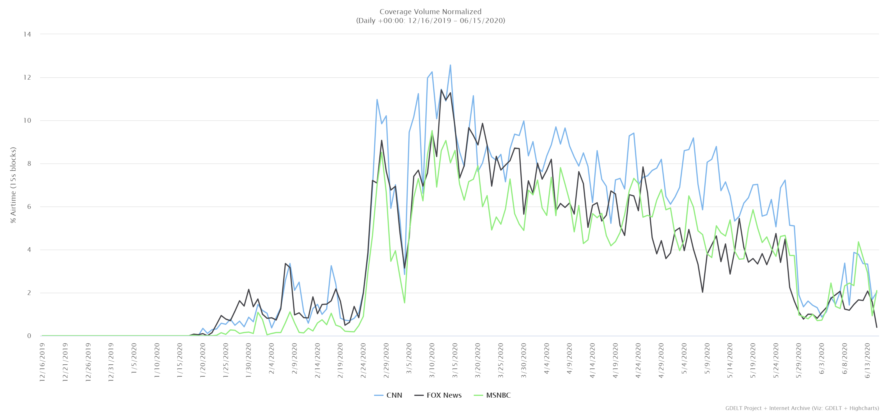
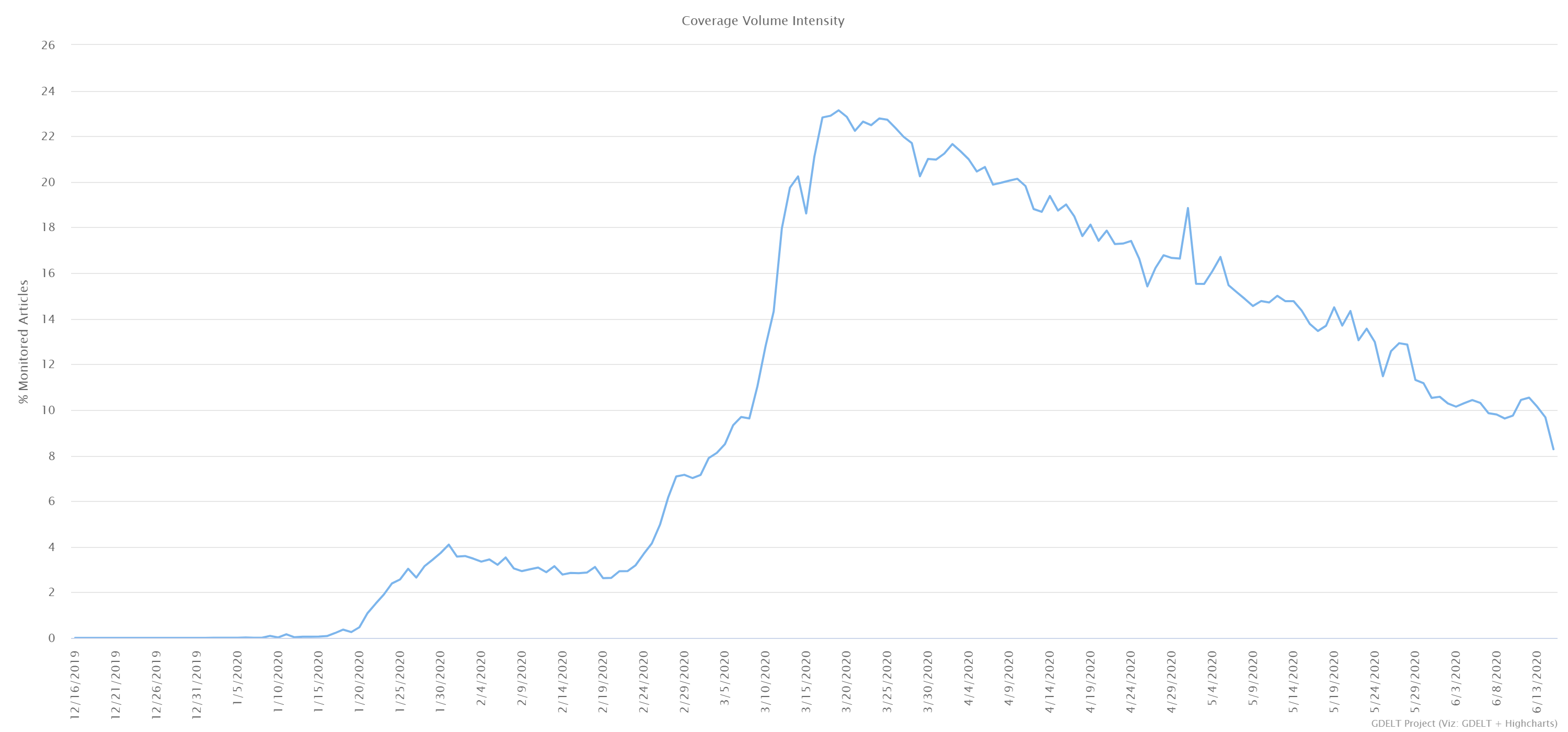
Coverage of the coronavirus pandemic flourished within U.S. cable TV news and on internet news sites from late-February to late-May (see Figures 1 and 2, respectively), peaking in mid-March when most U.S. states issued lockdown orders to combat the virus’ spread, but declining steadily thereafter until late-May when George Floyd’s death at the hands of Minneapolis, Minnesota police officers quickly rose to the top of the news agenda (see Figure 3).
Figure 1: U.S. Cable TV news coverage of the coronavirus pandemic
But those three graphs represent the news media’s attention. What about the public’s attention?
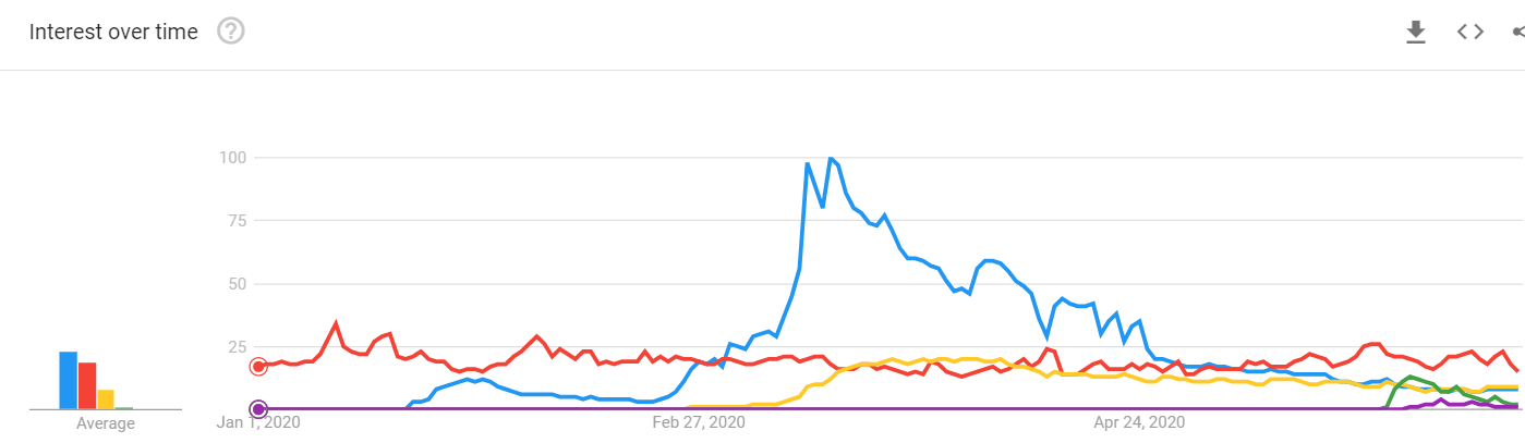
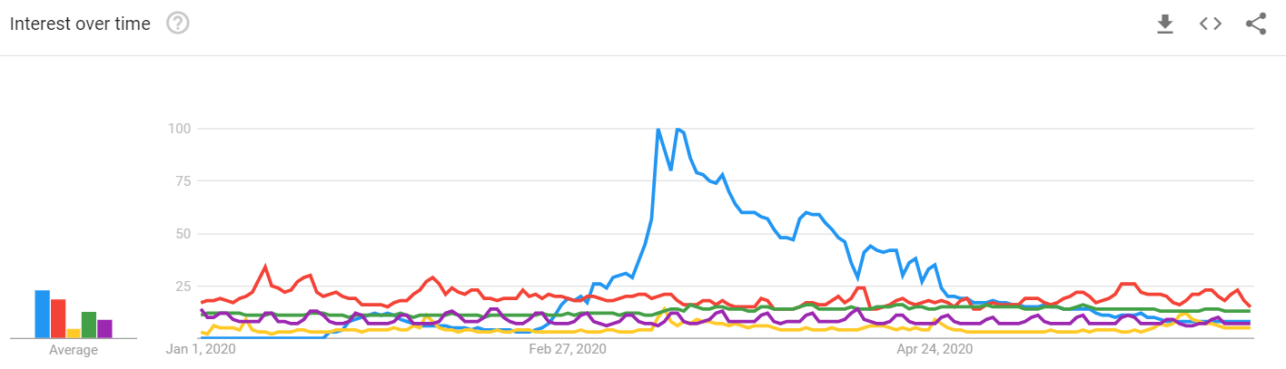
Google Trends tracks how often people Google-search on a specific topic and therefore is often used by researchers as a proxy for public interest. Figure 4 shows five search terms and the relative frequency each has been searched since January 1st.
Figure 4: Google searches on coronavirus, weather, COVID-19, George Floyd and Black Lives Matter from January 1 to June 14, 2020.
Like the news coverage, the public’s interest in the coronavirus/COVID-19 peaked in mid-March with the first statewide lockdowns and has been in a steady decline since then, being matched by searches on ‘weather’ after May 21st and by the combined searches on George Floyd and Black Lives Matter from May 27th to June 6th.
Part of that decline in searches on ‘coronavirus’ could reflect people using Google as a basic education source, not just a news source. Once people acquire sufficient information on a topic, their use of Google’s search engine on the topic may also decline. Perhaps this apparent decline in interest is not as substantial as it looks in Google Trends.
However, research as shown Google search frequency is a useful indicator of public interest and relatively accurate predictive tool. For example, Google searches for upcoming movies, political candidates and specific vehicle brands and models are predictive of movie box office receipts, candidate vote shares and vehicle sales.
Assuming, therefore, that this decline in public interest in the coronavirus is genuine, what has caused it?
Possible Reason #1: People have shorter attention spans
Possible Reason #2: More compelling events (e.g., the 2020 Election, George Floyd, Black Lives Matter) have replaced the pandemic in people’s minds
I’ve already discussed these two possible explanations in the above discussion about attention spans and the importance of compelling content in keeping people engaged.
These potential reasons are not necessarily mutually exclusive. Both could be factors in the coronavirus interest decline.
But there are other possible causal factors to consider…
Possible Reason #3: Public interest follows the news media’s interest
Insight is gained when Google-search data on the coronavirus is overlaid with the cable TV news data (see Figures 1 and 4 above). The two data series track closely together, with a Granger causality test indicating changes in cable TV news coverage are more predictive of changes in public interest (Google-search behavior) than the other way around.
In fact, there is a large amount of media and public agenda-setting research linking changes in public attitudes and beliefs to changes in media coverage (and vice versa).
In their meta-analysis of the news media’s public agenda-setting effects from 1972 to 2015, Yunjuan Luo, Hansel Burley, Alexander Moe, and Mingxiao Sui found a “consistency in findings across agenda-setting studies and the presence of strong news media’s public agenda-setting effects.”
Therefore, it is reasonable to conjecture that one possible cause of the U.S. public losing interest in the coronavirus is its declining priority within the news media.
Possible Reason #4: The coronavirus pandemic is in decline
Could the objective decline in the coronavirus pandemic explain the falling interest by both the news media and the public?
This possible reason seems implausible to me.
While the U.S. is off its pandemic peaks, the number of daily new U.S. cases has only fallen 30 percent from its high on April 24th (see Figure 5) and 23 U.S. states are still experiencing increasing infection rates. Meanwhile, worldwide, the coronavirus pandemic is still growing, particularly in countries in South and Central America where a significant percentage of Americans were born or have family still living there (see Figure 6).
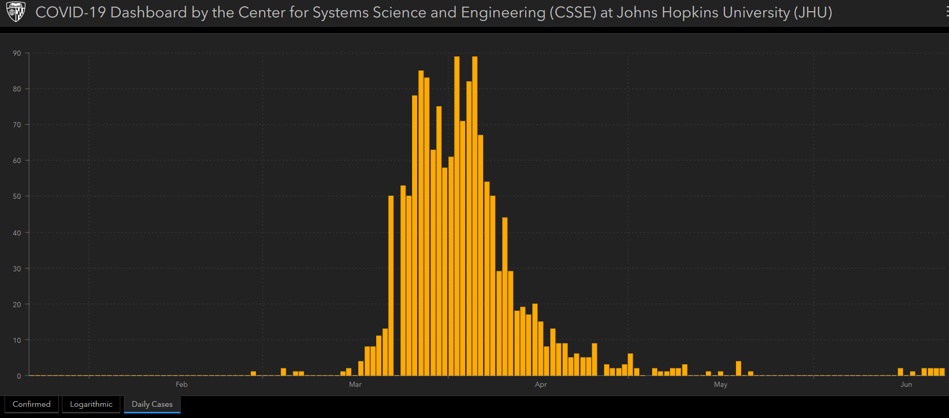
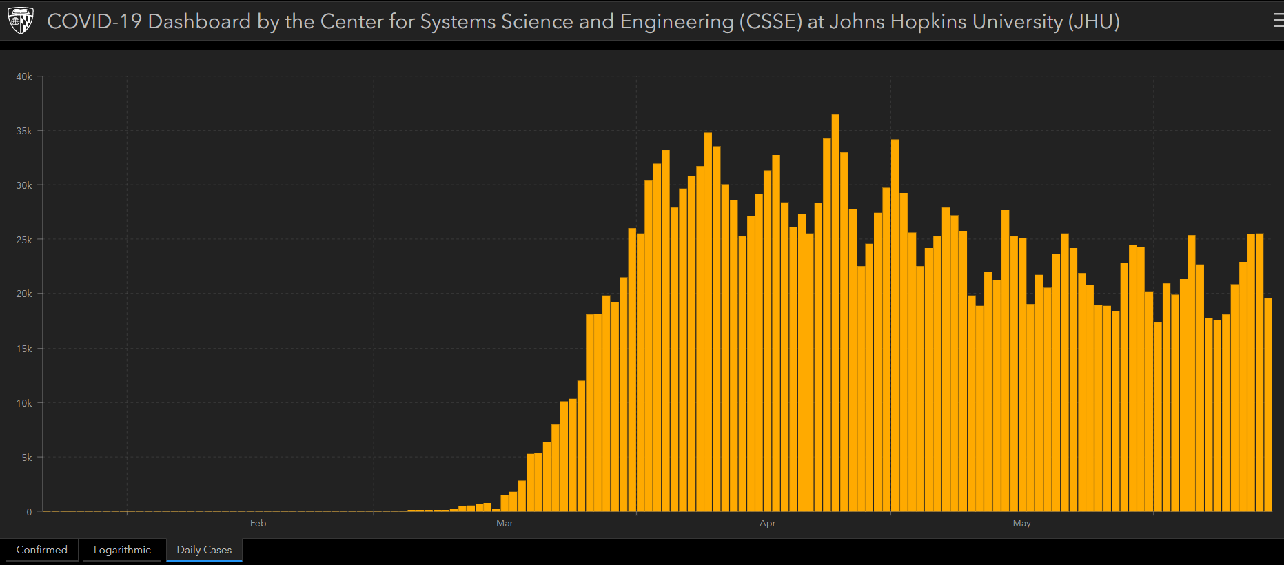
Figure 5: U.S.New Daily Coronavirus Cases (Jan. 22 to June 14, 2020)
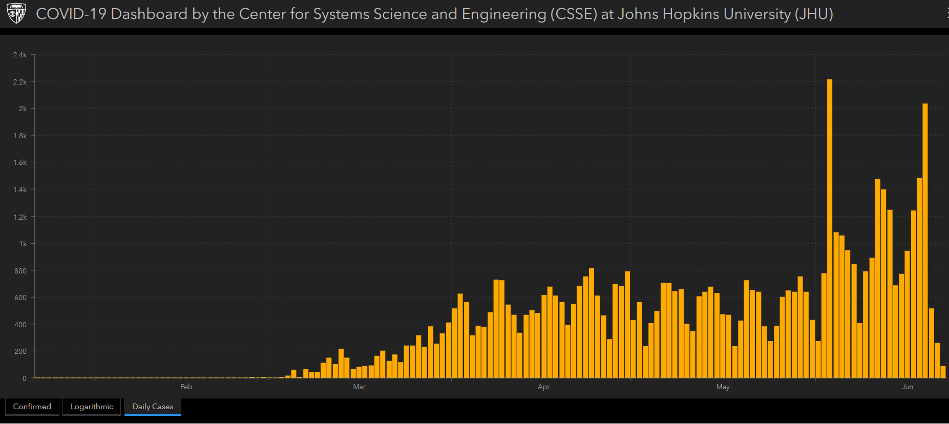
Figure 6: Worldwide New Daily Coronavirus Cases (Jan. 22 to June 14, 2020)
To my eyes, the coronavirus pandemic has not declined anywhere near the magnitude of the decline in interest. It could be a contributing factor, but it doesn’t seem likely that this is the primary cause.
Possible Reason #5: Americans are weary of negative news
In a November 2019 survey of more than 12,000 U.S. adults, Pew Research documented a high level of ‘negative news fatigue’ by Americans.
“About two-thirds of Americans (66%) feel worn out by the amount of news there is, while far fewer (32%) say they like the amount of news they are getting,” says senior researcher Jeffrey Gottfried. “Americans’ exhaustion with the news hasn’t changed since early 2018 — the last time the (Pew) Center asked this question — when 68% felt worn out. And in a similar question asked several months before the 2016 presidential election between Donald Trump and Hillary Clinton, nearly six-in-ten (59%) felt worn out by the amount of coverage of the campaign and candidates.”
It is certainly plausible that the profoundly negative, life-threatening aspects of the pandemic has made it a tough topic for Americans to sustain their unbroken attention.
Sometimes you just need to look away.
The coronavirus pandemic has produced an unprecedented level of public interest, even if that interest has since softened
Google searches on thecoronavirus reached unprecedented levels in the U.S. and across the globe in March and April.
Figure 7 shows Google search trends in the U.S. from January 1st to June 15th for the term ‘coronavirus’ in comparison to other common search terms: weather, Trump, Amazon, movie.
Figure 8, in turn, shows Google search trends since 2004 for the U.S. presidents and the Iraq War.
Figure 7: Comparing Google searches on the ‘coronavirus’ to other common search terms
The coronavirus towers over everyone and everything else. So much so that the effectiveness of online advertising significantly changed soon after the pandemic became the dominant U.S. news story.
One of the most important measures in website analytics and digital advertising is the conversion rate— which is the proportion of website visitors who take action beyond simply viewing its content, such as clicking on a banner ad or responding to a direct request from a content creator.
According to digital advertising expert Mark Irvine, after it was clear in mid-March that COVID-19 was a massive epidemic in the U.S., conversion rates dropped by an average of 21 percent in just three weeks.
So, yes, interest has waned since the peak in April, but it is still relatively high compared to terms that are typically in the Top 10 of Google searches on an average day.
Even so, the declining Google-search interest in the coronavirus since March is significant and sustained and matched by a similar decline in the news media.
Understanding why this has occurred despite the ongoing nature of the crisis — and at such a fast rate nonetheless — should be fertile ground for research far into the future.
Final thoughts
I left one possible explanation for this coronavirus interest decline out of the above discussion, in part, because it is more of a corollary to Possible Reason #3 (Public interest follows media interest). There is no question that the world economy has contracted due to the coronavirus pandemic. The U.S. is now officially in a recession, according to the National Bureau of Economic Research. Thus, there is an economic incentive for economic and incumbent political elites to desire moving past this worldwide health crisis. To dwell on it longer than necessary can only hurt the economy further.
Is it possible economic or political elites have actively seeded the news media — particularly the corporate-controlled news media (Is there any other kind in the U.S.?) — with stories and agendas designed to cast attention away from the coronavirus pandemic?
I do not possess any evidence to suggest this has happened, but I won’t rule it out.
K.R.K.
Send comments and suggestions to: kroeger98@yahoo.com
By Kent R. Kroeger (Source: NuQum.com, June 12, 2020)
I’ll rip my ear hairs out if I read one more article about how islands have been so effective at controlling COVID-19.
New Zealand, Hawaii, Iceland, Singapore and South Korea (which is effectively an island given its infrequently crossed land border with North Korea) did a great job defeating COVID-19.
So, if I understand the lesson, when the next pandemic hits, policy step number one is to live on an island.
Got it.
For the rest of us, we need real information on how to defend against the coronavirus and its genetic cousins to follow.
Unfortunately, the U.S. mainstream media deals only in canned narratives when it comes to the COVID-19 pandemic — its either: (1) the Republicans are a bunch of anti-lockdown, anti-science bumpkins who put their 401ks ahead of human lives, or (2) the Democrats are fear-mongering proglodytes using the pandemic to advance the oppressive power of their postmodern Menshevik state.
What these two narratives miss is reality, even as some aspects within each are true — which is precisely why both are seductive and dangerous.
They can’t tell you the truth because, frankly, it wouldn’t attract an audience in today’s hyper-partisan landscape. The ongoing rampage of the Mean Orange Man is one (perhaps only) reason The New York Times and CNN are profitable in today’s over-crowded, highly-competitive entertainment milieu. On the other side of the dung heap, coverage of the existential threat of leftofascists to our God-endorsed democracy and Jesus’ two-thousand-year reign on Earth has been Fox News’ golden goose for over 20 years now. They aren’t going to change their news chyron because I believe objective, non-partisan journalism has an audience.
Given the narrow motivations of today’s news media, why wouldn’t their news coverage of the coronavirus pandemic be full dramatic but marginally relevant info-twaddle?
At this point, most of the American news audience is too conditioned to accept anything else.
The Great Convergence
But there is one feature of the coronavirus in the U.S. that has received sparse attention, even though it may represent the most important characteristic of the virus’ spread within the country.
The biggest story of the COVID-19 pandemic in the U.S. may be that its daily rate of spread is converging across all 50 states (and the District of Columbia), with little regard for the specific state-level policies implemented to suppress and mitigate its advance.
In other words, most of the states will eventually catch up with New York, New Jersey, Connecticut and Massachusetts in terms of cases and deaths per capita (after adjusting for population density).
New York, New Jersey , Connecticut and Massachusetts took a devastating hit from the coronavirus early despite implementing some of the strictest lockdown measures in the country, suggesting that the virus was already distributed through those populations before the lockdowns. While states such as Florida, Georgia, Texas and California have benefited from a much slower (“flatter”) spread of the virus despite implementing their lockdowns late (California being an important exception).
The good news for New York and the other densely-populated Northeast Atlantic states is that the virus may have already passed through their most vulnerable populations. The bad news for California and the other warm, lower latitude states may be that this has not yet happened.
Of course, these relationships are subject to change as this pandemic progresses.
Convergence is inevitable, but how each state gets there isn’t
At first glance, the chart’s most striking feature is New York’s dramatic rise in coronavirus cases from mid-March to mid-April (and dramatic fall in new cases thereafter). Equally interesting (to me at least) is the relatively slow climb for the other seven large U.S. states — which is probably a function of the population density of states along the northeast Atlantic corridor.
Figure 1: Number of daily new COVID-19 cases per 100k people for the 8 most populous U.S. states (through June 10, 2020)
However, another takeaway from Figure 1 is the convergence of the new COVID-19 case rates over time. At the end of April, the average number of new cases per day for every 100K people ranged from 2.3 (Florida) to 24.1 (New York). By June 10th, the average number of new cases per day for every 100K people ranged from 2.8 (Ohio) to 6.3 (Illinois).
You don’t need to be a statistician or an epidemiologist to see that new case rates have become more the same than different since the start of this health crisis.
Yes, there are still substantive state-level differences which can (and will) have a meaningful impact on the final coronavirus case and death rates. And variations in public policies in response to this health crisis likely will be needed to explain those outcome differences. And it is also critical to note that California, Florida, Georgia and Texas are still at or near their peak in daily new COVID-19 cases.
This health crisis is far from over.
In the larger scheme of things, despite substantively divergent coronavirus policies across the eight states in Figure 1 (Florida, Georgia and Texas being regularly chastised in the media for not being more aggressive in stopping the virus), all eight states are becoming more alike than different over time.
I call it the Great Convergence.
Isn’t that convergence inevitable — and therefore uninteresting — given that all the 50 states (plus D.C.) will reach zero new cases-per-day at some point?
Yes, in the long run, all the states will converge towards zero new cases per day. But how states get there is important. Specifically, how many people will die by the time the states stop registering new cases?
However, there is evidence that the states are becoming more homogeneous over time in COVID-19 case and death rates. While few states will ever match New York’s approximately 1,600 COVID-19 deaths (per 1 million people), Figure 2 shows that the standard deviations across states in their case and death rates have been going down since April 1st.
Figure 2: The Slow Decline of Standard Deviations in State’s COVID-19 Case and Death Rates
Considering the percentage of coronavirus news coverage dedicated to promoting (or dismissing, if you are Fox News) the aggressive lockdown policies recommended by most epidemiologists and public health experts, heretofore, those mitigation measures have not repaid the effort, particularly in terms of COVID-19 deaths per capita.
Some final thoughts
Remember the “flatten the curve” graph (Figure 3) often shown in the media at the beginning of the pandemic?
Figure 3: “Flattening the Curve”
Epidemiologists generally agree that the value of virus protective measures (e.g., lockdowns, social distancing) is to distribute the number of new cases more evenly over time, thereby putting less pressure on the healthcare system and saving lives. “Flattening the curve” also gives researchers more time to develop effective treatments and vaccines.
Recall Figure 1 (above) where New York’s distribution of new cases over time looks much more like the “without protective measures” curve in Figure 3, while the other seven states have much flatter curves. California and New York were two of the first states to issue statewide lockdown orders (March 19th and 20th, respectively); yet, New York’s new case curve has a much higher, more narrowly-shaped peak, while California’s is much flatter. More importantly, California’s COVID-19 death rate per capita is significantly lower than New York’s (128 deaths per 1 million people versus New York’s 1,587).
What happened? Why were epidemiologists accurate for California, but not so much for New York? Three possible (and preliminary) explanations include: (a) the coronavirus prevalent on the U.S. East Coast may have been more contagious and lethalthan the version prevalent on the West Coast, (b) the virus was embedded earlier and deeper on the East Coast than previously thought, and (c) the population densities on the East Coast were more favorable for hosting and spreading the coronavirus.
But even if those disadvantages faced by New York are true, California’s case and death rates may yet approach New York’s when this pandemic is finally over.
Similarly, the current surge in new coronavirus cases in states that had previously lagged in its growth (e.g., Arizona, California, Florida, Georgia, North Carolina and Texas) may be less a function of poor policy responses by those states and more the result of their advantages over the Northeast Atlantic states as well as the characteristics of the virus itself.
As we often are reminded during this pandemic, the coronavirus is more in charge than politicians and experts care to admit.
By Kent R. Kroeger (Source: NuQum.com, June 11, 2020)
“More than a dozen states and Puerto Rico are recording their highest seven-day average of new cases since the pandemic began, hospitalizations in at least nine states have been on the rise since Memorial Day,” says The Washington Post. “In Texas, North and South Carolina, California, Oregon, Arkansas, Mississippi, Utah and Arizona, there are an increasing number of patients under supervised care since the holiday weekend because of covid-19 infections.”
“While the recent mass protests could exacerbate its spread, the incubation period of the (corona)virus means this latest rise in cases can more likely be traced to a loosening of lockdown restrictions around Memorial Day weekend late last month,” writes The Guardian’s Tim Walker.
Given the evidence — both in terms of new cases and hospitalizations — its an easy conclusion to draw.
Unfortunately, most news accounts of the recent rise of coronavirus cases in some (mostly southern) U.S. states misses the bigger story.
Figure 1: New COVID-19 cases in U.S. Coastal States (7-day moving average)
Data source: Johns Hopkins University (CSSE); Graph by Kent R. Kroeger (NuQum.com)
In terms of sheer numbers, California, Florida and Texas have experienced the largest increases in daily new COVID-19 cases since the Memorial Day weekend (May 23–25). As of June 9th, California’s 7-day moving average of new cases each day is around 2,750 — its highest levels ever.
Likewise, Texas is at an all-time high at around 1,500 new cases each day (7-day moving average) and Florida is near its all-time high at 1,250 per day (7-day moving average).
However, a serious question remains as to precisely why these states (including other states such as North Carolina and South Carolina) are witnessing new highs but not others.
The easy suspect is the loosening of lockdown policies across the country, especially in Southern states where the summer vacation season is in full-swing.
Ballotpedia offers a summary of the lockdown policies for all 50 states (plus D.C.). Using their data, combined with the John Hopkins coronavirus data, I break out the 7-day moving average trends in new coronavirus cases for states in each of three lockdown categories: (1) states that continue to have a statewide lockdown in place, (2) states that began to loosen their lockdown policies after the start of the Memorial Day weekend (May 23 to 25), and (3) states that began to loosen lockdown restrictions before the Memorial Day weekend.
Figure 2 shows the trends for all three lockdown categories.
Figure 2: Comparing New COVID-19 cases by Lockdown Categories (7-day moving average)
Data source: Johns Hopkins University (CSSE); Graph by Kent R. Kroeger (NuQum.com)
Looking at the total U.S. trend in Figure 1, there has been a clear downward movement in new coronavirus cases since the first week of April. However, there is a small upward bump occurring soon after the Memorial Day weekend and before any possible impact by the George Floyd/Black Lives Matter protests, which began on May 26th (in Minneapolis) and increased steadily across the country through the first week of June.
That is evidence of a modest Memorial Day effect.
[Note:A large spike of 5,500 new coronavirus cases in Michigan on June 5th appears to be the function of a backlog in test results and not an actual spike in new cases in and around that day. Removing this spike does not significantly change the nominal shape of the U.S. totals in Figure 1.]
More interesting than the total U.S. trends, however, are the changes for the three lockdown categories.
For the six states that have not significantly loosened their lockdowns (California, Kentucky, New Hampshire, New Mexico, New York and Oregon), the trend in new cases has been consistently downward since early April — though, this encouraging trend has plateaued since mid-May.
For the 10 states that began opening up for normal business after May 23rd (Delaware, Hawaii, Illinois, Maine, Michigan, New Jersey, Pennsylvania, Rhode Island, Virginia and Washington), the downward trend in new cases did not begin until early May, but has continued consistently since.
Finally, those 27 states that began easing restrictions before May 23rd, the evidence is mixed. On one hand, there has been no sustained rend up or down in new COVID-19 cases since early April. However, these states appear to be the drivers behind the U.S. total uptick in new COVID-19 cases after Memorial Day, suggesting some of the states in this group are the likely culprits behind the national increase.
But what states and why?
Figure 3 breaks out the 50 states (and D.C.) by whether or not they are Coastal states within the warmer half of the country (i.e., states entirely or partially below 40° latitude; shown in Figure 1).
We have found the malefactors responsible for recent increases in coronavirus cases and it is not based solely on a state having loosened their lockdown restrictions. There are states that loosened their lockdowns before May 23rd and yet have not experienced a significant rise in COVID-19 cases (Connecticut, Idaho, Indiana, Iowa, Kansas, Louisiana, Missouri, North Dakota, Nebraska, Ohio, South Dakota, and Wyoming).
Something else is driving up coronavirus cases and I believe Figure 3 has found the prime suspect: warm, sunny beaches where documentary evidence has shown in the past few weeks that beach goers are not routinely practicing sound social distancing methods (e.g., facial masks and 6-ft personal spaces).
Figure 3: Comparing New COVID-19 cases in U.S. Overall and Coastal States (7-day moving average)
Data source: Johns Hopkins University (CSSE); Graph by Kent R. Kroeger (NuQum.com)
“We expected 50/50,” said one Ocean City, MD beach visitor about the prevalence of facial masks during the Memorial Day weekend. “But this is like 10 percent, maybe.”
Similar accounts have been reported on beaches throughout the country since the first warm days of April.
As seen in Figure 3, Coastal states (which include California, Florida, North Carolina, South Carolina and Texas) have seen their COVID-19 cases rise persistently since mid-April — the peak of the spring break beach crowds and the start of the regular vacation season.
There are exceptions to this rule: (1) Lousiana has not seen a large rise in new cases (but neither is Louisiana a prime beach location), (2) New Jersey (where I live) saw its beaches begin to fill in late May and, yet, has not witnessed a surge in new COVID-19 cases, and (3) Arizona — which has experienced a large increase in new COVID-19 cases since Memorial Day — has no apparent ocean beaches.
Yet, the data is showing a strong connection between warm Coastal beach states and the recent spike in new COVID-19 cases.
Far more people will go to the beach this weekend than march in protests. In a typical year, 64 percent of Americans spend at least one summer weekend away from home and the most frequent destination is a beach (or about 13 million people during each of the summer weekends). From 2016 to 2018, only one-in-five Americans participated in at least one protest — a time period which includes the Women’s Marches around Donald Trump’s inauguration — and the recent mass protests for George Floyd and Black Lives Matter (BLM), while likely larger and more widespread, probably has not exceed 10 million in total (based on my analysis of the recent BLM marches listed here).
None of the findings here suggests mass protests can’t spread the coronavirus or that states where lockdown restrictions have loosened too fast or recklessly won’t experience a spike in new cases. Both are likely sources of some of the newest COVID-19 cases.
Still, the evidence is stronger that recent increases of COVID-19 in the U.S. are a function of the specific social distancing behaviors of Americans (or lack thereof) when they are relaxing along our nation’s many warm beaches.
To anyone I might see on one of the New Jersey beaches this weekend: Please wear masks and keep your distance from me and my family. No offense intended.
K.R.K.
The dataset and statistical code used for this analysis can be requested at: kroeger98@yahoo.com
Sixty deaths in one day for L.A. County is a significant increase at a time when California had been looking like they had turned the corner on the coronavirus. [California averaged about 60 deaths-a-day statewide over the past week.]
Like many observers, I believe California Governor Gavin Newsom has done one of the more commendable jobs in handling this health crisis, and he has done so with very little partisan grandstanding and preening for the news cameras.
However, I am generally forgiving of Gov. Cuomo given the sheer scale of tragedy his state has faced during this pandemic. At around 1,580 COVID-19 deaths per 1 million people, New York’s death rate far surpasses the state with the second highest death rate, New Jersey, at around 1,360 deaths per 1 million people.
In comparison, California’s COVID-19 per capita death rate is currently around 115 per 1 million people. While the gap in death rates between New York and California is wide, the news that California is not experiencing the steady decline in COVID-19 cases or deaths as is happening in New York led me to wonder: How bad would things need to get in California in order to for that state to compare to New York’s horrific COVID-19 per capita death rate?
I thought the answer would be easy to determine: Calculate how many deaths would be necessary to match New York’s 1,580 per-million. In California’s case, with 39.5 million citizens compared to New York’s 19.5 million, that would be about 61,000 COVID-19 deaths. As of June 6th, California had only 4,558 deaths.
Yet, I knew even as I did that napkin calculation, it wasn’t fair to New York which is much more densely populated than California (419 persons per sq. mile versus 251 persons per sq. mile, respectively) — and population density is likely a major factor in explaining variations in state-level COVID-19 cases and deaths.
I needed to adjust for a state’s population density before I tried to compare its pandemic performance relative to New York. States less densely populated than New York have a clear advantage in controlling the coronavirus and to compare their numbers to New York’s without such an adjustment would be unjust.
So, I added an additional step to the analysis by estimating a state-level linear model of COVID-19 deaths (per-million) with a state’s population density as the lone independent variable.
[Note:I also tested a variable measuring the number of days since a state first reported COVID-19 case, as it seems plausible the time a state has been dealing with the virus might be related to its relative number of deaths. However, this variable was found to be significant and was therefore excluded.]
Using the estimated parameters from the simple linear model, I determined New York’s population density disadvantage/disadvantage relative to each of the other states and D.C.
[Note:The most densely populated state-like jurisdiction is Washington, D.C. at 10,298 per sq. mile; and the most densely populated state is New Jersey at 1,208 per sq. mile].
From there I adjusted the number of additional COVID-19 deaths each state would need to have a comparable per capita death rate to New York’s, as well as the number of days it would take each state to reach that number given their current number of deaths per day (7-day moving average from May 31 — June 6).
For example, in the case of California where the napkin calculation said the state needed about 61,000 COVID-19 deaths to equal New York’s per capita rate, after adjusting for California’s population density advantage that number fell to 47,093 (i.e., 4,558 + 42,535 = 47,093; see columns 2 and 9 for California in Figure 1 below).
In Figure 1, we see the states where it would take the longest to reach the New York COVID-19 per capita death rate. In the cases of Alaska, Hawaii, and Vermont that have not experienced a COVID-19 death in the past 7 days, this measure is essentially infinity. Nonetheless, Alaska would need to add 44 deaths to its current 10, Vermont would need to add 317 to its current 55, and Hawaii would need to add 1,566 deaths to its current 17.
It is unlikely any of those three states will reach New York’s relative death total (though not impossible).
However, there are other states where it would take at least 600 days to match the coronavirus’ lethality in New York. Those states notably include: California, Florida, North Carolina, and Texas — all of which continue to experience a relatively high number of new COVID-19 cases and deaths each day. Still, it would take California 644 days at its present pace to parallel New York’s per capita death rate.
Figure 1: U.S. states unlikely to surpass New York’s COVID-19 per capita death rate
California is not likely to ever reach New York’s relative numbers, but what states might still?
Figure 2 reveals the states needing the fewest days at their current pace to surpass New York’s death rate: Louisiana, New Mexico, North Dakota and Mississippi (at 30, 37, 60 and 73, respectively.
Figure 2: U.S. states that could potentially surpass New York’s COVID-19 death rate
[Note:The remaining U.S. states not listed in Figures 1 and 2 can be found in the Appendix at the end of this essay.]
It is important to remind ourselves that the coronavirus pandemic in the U.S. is still ongoing and only in its first wave. According to experts, there could be additional coronavirus waves as states loosen their lockdown policies and until a vaccine is widely available.
Despite that unpleasant fact looming over us, most states are probably not going to approach New York’s per capita death rate, even with additional outbreak waves — which begs another important question: What went wrong in New York and (to slightly lesser extents) in other East Coast states such as New Jersey, Massachusetts, Connecticut?
All were among the earliest to institute statewide lockdowns and the governors in each of those states have generally received praise in the national and local media for their leadership during the pandemic.
Was the virus on the East Coast more dangerous than the virus in other parts of the country? There is already some evidence already suggesting that possibility.
We must also consider that using state-level data (just 51 data points) is too crude a measure to fully understand variations in per capita death rates within states. For example, New York City is primarily responsible for driving up New York’s per capita death rate — which is understandable given its population density of 26,400 per sq. mile.
If we treat New York City as separate from the rest of the state, New York’s overall performance may be quite explainable and not as much of an outlier.
It is still too early to draw strong conclusions about how each state governor has performed during this crisis. What one New York Daily News Letter to the Editor called Governor Cuomo’s pandemic failure may, in truth, be one of this pandemic’s success stories. According to researchers at Columbia University, had Governor Cuomo acted slower in locking down the state, things would have been much worse. Conversely, had he locked down the state sooner — by even a week — many lives possibly could have been saved.
Such conclusions, even based on solid data and modeling methods, are still more theoretic than practical.
As yet, little is yet known about whether broad, statewide lockdowns are more effective than simply practicing strict social distancing techniques — as both were typically implemented simultaneously.
The U.S. and Europe right now are inadvertently running broad social experiments as they loosen their lockdown orders and also when people gather in large numbers for protests. Is it social distancing or ‘stay-at-home’-type lockdowns that are most helping to control the spread of the coronavirus.
When this pandemic ultimately ends and as the data are fully analyzed — including from other parts of the world — we will know more than at any other point in history about how to limit the damage (human and economic) from the next viral pandemic.
By Kent R. Kroeger (Source: NuQum.com, June 5, 2020)
Defending in April her decision not to issue a statewide, mandatory ‘stay-at-home’ order, Iowa Governor Kim Reynolds (R) said, “We have a role and obligation from our farmers, to our processors, to our supply chain to continue to feed the world and keep food on the plate.”
Iowa produces 10 percent of the nation’s food supply.
“Our goal, of course, is to get Texas back to work,” Texas Governor Greg Abbott (R) said in late April as his state slowly rolled back its ‘stay-at-home’ order.
And its not just states with Republican governors feeling the pressure to re-open their economies during the ongoing COVID-19 pandemic, California has witnessed some of the largest protests to get the state’s economy up and going.
Oceanside, California city councilman Christopher Rodriguez, a Republican, told a protest crowd gathered in mid-May that his mother had taught him, “If you don’t work, you don’t eat.”
Popular podcaster, Joe Rogan, has been one of the most vocal critics of the California statewide lockdown and — with his 4.6 million subscribers — is taken seriously among California politicians.
“How are you supposed to make money?” asked Rogan during a recent podcast, who chides those politicians who are asking people to “snitch” on businesses that open during the statewide lockdown but say little about staying healthy.
“This is bad government. There’s zero effort talking about giving people information on how to strengthen your immune system. Zero. Or talking to people about lowering stress. Zero on the importance of keeping your body healthy…It’s crazy.”
Facing pressure to re-open the state economy, California Governor Gavin Newsom, one of the first governors to issue lockdown orders, has also been among the most active governors in putting forth a plan to safely reopen the state economy.
“Many of the strengths of the California economy — its role as a hub for commerce, tourism and education in the Pacific Rim — have become liabilities during the pandemic-induced recession,” conclude Tim Arango and Thomas Fuller, who have covered the coronavirus pandemic in California for The New York Times.
It has been under these legitimate economic pressures that recent upticks in new COVID-19 cases in some states force an equally legitimate question: “Are some governors, particularly Republicans governors, opening up their economies too fast?”
Figure 1 shows the 20 U.S. states with highest number of new daily COVID-19 cases relative to their peak number (7-day moving averages are used to smooth out random day-to-day variations).
Figure 1: 20 U.S. States with highest number of new daily COVID-19 cases relative to their peak number
As of June 3rd, Arizona, Arkansas, North Carolina, Texas, Utah and California were at their peaks in daily new cases and, among the 10 states at (or near) their new cases peak, nine are led by Republican governors.
But notice also that nine of those states struggling with bringing their number of new cases down are also Atlantic or Gulf coastal states, and are among the states with the highest percentage of their GDP connected to trade with China.
Hold your comments for a moment. I am not suggesting China is somehow directly involved in keeping the number of new COVID-19 cases high in these states. But, it is possible the economic stresses of the coronavirus pandemic have been hardest on those states heavily dependent on trade with China. Subsequently, those states might be among the first to try and re-open their economies before it is prudent.
If we examine those 20 states that are at (or near) their minimum number of new daily COVID-19 cases relative to their peaks, an opposite pattern emerges for the partisanship of governors, the state’s connection with Chinese trade, and proximity to the Atlantic and Gulf coasts.
Figure 2: 20 U.S. States with lowest number of new daily COVID-19 cases relative to their peak number
Among the top 10 states in the relative number of new daily cases, only three are led by Republican governors (Idaho, Vermont, Wyoming), three are in the Top 15 for trade with China (Idaho, Louisiana, New Jersey) and only one is an Atlantic/Gulf coast state (Louisiana).
So, what is causing those states to have problems bringing down their number of new cases? Is it those Republican governors? All that beach and water that makes people want to leave their safe homes? Or is it the heavier economic burden some states are experiencing during this pandemic that is causing the premature relaxing of lockdown orders?
Of course, it could be all of the above. And we must also account for the fact that the pandemic started later in some states compared to others. Lastly, it may be the importance of international trade in general, not just trade with China, that compels some states to re-open too early.
A Quick and Dirty State-level Model
Figure 3 shows the parameter estimates and diagnostics for a linear model explaining the number of new daily COVID-19 cases relative to state-level peaks. [Keep in mind, these results represent the COVID-19 data through June 3rd. We have seen throughout this pandemic that new case levels can change rapidly from day-to-day — which will affect static model results like the one I’m reporting here.]
Here are the bottom line findings for the state-level COVID-19 data through June 3rd:
(1) The most important correlate with new COVID-19 cases is the percentage of a state’s GDP related to trade with China (standardized coefficient = 0.55, p = 0.002).
(2) There is a partisan effect: States with Republican governors are having greater difficulties bringing down the relative number of new COVID-19 cases (standardized coefficient = 0.30, p = 0.02).
(3) While not statistically significant from the common frequentist perspective (p > 0.05), there is an indication that Atlantic and Gulf coastal states are also experiencing higher relative numbers of new COVID-19 cases.
(4) Not significant in explaining the relative number of new cases are these variables: (a) Days since the first confirmed COVID-19 case, and (b) the relative importance of international trade on a state’s GDP.
Figure 2: A state-level linear model explaining the number of new daily COVID-19 cases (7-day moving average) relative to state-level peaks (7-day moving average).
Final Thoughts
Ideally, the above linear model would have accounted for the different speeds at which states are rolling back their lockdown orders. I suspect — rather, I’m fairly confident — the state-level policy differences are in fact what we are seeing with the significant parameters in the above model.
The premature loosening of lockdowns by Republican governors and the start of the vacation season (i.e., people love warm beaches) are probably playing a small but meaningful role in recent upticks in new COVID-19 cases.
However, the most important factor appears to be the extent to which a state relies on trade with China. And it is important to note that China’s economy is substantially open again. The pressure on U.S. governors to re-open their own state economies will only increase as China and other countries return their economies back to (near) normal.
Christopher Rodriguez’ mother: “If you don’t work, you don’t eat.”
By Kent R. Kroeger (Source: NuQum.com, June 3, 2020)
We, Americans, are living in dark times, though far from the darkest of times.
And, no, I do not blame Donald Trump for George Floyd’s death and the subsequent rioting, though Trump’s organic inability to show empathy for other humans crushes any hope that his words will lead us from this dark place.
And I also don’t blame Joe Biden, the author of the 1994 Crime Bill that many claim is responsible for this nation’s high incarceration rate. Along with his daily offering of platitudes from his basement, bland even by centrist candidate standards, Biden has singled out Trump’s cavalier attitude about police violence for creating an environment where something like the Floyd tragedy was inevitable.
More troublesome about Biden, however, is his lifetime penchant for exaggerating (and, in some cases, manufacturing) stories of his political accomplishments. As comedian Jimmy Dore describes the presumptive Democratic nominee: “Joe lies about his record more often than he blinks.”
Not exactly true, but closer to the truth than comfortable.
“I’m the most progressive presidential candidate in this race,” was Biden’s go-to line during the 2020 nomination race when pressed to cite his progressive credentials. “On health care, pay equality, voting rights, climate change, I’ve led.”
But, in words and in deeds, Biden doesn’t look so progressive. In the current campaign, Biden draws significant campaign contributions from health care and pharmaceutical executives, and even launched his 2020 election effort with a fundraiser co-hosted by Dan Hilferty, CEO of Independence Blue Cross.
Biden’s 2020 campaign is also central to the health care lobby’s effort to discredit Bernie Sanders’ Medicare-for-All proposal.
“Part of a multi-front corporate effort to defeat the policy,” according to journalist Branko Marcetic, author of Yesterday’s Man: The Case Against Joe Biden. “In Biden, the health care industry has found its guy.”
On climate change, a similar story emerges. While Biden did introduce the Global Climate Protection Act (GCPA) of 1987, the first of its kind, the GCPA merely funded a task force to develop a national strategy for addressing global warming.
The surge in U.S. fossil fuel production under the Obama administration is one thing, but nothing highlights Biden’s internal contradictions on climate change than the work he did as vice president to engineer a $50 million aid package to Ukraine for the development of its shale gas infrastructure and expanding its fossil fuel industry. At a time when the Paris Agreement was trying to get the country’s to draw down their greenhouse gas emissions, Biden was helping Ukraine do the opposite.
In a scathing rebuttal to Biden’s claim as a “leader on climate change,” GQ’s Luke Darby recently wrote: “Biden’s pitch for his climate policy is that it’s the most realistic. That’s true in a sense — it offers the fossil fuel industry the least disruption and headache possible while gently trying to reduce carbon emissions. But his plan doesn’t seem realistic in terms of actually fighting climate change.”
Biden banks on the credulity of the American voter and on no subject does Biden push those limits more than when he talks about his record on criminal justice.
When asked by CNBC’s John Harwood if he was ashamed of the 1994 Crime Bill he authored, Biden replied, “Not at all. When you take a look at the money in the crime bill, the vast majority went to reducing sentences, diverting people from going to jail for drug offenses and into drug courts and providing for boot camps instead of sending people to prison.”
Biden continued: “(The 1994 Crime Bill) put a hundred thousand cops in the street when community policing was working neighborhoods were not only safer but they were more harmonious. The reason why the cops originally opposed my hundred thousand cops from this community policing piece is because it’s highly intensive. It means they literally got out of the cars and learned who owned the local drug store and local neighborhood bar and they were engaged in the neighborhood which built confidence (in those neighborhoods).”
Its a nice story, but like most anything a politician claims, the truth lies somewhere between the politician’s rhetoric and their sharpest critics.
One of Biden sharpest critics, President Trump, while praising his own criminal justice reform accomplishments, tweeted in May that “anyone associated with the 1994 Crime Bill will not have a chance of being elected. In particular, African Americans will not be able to vote for you.”
A bold statement, but misses the mark with its focus on the 1994 Crime Bill, a piece of legislation that some policy analysts consider more impactful in its symbolism than its substance.
According to Udi Ofer, the American Civil Liberty Union’s Director of the Campaign for Smart Justice: “The 1994 crime bill gave the federal stamp of approval for states to pass even more tough-on-crime laws. By 1994, all states had passed at least one mandatory minimum law, but the 1994 crime bill encouraged even more punitive laws and harsher practices on the ground, including by prosecutors and police, to lock up more people and for longer periods of time.”
But the other significant impact of the 1994 Crime Bill was how it changed the Democratic Party’s political approach to criminal justice reform.
Writes Ofer: “Under the leadership of Bill Clinton, Democrats wanted to wrest control of crime issues from Republicans, so the two parties began a bidding war to increase penalties for crime, trying to outdo one another. The 1994 crime bill was a key part of the Democratic strategy to show that it can be tougher-on crime than Republicans.”
Biden was a central player in that strategic shift within the Democratic Party.
Given that context, the current crisis over George Floyd’s death by a Minneapolis police officer may be less of a partisan advantage for the Democrats than commonly assumed.
Is Trump culpable in Floyd’s death? No, but…
President Trump’s defense on the question of police violence is unnecessarily weak. Inexplicably, he has repeatedly promoted police violence against crime suspects, both as a candidate and as president. The following video (and others like it) is exhibit number one:
“I’d like to punch them in the face,” Trump has said on more than one occasion.
President Trump’s too numerous and artless incitements for police violence may not be responsible for any specific excessive use of force case carried out by law enforcement, but he’s still culpable for giving spiritual support to such tactics. Police culture in the U.S. has always been too permissive in how it allows officers to apply potentially deadly force and Trump, through his frequently disordered rhetoric, has reinforced those counterproductive rules of engagement.
Joe Biden’s relationship with U.S. crime and law enforcement policy is more complicated and requires a significant amount of effort to reconcile his legislative record with his campaign rhetoric.
Spoiler alert: Joe Biden’s record on crime and police enforcement is not as constructive as CNN and MSNBC want you to believe, but its not as egregious as others suggest. It’s nuanced, while still being bad.
Any discussion on Joe Biden and crime law must start with Reagan
While political pundits and Biden critics focus on the 1994 Crime Bill, the real story behind Biden’s view on criminal justice goes back further in time.
The 1980 election of Ronald Reagan was a traumatic experience for Democrats (myself included). Here he was, a far-right conservative and former B-movie actor, winning the White House at a time when the U.S. was still healing from the Vietnam War and the Watergate scandal.
The 1980 election felt as if the country learned nothing since John F. Kennedy’s assassination in 1963 and the Vietnam War.
Had Reagan’s presidency failed, the FDR-New Deal wing of the Democratic Party would have enjoyed both consolation and reinvigoration heading into the 1984 presidential election. Instead, the party suffered the worst defeat in its history.
In that same 1984 election, U.S. Senator Joe Biden (D-Delaware) won re-election by a 20-percentage-point margin; and, to the southwest of Delaware, two other young Democrats, Al Gore (D-Tennessee) and Bill Clinton (D-Arkansas), won a U.S. Senate and gubernatorial election, respectively, by even larger margins.
For good reason, all three were rising stars within the Democratic Party.
While strategically adopting liberal positions on some social issues (women’s rights, the environment) but not others (abortion, criminal justice), these New Democrats — loosely organized through the Democratic Leadership Council — were best distinguished from the Democratic old guard by their willingness to work with the corporate sector in crafting policy solutions, as opposed to aligning against those same business interests.
The working-class-versus-big-business model the Democrats had used to win 8-out-of-12 elections between 1932 and 1976, was now 0–2 going into the 1988 election. [Economic progress will do that.]
In the 1988 Democratic nomination race, Joe Biden and Al Gore were dark horse favorites, but eventually lost to the party establishment favorite — Massachusetts Governor Michael Dukakis.
Side bar:Few remember how the Reverend Jesse Jackson received nearly 30 percent of the Democratic primary vote in 1988, finishing a solid second to Dukakis, and who aggressively forced the Democratic Party to make its nomination more democratic, directly paving the way for a young U.S. Senator from Illinois in 2008 to take down the Democratic establishment candidate, Hillary Clinton. There is no Barack Obama without Jesse Jackson.
If the Democratic Party establishment is good at anything, it is good at misreading mainstream America.
Where the 1980 Reagan victory was traumatizing but rationalizable, George H. W. Bush’s victory in 1988 was deflating. The Democratic Party couldn’t even beat a low-charisma, Republican hack.
Contributing to Dukakis’ defeat was a Bush political ad crafted by the Republican’s dark lord, Lee Atwater. The ad featured Willie Horton, a convicted murderer who was granted 10 weekend prison passes during Dukakis’ tenure as Massachusetts governor and who used his last one to assault a Maryland man and rape the man’s fiance.
On the issue of criminal justice, the Democratic Party was never the same after Willie Horton; and Joe Biden, who had already helped write three substantive, Republican-supported crime bills before the 1988 election, became one of the party’s most important voices on the subject after that election.
As a volunteer for the 1988 Jesse Jackson presidential campaign, I saw in real-time the rise of the New Democrats over the New Deal old guard between the 1988 and 1992 presidential elections. Presidential candidates like Missouri’s Richard Gephardt and California’s Jerry Brown tried to carry on the FDR tradition, but to no avail. By 1992, the Democrats were determined they would not lose to H. W. Bush again without putting up a credible fight. That meant, in part, abandoning party doctrine on criminal justice — and no Democrat did that better than Arkansas Governor Bill Clinton.
Cynical or not, the Clinton Sister Souljah tactic was effective and he won the 1992 election.
At the focal point of that ideological shift within the Democratic Party was Senator Joe Biden, who happened to already chair Senate Judiciary Committee in 1992.
The 1994 Crime Bill in context
President Clinton’s job approval plummeted to 37 percent within the first year of his presidency, driven down partly from a failed effort to produce a viable health care reform package he had promised during the 1992 campaign.
However, after successfully pushing ratification of the North American Free Trade Agreement through the U.S. Senate in November 1993, Clinton’s public support experienced a significant, if only temporary, rise.
In the midst of his approval rise in late-1993, Clinton pushed for a crime bill that would place himself (and his party) to the right of the Reagan-era 1984 crime bill, a piece of legislation that, among other things, increased sentences for felons committing crimes with firearms and who had also been convicted of certain crimes three or more times. The 1984 Crime Bill also increased federal penalties for the cultivation, possession, or transfer of marijuana.
With the help of U.S. Representative Jack Brooks (D–TX) and Senator Biden in 1993, Clinton wanted a crime bill that would ensure his presidency and party would not be perceived as weak on the issue.
Figure 1 shows the scale of the violent crime problem Clinton faced in 1993. When the 1994 Crime Bill was being written, the rate of violent crime in the U.S. was at an all-time high post-1960 (approximately 750 violent crimes per 100,000 people per year).
Figure 1: The U.S. Violent Crime Rate (per 100,000 people) from 1960 to 2016.
The 1994 Crime Bill, the largest U.S. history in monetary terms, provided for 100,000 new police officers, $9.7 billion in funding for prisons and $6.1 billion in funding for crime prevention programs. It passed the U.S. House on a 235–195 vote on August 21, 1994 and passed the Senate August 25th on a 61 to 38 vote, including support from seven Republicans.
The 1994 Crime Bill was signed into law on September 13, 1994, two months before one of the biggest Democratic midterm election defeats in history.
Did the 1994 Crime Bill work?
The precise impact of the 1994 Crime Bill is a contentious question.
Indisputable is that the U.S. violent crime rate fell around the time the 1994 Crime Bill was passed.
The drop in crime after 1994 is the function of (1) increases in the number of police, (2) increases in the size of the incarcerated population, (3) the waning of the crack epidemic, and (4) the legalization of abortion in the 1970s.
All four are plausible explanations, but an examination of the aggregate data casts some doubt on the importance of Levitt’s first two explanations.
Figures 2 and 3, respectively, show the over time changes in the incarcerated population and the relative size of the U.S. police force.
Figure 2: Incarceration rate per 100,000 people from 1925 to 2014
The US incarceration rate under state and federal jurisdiction per 100,000 population 1925–2008 (omits local jail inmates). Graph by Smallman12q (talk)
Figure 3: Incarceration rate per 100,000 people from 1925 to 2014
A topline examination of Figures 2 and 3 suggests that the 1994 Crime Bill did little to alter the trajectory of the U.S. incarceration rate or the relative number of police on the street.
If anything, the incarceration rate and relative number of police officers on the street plateaued soon after the passage of the 1994 Crime Bill — hardly the basis for indicting Biden on growing a police state or the unnecessary incarceration of Americans. Which is not to say both aren’t happening, they just aren’t a product of the 1994 Crime Bill.
Rather, as seen in Figure 4 below, the rapid rise in incarceration rates and the number of police on the street occurred after two political milestones: (1) Richard Nixon’s 1971 declaration of a “War on Drugs,” and (2) Reagan’s Comprehensive Crime Control Act of 1984 (i.e., the 1984 Crime Bill).
Figure 4: Number of incarcerated Americans from 1920 to 2008
The incarceration rate for Americans rose 250 percent from 1971 to 1994 (or about 11 percent per year), but following the 1994 Crime Bill rose only 15 percent from 1995 to 2000 (or about 3 percent per year).
As for the relative number of police officers, the pivot point appears to be around the 1984 Crime Bill. From 1975 to 1984, the number of police per 100,000 residents fell 1.7 percent; however, from 1985 to 1994, the relative number of police grew 9.5 percent (or about 1 percent per year).
And how did the 1994 Crime Bill impact the relative level of police employment? It grew 7 percent from 1994 to 2001 (or about 1 percent per year).
The straightforward conclusion from this aggregate data is that the 1994 Crime Bill reinforced trends already established by Nixon’s “War on Drugs” and Reagan’s 1984 Crime Bill.
And where did Joe Biden stand on the 1984 Crime Bill? He voted for it, along with 36 other Senate Democrats (Side Note: North Carolina Republican Jesse Helms voted against the bill.)
As for the 1994 Crime Bill, the man most responsible for it, President Bill Clinton, would eventually express regret over the portions of the 1994 Crime Bill that led to an increased prison population, particularly the three strikes provision, widely considered a failed policy by policy analysts.
Biden’s criminal justice record is more than the 1994 Crime Bill
When judging Biden’s entire career on criminal justice reform, the analysis must include not only the 1994 Crime Bill but also the Comprehensive Control Act of 1984, the Anti-Drug Abuse Act of 1986, and the Anti-Drug Abuse Act of 1988 — all criminal justice bills Biden co-authored or had significant influence over its content. All together, those four bills did the following:
allowed police to seize someone’s property without proving the person is guilty of a crime,
created a significant sentencing disparity between crack and powder cocaine (which helped expand the current racial disparities in incarceration rates),
increased prison sentences for drug possession,
funded the building of more state prisons,
funded the hiring of hundred of thousands of additional police officers, and,
used grant programs to encourage more drug-related arrests— an significant escalation in the War on Drugs started under Nixon.
Our criminal justice system must be focused on redemption and rehabilitation…Create a new $20 billion competitive grant program to spur states to shift from incarceration to prevention.
End, once and for all, the federal crack and powder cocaine disparity.
Biden helped create the very problems he is today asking us to believe he can now fix. Forgive me, but that sounds like the Arsonist-Fireman Syndrome.
On the positive side, the U.S. experienced a dramatic decline in violent crime rates after 1994, and to the extent the 1994 Crime Bill and bills preceding it are responsible, Biden deserves some of the credit.
But is this decline the result of deterrence (e.g., stricter laws and enforcement) or incapacitation (i.e., taking criminals off the street)?
There seems to be little consensus among social scientists as to why violent crime rates have fallen since 1994.
“Despite the rich history of econometric modelling spanning over 40 years, there is arguably no consensus on whether there is a strong deterrent effect of law enforcement policies on crime activity,” write economists Maurice Bun, Richard Kelaher, Vasilis Sarafidis and Don Weatherburn, who found in their own 2016 research in Australia that “increasing the risk of apprehension and conviction is more influential in reducing crime than raising the expected severity of punishment.”
Therein lies the problem with overly harsh conclusions about Biden’s criminal justice record (or excessively laudatory ones). We generally can’t assign levels of credit or blame on extremely complex social processes.
On the first-order effects (action ⟹ consequences), there is modest evidence that the “tough-on-crime” laws from 1984 to the present helped lower violent crime rates, though exactly how those laws lowered crimes rates remains debatable. Was it deterrence or incapacitation? Probably both.
But particularly with incapacitation, the higher-order effects (consequences ⟹ consequences, i.e., “consequences have their own consequences”) may have had contradictory effects for the communities where their young men have been disproportionately incarcerated. On the one hand, these communities are demonstrably safer today than they were 30 years ago — that has distinct economic benefits. At the same time, generations of young men who could have been adding to the economic base of their communities are, instead, economically marginalized (often permanently) by the broader society.
Over his long legislative history, Joe Biden has addressed urban crime the way the U.S. military addresses its urban-based enemies — destroy the village in order to save it.
Yes, crime is down, but at what cost? Were there better ways to reduce crime without creating permanently distressed communities? [Yes, there were.]
If Biden wants some of the credit for the unprecedented decline in U.S. violent crime since 1994, he is more than justified. He cut his political teeth during Nixon’s “War on Drugs” and achieved significant senatorial power when the Reagan Revolution was at its apex.
Biden’s criminal justice legacy is the product of those two prominent political forces. He doesn’t run from this reality. In fact, he embraces it.
However, at the same time, he must own the consequences of those policies used to achieve this landmark drop in crime, for they created the context within which deaths like George Floyd’s are sadly inevitable.
Too many of our urban police forces act more like occupying armies than as servants to a public they take an oath to protect. That reality is the dark side of the “tough-on-crime” policies politicians like Biden enacted.
Joe Biden needs to own responsibility for that result too.
K.R.K.
Send comments to: kroeger98@yahoo.com
Or tweet me at: @KRobertKroeger1
APPENDIX
I find this graphic distressing. It shows the incarceration rates around the world if every U.S. state were a country. For example, Hawaii has an incarceration rate similar to Cuba’s!
By Kent R. Kroeger (Source: NuQum.com, May 28, 2020)
“I don’t believe I am costing lives at all,” said Missouri Governor Mike Parson (R) in late March as he rejected calls for a statewide stay-at-home (SaH) order. “The effects that (a statewide SaH) will have on everyday people are dramatic. That means businesses will close, people will lose their jobs, the economy will be in worse shape than ever.”
At the time Governor Parson said those words, eight Missourians had lost their lives to COVID-19. Two months later, the death toll stands at 705 (or about 115 people per 1 million Missouri residents), putting the Show-Me state at 26th among the 50 states (plus District of Columbia) in the relative number of COVID-19 deaths. Missouri is ranked 37th in the relative number of confirmed COVID-19 cases at 2,088 per 1 million people.
In other words, Missouri’s performance so far in containing the coronavirus is roughly average to above-average.
It can’t emphasized enough that this pandemic is still an ongoing and many of the Middle America states that refused to impose stay-at-home orders, such as Iowa, Nebraska and Arkansas, are now in the middle of their first wave of cases (as opposed to states like New York and New Jersey that are near the end of the first wave).
Still, it is legitimate to consider whether Governor Parson was at least partially correct about SaH orders (though he did end up issuing a SaH order on April 6th). This question is particularly important as all 50 states (plus the District of Columbia) are in the midst of slowly re-opening for business — some faster than others.
What is not helpful nor analytically pertinent is the suggestion that one party is wholly responsible for increasing the number of COVID-19 deaths or worsening an economic recession merely for political gain.
At least, as of today, explicitly political variables (e.g., a state governor’s political party, Trump’s share of the statewide vote in 2016, etc.) offer little information that can explain the relative number of COVID-19 cases and deaths across states.
However, today we are in a period where many of the Democrat-led states (CT, HA, KY, LA, MI, MT, NY, NJ, OR, RI, PA, WA) are witnessing significantly lower numbers of new cases as the first wave of the COVID-19 pandemic nears its end in those states (see Figure 1). Six out of the 10 states with the lowest relative number of new cases in the past week (May 19th to 25th) are led by Democratic governors.
In contrast, four out of the 10 states with the highest relative number of new cases new cases in the past week are led by Republican governors.
Figure 1: A state’s recent new cases (7-day moving average, May 19–25) as a percent of the state’s highest 7-day average (Data from 22 Jan — 25 May)
Data Source: Johns Hopkins University — CSSE
If there is a partisan effect on how long this pandemic is extending, it is more subtle than appreciated.
A more explanatory hypothesis might be that the start of the summer tourism season is starting to increase new COVID-19 cases for coastal states (AL, CA, GA, ME, MD, MS, NC, SC, TX, VA). Figure 2 shows a selection of beach states and their 7-day moving average trends in new cases.
Figure 2: New COVID-19 Case Trends by Selected Beach States (as of 25 May)
Data Source: Johns Hopkins University — CSSE
We’ve seen the pictures and video from the Memorial Day weekend: Ocean City, MD tourists cramming along the boardwalk with not even a quarter of the people wearing face masks.
Even you believe it is hard to transmit the COVID-19-causing virus (SARS-CoV-2) or believe its effect is not significantly different from the seasonal flu, not donning a mask is disrespectful to those who believe otherwise. Its called being neighborly and its a small price to pay if that is what it takes to keep our beaches and outdoor entertainment facilities open.
In the next 14 days or so, we will see the impact of the Memorial Day weekend on new COVID-19 cases. If we don’t see a bump, expect almost all states to accelerate their phase-out of business closures and SaH orders. If we witness a surge, on the other hand, the recriminations and calls for extending SaH orders will thunder across cable news networks and social media.
New COVID-19 Path Model (updated through 25 May 2020)
Figure 3 (below) shows the coefficient estimates for a path (mediation) model estimated in JASP, a free statistical software package available here. More detailed results for this path model are in the Appendix at the end of this essay.
As with previous path models I’ve estimated for the COVID-19 pandemic, the outcome of interest is the relative fatality rate for COVID-19 (measured in each state as the number of fatalities per 1 million people). The mediating variable is the relative confirmed case rate (number of cases per 1 million people) and the other predictor variables are: (1) A binary variable for West Coast states (CA, HA, OR, WA), (2) A binary variable for whether a state imposed a SaH order, (3) a binary variable for states that imposed travel restrictions, (4) the number of COVID-19 tests (per 1 million people), and (5) a state’s population density. [Note: An indicator variable for “Beach” states was only weakly correlated with the outcome and mediation variables and was therefore left out of the final path model.]
Overall, the path model in Figure 3 explains 75 percent of the variance in relative confirmed case rates and 93 percent of the variance in relative fatality rates.
Figure 3: COVID-19 Path Model (U.S. data updated through 25 May 2020)
Data Source: Johns Hopkins University — CSSE; Data Analysis by Kent R. Kroeger (NuQum.com)
In the case of COVID-19-related fatalities through May 25th, by far, the most significant correlate is the relative number of confirmed cases. That is not surprising. More puzzling is that SaH states have experienced disproportionately more COVID-19 fatalities than non-SaH states, all else equal. This relationship is weak enough, however, that it could change when the first wave of this pandemic is over for every state. Those two variables were the only variables significantly correlated with COVID-19 fatalities.
The more interesting results are for the factors correlated with the relative number of confirmed cases where (as in past models I’ve estimated) a state’s population density and the number of COVID-19 tests (per 1 million people) are the most significant correlates with case rates.
However, we also find two policy variables negatively correlated with case rates (SaH orders and Travel Restrictions). In other words, the presence of a SaH order and travel restrictions in a state independently correlate with fewer COVID-19 cases in that state. This is in consistent with our expectations that these policies should suppress confirmed case numbers (if only temporarily).
Finally, the West Coast states (CA, HA, OR, WA) are also negatively associated with relative confirmed case rates. This relationship has been fairly consistent over time, if previous path models are an indication.
The significance of West Coast states, however, may not be a function of the specific policies in those states (though all four were aggressive in putting SaH orders in place early). There is epidemiological evidence that the U.S. West Coast has been predominately hit by a slightly weaker form of the SARS-CoV-2 virus compared to the U.S. East Coast. For this reason, I hesitate to assume West Coast state policies are the sole reason for their relatively lower case rates. It most likely a combination of the SARS-CoV-2’s pathogenic characteristics and state policies.
Final Thoughts
As I must always caveat any statistical finding related to the COVID-19 pandemic: the pandemic is far from over. In fact, we may only be in the first of many contagion waves for this virus, according to The University of Minnesota’s Center for Infectious Disease Research and Policy (CIDRAP). Indeed, the hopeful discovery and production of a SARS-CoV-2 vaccine by early next year (or possibly late this year) may not completely eliminate the presence of COVID-19 in our lives.
Furthermore, our knowledge about this virus seems to change by the day. On day the CDC can say picking up the virus from surface exposure, and the next day the CDC retracts that statement and says “it is possible to become infected by touching a surface containing the active virus.”
We just don’t know enough to make strong declarative statements yet on what policies will or won’t defeat SARS-CoV-2.
For all of these reasons, the partisan narratives polluting our airwaves over this virus are not helping in the slightest. These partisan tirades from both sides are, in fact, hurting the learning process for those in a decision-making position who must increasingly filter out the noise to get to the facts.
No politician, in the U.S. or elsewhere, has made perfect decisions regarding COVID-19 and they will make mistakes going forward. [I know how successful New Zealand Prime Minister Jacinda Ardern has been in pushing policies that have successfully suppressed the virus in her country; but, remember, New Zealand is an island. They have an advantage. The same goes for Hawaii.]
It is time to chuck the partisan noise driving the coronavirus narrative in the national media and, instead, focus on the actual facts.
Recent COVID-19 data has not been a good news story for a significant number of Republican-led states. Unfortunately for some Democrat-led states (e.g., CA), it has been a tough week for them too.
What is clear from a statistical point of view, the coronavirus does not give a bucket of owl spit about anyone’s political preferences. The coronavirus is brutally apolitical.
Slowly and methodically, the U.S. states are converging towards similar COVID-19 case and death rates, independent of partisanship or public policy. That does not mean public policy is irrelevant. Governors are merely rearranging chairs on the Titanic. Ask Hawaiians if state-level coronavirus policies have made a difference. They have mattered, as we can see with the significance of travel restrictions and statewide stay-at-home orders in the above path model.
By Kent R. Kroeger (Source: NuQum.com, May 26, 2020)
As a society we’ve become accustomed to seeing awkwardly shot cellphone videos of police officers using excessive force against African-American males.
Michael Brown, Eric Garner and Freddie Gray. We know the names even if we don’t remember the details.
And with each new incident, the predictable responses on social media emerge: “If you’re smart, you do what the officer tells you to do,” “The police have to protect themselves” or “Why was he resisting arrest?”
Such reactions are understandable, though not particularly helpful or insightful.
However, an apparent excessive force incident from about nine months ago in Oklahoma put a slight twist on things. In the following video — shot by the police officer’s body cam — the subject who was taken aggressively to the ground and subsequently tased is a 65-year-old woman:
Don’t assume social media was sympathetic to her case just because she was an older woman and the purpose for the traffic stop was a defective tail light.
“You can tell this lady has been getting her way for years. Well not anymore.” (Benji)
“Turns an $80 ticket in to a felony pursuit. Brilliant.” (Anonymous)
“Result of when you’re used to getting everything you want for the past 70 years.” (Stephanie)
“I don’t feel any sympathy for this lady. She got what she deserved.” (Janae)
“I don’t know what level of entitlement she thinks she is due, but MAN was I satisfied when she got tased.” (Kimberly)
Nobody enjoys the snarkiness of social media more than I do, but my reaction to this video was somewhat different.
Here is where I agree with the majority of comments:
First, the woman’s reaction to the traffic stop was entirely inappropriate. She had been driving for six months with a broken tail light (presumably she was previously stopped for this violation) and she expects she can talk her way out of a ticket?
Um…no. Not going to happen.
Second, of all the things not to do during a routine traffic stop, the woman decides to drive off. Sweet Jesus, what did she expect would happen next?
The bottom line here: she’s at fault and the Cashion, Oklahoma police chief would have no reason to discipline this police officer.
Even within police departments with strict rules of engagement — where use of force is highly circumscribed — a police officer in this situation would be trained to draw his firearm and subdue the woman, including the use of a taser if necessary. A woman willing to drive away from a traffic stop, no matter how old, may be armed and dangerous.
But the fact that this is allowable police behavior is part of a much bigger problem within law enforcement: The basic theory guiding law enforcement’s rules of engagement must fit the crime.
The Context
The current social and political context makes reforming rules of engagement more important than ever for police departments. Some Americans (Blacks and Hispanics, in particular) have understandably grown more distrustful of the police.
Since 1993, according to the Gallup Poll, the average American citizen’s confidence in the police has narrowly ranged between 52 percent and 64 percent having “a great deal” or “quite a lot” of confidence (see Figure 1).
Figure 1: U.S. Confidence in the Military, Police and Small Business over time
This possible downward spiral of trust and legitimacy between some communities and law enforcement could be toxic and whether those intertwined forces were at play with the woman and police officer in Oklahoma is uncertain, but definitely plausible.
Which is why I believe, now more than ever, the police need to rethink their rules of engagement in routine situations like the one in Oklahoma.
What happened didn’t need to happen and the burden to make sure it doesn’t happen must rest with the police.
Let us re-examine what happened in Cashion, Oklahoma to see how this situation could have been resolved much more peacefully. And, keep in mind, the highest priority for police departments when their police officers justifiably use force is the safety of those officers.
Early in the traffic stop, both the officer and woman are actually cordial with one another, though clearly the woman is annoyed. On the Federal Law Enforcement Training Center’s Use of Force Model, the interaction between citizen and officer is still in Level 1 (see Figure 2).
Figure 2: Federal Law Enforcement Training Center’s Use of Force Model
A use-of-force continuous scale developed by the Federal Law Enforcement Training Center.
At 0:29 in the video, however, the officer ceases to entertain the woman’s passive plea that she should not be fined for a safety equipment violation and asks her to leave her truck so he can arrest her.
Stop right there.
By the officer saying he was going to arrest the woman, his range of options for deescalating the conflict significantly narrowed. On the Use of Force scale, he’s on already Level 3, even as the woman is merely complaining that she doesn’t deserve an $80 ticket.
At 0:47, the officer says again, “You’re under arrest,” to which she replies, “No, I’m not.”
At this point, this incident isn’t going to end with anything but the woman being handcuffed and taken to the police station…over an $80 safety violation on her truck.
Also not helping the situation, the officer’s ego is now threatened if she does not immediately submit.
Arrests are emotionally violent acts, if not physically violent. The natural human reaction at being arrested therefore is often fight or flight.
At 1:04, the woman makes the unfortunate decision of choosing flight and drives off in her truck.
At 1:13, the officer has caught up to her and has his gun drawn as he approaches the woman’s truck. The incident is somewhere between Levels 3 and 4 on the Use of Force scale at this point.
All of this drama over an $80 safety equipment violation.
At 1:32 in the video, she is pulled out of the car and taken to the ground, at which point the officer tries to get her hands behind her back so he can cuff her.
When he fails to get the cuffs on, he pulls out his taser gun and uses it on the woman.
All because of an $80 safety equipment violation.
After he’s cuffed the woman, the officer asks her if she realizes she’s “gotten herself in a whole lot more trouble” for running off in her truck.
It almost sounds like a parent speaking to a child. And before you hoot and howl at how some adults aren’t much more emotionally developed than children, it is not the job of our police to raise us to be good adults. Their job is to protect and enforce. To the extent education is part of their job, it is not as a parent-to-a-child — and that is exactly how this interaction in Oklahoma comes across.
What possibly could have changed this outcome and still convey to the woman that, in the future, she must comply with vehicular safety equipment laws?
How do we get to the desired final outcome without the violence?
The problem starts with the law which requires ticketing officers to get a signature from the accused acknowledging the accused will appear in court. The signature, of course, does not imply guilt. It merely allows the accused to avoid getting arrested.
That seems like a good thing: I don’t have to get arrested for a broken tail light!
This legal requirement however makes the first direct, verbal interaction between the ticketing officer and the citizen a necessity. It cannot be avoided.
But why is that? We can get speeding tickets and traffic signal violations based merely on traffic cam evidence, why can’t the same be true for other plainly visible violations?
According to FindLaw.com, the issue is that localities using traffic cameras for enforcement must provide a warning sign, such as a green-yellow-red traffic light, a stop sign, or a speed limit sign. I’ve never seen a “Are your tail lights working?” sign.
“But I didn’t know my tail light was broken, officer!”
Not an excuse, drivers are supposed to know their vehicle is road safe every time they get in it and drive.
So, no, passive traffic cam enforcement isn’t going to work in the Oklahoma lady’s case. She had a broken tail light.
But there is a key moment in the Oklahoma incident where the need for a signature is OBE (overtaken-by-events).
When she drives off, she’s fleeing the scene of an alleged crime where she is the suspect.
At that point, why should the officer go after her? Unless he suspects a more serious crime is taking place and the traffic violation is merely a pretense to get the driver and truck stopped, why can’t the officer let her drive off?
I can already share the answers I’ve received to that question.
“It sets a bad example.”
“Some people will think they never need to obey the police.”
“Police can’t do their jobs if people can drive away.”
“If we don’t enforce minor laws, people will think they can commit more serious crimes.”
Those answers may all contain truths, but don’t forget, she drove off (a felony) after refusing to accept an $80 ticket for a broken tail light. This is not a high crime, even with the felony aspect. And, no, thinking I can drive away from a vehicle safety ticket doesn’t necessarily make me more likely to rob a bank.
More importantly, our law enforcement establishment and other legal authorities have many tools proportionate to the crime to penalize this woman and ensure her compliance with the law in the future.
If at 0:47 in the video, instead of telling the woman she was going to be arrested, the officer could have said, “If you refuse to sign this ticket, I have your license plate number, this car will be impounded and you will face additional fines, possibly even jail time.”
If she decides to drive off, from that point forward, the municipal authority can levy fines that, if ignored, can be increased appropriately. The authorities can prevent her from receiving local licenses and approvals (business, hunting, home improvement, etc.), as well as other punishments, which can be applied without arresting her and putting her in jail.
But do not misunderstand my proposal. Once a police officer says, “You are under arrest,” driving off or fleeing is a serious crime. What I am proposing is a rule of engagement that avoids an officer needing to say, “You are under arrest.”
Of course, people cannot flout the law, no matter how minor the offense. But the scale of the punishment and how it is enforced is equally important.
In my opinion, throwing a 65-year-old woman resisting arrest to the ground and using a taser on her is not appropriate given her crime is refusing to accept a ticket for a vehicle safety violation and driving off.
Vehicle Safety Laws Are Important
One last comment I received to the first draft of this essay deserves some attention.
“You diminish the seriousness of vehicle safety laws which can, when violated, lead to accidents and deaths.” (My wife)
That comment resonates with me and I do not consider such laws as unimportant. They are, in fact, critical to community safety.
But show me the evidence that arrests like that of the woman in Cashion, Oklahoma lead to better overall outcomes for a community than my solution (let her drive off, impound the vehicle, impose additional fines).
One cannot assume arresting people makes them more compliant in these types of crimes.
I suspect they do not, and may even cause the exact opposite outcomes.
K.R.K.
Send comments, traffic fines and arrest warrants to: kroeger98@yahoo.com Or tweet to: @KRobertKroeger1