By Kent R. Kroeger (Source: NuQum.com, May 26, 2020)
I stopped counting at 50 — the number essays that came up in Google when I searched on “Why I am not voting…”
And that was after filtering down to essays focused on not voting for president, as opposed to not voting for a particular candidate or party.
So when I decided to write this essay, I knew I wouldn’t say anything new or novel. And that is not my intent.
Rather, I believe the more people who extend their voice into the public arena about their disaffection with the American political system by posting on Medium.com, Facebook, Twitter, or their personal websites, the stronger our message to the two major parties and the news media will be that our political system doesn’t represent our interests or values well enough to inspire voting.
In writing this, I understand that the news media and the social media platforms consciously choose to exclude voices outside their definition of the mainstream. [To be fair, this has been the case since the invention of the movable metal type printing press. Gutenberg printed the Bible after all — what was more mainstream in 15th-century Europe than that?]
Facebook explicitly bans paid ads that suggest voting is useless or advise people not to vote, under the justification that they are fighting voter suppression and interference. More ominously, Facebook announced last year that their “systems are now more effective at proactively detecting and removing this harmful content. We use machine learning to help us quickly identify potentially incorrect voting information and remove it.”
[A Facebook public relations representative did not reply to my inquiries over whether Facebook’s machine learning algorithm censored posts promoting or describing personal reasons for not voting.]
However, Facebook, Google and Twitter’s track record suggests they feel legally and ethically justified in targeting and suppressing a broad range of political speech that deviates from a mainstream consensus. [Comedian Jimmy Dore’s magnificent, towering rant against Twitter over its censoring of tweets suggesting Democrat’s should not have voted in their primaries during the coronavirus pandemic is worth a look-see here.]
My reason for writing this essay focuses on my own sentiments and I am not suggesting people who feel represented under our current political system should stop voting just because I’m not inclined to do so. In fact, if such a person were to do so, it would dilute my message to the two political parties.
But I know there are people like me (if past non-voting behavior is an indication), and if they read this essay, perhaps they might realize they are far from alone.
There are three issues that I expect my preferred presidential candidate to address in a coherent, credible way. I don’t necessarily expect the candidate to know the specifics underlying these issues, but I need to trust their broad intentions. [The only candidate to make me feel that way since Jesse Jackson in 1984 and 1988 has been Tulsi Gabbard.]
Here are my issues:
(1) Ending our nation’s forever wars,
(2) Reversing monetary and fiscal policies that have helped to increase income inequality over the past 30 years, and
(3) Moving this country significantly closer to a universal health care system.
I could have easily added education costs and climate change, but those issues wouldn’t change my decision not to vote for President Donald Trump or former Vice President Joe Biden. From my perspective, they are bad on all these issues, and its not even close. You are free to disagree.
Ending America’s Forever Wars
This is an easy one. The Obama-Biden administration continued George W. Bush’s occupation of two countries (Iraq, Afghanistan) and decided to bomb five more (Syria, Libya, Yemen, Somalia, Pakistan), eventually putting troops in Syria and leaving the country so destabilized that 400,000 Syrian civilians would lose their lives in a civil war which started in 2011.
Barack Obama was the biggest disappointment as president in my lifetime. I feared George W. Bush’s oil buddies would lead this country to a near apocalyptic disaster in the Middle East and they didn’t disappoint, but at least they kept their unwinnable wars down to two.
Biden has been a stronger defender of the Obama war record, even suggesting during a trip to Turkey in early 2016, as the U.S. turned its military focus off of arming anti-Assad jihadists and towards rolling back ISIS, that the U.S. should use its military to take out Assad. The Obama foreign policy team and U.S. military leaders quickly distanced themselves from Biden’s informal remarks, forcing his staff to promptly issue a clarification saying “there is no change in U.S. policy (in Syria).”
If you are tired of Trump’s “off-the-cuff” U.S. foreign policy changes, Biden may not be your relief.
As for Trump’s national security policy, it looks remarkably similar to Obama’s but with the palpable threat of a war with Iran to make my blood pressure even higher.
Trump has not ended any war during his first term and there is no reason to think he will in a second term.
Decreasing Income Inequality
Trump’s administration has spurred real income growth among working class and minority Americans. Whatever damage the coronavirus pandemic has done to the U.S. economy, up to that point, Trump had been successfully in lifting incomes across all income groups.
But in terms of economic inequality, the Trump administration has continued and amplified the same monetary and fiscal policies that have led to the secular increase in U.S. income inequality since the 1980s.
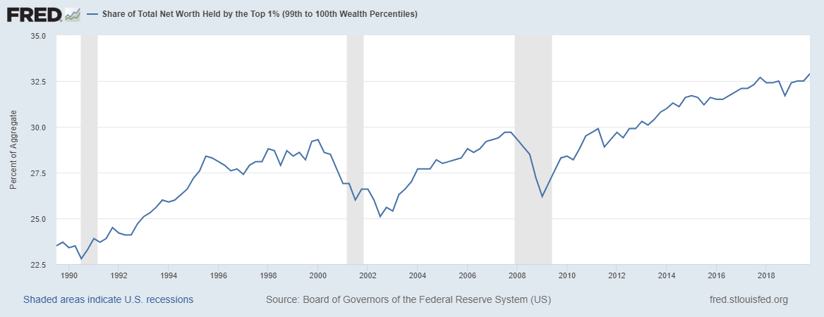
Figure 1: Share of Total Net Worth Held by the Top 1% in the U.S.
Trump didn’t cause income inequality, but the economic growth during his administration has not reduced it. In fact, in addressing the economic damage done by the coronavirus pandemic, Trump and congressional Democrats have mothered one of the most unbalanced economic rescue bills in U.S. history — the $2.2 trillion CARES Act, which includes a tax provision that allows taxpayers to use some business losses to reduce taxes owed on non-business income, such as profits from investments.
Biden, like most congressional Democrats, has expressed support for the CARES Act and its tax provisions. And while Biden’s campaign has issued nebulous policy proposals that would extend direct financial support to some Americans affected by the coronavirus, Biden has offered no ideas on the scale of Change.org’s Universal Basic Income (UBI) proposal where monthly payments of $2,000 would go to everyone in the U.S. while the pandemic continues. [The CARES Act distributed $1,200 to some Americans based on income.]
But pandemic stimulus packages aside, the causes of income inequality are rooted much deeper within U.S. public policy. For example, following the worldwide financial crisis of 2007–08, the U.S. Federal Reserve’s quantitative easing (QE) policy — where it buys long-term securities to push down long-term interest rates — resulted in the Fed accumulating $4.5 trillion worth of assets by late 2014. The QE-era Fed policies have been on “as expansive a setting as it ever has been — not only in this recovery, but arguably in the history of the nation,” according to the New York Times.
The Fed’s QE policies during the Obama administration helped grow the Top 1%’s share of total net worth by almost 25 percent (see Figure 1), and that is not just the opinion of people like U.S. Senator Bernie Sanders, the Fed itself acknowledges the connection. In May 2013, Federal Reserve Bank of Dallas President Richard Fisher acknowledged on CNBC that “cheap money has made rich people richer, but has not done quite as much for working Americans.”
More recently, former UK Prime Minister Theresa May said the same thing about similar monetary policies in her country: “”Monetary policy — in the form of super-low interest rates and quantitative easing — has helped those on the property ladder at the expense of those who can’t afford to own their own home.”
And where do Trump and Biden stand on these Fed policies — which are relevant again given the pandemic-caused economic slowdown? Not a word.
How about their policy proposals addressing other causes of inequality, such as CEO compensation or capital-friendly tax policies? Crickets.
Universal Health Care
On his campaign website, Biden posts his five-point plan to improve the U.S. health care system. Among his proposals are lowering Medicare eligibility to 60 years old and including a public option available to individuals not happy with the employer-based health plan.
I could forgive Biden for putting his health care ideas 24th on his list of priorities, if I thought he was willing and capable to push for his health care proposals once elected. But I don’t.
The Obama-Biden administration had two years where the Democrats controlled both congressional chambers and, while letting Nancy Pelosi and congressional Democrats craft what would become known as Obamacare, rolled over like a love sick puppy when a public option was taken out of the legislation.
“Ultimately, the public option failed as a result of many factors, including lack of support from moderate and conservative Democrats, opposition from Republicans and health care interest groups, and ultimately an absence of strong support from the White House,” according to Helen A. Halpin and Peter Harbage of HealthAffairs.org.
Will things be different if Joe Biden is elected? Not likely, according to Wendell Potter, a former Cigna executive turned private healthcare whistleblower. “Biden, Pelosi, and Schumer know the health care special interests can plow millions of dollars into the campaigns of candidates they favor or think they can influence. Because we have no real constraints on that spending, the special interests, as always, are contributing to candidates in both parties, and Biden, Pelosi, and Schumer and others who raise money for themselves and other Dems want to keep as much of it flowing to Dems as possible.”
Given that so many health care insurance, medical equipment, and pharmaceutical executives orbit around the Biden campaign, it is safe to assume they have his ear on health care policy and any real reform ideas, such as a public option, will not make their way into a Biden administration health care bill.
When judging candidates, more important to me than any single issue is whether I trust a candidate to do what they say. In the case of Biden on health care reform, he’s earned my lack of trust.
As for Trump on health care reform, he’s earned a D- up to now, and there is no reason to believe a second Trump term would be different.
It’s a two-party system, but is it my civic duty to pick sides?
Barely a week into my first political campaign job as a canvass coordinator for Iowa Democrat Tom Harkin’s 1984 Senate run, I was once told by my boss, longtime Democratic operative, Teresa Vilmain, “Don’t let people tell you they are not voting or are supporting a third party candidate. We are a two-party system. That’s the choice.”
Her logic was nonsense then and sounds worse today.
For one, we are not explicitly a two-party system. The Constitution doesn’t even mention political parties, and for good reason, according to historian Sarah Pruitt:
“This was no accident. The framers of the new Constitution desperately wanted to avoid the divisions that had ripped England apart in the bloody civil wars of the 17th century. Many of them saw parties — or “factions,” as they called them — as corrupt relics of the monarchical British system that they wanted to discard in favor of a truly democratic government.”
Secondly, non-voting is a legitimate voting choice that carries with it, in the aggregate, significant information that the two major parties can use to increase their chances of winning the next election.
I believe that strategic use of my vote choice in 2020 is more impactful than voting for a candidate that does not come close to representing my interests or values.
Not voting is not a wasted vote when done for this reason. If enough people who feel the same way consistently do not vote, at some point, one of the two parties — probably the one that loses consistently — is going to get their act together and start representing us disaffected non-voters.
I can dream.
I use this analogy when talking about my decision not to vote:
Imagine a country where there are only two movie studios and the people in this country have the habit of going to the movies one weekend every month, regardless of what movies are showing or their quality.
Imagine in this same country the two movies have found it easier to make bad movies, and since the people keep going to the movies regardless of quality, the two movies start making only bad movies.
The only way the two movie studios will start making good movies is if people stop going to see the bad movies.
A similar process has been at play with our two political parties. And, today, I see two presidential parties that make no effort to appeal to my interests and values and, instead, prefer the dark art of propaganda to make their candidates attractive to voters. The parties would rather put lipstick on pigs than modify their core ideas.
For my tastes, the two parties have been nominating gussied up pigs for decades and I’m tired of the farce— which today feels more like a straight up con job. Farces are at least entertaining.
So, President Trump and Mr. Biden, I’ve listened to your words and studied your policies, forgive me if I sit this one out.
K.R.K.
Send comments to: kroeger98@yahoo.com or tweet me at: @KRobertKroeger1
By Kent R. Kroeger (Source: NuQum.com, May 25, 2020)
The analysis of stool samples is a vital screening method for medical conditions ranging from colorectal cancer, hookworm, rotaviruses, and lactose intolerance.
It seems only logical that the coronavirus (SARS-CoV-2) could also be detected in stool samples.
In Paris, France, researchers monitored genome unit levels of SARS-CoV-2 in waste waters between March 5 to April 23 to determine if variations over time tracked closely with COVID-19 cases observed in the Paris-area.
“The viral genomes could be detected before the beginning of the exponential growth of the epidemic. As importantly, a marked decrease in the quantities of genomes units was observed concomitantly with the reduction in the number of new COVID-19 cases which was an expected consequence of the lockdown. As a conclusion, this work suggests that a quantitative monitoring of SARS-CoV-2 genomes in waste waters should bring important and additional information for an improved survey of SARS-CoV-2 circulation at the local or regional scale.”
If your reaction to this research is — “Aren’t we already doing this for other diseases and public health issues?” — you would be correct.
This type of real-time health monitoring method dates back at least to the 1990s when environmental scientists began to observe the presence of pharmaceuticals in local waste waters (including illicit drugs), according to Christian G. Daughton, a U.S. Environmental Protection Agency scientist.
First proposed in 2012, Daughton has been developing a bioanalytic method called Sewage Chemical-Information Mining (SCIM) in which sewage is monitored for natural and anthropogenic chemicals produced by everyday actions, activities and behaviors of humans. One variation of this method — BioSCIM — is described by Daughton as “an approach roughly analogous to a hypothetical community-wide collective clinical urinalysis, or to a hypothetical en masse human biomonitoring program.”
Though privacy advocates may have reservations about the government or corporate entities monitoring something so private as our bodily wastes (the ACLU has not returned my phone call on this issue), researchers say the way sewage-based monitoring systems are designed makes it impossible to link individuals — whose genetic identifiers are mixed amidst the metabolites of interest — to specific pharmaceuticals, behavioral by-products, health conditions, and/or diseases.
However, they could tell you what cities and neighborhoods index high on these things, and it is not hard to imagine law enforcement authorities finding a reason to plug into this information. Or national intelligence agencies, perhaps?
Think about it.
Given that SCIM and other community-level biomonitoring techniques are fairly well established, it is astonishing that there is no systematic effort by U.S. cities, counties, states or the national government to use this valid, reliable, and non-intrusive technique for tracking the spread of the coronavirus.
We know the widely reported COVID-19 case numbers in the U.S. and worldwide are inaccurate.
“Inadequate knowledge about the extent of the coronavirus disease 2019 (COVID-19) epidemic challenges public health response and planning,” according to USC public health researchers who recently released an April study on the seroprevalence of SARS-CoV-2 antibodies among adults in Los Angeles County, California. “Most reports of confirmed cases rely on polymerase chain reaction–based testing of symptomatic patients. These estimates of confirmed cases miss individuals who have recovered from infection,with mild or no symptoms, and individuals with symptoms who have not been tested due to limited availability of tests.”
“The number of confirmed COVID-19 cases is a poor proxy for the extent of infection in the community,” one of the study’s researchers, Neeraj Sood, told the USC online news site.
For five months now, on a daily basis, our governments and worldwide news agencies have been reporting inaccurate numbers that do not give an unbiased picture of the coronavirus pandemic. They are bean-counting and they don’t know where all the beans are or which ones to count.
It did not need to be this way. We should have been analyzing our pee and poop from the beginning.
(There was no nice way to say that.)
K.R.K.
Send comments and stool samples to: kroeger98@yahoo.com or by tweet to: @KRobertKroeger1
By Kent R. Kroeger (Source NuQum.com, May 21, 2020)
Disclaimer: Though I address significant legal issues in this article, I am not a lawyer, only a concerned citizen and writer that places an extremely high value on our First Amendment rights — which I believe are under siege.
Is it illegal for a U.S. presidential campaign to obtain from a foreign source, by purchase or gift, derogatory information about an opponent?
But, before addressing this question, why am I even asking it? Aren’t we done with the Trump-Russia conspiracy theory? I’m as sick of the story as anybody. Let us move on.
Unfortunately, paraphrasing Michael Corleone in The Godfather: Part III, the Trump-Russia story keeps pulling us back in.
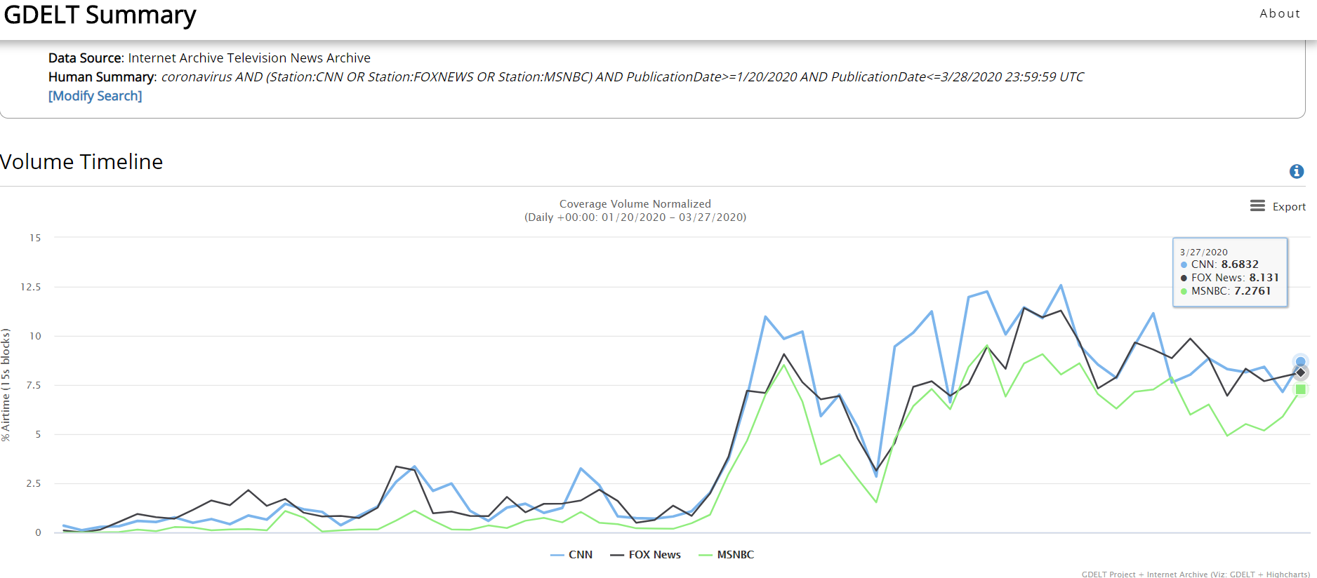
What draws us back in this time? For a brief moment last week, Obamagate replaced the coronavirus pandemic in the headlines.
If you somehow missed the Obamagate story — and if you get your news from CNN or MSNBC, I’m not surprised (see the Appendix for a graph of cable news network coverage of the story) — let me give you a brief overview:
In early January 2017, as the FBI was about to end its counter-intelligence investigation into General Michael Flynn’s relationship with Russia based on finding no improper activities, FBI Director James Comey decided to keep it going long enough to interview Gen. Flynn regarding the contents of a December 2016 meeting between Flynn and Russian ambassador Sergey Kislyak. In that FBI interview, conducted under oath at the White House, Flynn provided false information regarding the Kislyak meeting, and Flynn subsequently pleaded guilty to perjury (twice) with respect to his FBI interview.
So how did that become labelled as Obamagate?
Despite promising my therapist I would stop quoting comedian Jimmy Dore when discussing actual news, I’ve found a work-around. Here is comedian Joe Rogan’s retelling of Jimmy Dore’s summary of Obamagate:
“(Obama) was using the FBI to spy on Trump, and when it turned out that all that Russia-collusion stuff didn’t happen — and the Obama administration knew it didn’t happen —they still tried to turn it into something that it wasn’t.”
As a result, according to Trump allies, Gen. Flynn became one of the fall guys for a failed conspiracy theory originally concocted by the Hillary Clinton campaign, the Democratic National Committee (DNC) and Steele Dossier author Christopher Steele, but ultimately passed on to the Obama administration.
Whatever one’s partisan biases, indisputable is this fact: The Mueller investigation into a possible Trump-Russia conspiracy resulted in zero conspiracy-related indictments. All indictments generated by the investigation were process crimes (i.e., perjury) or ancillary crimes unrelated to Trump and Russia (e.g. Paul Manafort’s illegal financial activities).
Whether you agree or disagree with what Mueller’s team decided is not the point of this article. I will not re-litigate Russiagate. People have made up their minds and I’m fine with that.
But what I believe to be the central legal question of Russiagate — the procurement of opposition research (information) from foreign sources — remains unanswered.
Or is it?
The primary finding of the Mueller Report was that no compelling evidence exists suggesting the 2016 Trump campaign directly or indirectly conspired with any Russian entity to influence the 2016 election outcome.
One could argue (and I do) that the entire Russiagate controversy pivots on the events related to the acquisition of derogatory information regarding Hillary Clinton and the Democratic Party (i.e., deleted and hacked emails).
With respect to the hacked emails, we now know from recently released closed congressional committee interviews that the evidence linking the Russians to the DNC and Podesta email hacks is less than conclusive. I will remind readers, however, that the National Security Agency (NSA) — the U.S. intelligence agency of record on cyber-intelligence issues — concluded with “moderate” confidence that the Russians were responsible for the DNC/Podesta email hacks. But that is a topic for another day. [Spoiler alert: I still think Russia-aligned actors hacked, at a minimum, the Podesta emails.]
Apart from the fact that the U.S. news media selects its stories based more on how well they serve a pre-selected narrative (“Trump is bad”) than on a story’s basis in fact, Russiagate brings to the fore the question of whether foreign-sourced information is allowable in a U.S. presidential election.
If the U.S. Constitution still matters, the answer must be ‘yes.’
Still, we must ask, is the manner in which this information obtained pertinent?
Of course it is. No U.S. presidential campaign is allowed to steal the emails or private communications of an opposition campaign. If Person A steals the emails of Person B and gifts them to Person C, Persons A and C are complicit in a prosecutable crime.
But that is not what happened in 2016, according to the Mueller Report and the publicly known facts.
The evidence Trump’s adversaries cite to demonstrate his conspiratorial activities with the Russians comes down to these seven events:
(1) Donald Trump Jr.’s Trump Tower meeting with Russian lawyer Natalia Veselnitskaya over possible “dirt” against Hillary Clinton.
(2) Trump associate Roger Stone’s interactions with Wikileaks prior to the release of the DNC/Podesta stolen emails (yes, there were stolen).
(3) Trump campaign adviser George Papadopoulos’ boast to an Australian foreign diplomat that he had Russian contacts with knowledge about Hillary Clinton’s 30,000+ deleted emails.
(4) Donald Trump’s own campaign stump speeches where he appeals to the Russians to release Hillary Clinton’s 30,000+ deleted emails.
(5) General Michael Flynn’s private conversations with Russian ambassador Sergey Kislyak in December 2016.
(6) Former Trump campaign manager, Paul Manafort, sharing internal polling data with Konstantin Kilimnik, a Russian national with ties to Russian intelligence, according to the Mueller Report (Vol. I, p. 6).
(7) The Trump Organization’s pursuit of a Trump Tower project in Moscow concurrent with the 2016 presidential campaign.
Apart from process crimes (e.g., perjury) related to the FBI’s investigation of these events, not one of them warranted a criminal indictment by Robert Mueller’s special investigation.
Why didn’t Mueller’s team find at least one prosecutable conspiracy crime during their three-year investigation?
The most defensible answer is that such crimes didn’t exist.
Most supportive of the Trump campaign’s innocence is that none of the seven events listed above are in dispute by the participants, including the substance within those events.
“Several areas of the Office’s investigation involved efforts or offers by foreign nationals to provide negative information about candidate Clinton to the Trump Campaign or to distribute that information to the public, to the anticipated benefit of the Campaign.
The Office determined that the evidence was not sufficient to charge either incident as a criminal violation.”
However, by saying the “evidence was not sufficient” for an indictment, many of Trump’s critics are left howling at Mueller’s timidity. What more evidence did he need?
Though not sufficiently elucidated, the Mueller Report lays out the reasons for not pursuing a campaign finance violation against the Trump campaign, despite legal interpretations of campaign finance law broadly supporting bans on foreign-sourced “things of value” (Vol I., p. 187):
“These authorities would support the view that candidate-related opposition research given to a campaign for the purpose of influencing an election could constitute a contribution to which the foreign-source ban could apply.
A campaign can be assisted not only by the provision of funds, but also by the provision of derogatory information about an opponent. Political campaigns frequently conduct and pay for opposition research. A foreign entity that engaged in such research and provided resulting information to a campaign could exert a greater effect on an election, and a greater tendency to ingratiate the donor to the candidate, than a gift of money or tangible things of value.
At the same time, no judicial decision has treated the voluntary provision of uncompensated opposition research or similar information as a thing of value that could amount to a contribution under campaign-finance law. Such an interpretation could have implications beyond the foreign-source ban, see 52 U.S.C. § 30116(a) (imposing monetary limits on campaign contributions), and raise First Amendment questions. Those questions could be especially difficult where the information consisted simply of the recounting of historically accurate facts. It is uncertain how courts would resolve those issues.” [Bolded emphasis mine]
Buried in a 400+ page report, deserving only one single sentence, Mueller’s team acknowledges that the criminalization of the “voluntary provision of uncompensated opposition research…raises First Amendment questions.”
No kidding. [Pardon my sarcasm, but the central issue within the entire Russiagate brouhaha — the seeking of foreign-sourced derogatory information about a political opponent — was addressed in ONE sentence on page 187.]
I recognize that the average national journalist today doesn’t care about protecting First Amendment rights as their career doesn’t depend on protecting those rights. In fact, most seem happy to drop kick the First Amendment into the Potomac.
My evidence? Besides the fact I can’t name one mainstream U.S. journalist that questions why Wikileaks publisher Julian Assange sits in a British prison for publishing U.S. national security secrets (or abuses, depending on your point-of-view), I cannot find an example of a major U.S. news outlet having discussed with any depth Russiagate’s First Amendment implications.
Not a single one. Even Fox News and The Wall Street Journal have largely neglected this crucial aspect of the Russiagate story (The Wall Street Journal’s Kimberely Strassel being a notable exception).
How is that possible? Surely someone at the New York Times or Washington Post cares about First Amendment rights?
In contrast, the other side of the argument seems more than willing to piss on our constitutional protections if it means bringing down Donald Trump.
Nothing demonstrates the moral (and legal) low ground of Russiagateniks better than New York Representative Hakeem Jeffries admitting during Trump’s U.S. Senate impeachment trial that “payment” for foreign-sourced opposition research like the Steele Dossier is totally kosher.
If hypocrisy were an Olympic gymnastic event, Jeffries would get all 10s.
Watch and enjoy:
Asked whether, under the Dems' impeachment standard, the Clinton campaign's solicitation of the Steele dossier would be considered foreign interference, illegal, or impeachable, @RepJeffries says no — because the Steele dossier "was purchased." pic.twitter.com/SbEKFGNwM4
What Rep. Jeffries is trying to sell you is a diversionary truckload of legal nonsense. The distinction between paying for foreign-sourced opposition research and receiving it for free (for example, in the process of doing research) is most likely an artificial one, though admittedly untested in the U.S. courts (according to the Mueller Report).
That should have changed with Russiagate and the Mueller investigation, but it didn’t. Why not?
Because every D.C. lawyer knows the First Amendment allows the use of foreign-based sources — paid or unpaid — to collect information, derogatory or otherwise, on American political actors. It’s called journalism. It’s free speech, as in, protected by our Constitution. Mueller’s team knew challenging that right in a U.S. court would have had a flying pig’s chance of success.
It shall be unlawful for (1) a foreign national, directly or indirectly, to make:
(A) a contribution or donation of money or other thing of value, or to make an express or implied promise to make a contribution or donation, in connection with a Federal, State, or local election;
(B) a contribution or donation to a committee of a political party; or (C) an expenditure, independent expenditure, or disbursement for an electioneering communication (within the meaning of section 30104(f)(3) of this title); or
(2) a person to solicit, accept, or receive a contribution or donation described in subparagraph (A) or (B) of paragraph (1) from a foreign national.
(b) The term “foreign national” means
(1) a foreign principal, as such term is defined by section 611(b) of title 22, except that the term “foreign national” shall not include any individual who is a citizen of the United States; or
(2) an individual who is not a citizen of the United States or a national of the United States (as defined in section 1101(a)(22) of title 8) and who is not lawfully admitted for permanent residence, as defined by section 1101(a)(20) of title 8.
At the risk of over-simplification, Russiagate hinged on the definition of ‘other thing of value’ (in line a-1A): Wouldn’t “dirt” on Clinton qualify as something of value, thereby making its free acquisition from a foreign national an illegal campaign contribution by the Trump acquisition?
First, the Trump campaign never received any “dirt” on Clinton, so that is their first line of defense (though, in the case of the DNC/Podesta/Clinton emails, an attempt to procure stolen goods is potentially a criminal offense). Second, even if they had, the Mueller team conjectured (wrongly) that the Trump campaign’s legal jeopardy might be minimized if “the information consisted simply of the recounting of historically accurate facts.”
The U.S. legal history on defamation and First Amendment rights is too extensive and complex to retrace here, but suffice it to say the case law leans in favor of free speech and the press and generally forgives unintentional factual mistakes.
“Error is inevitable in any free debate and to place liability upon that score, and especially to place on the speaker the burden of proving truth, would introduce self-censorship and stifle the free expression which the First Amendment protects,” according to a 2012 Congressional Research Service analysis of U.S. Supreme Court First Amendment cases.
Even the Steele Dossier, despite having more in common with fiction writing than journalism, would likely be constitutionally protected.
Finally, adding to the protection of the Trump campaign’s 2016 activities (and the Clinton campaign activities also) is the Overbreadth Doctrine — a legal principle that says a law is unconstitutional if it prohibits more protected speech or activity than is necessary to achieve a compelling government interest. The excessive intrusion on First Amendment rights, beyond what the government had a compelling interest to restrict, renders the law unconstitutional.
One common cause of such an intrusion is a statute that using overly broad definitions and language. I’m not a lawyer, but the campaign finance statute’s use of concepts such as “other thing of value” would be ripe for an Overbreadth Doctrine challenge.
Final Thoughts
Nothing speaks to the self-inflicted lunacy of the political establishment Left than their willingness to embrace the Steele Dossier — an anti-Trump hit piece of mostly secondhand hearsay, possibly from Russian intelligence operatives (or, as they are frequently called in the U.S. media,“Kremlin insiders”).
And do you think anybody in the U.S. media went to the effort to independently verify the information in the Steele Dossier? Journalist Bob Woodward tried and in his words: “I could not verify what was in the Dossier.”
And that is pretty much where we stand today. The Mueller-led investigation into Russiagate punted on potentially the most consequential legal aspect of the story: Is it legal for a political campaign (or anyone, for that matter, as we are all protected by the First Amendment, not just journalists) to acquire from a foreign-based source any derogatory information about another political campaign.
The Mueller team plainly had an educated hunch that a court’s answer would be “yes, it is legal,” but decided to bury that important insight on page 187 of their report.
Thank God I didn’t fall asleep until page 192.
K.R.K.
Send comments and grand jury subpoenas to: kroeger98@yahoo.com, or tweet me at: @KRobertKroeger1
APPENDIX: Cable News Coverage of the Michael Flynn Story (5/6/20 to 5/19/20)
For the most part, only Fox News has consistently covered the Michael Flynn story over the past two weeks. Does that make it fake news? Discuss.
On a macro-level, Anthropologist Leslie White once wrote that human cultural evolution is the “process of increasing control over the natural environment” through technological progress.
He even proposed a simple equation, known as White’s Energy Formula, to summarize his neoevolutionist view:
C = ET
where E is a measure of energy consumed per capita per year, T is the measure of efficiency of technical factors utilizing the energy and C represents the degree of cultural development.
The coronavirus (SARS-CoV-2) has shaken one of our most durable assumptions about human history: the near uninterrupted progress of human society over time.
Today, we live better than our parents, who lived better than their parents, who lived better than their parents…and on and on it goes.
If we view progress as our ability to produce greenhouse gases and consume heavily processed foodstuffs, we’re kickin’ it like never before. If we take a more comprehensive view of human happiness, however, the progress myth was never true.
As businessman Mark Cuban recently said: “I’m worth billions and I’m afraid to leave my damn house.” But that is just one manifestation of the coronavirus’ power over humans.
We live in the coronavirus’ world for now — and when will that end?
“The (corona)virus dictates the the timeline for lifting restrictions, not us,” said a New York epidemiologist on WNYC-FM last Friday.
Still, since the earliest stages of the COVID-19 pandemic, experts, bureaucrats, and politicians have hammered on the same basic message: We can control the coronavirus.
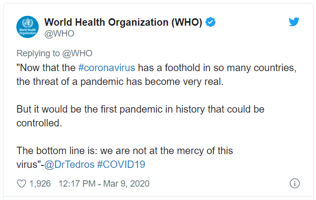
“We are not at the mercy of this virus,” said the WHO Director-General Tedros Adhanom Ghebreyesusat a March 9th media briefing. “All countries must aim to stop transmission and prevent the spread of COVID-19, whether they face no cases, sporadic cases, clusters or community transmission.”
The WHO Director followed up his press conference with a tweet:
At around the same time, Dr. Marc Lipsitch, a professor of epidemiology and director of the Center for Communicable Disease Dynamics at the Harvard T.H. Chan School of Public Health, wrote:
“The city of Wuhan, China, where Covid-19 started, waited weeks before acknowledging human-to-human transmission and taking measures to control it. Wuhan thus experienced an out-of-control epidemic that overwhelmed the health care system. The city felt these effects for weeks after intense control measures were in place, as newly infected people got sick and required care. Other cities in China watched Wuhan’s experience and imposed strict controls at a much earlier stage in their epidemic: They closed schools, sharply limited social contact, and traced and isolated cases and contacts. These early interventions dramatically slowed transmission. No other Chinese city has repeated Wuhan’s horrific experience so far.
These experiences…show that early and sustained imposition of measures to limit social contact will slow the epidemic. This is desirable for many reasons — fewer total people get infected in a slowly moving epidemic; those who do get infected do so later, on average, so doctors will have learned more about how to care for the illness, and antiviral drugs may even be available.
Most important in light of Wuhan’s crushing experience, a controlled epidemic has a lower peak, reducing the strain on health systems. From the perspective of disease control, every effort should be made, as soon as possible, to slow the spread of the virus and flatten the epidemic curve. If these interventions are not sustained, spread will resume, but every action to slow it buys us some time and probably reduces the total size of the outbreak.”
Within days of the WHO and Dr. Lipsitch statements — as well as from other public officials and epidemiologists around the world — the majority of the northern hemisphere rapidly implemented the core recommendations: (1) school and business closures, (2) lockdowns (‘shelter-in-place’), (3) travel restrictions, (4) social distancing requirements (e.g., masks, “the 6-feet rule”), (5) and the promulgation of stricter personal hygiene techniques (e.g., “20-second hand washing”).
Have these efforts worked? How would we know?
Is the U.S. (& the world) controlling the coronavirus (SARS-CoV-2)?
From the U.S. experience (so far), aggregated to the state-level, the data do not tell us which suppression and mitigation (S&M) efforts have been more effective than others.
Working against the data are numerous methodological issues: (1) states implementing multiple S&M techniques simultaneously (confounding factors), (2) vast majority of states (and all of the large, densely-populated states) implemented ‘shelter-in-place’ orders, though some states adopted this policy later than others (e.g., Texas, Florida, Oklahoma, Kansas), (3) significant variation between states in how otherwise similar S&M techniques were implemented, and, most importantly, (4) the pandemic is not over in the U.S. by any stretch of the imagination.
Adding to these complications is this fact: the COVID-19 pandemic has included more than one coronavirus, with at least one being more contagious than others.
According to a recently released Los Alamos National Laboratory study, a new (mutated) strain of the coronavirus has become dominant in Europe and the U.S. East Coast and is potentially more contagious than versions that dominated China and the U.S. West Coast during the early stages of the pandemic.
If true, how can we compare New York and California’s response to the coronavirus if they are dealing with fundamentally different viruses?
It makes the analysis difficult — but not impossible. Studies using probability-based sampling are already in the field throughout the U.S. and when their results are available, more sophisticated statistical controls will better facilitate such comparisons.
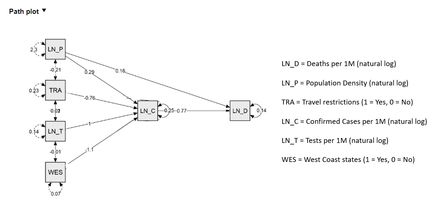
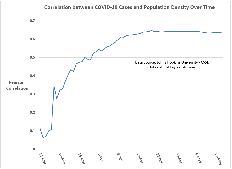
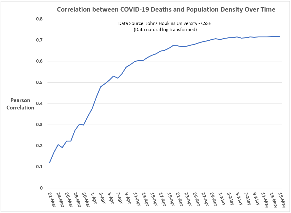
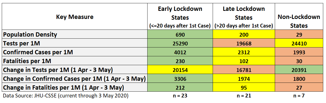
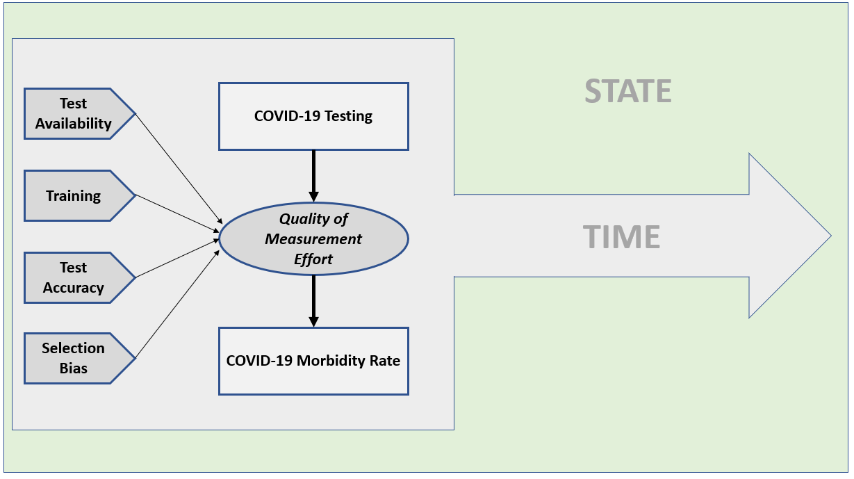
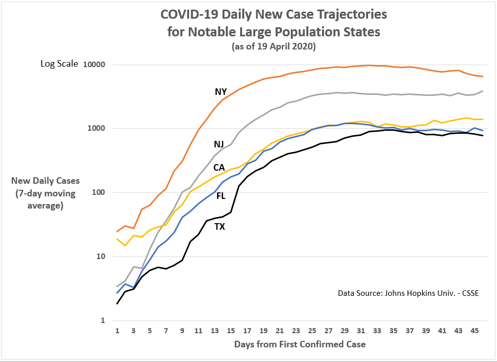
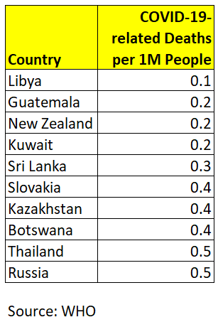
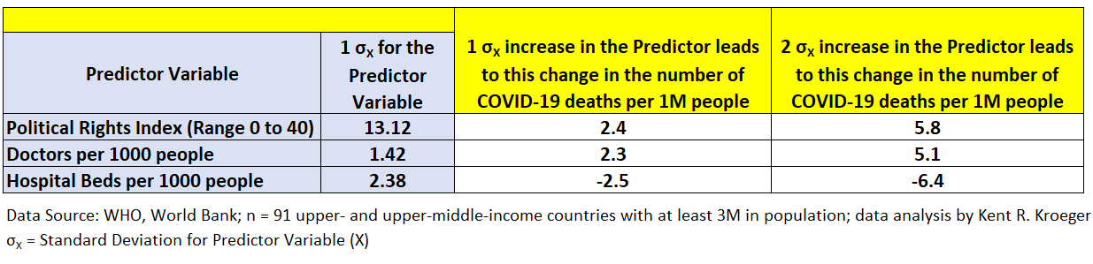
In the meantime, we have U.S. county-level data from Johns Hopkins University (CSSE), updated daily, which continues to suggest four state-level factors are correlated with the spread and lethality of the COVID-19 pandemic in the U.S.: (1) Population density, (2) Testing incidence, and (3) Travel restrictions, and (4) an indicator for West Coast states (CA, HI, OR, WA).
See Figures 1 and 2 for a path model (mediation) analysis of the spread and lethality of the coronavirus in the U.S. at the state-level (through May 15th).
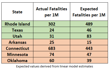
While only a state’s population density (per sq. mile) is significantly correlated both directly and indirectly with the number of COVID-19 deaths (per 1 million people), the total effects are significant for all four factors.
Figure 1: Path model estimates for COVID-19 deaths per 1M (output) and COVID-19 cases per 1M (mediator) for the U.S. through May 15, 2020.
Figure 2: Path model estimates for COVID-19 deaths per 1M (output) and COVID-19 cases per 1M (mediator) for the U.S. through May 15, 2020.
While researchers note that population density alone cannot explain many of the differences in COVID-19 morbidity and mortality across the U.S. — for example, New York City and San Francisco are both densely populated but have significantly different morbidity and mortality rates — it is manifestly a major factor, if not the dominant factor.
As can be seen in Figures 3 and 4, the correlations of state-level population density and state-level COVID-19 case rates and fatality rates have increased over time, reaching in mid- to late-April an apparent threshold of 0.64 (Pearson coefficient) for cases and 0.72 for fatalities.
Figure 3: Correlation between COVID-19 cases (per 1M) and a state’s population density over time (U.S. state-level analysis; data through May 15, 2020).
Graph by Kent R. Kroeger (NuQum.com)
Figure 4: Correlation between COVID-19 deaths (per 1M) and a state’s population density over time (U.S. state-level analysis; data through May 15, 2020).
Graph by Kent R. Kroeger (NuQum.com)
To my eyes, this over-time convergence in the correlation coefficient for population density reminds me of how population parameter estimates in sample surveys converge as sample sizes increase.
As for the other variables in the path model, the significance of the West Coast-indicator confirms that something substantively different is happening in those states — be it the characteristics of the virus itself, the S&M policies of those states, or both.
Likewise, as has been the case since I first estimated models for U.S. state-level COVID-19 cases and deaths, those states that implemented internal travel restrictions on its citizens (AL, AZ, DE, FL, HI, ID, KS, KY, ME, MT, ND, NM, OK, RI, SC, TX, UT, VT, WV, WY) are experiencing significantly lower COVID-19 case incidences than other states, all else equal.
Overall, the path model explains about 75 percent of the state-level variance in COVID-19 case incidences and 85 percent of COVID-19 death incidences — all without any reference ‘shelter-in-place’ orders and their timing, which were found to be insignificant in this cross-sectional (i.e., one-point-in-time) analysis when included in the model.
Have the ‘Shelter-in-Place’ orders been ineffective? The state-level evidence is not clear on this question, though I feel some confidence in saying that broad, state-level “Shelter-in-Place’ orders have no statistically significant relationship with state-level case and fatality rates. Unless it is the location of a cluster outbreak, why should Wanakah, New York (Population 2,824) be under a state-ordered lockdown? I can’t find any justification in the data for such a policy.
But does that mean these orders didn’t help moderate the scale of the coronavirus pandemic? Absolutely not.
Imagine there is a parallel universe where New York didn’t institute a ‘Shelter-in-Place’ during the coronavirus pandemic. Do you think the end result would have been the same as in our universe? I don’t.
Unfortunately, we don’t have access to this parallel universe. We have only this one. And in this one New York suffered more than any other U.S. state during the coronavirus pandemic, even with a statewide shutdown.
But do not despair, the path model presented here offers strong evidence that states are far from powerless in addressing viral outbreaks, with testing rates being the most important controllable factor.
Still, the statistical evidence reminds that us that factors outside the control of political actors and subject-matter-experts — population density and a virus’ characteristics (contagiousness and lethality), including regional variations in those characteristics — explain a significant portion of state-level variances in case and fatality rates.
A state cannot easily control its population density or its location on a map and as this pandemic progresses over time, the impression I am left with is that states are becoming more similar, not different, in their COVID-19 case and fatality rates.
In other words, a state’s S&M strategies can definitely ‘flatten the curve,’ but these strategies may be more limited in their ability to change the eventual incidence rates in cases and fatalities.
Are we all going to end up like New York? Probably not, as we do have some control over the COVID-19 pandemic, though probably not as much as we want to believe. And when I say we, I mean our elected politicians.
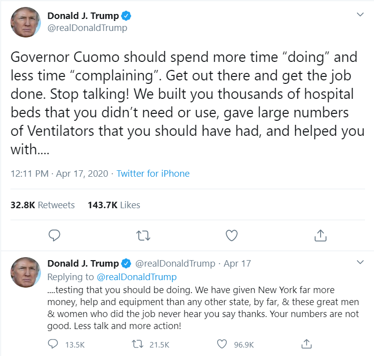
Watching New York Governor Andrew Cuomo’s daily press conferences on the coronavirus remind me of Billy Crystal’s catch phrase when doing his Fernando Lamas imitation on Saturday Night Live: It is better to look good than to feel good. [An analogous axiom I learned while working in the Federal Government may also apply:It is more important to look busy than to be busy.]
Governor Cuomo sure looks like he knows what he’s doing about the coronavirus, but the reality for New Yorkers is far different.
New York nonetheless leads the country in the relative number of COVID-19 cases (1,458 per 1 million people) and deaths (18,522 per 1 million people) and only New Jersey appears close enough to challenge New York for those two ignominious titles.
In all fairness, New York has seen its number of new cases and fatalities drop dramatically in the past two weeks:
New York is among only six states to see its current 7-day moving average in new confirmed cases fall below 25 percent of its peak. New York’s 7-day moving average peak in cases was 9,909 per day (on April 10th). As of May 15th, New York’s current 7-day moving average is 2,201 per day. The other states under 25 percent of their peak are: Alaska, Hawaii, Idaho, Montana, and Vermont.
New York is also among seven states to see its current 7-day moving average in new deaths fall below 25 percent of its peak. In New York’s case, its 7-day moving average peak in deaths was 951 per day (on April 12th). As of May 15th, New York’s current 7-day moving average is 234 per day. The other states to share this honor with New York are: Alaska, Hawaii, Idaho, Montana, Vermont, and Wyoming.
Barring any major setbacks — which is possible given the virus might be in more control than we realize — New York is the only large-population state on those two lists. [Maybe I was too hard on Governor Cuomo earlier?]
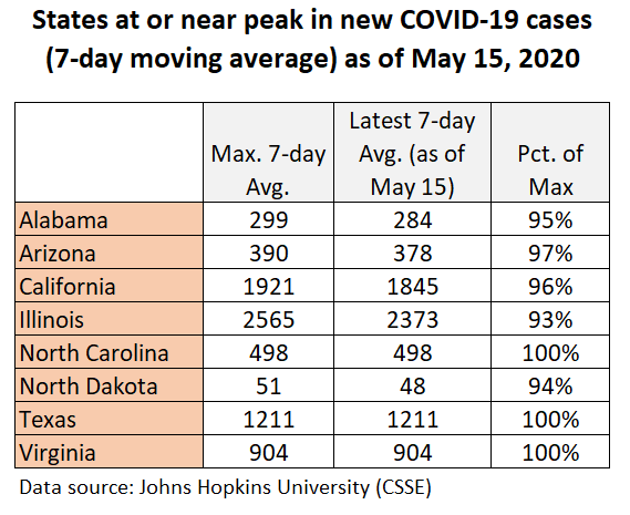
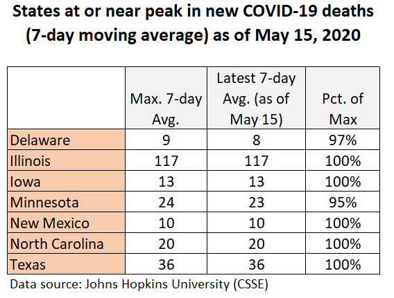
Unfortunately, there is an equally long list of U.S. states that are currently at or near their peaks in COVID-19 cases and deaths (see Figures 5 and 6).
Figure 5: States at or near peak in new COVID-19 cases
Figure 6: States at or near peak in new COVID-19 deaths
Should the data make us optimistic or pessimistic?
Based on the data, I am promiscuous in my belief that the U.S. is on the downhill side of this first coronavirus wave (see Figure 7). As for future waves, there is no consensus among epidemiologists on the shape they will take, but there appears to be a consensus that they will occur.
Unfortunately, the worldwide trend in this first wave of COVID-19 cases is not declining (see Figure 8); but, it is a relatively flat curve, as opposed to a highly peaked one, suggesting mitigation and suppression efforts are working on some level.
Figure 8: Worldwide trend in new COVID-19 cases (as of May 18th)
My optimism also grows as we learn more and more about this virus, particularly about potentially controllable drivers of COVID-19 morbidity and mortality.
For example, a recent UK study found levels of Vitamin D in a population may affect how the coronavirus impacts a population.
“Vitamin D levels are severely low in the aging population especially in Spain, Italy and Switzerland. This is also the most vulnerable group of population for COVID-19,” concludes research conducted by Petre Cristian Ilie (The Queen Elizabeth Hospital Foundation Trust, King’s Lynn), Simina Stefanescu (University of East Anglia), and Lee Smith (Anglia Ruskin University). “We believe, that we can advise Vitamin D supplementation to protect against SARS-CoV2 infection.”
When this pandemic is finally over — and it will end, at the minimum when a reliable vaccine is available — epidemiologists will have the time to
What seems less debatable is whether we can control the coronavirus to our liking. That is not going to happen.
“We must be prepared for at least another 18 to 24 months of significant COVID-19 activity, with hot spots popping up periodically in diverse geographic areas. As the pandemic wanes, it is likely that SARS-CoV-2 will continue to circulate in the human population and will synchronize to a seasonal pattern with diminished severity over time.”
In other words, the coronavirus remains in charge…until a vaccine is widely available.
K.R.K.
For data and statistical code used in this analysis, send requests to: kroeger98@yahoo.com
By Kent R. Kroeger (Source: NuQum.com, May 13, 2020)
Along with Doomcock, ThatStarWarsGirl, and Geeks+Gamers, YouTube vlogger Nerdrotic (aka Gary Buechler) is a member of the Praetorian Guard for George Lucas’ Star Wars franchise.
Though frequently mocked by the corporate-controlled entertainment media for their religious-like devotion to the Stars Wars myth, Star Wars is not their religion, it is their hobby.
Granted, they use religious terms like ‘canon’ to frame their critiques of how The Disney Company has fundamentally altered the Star Wars myth, but they do so to contextualize their uniformly negative reaction to the Disney Star Wars trilogy that was recently concluded with 2019’s release of The Rise of Skywalker.
They are fans of the Star Wars franchise. No more, no less.
The point of deepest contention between Disney Star Wars critics — sometimes called the Fandom Menace — and the mainstream entertainment media hinges on whether Disney should have respected Star Wars canon (i.e., historical precedent) when producing the trilogy and standalone movies (Rogue One, Solo).
“There has to be a basic foundation,” Buechler said in a recent live broadcast on YouTube. “(For Star Wars) Luke Skywalker was the hero that threw away his light saber to save his father (Darth Vader). He wasn’t going to go to the dark side. That was Luke Skywalker. ”
In contrast, Buechler considers the Disney trilogy’s rendering of Luke Skywalker as unrecognizable to the original character: “Luke Skywalker is not the one (in the Disney trilogy) who had a bad dream and was going to kill his nephew. His sister’s son. His best friend’s son.”
Buechler admits Lucasfilm head Kathleen Kennedy, and The Force Awakens/Rise of Skywalker director J. J. Abrams aren’t required to honor the fans, but if they want those fans to reliably show up for the Disney Star Wars projects, “they need to respect the love people had for that franchise.”
Unfortunately, says Buechler, the Disney people in charge of Star Wars have not demonstrated that respect.
Jeffrey Riley, a Nerdrotic YouTube follower, perhaps put it best: “Canon is history. If content loses its history, it stops existing.”
And how has Disney responded to these criticisms from fans? “Too bad, so sad,” seems to be their collective reply.
Matt Martin, a member of the Lucasfilm Story Group and creative executive for the animated Star Wars series Rebels, says of critics like Nerdrotic: “Canon is all fake anyway.”
If by ‘fake’ Martin means ‘fiction,’ there is no argument. Star Wars fans don’t consider the original Lucas-produced trilogy movies to be documentaries. They know these movies are science fiction.
Their message to Disney, instead, is that — as fans — they no longer recognize the Star Wars story line; and if Disney had wanted them to turn out in large numbers for the Disney trilogy movies, they would have considered the opinions of the Star Wars fan base.
For example, Han Solo’s unheroic death at the end of “The Force Awakens” represented the tipping point for me and Disney Star Wars movies.
Han Solo deserved better. And Star Wars stopped being fun.
However, for other Star Wars fans I’ve met who say they are done with Disney Star Wars, the cause of their divorce runs the gamut from Han Solo’s ignominious demise in The Force Awakens, Luke Skywalker’s minor role in all three Disney trilogy movies, General Leia Organa’s demonstration of a previously unknown Jedi ability to fly in space without a spacesuit, to the use of light-speed in The Last Jedi to destroy the First Order’s Star Dreadnought.
Star Wars creator George Lucas has publicly complimented The Last Jedi’s director Rian Johnson for taking chances with the Jedi myth. Speaking on his behalf, director and close Lucas friend Ron Howard says, “He’s all for the galaxy expanding and experimenting. That’s what he prefers the most.”
‘Expanding and experimenting’ is one thing; taking a blow torch to the most basic precepts of the Star Wars mythology is an entirely different matter. Not even Lucas can get away with that in the eyes of some fans.
Feel free to mock Star Wars fans for caring about ‘fake’ canon, but if Disney is still a for-profit business — and Disney’s stockholders assume the company is — they should have done a better job understanding the core Star Wars fandom even if they didn’t want to cater exclusively to their desires and expectations.
Henry Ford famously said: “If I had asked people what they wanted, they would have said faster horses.” Kathleen Kennedy probably has a similar quote.
Where did Disney go wrong with their Star Wars trilogy?
A minor dispute among Star Wars fans has developed over when and how the world’s most lucrative science fiction movie franchise started its slide. Was it by Rian Johnson’s canon-mocking The Last Jedi? Was it J. J. Abrams’ The Force Awakens? Was it the last movie in the trilogy — The Rise of Skywalker — that placed the Star Wars franchiseon life support? Or did the Lucas-produced prequels deliver the decisive blow long before Disney acquired the franchise?
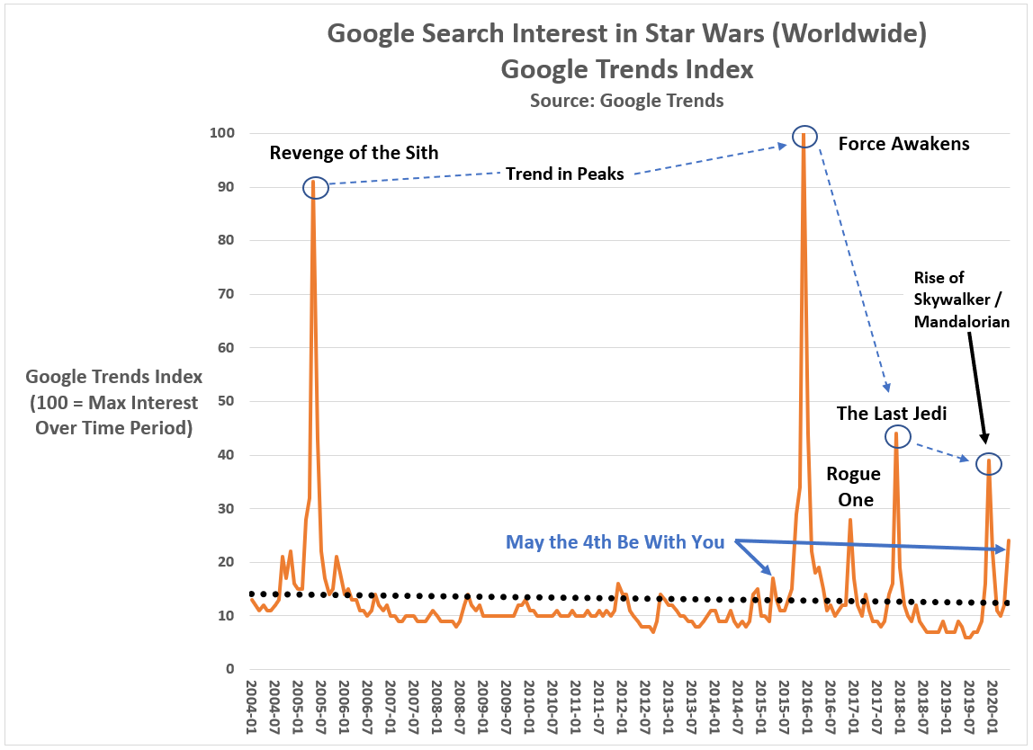
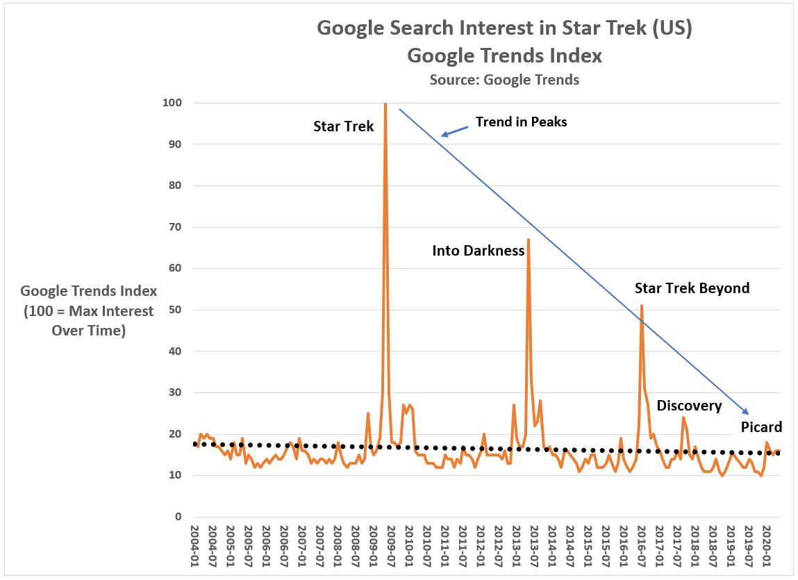
While I can’t prove how the Star Wars franchise was damaged, I’m confident I know when it happened (see Figure 1): The Force Awakens caused Disney’s Star Wars troubles, not the more reviled Last Jedi.
Worldwide Google searches on the term ‘Star Wars’ have followed a predictable pattern since 2004 (the first year Google search data is available). In the month of a Star Wars movie premiere, Google searches spike, and then fall off until the next Star Wars movie (or until the next May the Fourth Be With You).
The assumption underlying my conclusion is that Google searches are a reliable and valid proxy for assessing public interest in media properties such as Star Wars. There is empirical evidence to support this assumption.
Figure 1: Worldwide Google searches on ‘Star Wars’ from 2004 to present
Had 2005’s Revenge of the Sith inflicted major damage to the Star Wars franchise, we would have expected the next Star Wars film (2016’s The Force Awakens) to have relatively deflated Google search totals. To the contrary, worldwide interest in Star Wars peaked leading into the release of The Force Awakens.
Revenge of the Sith is no longer a suspect, but what about The Force Awakens? — generally considered the best of the Disney trilogy movies (receiving a 93 critics rating on Rotten Tomatoes).
If we set 2016’s Rogue One aside as a unique case (it was a standalone Star Wars movie), and focus on the second Disney trilogy movie — The Last Jedi — the impact of The Force Awakens becomes apparent. Worldwide Google search interest in ‘Star Wars’ fell 55 Google Index points (where an index score of 100 represents the month with the most Google search interest in Star Wars).
Why?
Buechler theorizes Abrams’ unflattering deconstruction of the original saga’s protagonist — Luke Skywalker — and transforming Han Solo from a competent, space-savvy smuggler into a depressed, divorced dad did the critical damage.
Other Star Wars vloggers such as Doomcock have suggested the Disney saga protagonist — Rey — never became a fully-developed character on Luke’s level.
Regardless, the key point in Figure 1 is that blaming Star Wars’ decline on the visually impressive, but storytelling monstrosity — The Last Jedi — is misplaced. By the time of The Rise of Skywalker, public interest in Star Wars was60 Google Trends Index points below the similar period leading into The Force Awakens. Whatever the cause, Disney squandered their $4 billion Star Wars investment with a series of trilogy movies that alienated preexisting fans and created few new ones.
That is a recipe for a brand management disaster.
Fear not Star Wars fans. The franchise is wounded, not dead.
If I seem pessimistic about the future of Star Wars, let me share two reasons why Star Wars fans should remain optimistic: (1) Other popular culture franchises have survived mediocre middle acts, and (2) the world still thinks and writes about Star Wars more than any other science fiction movie franchise.
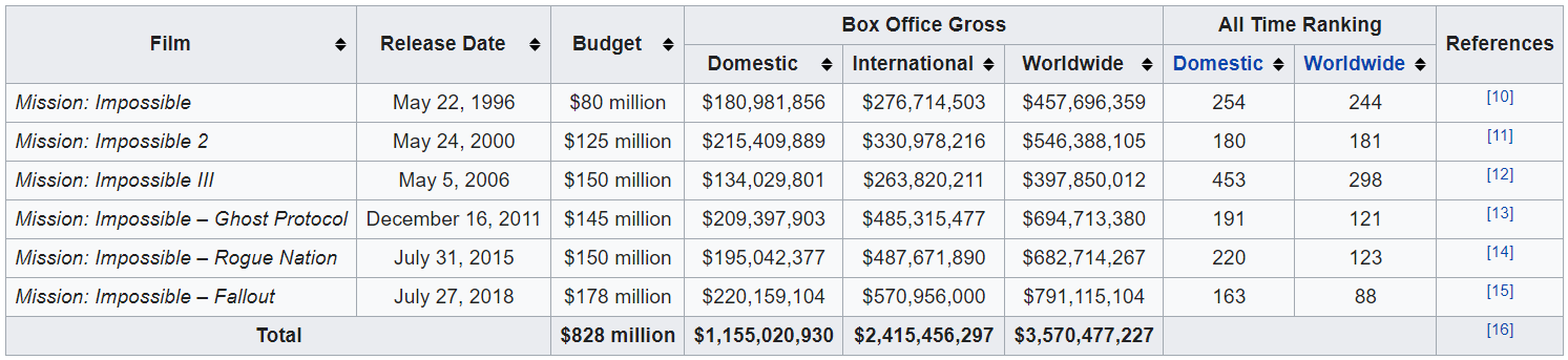
On the first point, the Tom Cruise-produced Mission: Impossible movie series suffered a mid-season slump only to come back stronger than ever. After two profitable, if unspectacular movies at the series start (released in the Summers of 1996 and 2000), the third Mission: Impossible installment (directed by J. J. Abrams oddly enough — Is there a pattern forming in his career?) was met with critical but not financial success (see Figure 2).
In the aftermath of Mission: Impossible 3, the franchise’s lowest grossing movie, Paramount Pictures could have easily pulled the plug on any future Mission: Impossible movies. The series seemed to have run its course.
Instead, Cruise brought in a new creative team (director Brad Bird and writers Josh Appelbaum and André Nemec) and released Mission:Impossible: Ghost Protocol in the Summer of 2006 to wide critical praise and strong box office numbers. The two subsequent movies (Rogue Nation and Fallout) have been similarly successful and two more sequels are planned for release in 2021 and 2022. [Is there a harder working person in Hollywood than Tom Cruise?]
Figure 2:Mission: Impossible box office and production costs
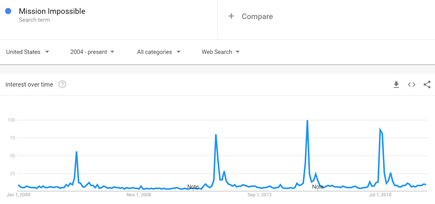
The sustained success of the Mission: Impossible franchise can also be seen in Google search data (see Figure 3). From a Google Trends Index score of 55 in April 2006 (Mission: Impossible 3), the three subsequent releases have witnessed peak Google Trends Index scores of 78 (Ghost Protocol), 100 (Rogue Nation) and 88 (Fallout), respectively. Fallout’s figure, however, is deceiving as its spike in Google searches covered a two-month period (instead of one as for the other Mission: Impossible movies). Fallout is the highest grossing Mission: Impossible movie to date.
Figure 3: Google Search Interest in ‘Mission: Impossible’ (US, 2004 to present)
“All franchises have their implausibilities, whether it’s Transformers’ sentient cars or the Fast and Furious’ sentient Vin Diesels. But only the Mission: Impossible franchise has gotten better reviews with every installment, climbing its way up the Rotten Tomatoes rankings as though wearing electromagnetic gloves,” says Cruise biographer Amy Nicholson.
What has sustained Mission: Impossible’s success? Strong creative leadership from the producer/actor (Tom Cruise), screenwriters, and various directors utilized during the six-movie franchise.
Lucasfilm and Disney Strong creative leadership on the top-side has not been the case for the Disney Star Wars saga. But there is no reason why it couldn’t be going forward.
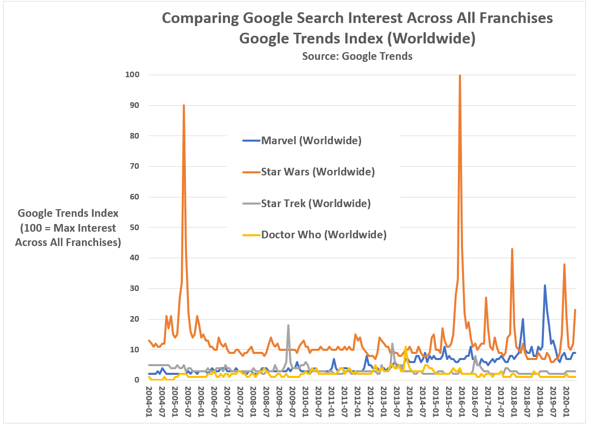
What should maintain Disney’s optimism is that the Star Wars franchise remains among the most talked about in all of popular culture. While Star Wars may have been surpassed in total box office by the Marvel Comics Universe movies, it is still a heavyweight among science fiction movie franchises when it comes to worldwide public interest (see Figure 4).
Figure 4: Comparing Google Search Interest Across Science Fiction Franchises (Worldwide, 2004 to present)
Graph by Kent R. Kroeger (NuQum.com)
Since 2004, Star Wars claims four of the Top 5 monthly Google Trends Index scores. The Marvel Comics Universe has the fifth ranked month (when Avengers: Endgame was released in April 2019).
Disney would obviously trade their high Google Trends Index scores for Endgame’s worldwide gross receipts. But Google searches do represent something tangible — public interest — and to this day Star Wars maintains a large reservoir of that across the globe.
The modest success of the Disney+Mandalorian series, a sparse story about a lone bounty hunter in the outer reaches of the galaxy, far from the authority of the New Republic, who takes on the responsibility of protecting a child of Yoda’s species in a post-Battle of Endor galaxy.
Star Wars fans will show up if you give them a good reason.
No, Star Wars is not dead. It isn’t even dying. But it is ill.
By Kent R. Kroeger (Source: NuQum.com, May 10, 2020)
One of my first market research jobs was at HBO (New York) in the late-1990s. About two months into the job, a personal assistant to HBO CEO Jeff Bewkes asked me to attend a 4 p.m. executive meeting.
At the time, I was heading the subscription cable network’s yet-to-be-launched “HBO-on-Demand” service and had been verbally abused that morning by the network’s chief financial officer for inconsistencies in my 5-year budget proposal.
The CFO hated subtotals that didn’t add up as much as I hated making them.
As I assumed the 4 p.m. meeting with Mr. Bewkes was to fire me, my office neighbor reminded me that Mr. Bewkes would never lower himself to fire someone at my level.
Typically at HBO firings at my level would consist of a security guard informing you of your termination and then escorting you out of the building. To the extent you saw anyone else, it would be colleagues diving back into their offices as you walk your box full of desk toys and family pictures to the elevator.
After some encouragement from colleagues, my optimism started to rise, though the morning’s tongue-lashing from the network’s second most powerful person was still fresh in my mind.
I don’t remember much about Mr. Bewkes’ office except that it was large, had an dark lacquered desk, and a nice view of Manhattan’s Bryant Park.
I also remember the chair I sat in, as it put me about a foot below Mr. Bewkes eye line and every time I shifted my butt, the leather seat would make a sticky squeak sound. Since I tend to shift a lot (adult ADHD), the noise annoyed everyone in the room, including myself.
After a few small-talk niceties between myself and the three or four other people in the room, none of whom were the CFO (thank God), Mr. Bewkes turned to me to explain why I was there.
“Kent, I appreciate the work you are doing on our on-demand service. I just wanted to get the senior people together who will be working with you on getting it up and running.”
It was a nice introduction.
What Mr. Bewkes said next I have never forgotten.
“I am told you have a market research background and that is exactly the type of person we want launching this new service. For HBO-on-Demand to be successful — and this is true for any media service — you must know and respect your core audience.”
And I did know HBO’s core audience: Young, educated, upwardly mobile professionals.
“I’m HBO’s core audience,” I said.
Mr. Bewkes’ immediate smile sent a jet stream of adrenaline into my system. I was going to nail this meeting. God yes. Director of HBO-on-Demand today. CEO of Time-Warner-Europe by Arbor Day!
“Good. Good,” he shot back.
Good? How about great!? (I didn’t say that, of course.)
Mr. Bewkes leaned back in his chair and paused for a moment. “How long have you been an HBO subscriber?”
Uh oh.
The truth was, at the time, only twice in my life did I have HBO service. The first was as a teenager when I hacked into my neighborhood’s cable TV hub and pirated the service for about a year. The second time was Spring 1997 when I moved into a New Jersey apartment and the service had been paid for through the year by the previous tenant.
Yep. I could feel the swamp water rising above my ankles.
“Since I was a teenager,” was my answer followed by some butt shifting, with accompanying sticky squeaks. “With maybe a couple of service breaks here or there.”
Good lesson in life: When anyone uses the word ‘maybe,’ it often means they are about to throw up a verbal smoke screen.
I prayed Mr. Bewkes’ inquisition about my subscription habits was over.
It wasn’t.
“I believe that if you don’t love the product you sell, you’re in the wrong business,” he said.
That makes sense. Let’s talk about HBO-on-Demand now, I thought to myself.
Mr. Bewkes, still leaning back in his chair, drew wry smile across his lips and asked, “What’s your favorite HBO show?”
My confidence made one final appearance that day. I knew the best answer to his question. It was the show Mr. Bewkes’ launched during his tenure at HBO — the show that heralded the subscription service’s move away from carrying only theatrical movies to providing exclusive, HBO-produced content.
“The Sopranos, of course.”
The Sopranos made Jeff Bewkes one of the most coveted media executives in New York at the time.
It may have been the best answer, but it wasn’t a truthful answer. I had never watched a complete episode of The Sopranos in my life. It was another trendy East Coast show not targeted to people from Iowa who listen to Kansas and the Dave Matthews Band and consider dinner at The Olive Garden or Red Lobster a nice night out.
“Don’t worry, this is not a test.”
But, of course, that is what someone says right before they give you…a test.
Mr. Bewkes turned to the other executives in the room: “I like focus groups. They don’t give you hard numbers, but they give you insights you can only gain from listening to people and seeing their eyes; you get a better perspective.”
Oh, crap.
Mr. Bewkes turned his gaze back to me: “Any favorite Sopranos character?”
Double crap.
“Tony and Big Pussy,” came out of my mouth as if by divine intervention.
Phew! Nailed it again. But please God, let the questions end, I thought.
“A favorite episode?”
OK, I was cooked.
More butt squirming. More sticky squeaking.
“I can’t come up with one right at the moment,” Even more butt shifting. And more glances between Mr. Bewkes and the other executives — but no wry smiling this time.
I will always be grateful to Mr. Bewkes for not going for the kill shot. He knew I was feeding him bull crap. Another butt-kissing young executive. But he had the decency to leave me with at least some thin slice of dignity. Not a lot — an earlobe’s worth.
I worked at HBO for about two more months.
What is the point of this story? I had two takeaways: (1) Don’t feed people verbal crap, and (2) know and respect your core audience.
I don’t follow Lesson 1 very well, but Lesson 2 has been my market research mantra ever since — and particularly useful in political polling research.
Mr. Bewkes understood the basic tenet of marketing: Know your customer.
Indeed, experiences after HBO caused me to augment Mr. Bewkes’ original maxim to include this simple rule: If you want to alter your product so you can expand or change your customer base, give your current core audience a reason to follow. Many won’t, but the more that do, the more likely your product’s new direction will succeed.
This isn’t rocket science — it should be common sense, you would think.
A female-centric Star Wars TV series?
The loosely organized internet mob, self-labeled The Fandom Menace, came out in full force in this past two weeks over a news story that Lucasfilm, headed by Kathleen Kennedy, was going to executive produce a ‘female-centric’ Stars Wars TV series.
Joe Otterson, who broke the story for Variety, reported that Leslye Headland — co-creator of the Netflix series Russian Doll, recently renewed for a second season — will be the showrunner for a new Star Wars series on Disney Plus.
The exact plot of this new series is not known other than it will be female-centered and occur in a different time period than the other Disney Star Wars projects.
The Fandom Menace on YouTube and Twitter quickly ambushed Disney and Kennedy, none more ferociously than the YouTube vlogger Doomcock — future ruler of Earth:
“In light of Hollywood going bankrupt, Disney fighting for its life, and theater chains going under, I thought Hollywood was going to pull its head out of its ass and actually get back to just making entertainment that people want to see. Apparently not. Hollywood hasn’t learned a damn thing…
They (Disney) have picked the wrong person to do this show and I’m not saying that lightly. (Headland) is a social justice warrior typhoon five on the sphincter scale…
(Kathleen Kennedy), you’re gonna turn away from the lesson that the Mandalorian should have taught you — that, when you make even a mediocre series like the Mandalorian, fans will forgive you and watch — and now you’re going to develop an explicitly female-centric series for Disney Plus…
Kathleen Kennedy strikes again. (She) is ramming her agenda down the throats of fans and she’s recruited the social justice warrior equivalent of General Patton to run an entire armored division of woke right down our throats.
I thought Disney was fighting for its life, not trying to take its own life?”
Legions of other Star Wars fans on social media (Nerdrotic, ThatStarWarsGirl, Geeks + Gamers) have voiced similar complaints about this new Star Wars series.
In general, while puzzled why Disney needs another ‘female-centric’ Star Wars project — wasn’t that what the new Disney Star Wars trilogy was all about? — the Fandom’s complaints are more focused on why Kennedy continues to green-light new Star Wars projects despite being responsible for the Disney trilogy debacle.
The capstone to the Disney trilogy — The Rise of Skywalker — was a Frankenstein’s monster of a movie, stitched together so poorly even its director, J. J. Abrams had to confess the negative reviews had merit.
Visit the toy section in your local Target store. Disney Star Wars figurines and toys are sitting on the shelf: Untouched. Unloved. Unpurchased.
In a recent interview with Rebelscum.com, Chuck Terceira, President of Diamond Select Toys, a high-end collectibles manufacturer specializing in pop culture properties, said, “The overall demand for busts and Star Wars products is not what it was 10 or even 5 years ago.”
An interesting statement given that the start of the Disney Star Wars trilogy five years ago should have caused an explosion in demand for such collectibles.
There is an EF5-level storm in the science fiction franchise world right now. The most iconic franchises — Star Wars, Star Trek, Doctor Who — are genuinely at risk of being shelved.
Less iconic science fiction franchises have already met their end: The Terminator, Alien, The Transformers. [In the latter case, we are grateful.]
I don’t expect to see a new Superman movie in my lifetime.
With the exception of the Marvel Comics Universe (MCU) — which has the good problem of trying to match the success of its first phase movies which ended with the multi-billion dollar successes of Avengers: Infinity War and Avengers: Endgame — the other Sci-Fi franchises are struggling.
Why?
I don’t have the answer.
But I can show you the problem using worldwide Google search data obtained through Google Trends.
In the digital age, people can show interest in movie franchises in different ways. There are the traditional ways: go to a movie theater, buy a toy, watch a movie on TV. And there are new ways: Watch a movie on Netflix or some other premium service, download it from a file-sharing website, or stream it on your smartphone. And interest can also be shown simply by searching the internet for information about your favorite movie or franchise.
Google, of course, saves this information in the aggregate and offers it (for free) through Google Trends and other big data services they’ve developed (Google Ngrams is a personal favorite).
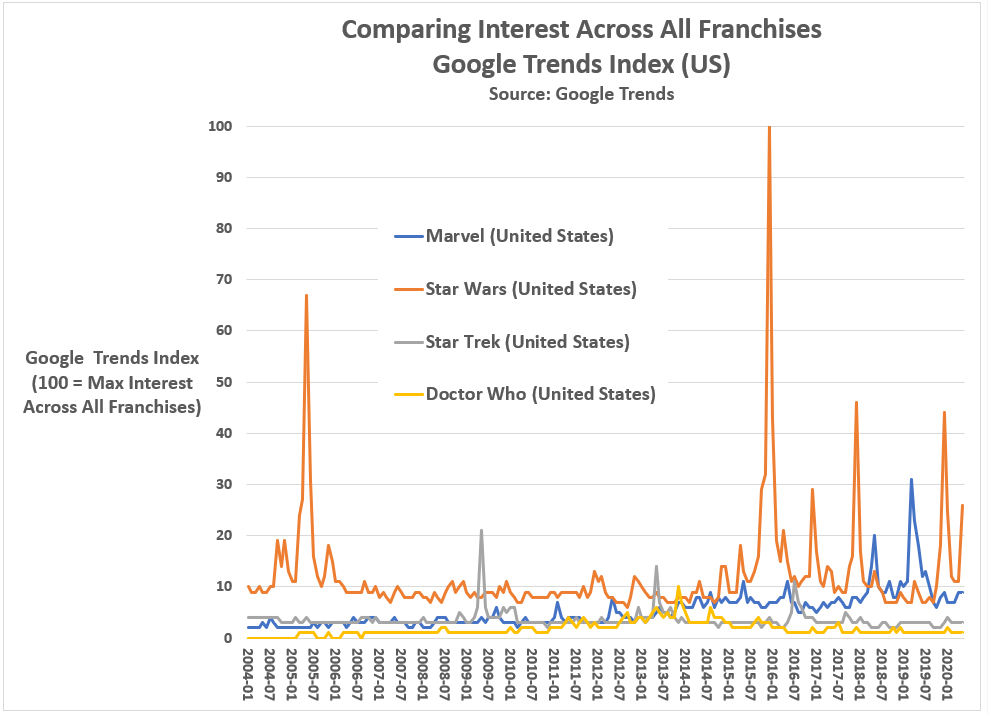
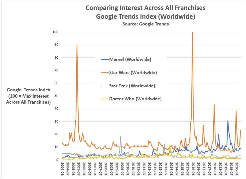
And it is the data service I recently used to plot public interest in the following Sci-Fi franchises since 2004: Star Wars, Star Trek, Doctor Who, and the Marvel Comics (which I include for comparison purposes).
The results are not good news. All three of these science fiction franchises — Star Wars, Star Trek, and Doctor Who — are dying from self-inflicted wounds.
But don’t take my word for it. Look at the Google Trends data on the search habits of people worldwide regarding these franchises.
It’s not a happy story.
Google Trends for Star Wars, Star Trek, and Doctor Who (as well as Marvel Comics)
Let us start by describing what a healthy movie franchise looks like based on Google search behaviors, and the best comparison is the Marvel Comics Universe (MCU).
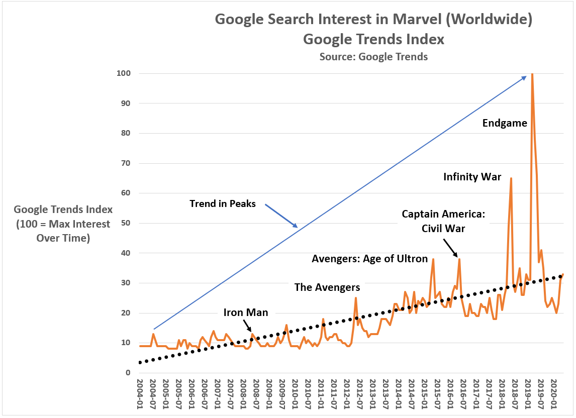
Figure 1 shows worldwide Google search behavior since 2004 on the word ‘Marvel’ using the Google Trends Index which ranges from 0 to 100, where 100 equals the monthly maximum across the analytic time period (Jan 2004 to May 2020). For example, searches on ‘Marvel’ reached a 16-year maximum in April 2019, the month the movie Avengers: Endgame was released. The next highest month for searches on “Marvel” was April 2018, the month Avengers: Infinity War was released.
Figure 1: Google search interest in Marvel Comics (Worldwide, 2004 to present)
Graphic by Kent R. Kroeger (NuQum.com)
The key pattern in worldwide searches on “Marvel” is that they spike with each subsequent MCU movie release, starting with Iron Man in May 2008 through Avengers: Endgame. More importantly, and what distinguishes the MCU as a successful movie franchise, is that with each new MCU movie release, the level of “Marvel” searches increased over the previous movie release. The “peaks” in public interest for “Marvel” rise monotonically over time (i.e., never decreases).
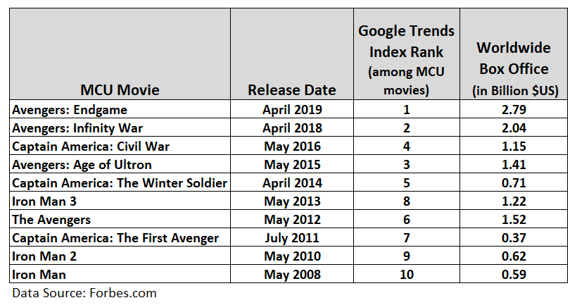
In other words, Disney’s MCU franchise built fan interest and momentum over the course of MCU’s Phase 1 movie catalogue. That is what a successful movie franchise looks like; and while Figure 1 only tracks Google search behavior, this measure correlates strongly with the MCU movie worldwide box office receipts, as displayed in Figure 2.
Figure 2: Relationship between MCU Worldwide Box Office and Google Searches (Jan 2004 to May 2020)
Just in the core MCU movies alone, the MCU has grossed over $12 billion $US, unadjusted for inflation) for Disney/Marvel. Adding in the other MCU origin story movies and their sequels (e.g., Black Panther, Thor, Thor: The Dark World), the MCU catalogue has grossed over $22 billion worldwide. Compare that to the Star Wars movies which have grossed a healthy, but not MCU-level, $10.3 billion worldwide. And Star Wars isn’t even number two all-time — that honor belongs to the 12 Harry Potter movies at $9.2 billion in worldwide movie receipts.
STAR WARS
The MCU is the gold standard for movie franchises, an honor formally belonging to George Lucas’ Star Wars franchise.
To someone like myself, who in June 1977 caught pneumonia standing overnight in line at the Strand Theater so I could be among the first of my friends to see Star Wars (now titled Star Wars: A New Hope), relinquishing the box office title to the MCU has not been easy. But, as The Killers song says, “This is the world we live in.”
Further distressing for Star Wars fanslike myself has been the letdown of the Kennedy-produced Disney trilogy movies. There was so much hope among fans in December 2015 just before the release of Star Wars: The Force Awakens (helmed by J. J. Abrams).
The MCU was going to get some real competition from a new Star Wars saga (granted, both franchises are controlled by Disney, rendering a large element of the competition basically meaningless).
Figure 3 shows worldwide Google search interest for the term ‘Star Wars’ from 2004 to May 2020. The high point was December 2015 — which was a 9 percent increase over public interest during the month Star Wars: Revenge of the Sith was released (May 2005).
However, instead of generating interest in the Disney trilogy over time, Disney deflated it with The Force Awakens. Compared to the interest prior to The Force Awakens, interest in ‘Star Wars’ fell 76 percent leading into The Last Jedi and 86 percent prior to the release of The Rise of Skywalker.
Figure 3: Google search interest in Star Wars (Worldwide, 2004 to present)
Graphic by Kent R. Kroeger (NuQum.com)
Wait, wasn’t it The Last Jedi that disappointed fans, not Force Awakens?
No.
The Google search data is uncompromising and clear: The Force Awakens killed public interest in Star Wars, not The Last Jedi. If The Last Jedi had been the culprit, the public interest spike in Star Wars leading into The Last Jedi would have been comparable to The Force Awakens. It was not even close.
Killing Han Solo as ignominiously as J. J. Abrams did and then marginalizing the Star Wars saga’s most important character — Luke Skywalker — was destined to anger Star Wars’ core audience. Why would Disney think otherwise?
Granted, Carrie Fisher’s death in December 2016 and the Last Jedi script leaks may have contributed to some softening in public interest in The Last Jedi, but those events are not comparable to the impact of a Star Wars movie itself.
The Force Awakens did the most damage to the Star Wars franchise.
As for the other two science fiction franchises I investigated in Google Trends — Star Trek and Doctor Who — they have witnessed similar declines in public interest.
In contrast to Star Wars and the MCU, I’ve limited my Google Trends analysis for Star Trek to the U.S and for Doctor Who to the U.K. as their fan bases have been mostly concentrated in the domestic markets of their origin.
We’ll start with Star Trek…
STAR TREK
Between 2004 and today, Google search interest in Star Trek peaked when the J. J. Abrams-helmed reboot of Star Trek debuted in May 2009 (see Figure 4). But, since the reboot, interest in Star Trek has been in a consistent decline — 38 percent lower for 2013’s Star Trek: Into Darkness and 63 percent lower for 2016’s Star Trek: Beyond.
Figure 4: Google search interest in Star Trek (US, 2004 to present)
Graphic by Kent R. Kroeger (NuQum.com)
If you include the two CBS-produced Star Trek TV shows — Discovery and Picard — the downward “trend in peaks” for Star Trek has been steeper than for Star Wars, going from 100 on the Google Trends Index for the Star Trek reboot movie down to 19 for Picard.
Though the Google Trends data tells us little about why interest in Star Trek has declined, Star Trek fans on social media, especially those partial to the Prime timeline (i.e., The Original Series and The Next Generation) over the Kelvin timeline (started by J. J. Abrams’ Star Trek), are not reluctant to share their theories:
These complaints aren’t proof of anything but they capture the general sentiment I’ve seen and heard elsewhere across social media from the most vocal elements of the Star Trek fan base.
That overt sexist, racist and homophobic tirades are occasionally mixed in among otherwise cogent criticisms of the recent Star Trek projects should not detract from the more thoughtful Star Trek fans. It is an unfortunate feature of our social media ecosystem, but hardly the dominate one.
DOCTOR WHO
The last science fiction franchise I investigated was U.K.’s Doctor Who, a long-running TV series that ran from 1963 to 1989 in its first iteration, and then re-started in 2005.
For those unfamiliar, Doctor Who chronicles a time lord called “the Doctor” who travels through time in a space craft called the TARDIS — which looks like a blue British police box. One unique feature of the show is that the lead actor playing “the Doctor” changes whenever the time lord undergoes a “regeneration.” The result is that there have been 13 “Doctors” since the series started, 12 having been played by men, and the most recent being played by a woman, Jodi Whittaker.
Its hard to generalize every Doctor Who episode down to one sentence, but it might go something like this: “The Doctor,” a time lord, is accompanied by one or more human companions as they combat various alien foes in an effort to help people in need or to save past, present or future civilizations.
While I would characterize most Doctor Who shows as more lighthearted and cheeky than serious, some of the best episodes, particularly those when “the Doctor” says goodbye to a companion (or vice versa), can be profound and genuinely heart-breaking.
In other words, the show is very British: Smart. Sharply-written. Well-acted. And moves fluidly between humor and drama.
It is my favorite science fiction franchise. But I am fearful the show will not survive under its current writer (showrunner) Chris Chibnall.
We are fortunate that Google Trends goes back before 2005, the year of the Doctor Who reboot, so we can see the initial UK interest in the Doctor Who reboot (starring the underappreciated 9th Doctor Christopher Eccleston) through to the 13th Doctor (played by Whittaker).
Figure 5 reveals a number of interesting features of Doctor Who interest levels in the UK since 2004. First, interest in Doctor Who leading into the March 2005 reboot was relatively high (Google Trends Index =48) and grew with each new season’s final episode (i.e., “a rising trend in peaks”), climaxing in June 2008 with the Russell T. Davies-penned episode, “Journey’s End” — an episode marking final regular appearance of the Doctor’s very popular companion Donna Noble.
Figure 5: Google search interest in Doctor Who (UK, 2004 to present)
Graphic by Kent R. Kroeger (NuQum.com)
The revival of Doctor Who under Davies’ creative leadership is a textbook example of how to (re)build a science fiction franchise — superior writing, extremely likable actors, and respect for the long time Doctor Who fans who generated the initial excitement prior to the March 2005 reboot. “Know and respect your audience.”
That doesn’t mean a franchise can’t innovate and even violate previously established “canon,” as Davies did when the 10th Doctor short-circuited a regeneration process in order to create a clone of himself.
The problem for the Doctor Who franchise appears to have started following the transition from the 11th Doctor (played by Matt Smith) to the 12th Doctor (played by Peter Capaldi). During Matt Smith’s tenure as the Doctor, Google search interest peaked in November 2013 with the episode “The Day of the Doctor” in which David Tennant, reprising his role as the 10th Doctor, appeared along with the 11th Doctor.
In terms of public interest in the UK, the premiere of the first female “Doctor” (Whittaker) exceeded that of the March 2005 reboot, achieving a Google Trends Index score of 58. Unfortunately, its been downhill from there for Doctor Who and showrunner Chibnall. The last season ending special (December 2019) achieved a Google Trends Index score of 30, the lowest of any season ending Doctor Who episode.
What happened?
I think the best explanations of Doctor Who’s current death spiral comes from those defending the Chibnall-era shows:
I suspect “Steve” is not a Doctor Who fan. Prior to Chibnall, Doctor Who was not political, even as its core theme has always been the defense of the defenseless and dispossessed. That is not a “liberal” agenda, even if “liberals” think it is.
Pre-Chibnall Doctor Who avoided politics for the most part — and in the era of hyper-partisan, that doesn’t seem like a bad idea if you want to build a large audience. The MCU would not be as popular as it is had it decided to use its movie franchise to preach about border walls, privilege and the patriarchy. [Yes, I know Tony Stark, aka Iron Man, supported an Earth shield to protect us from hostile aliens and Captain America didn’t. That issue occupied maybe 10 minutes of a 22-movie franchise.]
The extent to which hot-button issues like racism or sexism were ever addressed on pre-Chibnall Doctor Who, it was done irregularly, and when addressed, done well. That is in stark contrast to the kitschy, two-dimensional way Chibnall handled the 13th Doctor’s Rosa Parks episode (“Rosa,” airing October 2018). If you want to see a superior time treatment of Rosa Parks’ historical significance by a science fiction show, watch the Quantum Leap episode “The Color of Truth — August 8, 1955.” [And I’m not a fan of Quantum Leap.]
‘Wokeness’ seems to inspire bad writing and I wonder why. Perhaps because, nowadays, it is too easy get such scripts approved or through the creative process without significant editing? I do not know.
All I know is that in the case of the three science fiction franchises I value the most — Star Wars, Star Trek, and Doctor Who — ‘wokeness’ is turning off their core audiences in droves. And, no, these franchise defectors are not all Donald Trump supporters.
Know and respect your audience
Jeff Bewkes didn’t invent the ‘know-your-audience’ principle. Its pretty rudimentary to any understanding of business marketing. But sometimes the easy lessons are the hardest to internalize and sustain. Our lives all tend towards complication, not simplicity.
And, in taking over the Star Wars franchise, Disney and Kathleen Kennedy committed the worst blunder of all: they alienated their core audience with a story line that was never going to attract a new audience. They killed Han Solo (who was a shell of his old-self) in the least heroic way possible — as a depressed, divorced dad. They took the franchise’s protagonist — Luke Skywalker, the courageous hero of the whole Lucas-inspired saga — and turned him into a feckless nag with not even the courage to help his sister Leia fight off the new looming menace, the First Order.
And they were going to make Leia, not Luke, the true hero of the Skywalker saga? When (God rest her soul) Carrie Fisher was is no condition to carry the Star Wars franchise in this new direction. Kathleen Kennedy and J. J. Abrams had to know that.
Disney seemed to be begging long time Star Wars fans not to show up for the new trilogy.
A friend recently described first generation Star Wars fans as “50- and 60-something divorced men who say ‘got’ a lot and still call flight attendants ‘stewardesses.’ Kennedy was never going to make a movie for them.
The trouble with that thinking is its inaccuracy. Star Wars fans, like science fiction fans, are misunderstood. They are mainstream entertainment consumers — a multi-billion dollar consumer segment split evenly between men and women and drawn from all age, income and racial/ethnic categories.
An entirely new generation of fans, whose first contact with Star Wars was the animated series Star Wars: The Clone Wars or the Lucas-produced prequel movies, now attend fan conventions in near equal numbers to the first generation fans.
In a 2014 survey of science fiction convention attendees, a subset of science fiction movie fans, the gender breakdown overall was 54 percent male to 46 percent female, but almost even for fans age 30 or under.
Science fiction is mainstream, which is why I understand Kathleen Kennedy and Leslye Headland’s belief that they can create a successful female-centric Star Wars series. There is a potential audience for such a show.
I just don’t believe Kennedy, Headland, or corporate Disney, based on how they butchered the Skywalker saga, have a bloody clue how to do it.
But I also believe Disney will find a way to revive their $4 billion dollar initial investment in Star Wars. Disney always finds a way. Disney marketing since Steamboat Willie has perfected the art of bludgeoning us to the point where we can’t get enough of Disney’s homogenized, entertainment caboodle.
Unfortunately, the other two Sci-Fi franchises — Star Trek and Doctor Who — are dead men walking.
They had great runs, but as George Harrison once sang, all things must pass.
My personal view on why these Sci-Fi franchises are teetering
My first science fiction loves were the British series Doctor Who (introduced to me when Tom Baker played the fourth doctor in the mid-70s and early-80s) and Star Trek (The Original Series).
If things look bleak for Star Wars (though I believe Star Wars will rise again, despite the mediocrity dominating the Disney output so far), the prospects for the Star Trek and Doctor Who franchises are even grimmer.
In both cases, TV ratings for their newest iterations are at or near historic lows, leading some long time fans to also point fingers at the showrunners and executive producers of these franchises for forcing their political agendas into show scripts, instead of good, solid science fiction stories.
In the case of Doctor Who, the thirteenth and latest doctor, Jodi Whittaker, is the first female doctor, which was largely met with positive reactions from fans. Not sitting well with many Doctor Who fans (including myself), however, is the writing that has dominated Chris Chibnall’s two-year tenure as the showrunner (and he’s slated to return for a third). Where once Doctor Who episodes emphasized the science in science fiction (often dealing with time travel), the Chibnall produced shows descend into didactic, high school civics class-level moralizing.
Star Trek has suffered a similar fate under the leadership of CBS TV Studio’s Alex Kurtzman. Where Star Trek creator Gene Roddenberry evoked an optimistic, inclusive image of our future, the newest Star Trek properties paint a bleak future. If the Road Warrior and Logan had a baby, it would be Star Trek: Picard. [That isn’t a fair characterization. Road Warrior and Logan are two of my favorite dystopian-genre movies of all time. Those are great movies. Picard is not a great TV show — just a dispiriting one.]
And then there is the colossus of science fiction movie franchises — Star Wars.
George Lucas changed fundamentally what movies are made and how they are made. Hence, the franchise’s possible demise may do the same.
When a movie like The Rise of Skywalker can cost up to $300 million to make and still be considered a “failure” after grossing over $1.3 billion worldwide, you know there is a structural problem in Hollywood.
I also believe that computer-generated-imagery (CGI) has hurt science fiction movie making as much as helped. I think that’s why I’ve always drifted towards TV shows like Star Trek (The Original Series) and Doctor Who. They are story and character-driven, not special effect-driven.
I suppose its my age that causes this feeling, but I’ve seen my son and his teenage friends watch these movies and, more often than not, they look bored.
Do you know what they like? They like funny characters and funny dialogue. They good writing reinforced by good acting and editing.
I thought Guardians of the Galaxy Vol. 2 had some of the most amazing CGI I have ever seen. The movie’s nemesis, Ego, played by Kurt Russell, lives on a planet that in the IMAX format literally took my breath away.
To my son and his friends, those amazing graphics in Guardians were white noise. When I ask them what they thought of the CGI and special effects, I get answers like: “They were OK.” “Good.” “Cool.” “The Last Jedi was better.”
When they talk among themselves about movies like Guardians, they talk about the characters. The funny lines. Even the CGI-heavy battle scenes are remembered, not by the explosions, but through references to characters’ one-liners (such as Guardians’ Yondu: “I’m Mary Poppins y’all!”)
They crack up laughing every time Drax calls Mantis ugly (if you are not familiar with Guardians, Mantis happens to be very attractive).
Fun dialogue. Good actors. Decent storytelling. Swift pacing. Those are the core elements that form the secret sauce for building lasting science fiction franchises. Star Wars had it. Star Trek had it. And Doctor Who had it.
Have you watched any of those franchises recently?
Here is my one-minute summary: Women are, by nature, good (see the Disney Star Wars trilogy). Some men are good, but stupid (see Solo, Picard or any Doctor Who episode from the 13th doctor’s first season). The other men are bad and also stupid (see any Doctor Who episode from the 13th doctor’s second season). Bad women are bad because of bad men (see Birds of Prey). And everyone is sexist, racist and privileged…except women (watch any hour of MSNBC).
That is why these franchises are dying. Even women don’t want to watch that patronizing crap. People are numbed by the incessant preaching and scolding that defines the most recent Doctor Who episodes. They are depressed by the dystopian future offered by shows like Star Trek: Discovery and Star Trek: Picard.
Science fiction movies used to be fun. And even when they were serious or scary (e.g., Aliens), they were still fun.
Not any more.
If Disney wants a successful female-centric science fiction franchise, they should create a new one. Star Trek creator Gene Roddenberry didn’t want to make The NewAdventures of Buck Rogersfor a reason: Buck Rogers wasn’t his idea. Instead, he created a new franchise — Star Trek — and changed science fiction entertainment forever. George Lucas and Star Wars even more so. And no science fiction franchise will be as smart as Doctor Who. All three are original ideas created by creative people.
But if the data I’ve presented here are telling, these franchises are done.
I will miss them.
K.R.K.
Requests for data used in this article can be sent to: kroeger98@yahoo.com
Final note: I apologize for not answering all constructive comments and requests sent to me. There are just too many, but I will continue to try.
By Kent R. Kroeger (Source: NuQum.com, May 5, 2020)
Note: In this article I use the terms ‘lockdown’ and ‘stay-at-home’ orders interchangeably.
There is a lot of partisan noise in the news coverage of the coronavirus (COVID-19) pandemic.
“This isn’t about science, this is about control,” Fox News host Laura Ingraham recently told her audience as she questioned the motives of those who believe the U.S. must continue to lockdown until the COVID-19 pandemic is more under control.
Meanwhile, on MSNBC, Chris Hayes was calling the hosts at Fox News “coronavirus truthers” for giving airtime to two California urgent care doctors who believe we no longer need statewide lockdowns, suggesting the cable new network’s coordinated push to “get Americans back to work” was not based on science but on ideology and blind greed.
The “lockdown” is the ideological pivot point for the current U.S. political discourse on the COVID-19 pandemic.
In dispute are three fundamental issues:
(1) What is the actual morbidity (infection) rate of the coronavirus (SARS-CoV-2)?
(2) What is the actual mortality rate of the COVID-19?
(3) How effective have the statewide locksdowns been in containing and suppressing COVID-19?
Multiple large-scale studies based on probability samples will be needed to answer these questions definitively. Suggestions that the science is already established is absurd.
Only four days ago, New York Governor Andrew Cuomo announced results from a Staten Island, New York SARS-CoV-2 antibody study that found 20 percent of residents had been exposed to the virus. For the State of New York, overall, Cuomo said 12 percent had tested positive for the coronavirus.
If the New York results can be extrapolated to the entire U.S. population (it can’t, but for arguments sake), that would mean between 39 and 65 million Americans have had the virus. As of 3 May, around 70,000 Americans have died from COVID-19, meaning a rough estimate of the mortality rate of COVID-19 is somewhere between 0.1 and 0.2 percent — a range that covers the mortality rate for an average flu season and a really, really bad flu season.
Fox News and those two California doctors should have received an apology from Chris Hayes by now.
But the reality is, this New York State and Staten Island studies are just the beginning of the research that needs to be conducted over the next year or two before we know the actual morbidity and mortality rates of COVID-19.
As we are still in the middle of this health crisis, any definitive proclamations one way or the other are generally dubious…including mine.
Have Statewide Lockdowns Helped?
It is not too early to start assessing the effectiveness of statewide “stay-at-home” orders and economic lockdowns, as whether will end them in a same and timely fashion will depend on some quantitative level of knowledge about their utility.
A superficial look at the data suggests the lockdowns are not helping much (Note: This is not my opinion on lockdowns. I am doing this data walk in order to move towards a more evidence-based opinion)
While the states hit the hardest by the COVID-19 pandemic (on a per capita basis) are mostly Democrat-dominated states that decided relatively early in the crisis to issue statewide lockdown (“Stay-at-Home”) orders, states that adopted less stringent lockdown policies (Arkansas, Iowa, South Dakota, Nebraska, North Dakota, Utah and Wyoming) appear to be doing better (see Figure 1).
Figure 1. The relative number of COVID-19 cases and deaths by U.S. State (through 3 May)
Of the 10 states (plus District of Columbia) with the highest relative number of COVID-19 cases, only two were won by Donald Trump in 2016 (Louisiana and Michigan). Conversely, among the 10 states with the lowest relative number of cases, seven were won by Trump (Montana, Alaska, West Virginia, Wyoming, Oklahoma, Texas and Kentucky).
States won by Trump in 2016 average 1,885 COVID-19 cases per 1 million people, whereas states won by Hillary Clinton average 4,818 per 1 million people. Though this difference is significant using a two-sample difference of means t-test (t-statistic = 3.47, p = .001, std. error = 846), in no way can we conclude that Trump (“red”) states are doing better than Clinton (“blue”) states.
Furthermore, the real analytic question is about the effectiveness of “Stay-at-Home” orders, which some red states did implement. In fact, the difference in the relative number of cases between lockdown (“Stay-at-Home”) states and non-lockdown states is not statistically significant; in part, because we have so few instances of non-lockdown states (n = 7).
Also complicating our ability to discern the effectiveness of lockdowns is the variation in lockdown policies across states. Indeed, even a few non-lockdown states (such as Iowa) have implemented elements of a lockdown (such as social distancing recommendations, closing bars and restaurants and forbidding large group gatherings). Perhaps those policies, not a full lockdown, are sufficient to contain the spread of COVID-19?
We must also consider that the state-level differences in Figure 1 could be driven by factors unrelated to lockdowns or other strict suppression policies (e.g., travel restrictions within and between states). For example, previously I’ve argued population density is the dominant variable in explaining state-level differences in the relative number of COVID-19 cases, not mitigation and suppression policies. Trump states are doing better in containing the COVID-19 spread in part due to those states being sparsely populated. At a minimum, we need to control for that before declaring which states are doing a better job than others.
If we further divide lockdown states into two categories — those that locked down within 20 days of their first confirmed COVID-19 case and those that took more than 20 days — we might get a clearer picture of the impact of lockdowns.
Figure 2 shows the three lockdown categories across key measures of the coronavirus. With the exception of testing, there is a linear relationship between the three lockdown categories: Early lockdown states are the highest, late lockdown states are in the middle, and non-lockdown states are lowest on key measures such as population density, relative number of cases and deaths, and changes in cases and deaths since 1 April.
Figure 2: Lockdown Categories by Key Measures (as of 3 May)
Early lockdown states are much more densely populated (690 people per sq. mile), have done more testing (25,290 per 1 million people), have more confirmed cases (4,012 per 1 million people), have more COVID-19-related fatalities (230 per 1 million people), and have experienced larger changes in cases (3,306 per 1 million) and fatalities (212 per 1 million) since 1 April.
If Figures 1 and 2 were all you knew about state lockdowns, it would be hard to declare them successful. In fact, similar “topline” data is repeatedly used in the conservative media to reinforce the narrative that the U.S. should return to work sooner rather than later.
Are they wrong?
I believe as a blanket statement — Lockdowns are not working or necessary any more— they are partially wrong. However, to support my opinion, we need to make sure our state comparisons are made on a level playing field.
Can we compare COVID-19 case and death numbers between states?
The definitional comparability problem between states in measuring COVID-19 cases and deaths is highlighted by the Centers for Disease Control (CDC) in its own tabulations and research on the virus (SARS-CoV-2) and its associated disease (COVID-19). In the CDC’s latest report on COVID-19, here is the language they use to explain why their numbers may be different from state-reported numbers:
Provisional death counts in this (CDC) report will not match counts in other sources, such as media reports or numbers from county health departments. Death data, once received and processed by National Center for Health Statistics (NCHS), are tabulated by the state or jurisdiction in which the death occurred. Death counts are not tabulated by the decedent’s state of residence. COVID-19 deaths may also be classified or defined differently in various reporting and surveillance systems. Death counts in this report include laboratory confirmed COVID-19 deaths and clinically confirmed COVID-19 deaths. This includes deaths where COVID-19 is listed as a “presumed” or “probable” cause. Some local and state health departments only report laboratory-confirmed COVID-19 deaths. This may partly account for differences between NCHS reported death counts and death counts reported in other sources.
Worse yet, these case and fatality definitions can vary depending on the state where the victim died, according to the CDC.
This is a serious problem if the goal is to compare state-level mitigation and suppression policies. Without detailed case-level data on COVID-19, researchers are at a distinct disadvantage.
Adding to this problem is an even bigger problem, in my opinion. There is significant variation in how diligently states are trying to measure the spread of the coronavirus within their state. As of 3 May, Rhode Island has conducted 67,896 per 1 million people, and New York 50,680 per 1 million. Contrast those numbers to Arizona and South Carolina where, respectively, only 11,144 and 12,467 tests per 1 million have been conducted so far.
Does this mean New York or Rhode Island’s estimate of the morbidity rates (percent of residents that have had the virus) in their respective states are more accurate than Arizona and South Carolina? Not necessarily. It will depend on a number of factors related to the quality of a state’s effort to assess the spread of the coronavirus (see Figure 3), including: (1) COVID-19 test availability, (2) training in using the test, (3) test accuracy, and (4) and selection bias (perhaps the most serious problem if the goal is to generate an unbiased estimate of a state’s morbidity rate). We must also recognize that all of these factors are moving together in time. What was true on Tuesday may not be as true on Friday.
Figure 3: A Model for Assessing the Quality of a State’s COVID-19 Measurement Effort
Graphic by Kent R. Kroeger
If a state is only testing health care workers and citizens with severe symptoms (as New Jersey was doing initially), their testing will miss a significant percentage of people who are asymptomatic but still contagious. That is textbook selection bias. Only some form of probability sampling will reliably measure the prevalence of this group or the overall morbidity rate in a geographic location. Some states (hopefully most) are doing that already (New York is, for example). And I am certainly not the first person to call for more random sampling in measuring the COVID-19 pandemic (others doing the same are here, here and here).
Ironically, its the supposedly anti-science Republicans in North Carolina that have pushed for probability sample testing, not the Democrats. Why? The Democrats fear random testing will reveal their fundamental rational for imposing state-level lockdowns — a high COVID-19 mortality rate relative to the common flu — likely won’t be substantiated by the science.
The problem too is that we have a lazy, politically-biased national journalism corps in this country that would rather rely on the deceptive case numbers and case fatality rates pumped out by Johns Hopkins University (JHU-CSSE) and the WHO than insist on scientifically accurate numbers, such as the estimates recently released by a Stanford University study in Santa Clara County, California, showing a significantly higher COVID-19 prevalence rate than the official numbers released by the county and state governments.
“After adjusting for population and test performance characteristics, we estimate that the seroprevalence of antibodies to SARS-CoV-2 in Santa Clara County is between 2.49% and 4.16%, with uncertainty bounds ranging from 1.80% (lower uncertainty bound of the lowest estimate), up to 5.70% (upper uncertainty bound of the highest estimate),” the study said. Those estimates translate to between 48,000 and 81,000 Santa Clara County residents having had the coronavirus (SARS-CoV-2).
At the time of the study’s field closure, April 1st, the State of California and Santa Clara County were reporting a case prevalence of just 956 in the county. The implication of this difference from the Stanford results is profound: If the Stanford study is correct, the mortality rate for COVID-19 is not nearly as high as being implied when the news media reports the Johns Hopkins University case and fatality numbers. If one of the fundamental arguments behind imposing statewide lockdowns is the purportedly high mortality rate for COVID-19 — as high as six percent if using only confirmed cases (as reported by JHU-CSSE) in the denominator — any evidence that pushes that number closer to 0.1 percent (the estimated mortality rate for the common flu) is heresy.
We don’t need to use the numbers offered by the two California doctors to argue the media-reported COVID-19 mortality rates may be seriously inflated — we have the Stanford study. But is the Stanford University necessarily right? Of course not, but at least that study’s team documented their methodology, giving readers (and the news media) something to critique.
An even larger scientific study in China found a higher fatality rate for COVID-19 than the Stanford study —2.3 percent overall and as high as 14.8 percent for people aged 80 and older. Across other age groups, the fatality rate was found to be as follows:
Aged 70 to 79 = 8.0%
Aged 60 to 69 = 3.6%
Aged 50 to 59 = 1.3%
Aged 40 to 49 = 0.4%
Aged 0 to 39 = 0.2%
Let me now reveal my bias regarding statewide lockdown policies: If the Stanford study is correct and the COVID-19 fatality rate is similar to the common flu, it is time to end the statewide lockdowns (while maintaining strict social distancing recommendations). However, if the Chinese study is more accurate, as a man in his mid-50s, a 1.3 percent chance of dying from COVID-19 is too hot for my oatmeal — I’m staying home until there is a vaccine or reliable treatment (and anyone my age or older should do the same).
Which is why the national news media’s attempt to suppress the important scientific debate going on right now about the mortality rate of COVID-19 is reckless and counterproductive.
We may be huddling in our basements for no reason and to little effect? Is the damage being done to the world economy worth being so overly cautious? I would say, ‘No,’ particularly if people are losing their health care coverage or being saddled with large medical bills due to the pandemic.
Do you want to know a way to kill millions of Americans even faster than COVID-19? Take away their health care coverage.
Enough news media bashing. It has become too easy.
The point of this article is to make a preliminary assessment of the effectiveness of statewide lockdowns in controlling the spread and lethality of COVID-19.
Here is my take on the data (as of 3 May 2020)…
After controlling for population density (and other factors), what can we say about statewide lockdowns to control COVID-19?
My answer is not a satisfying one: it is not clear the states with lockdowns are doing better containing the effects of the coronavirus than states without full lockdowns.
One caveat to this finding is important: the COVID-19 pandemic is not over. Many non-lockdown states like Iowa and Nebraska still have not experienced a decisive peak in new daily cases. But also, keep in mind, these state-reported cases and deaths numbers are of dubious quality (see discussion above). The fact that Iowa Governor Kim Reynolds found the Utah-based company to handle Iowa’s COVID-19 testing program through D-list Hollywood celebrity and Iowa-native Ashton Kutcher should tell you all you need to know about how seriously I take Iowa’s measurement program.
[Sidebar:You would think Iowans would have learned their lessons from the Iowa Caucuses vote counting disaster last February when the Iowa Democratic Party chose another Utah-based tech company to count the votes. Are these people morons? What happened to Iowa’s once premiere public education system? That’s a debate for another article — and a heads-up, my conclusions are not kind to Iowa’s political leadership.]
Another caveat is that this is an aggregate (state-level) data analysis. It does not inform us directly about individual-level relationships. So, when you read below that the relative number of tests, indirectly, has a positive relationship to the relative number of COVID-19 deaths, this does not mean states should stop testing to reduce the number of deaths! The result means in the aggregate that states with the most relative testing are also experiencing higher relative fatality rates for COVID-19, all else equal. Correlation is not causation.
A Path Model for COVID-19 Cases and Deaths for U.S. States & D.C.
Using the JHU-CSSE data at the state-level through 3 May (see, I’m no better than those lazy journalists), I estimated a linear path model for explaining state-level COVID-19 confirmed cases and deaths.
To mitigate the noise and bias inherent in the JHU-CSSE fatality numbers, I calculate the fatality incidence as a function of the state’s total population (i.e., deaths per 1 million people). That is not the mortality rate, but its denominator is a more reliable government statistic than the confirmed number of cases.
The variables tested for their relationship to the relative number of COVID-19 deaths (natural log transformed) included:
A state’s population density (log transformed) (Variable name: LN_P)
The cumulative number of tests conducted by the state per 1 million people (natural log transformed) (Variable name: LN_T)
The number of confirmed COVID-19 cases per 1M people (natural log transformed) (Variable name: LN_C)
Whether a state imposed travel restrictions between and/or within their state (1 = Yes, 0 = No) (Variable name: TRA)
Whether a state imposed a statewide (“stay-at-home”) lockdown policy (1 = Yes, 0 = No) (Variable name: STA)
Governor’s political party (1 = Democrat, 0 = Republican…not a value judgment on my part) (Variable name: PAR)
I also tested variables such as the state’s percentage of vote for Trump in 2016 (sorry, but this confirms to me that the state differences seen in Figure 1 above are not substantively meaningful), GDP per capita, number of staffed beds per 1 million people, percent of state’s economy related to China, and percent of population aged 65 and older. None proved statistically significant.
And here are the results…
First, with only seven states not imposing a full statewide lockdown, it will require sizable predicted differences in relative confirmed case and death rates for the lockdown variable’s two levels to be statistically significant, regardless of whether the model is estimated in a Bayesian or Frequentist context.
The linear path model in Figure 4 was estimated using JASP, a free statistical analysis package (with Bayesian estimation for most analytic options) made available by the University of Amsterdam. The model’s diagnostic output, including standard errors, is in the Appendix below.
Figure 4: Path model standardized parameter estimates and residual covariances (data through 3 May 2020)
Interpretation of Results
Lockdowns versus No Lockdowns
Let us plunge right into the variable of most interest: statewide lockdowns (variable: STA). Its direct relationship to the relative number of COVID-19 deaths is positive and significant (β = 0.90, p < .001), while its direct relationship to the relative number of confirmed cases is negative and significant at an α < .10 level (β = -0.48, p = 0.088).
Have statewide lockdowns led to more COVID-19 deaths? No, not likely. There are anecdotal cases where some victims were isolated in their homes and did not get the urgent care needed to save the lives. One of inquiry in this regard is an increased number of younger and middle-aged victims who died from strokes related to COVID-19, some dying in their homes before they could get needed care. In theory, a statewide lockdown could increase those types of fatalities, but not on the level implied by the model here. But, again, this is an aggregate analysis and we cannot make individual-level inferences.
Instead, my interpretation is that unmeasured factors related to both lockdowns and COVID-19 deaths are at play. Although it is possible that states with lockdowns are inflating their COVID-19 numbers and/or non-lockdown states are under-reporting, I think it is far more likely that some unmeasured variable (my guess is ‘time’) is leading to much higher relative fatality rates in lockdown states compared to non-lockdown states. As all of the non-lockdown states are in the interior of the country, they have been among the last to experience their first cases and deaths compared to the coastal lockdown states.
Still, we cannot rule out the possibility that some states are systematically over-reporting or under-reporting their COVID-19 numbers. I offer the previous discussion about New Jersey including “probable” COVID-19 cases in their nursing home fatality counts as a possible avenue for this type of systemic measurement bias (fraud?). I also have anecdotal evidence from talking to friends back in Midwest about some of their family, friends, and neighbors “toughing it out” and not getting tested despite showing COVID-19-type symptoms. That is a Northern European cultural trait with which I have personal experience.
The more interesting result in our path model is that lockdown states, all else equal, are experiencing lower confirmed case rates per 1 million people than non-lockdown states. While lockdown variable is only marginally significant, that could be for a number of issues unrelated to the actual importance of lockdown policies suppressing COVID-19 morbidity rates.
The confirmed COVID-19 cases model certainly has specification error, though the model residuals cases appear random and the model fit at 69 percent is not too bad (see Appendix).
Over time, the observed differences in relative COVID-19 cases have narrowed between lockdown versus non-lockdown states. When this pandemic is over, we may in fact see much higher relative numbers in the non-lockdown states than we see now. That may, in turn, lead to a stronger (negative) statistical relationship between the lockdown variable and COVID-19 case rates.
Other Factors
When looking at total effects (direct + indirect effects), a state’s population density (+ relationship), relative number of administered tests (+), the presence of travel restriction policies at some point during the pandemic (-), and the presence of a Democratic governor are stronger correlates with the relative number of COVID-19 fatalities (+) than is a state’s lockdown policy. As I’ve said, that could change over time as the pandemic progresses into later stages — the question is: How much?
Residual Analysis
One of the benefits of estimating a linear path model is that we can look at the residuals for each state to see which ones are doing better than expected on COVID-19 case and fatality rates and, of course, which ones are doing worse.
According to my analysis, these states highlighted in green in Figure 5 are experiencing a lower rate of COVID-19 cases (per 1 million people) than expected (the presumption is that whatever these states have done, it is working better than other states). The states highlighted in red are experiencing a higher rate of COVID-19 cases (per 1 million) than expected:
Figure 5: Actual versus Expected COVID-19 Confirmed Case Rates (as of 3 May 2020)
Note in Figure 5 that Arkansas is a non-lockdown state, while Florida implemented its lockdown relatively late in their outbreak (29 days after the first confirmed case). The average lockdown state implemented their policy 21 days after the first confirmed case.
Figure 6 shows a similar table for actual versus predicted COVID-19 fatalities per 1 million people.
Figure 6: Actual versus Expected COVID-19 Fatality Rates (as of 3 May 2020)
Non-lockdown state Arkansas now finds itself on the under-performing (red highlight) list with 25 actual COVID-19 fatalities per 1 million people versus an expected 15 fatalities per 1 million people. On the other hand, non-lockdown state Utah is on good side of the ledger with 31 expected COVID-19 fatalities per 1 million people versus an expected fatality rate of 83 per 1 million people.
Final Thoughts
As of now, the quantitative evidence is mixed in support of full, statewide lockdown policies as being effective in mitigating and suppressing the spread of the coronavirus. To the extent lockdowns matter in controlling the spread of the virus, the analysis presented here cannot distinguish what elements of a lockdown policy are most effective. It could be that merely enforcing safe personal behaviors and social distancing — such as face masks, preventing large group activities, and pressuring people to keep at safe personal distances — are having the most impact. ‘Staying-at-Home’ may be unnecessary.
More importantly, the actual mortality rate of COVID-19 (along with the number of new daily cases) is critical information needed to make a wise decision on statewide lockdowns. Some extremely vulnerable populations — the elderly and those with certain preexisting medical conditions — may need to continue to stay at home; but, for the vast majority of Americans, it may not be a wise policy to continue, particularly in light of the economic damage the lockdowns are having across the globe.
South Korea didn’t lockdown. Japan didn’t. Taiwan didn’t. Singapore didn’t. Hong Kong didn’t. Yet, they are all doing better than the U.S. in COVID-19 fatality rates and they didn’t shut down their economies in the process.
The news media and Democrats may continue to dismiss or censor this type of information and cherry-pick evidence that supports full lockdowns, but doing so stunts what should be an open and constructive debate. [Remember those?]
And, frankly, I have provided some tentative evidence to support statewide lockdowns, though I draw no absolute conclusions on the importance of continuing statewide lockdowns.
The empirical question has not been definitively answered on lockdowns and may not be known until this pandemic is over and epidemiologists and public policy researchers can apply more sophisticated modeling to the final numbers. We will eventually find out the true mortality rate for COVID-19 — not unlike what epidemiologists at The University of Puerto Rico at Mayagüez recently did when they concluded the U.S. news media-promoted claims that up to 4,000 Puerto Ricans died in 2017’s Hurricane Maria were substantially inflated. They determined between between 1,069 and 1,568 Puerto Ricans died directly and indirectly from Hurricane Maria. Some will rightfully claim that number is still too big to be acceptable, but it is substantively different from the misinformation promulgated by the U.S. national media not long after Hurricane Maria hit Puerto Rico’s shores.
Similarly, if we want to avoid learning the truth years from now, instead of now, any suggestion that the debate on lockdowns is settled must be treated as nonsense — and potentially harmful to the country.
K.R.K.
As always, comments can be sent to: kroeger98@yahoo.com
To my readers that have sent constructive comments and not received a reply from me, I apologize. The volume has increased to the point where I am not able to answer all of them. But I do try.
By Kent R. Kroeger (Source: NuQum.com, May 2, 2020)
My disaffected Bernie Sanders-supporting friends (and other progressive Democrats abandoned by their party) are telling me Joe Biden is unfit for the Democratic presidential nomination due to an alleged sexual assault 27 years ago.
In the #MeToo-era, how can this accusation not be disqualifying for a Democratic candidate?
A fair question.
For me, however, the depth of my opposition to Biden is unaffected by a sexual assault charge that only now, as he stands ready to gain the party’s nomination, comes to light. No person can adequately defend themselves on a accusation that deep in the foggy past. I had the same opinion with respect to Brett Kavanaugh (and lost political friends because of that stance; many of whom now refuse to believe Biden-accuser Tara Reade despite considerably more corroborating evidence for her story than the allegations made against Kavanaugh).
No, my opposition to Biden is rooted in my direct experience with the man 33 years ago (and for which he is equally unable to defend himself).
That is the definition of a hypocrite and I plead guilty on that charge.
Nonetheless, here is my problem with Joe Biden…
I experienced Biden in the 1980s when he had abundant charisma and hair. In his best moments in the U.S. Senate, he was an inspiring orator — equal to Ted Kennedy — who willingly planted himself in the political center and had measurable influence on major pieces of congressional legislation, as many of his more senior, left-leaning colleagues were voted out of office during the Reagan Revolution.
Joe Biden is not blowing smoke when he says, “I’ve gotten things done.”
He really has. Not always good “things,” mind you, but he has a substantial record of legislative accomplishments. That is not my opinion. Look at his legislative record here. Contrast Biden’s lawmaking achievements to any other candidate in the 2020 Democratic nomination race and it is not even close (Minnesota Senator Amy Klobuchar comes in a distant second to Biden).
However, authoring substantive legislation doesn’t win presidential elections. If it were, Ted Kennedy’s 1980 and 1984 presidential victories would have been followed by Jack Kemp’s two-term presidency.
That didn’t happen.
In my research, I have found swing voters most often judge presidential on two factors: Likability and Trust. Competency plays a role in this dynamic, but mostly through its connection to trust.
In this world, Joe Biden should be the perfect candidate.
Until you actually encounter him, as I did during the 1988 presidential race.
In Fall 1987, I was starting graduate school at The University of Iowa. In a public policyclass, taught by the late Professor Russell Ross, we were graced during one session with an actual presidential candidate: U.S. Senator Joe Biden of Delaware.
Biden in 1987 was imposing, with an almost football player-like physique, whose informal rhetorical tendencies were also laced with good substance and meaty ideas. Among the 1988 Democratic Party presidential candidates, only Jesse Jackson was more impressive, and the two front-runners heading into the Iowa Caucuses, Rep. Richard Gephardt (Missouri) and former Massachusetts Governor Michael Dukakis, were proudly on the opposite end of the charisma scale.
In the first Biden campaign rally I attended, he didn’t disappoint. He spoke simply but eloquently on his disapproval of President Ronald Reagan’s Central American policies (Nicaragua, El Salvador) and transitioned effortlessly into a critique of Reagan’s confrontational approach to the Soviet Union (which he ultimately supported).
What I remember most, however, is that Biden was a natural public speaker: a loud, tenor voice (but not too loud) with expressive, disciplined hands. His signature hand move was to form a fist with his right hand and land an imaginary body blow to whatever point he was trying to emphasize. Biden might be Catholic, but in 1987 he spoke with a evangelical minister’s physicality and magnetism.
After over thirty years of studying the speaking styles and body language of political candidates, I still believe the Joe Biden of 1987 was one of the best public speakers I’ve ever seen. He wasn’t Jesse Jackson, but he was better than Ronald Reagan (and I’ll happily go to my grave defending that comparison).
In many ways, Biden was Bill Clinton before Bill Clinton: A centrist Democrat with an open hostility to New Deal–Great Society interventionism and a cagey acceptance of the liberal Democratic social agenda.
If you could have created the perfect centrist Democrat to beat the George H. W. Bush in 1988, it would have been Joe Biden.
Or, so I thought.
In the 30 minutes Biden commanded the attention of my public policy class, something weird happened towards the end — a personality trait that has become conspicuous in the 2020 presidential campaign.
Joe Biden has a hostility problem.
After he gave my class his standard stump speech focusing — as best as I can recall — on the damage the Reagan economy had done to “hard-working families” (as if to contrast with those lazy families), Biden took questions.
Q & As: The wheelhouse for any great politician (Barack Obama, Bill Clinton, John Kennedy).
One of the last questions came from a female classmate who asked a straightforward question about Biden’s support for many of Ronald Reagan’s conservative legislative triumphs, such as the 1981 tax reform bill —that lowered income tax rates, but, according to the non-partisan Congressional Research Service, did little for economic growth and productivity while disproportionately benefiting the wealthiest Americans — and the 1981 Reagan budget bill —that froze, cut and, in some cases, eliminated federal programs for health, education, and other social services. It was a budget that the Washington Post described as “the reversal of two great waves of government intervention, the New Deal and the Great Society.”
The question by my classmate was not overly hostile. “Do you consider yourself a Reagan Democrat?” was essentially her point.
It was the type of question Bill Clinton would have knocked out of the ballpark during his 1992 presidential campaign; and the 2008 version of Hillary Clinton, as prickly as they come, knew how to forcefully address unfriendly inquisitors without finger wagging or insulting their intelligence.
Not Joe Biden.
He bushwhacked his female inquisitor. The specifics of his verbal attack are now fuzzy, but I recall words and phrases like ‘naive,’ ‘lack of experience,’ and ‘live in the real world’ being directed at her.
The problem wasn’t him, it was her!
This answer shouldn’t have surprised me given that one the campaign themes tested by the 1988 Biden campaign was “Scold the Voter.” [I wish I made that up.] Political researcher Paul Taylor, in fact, documents the fratricidal warfare within the Biden camp that allowed such an titanically stupid idea to have life, if only for a brief moment.
Most shocking to me about Biden’s response to this young woman, however, was the personal nature of his answer. Joe went from zero to light speed on the ferocity scale…for no obvious reason! It was a softball question. Ican still see her face, her mouth agape, staring at Professor Ross as though about to ask if she said something wrong.
To Biden’s credit, he admitted he had “been too harsh” in his response, which significantly defused the tension. But the damage was done for me.
A well-balanced politician should be able to explain their votes on major pieces of legislation, particularly complicated budget bills that are typically packed with goodies and pet agendas that politicians can sell to their constituents back home.
It was not a hard question — and certainly not personal in tone.
I left that class thinking Joe Biden was odd, in the scary sense. As if he could, in a moment of passion, kill someone and bury the body along the Rock Creek Parkway. [I’m not saying Joe Biden has done that, only that he seems capable.]
In observing Joe Biden’s career-spanning instances of public fury, often manifesting at the strangest times, it is impossible not to think of his personal tragedies as possible sources of this latent anger. I have genuine empathy for Joe Biden, even as I cringe watching him in situations like this one below where he calls a 21-year-old woman a “lying dog-faced pony soldier”:
Source: Reuters
Admittedly, Biden was trying to be funny in supposedly borrowing the “lying dog-faced pony soldier” quote from a John Wayne movie. [More likely, it was a misquoted line from the movie, “Pony Soldier,” starring Tyrone Power.]
But to me, Biden still comes across as needlessly hostile, just as he did 33 years ago.
I realize I’m judging Biden on something far less serious than a sexual assault allegation; but, for that very reason, I feel comfortable using his unambiguous personality traits as judgment factors. The fact that Biden keeps reinforcing my doubts about his temperament through what he says and does in the present only further validates my vote decision process.
Politics is not a forgiving, merciful business. Politicians can once have had problems, but they can’t have problems. Americans love survivors, not victims.
And, since that day in 1987 when Joe Biden came to speak to my class, I can’t get over the feeling that Joe Biden has significant personality problems.
By Kent R. Kroeger (Source: NuQum.com, April 21, 2020)
Key Takeaways: While it may appear red states are doing a better job than blue states in controlling the spread and lethality of the coronavirus, if we control for population density, the severity of the coronavirus in the state, and the number of days since the ‘first case,’ the conclusion is more complicated.
New York, New Jersey, Connecticut and Michigan, so far, are under performing relative to other states with similar circumstances (i.e., dense urban areas), but other blue states like California, Hawaii, Washington and Oregon are writing the book on how to handle highly-contagious, deadly viruses like the novel coronavirus.
Among states with Republican governors, Tennessee, Florida, Texas, South Dakota and Utah are controlling the effects of the coronavirus better than expected, while Idaho, Iowa, Nebraska, and Oklahoma are not doing as well given their inherent advantage (i.e., less-densely populated).
Whether stay-at-home orders, travel bans, and other suppression and mitigation policies are useful in explaining these differences is an empirical question that won’t be answered definitively until the pandemic is over. Up to now, however, the evidence supporting stay-at-home orders is less than overwhelming.
The national news media could not hide its scorn at how Florida Governor Ron DeSantis, a Republican, allowed many of its beaches to stay open in mid-March to meet the annual demand of spring breakers seeking the warm ocean sun.
A few states away at the same time, Texas Republican governor, Greg Abbott, was resisting issuing a stay-at-home, suggesting the state’s expansive rural areas made such an order impractical. “What may be right for places like the larger urban areas may not be right for the more than 200 counties that still have zero cases of COVID-19,” Abbott said at a March 22 briefing on the state’s response to the coronavirus.
Covering the Florida and Texas coronavirus responses, Los Angeles Times reporters, Molly Hennessy-Fiske and Jaweed Kaleem, asked in their March 23 story: “Will Texas or Florida be ‘the next Italy’? Red states lag blue in stay-at-home orders.”
Governors DeSantis and Abbott eventually issued statewide stay-at-home orders on April 2nd, 14 days after California Governor Gavin Newsom, a Democrat, was the first state governor to issue a stay-at-home order.
Even with the late conversion of DeSantis and Abbott, the Fiske and Kaleem question remains a reasonable one. By being so slow in their statewide responses, were the Florida and Texas governors putting their states at risk of being the next ‘Italy,’ ‘Spain’ or ‘Iran’?
But it is not just Florida and Texas.
The governors of Arkansas, Iowa, Nebraska, North Dakota, South Dakota, Utah and Wyoming have yet to issue stay-at-home orders. Other Republican-dominated states, like Kansas, Oklahoma, and Missouri — while having issued stay-at-home orders — were relatively late in making that decision.
Given the patchwork nature of how states have handled the coronavirus pandemic — and that fact that not every stay-at-home order is identical — it is hard to answer overly-simplistic questions like: “Are stay-at-home orders effective?” This pandemic is not a controlled experiment where exposure to the intervention (e.g.,a stay-at-home order) is randomized.
Yet, if stay-at-home orders and other virus suppression and mitigation policies are effective, shouldn’t we observe a slower spread of the coronavirus — a ‘flattening of the curve’ — and a lower incidence rate of COVID-19-related deaths in states that acted early and comprehensively? States such as California, New York, Illinois, New Jersey, Connecticut, and Louisiana, the first to issue stay-at-home orders — and, as it happens, states with Democratic governors.
The final impact of the coronavirus pandemic has yet to be determined, so any observed differences across states in ‘flattened curves’ or death rates must come with a caveat.
Still, we don’t lack data, thanks particularly to Johns Hopkins University and the World Health Organization (WHO). Unfortunately, with data and statistics come this inevitable controversy: Can we believe them?
State-level coronavirus numbers are not easily comparable (but that won’t stop me)
The there is no data-centric chart I hate more than those ‘spaghetti-line’ graphs that are the news media’s go-to charts during this coronavirus pandemic. Here is mine showing the number of new coronavirus cases each day for a selection of 29 U.S. states and the District of Columbia:
Figure 1: New Daily Coronavirus Cases by State (as of 19 April; 7-day moving average)
Data Source: Johns Hopkins University — CSSE (Chart by Kent R. Kroeger)
Borrowing some phrasing from The Doctor (as played by David Tennant), people assume that the coronavirus is a strict progression of cause-to-effect, but actually from a non-linear, non-subjective viewpoint, it is more like a big ball of wibbly-wobbly, timey-whimey stuff.
I apologize for the scientific jargon. So let me summarize Figure 1 more simply: Once you consider the population size of a state (which determines where along the y-axis the state starts its progression of new coronavirus cases), the states generally follow a very similar trajectory. They have a relatively rapid rise in new cases in the first 15 to 20 days and then it plateaus (or, in some cases, like Louisiana, begin a steady day-to-day decline).
In other words, despite the patchwork of state-level coronavirus policies, states generally follow the same day-to-day trajectory — which I will argue is driven largely by the population density of a state (which a governor can’t change) and the number of days since the first confirmed coronavirus case in the state. This can visibly be seen in Figure 1 in the two states with the most coronavirus cases — the densely-populated states of NY and NJ, at the top of the graph — and two states with relatively few cases (MT and WY, at the bottom of the graph), which happen to be among the least densely populated states in the U.S.
I am not saying state-level policies do not matter. Clearly, they do and can be more easily seen in Figures 2 and 3 below.
Figure 2: New Daily Coronavirus Cases for Notable Large Population States (as of 19 April; 7-day moving average)
Data Source: Johns Hopkins University — CSSE (Chart by Kent R. Kroeger)
Figure 2 shows California following a distinct trajectory compared to other large states — the state has ‘flattened’ the curve, as epidemiologists like to say. However, it is hard to conclude that stay-at-home orders account for this difference. New York and New Jersey adopted stay-at-home orders 16 days after the first confirmed cases in those states, while Florida and Texas waited 29 days to do the same; and, heretofore, don’t seem to be doing any worse than New York and New Jersey.
Strike one against stay-at-home policies? Not so fast.
While California Gov. Newsom issued stay-at-home orders 15 days after the first confirmed case — not that much sooner than New York or New Jersey — his performance during this crisis has drawn significant praise, even from President Trump.
“They’ve done a good job, California. Now let’s see what happens, because we could see a spike,” Trump said at the end of March, as California’s number of new coronavirus cases appeared to be dropping. “I mean you don’t know. They could have a spike where all of a sudden it spikes upward.”
OK, it was not overly effusive praise, but it was praise nonetheless from a Republican president for a Democratic governor. Compare that to what Trump has tweeted about New York Governor Andrew Cuomo four days ago:
Gov. Cuomo’s response was predictably acidic:
“All he’s doing is walking in front of the parade, but he has nothing to do with the timing of the parade,” said Cuomo, who added that Trump loves talking about big businesses and airlines getting bailed out, but state governments still need funding.
“We’ll show gratitude,” Cuomo said, “How many times do you want me to say thank you? And I’m saying thank you for doing your job. This was your role as president.”
“You want me to say thank you? Thank you for doing your job,” he said. “Thank you for participating in a modicum of federal responsibility in a national crisis, which you know is a national crisis because he declared a federal emergency. So thank you for having the federal government participate in a federal emergency.”
Those two need couples counseling — which, apparently, they are pursuing this week.
Back to a more productive leadership style, The Atlantic’s Todd Purdum recently outlined some of Gov. Newsom’s unqiue actions to address the coronavirus: “Newsom, whose March 19 mandatory stay-at-home order was the first in the country, invoked California’s power as a nation-state to announce that it would lend 500 state-owned ventilators to other COVID-19 hot spots in need, and would use its immense budget surplus to start an almost $1 billion supply chain from China to import 200 million respiratory and surgical masks.”
California has tried to be less heavy-handed in enforcing social distancing and stay-at-home orders and has, instead, put more emphasis on peer pressure and socialization techniques. Nonetheless, at least recently, California is also using its police powers to enforce its social distancing and shelter-in-place policies.
The conclusion might be, therefore, that stay-at-home orders in isolation are probably not enough to ‘flatten the curve.’ Its effectiveness may well require more the complimentary interactions of other ancillary forces (e.g., social pressure, buy-in across diverse communities).
As for the few remaining states that have not issued stay-at-home orders (Arkansas, Iowa, Nebraska, North Dakota, South Dakota, Utah and Wyoming), the impact so far is not uniform or apparent. For one, those states are still a week or two behind coastal states like New Jersey, Connecticut and California that experienced much steeper surges (except California) in new cases over two weeks ago (see Figure 3). But, also, the trajectories for Iowa, Nebraska and North Dakota mirror more closely California’s trajectory than New Jersey or Connecticut.
More troubling for Iowa, Nebraska and North Dakota, however, are the surges in new cases over the last few days. Is this evidence that their lack of action stay-at-home policies is going to haunt, as suggested recently by the national news media?
The good news (or bad news, depending on the outcome) is that we will find out soon if those three states are going to look more like New York and New Jersey (in relative numbers) than California.
Figure 3: New Daily Coronavirus Cases for Selected States with Stay-at-Home orders (NJ, CA, and CT) and three without (IA, NE, and ND) (as of 19 April; 7-day moving average)
Data Source: Johns Hopkins University — CSSE (Chart by Kent R. Kroeger)
On a personal note: My 92-year-old mother is quarantined in a Cedar Falls, Iowa nursing home where the nurses and aides wear masks, but not protective gloves. Barely an hour down the road from her is a Cedar Rapids nursing home facility that has experienced 14 coronavirus-related deaths up to now. Understanding the effectiveness of these state-level policies (like stay-at-home) are not an abstract, academic exercise for me. On an instinctive-level, I believe such strict public policies that impinge on personal freedoms are an inconvenient necessity under the circumstances. But I also understand that livelihoods are adversely affected when business are idled indefinitely, and remedies such as two-thousand-dollar checks (personally signed by Donald Trump) are not enough to make people whole again. People have a genuine and immediate need to get back to work. Therefore, I will never mock intentions or intelligence of anyone protesting stay-at-home orders and mandatory business closures, even if I do believe stay-at-home orders are prudent — though not necessarily effective in their common execution.
In the end, it is the deaths that matter, not the number of cases
At the risk of being banned again from Twitter and Facebook, I beg people not to accept as gospel the coronavirus numbers being released by the World Health Organization (WHO) or the state governments here in the U.S.
These numbers are invariably contaminated with unknown levels of systematic error (not just random error — which is our friend). It is not deliberate malfeasance or the product of a conspiracy. It is the product of this reality: It is hard to get humans organized well enough to keep accurate, consistent records. When I worked for the Defense Manpower Data Center — which maintains the database records of military personnel — we aimed for 2 percent error rates, but had to live with 5 percent. Similar databases I’ve seen in the private sector would kill for 5 percent error rates.
We know already that some states are not testing as frequently as others for the coronavirus, which has an obvious impact on their case confirmation numbers. We also know that an unknown percentage of coronavirus carriers have been asymptomatic and may never know they had the virus.
These data collection flaws create systematic errors, making the highly-aggregated numbers on Johns Hopkins University’s coronavirus tracking website more problematic than assumed.
Until comprehensive statistical models are applied to the coronavirus data near the end of this first (and, hopefully, last) wave, the numbers and statistics reported up to now — including mine — need to be accepted with a grain of salt.
However, I do have a higher level of confidence in the case fatality data being released by the states. Coronavirus-related deaths are easier to quantify than the number of virus carriers, though certainly some deaths could already have occurred that were not properly linked to COVID-19 (the disease caused by the coronavirus), and other deaths may have been erroneously linked to COVID-19 when, in fact, the common flu or some other pneumonia-causing pathogen was responsible. In my experience, these types of errors are more likely to be random (as opposed to systematic) and easier to deal with in an statistical context.
Therefore, I believe the following analyses of COVID-19-related deaths are more useful for assessing the true impact of the virus across states and the effectiveness of their suppression and mitigation policies.
Let us start with a simple state comparisons: The number of COVID-19-related deaths per 100,000 people.
Figure 4: COVID-19-related deaths per 100,000 people (as of 19 April 2020)
Data Source: Johns Hopkins University — CSSE (Chart by Kent R. Kroeger)
I’m not going to make a big deal out of Figure 4 — because I believe it is deeply misleading — but here is the prima facie interpretation: Democratic-dominated blue states are suffering far more deaths from the coronavirus than Republican-dominated blue states. It isn’t even close.
Of the Top 10 states for coronavirus-related deaths per 100,000 people, 8 were blue states, one was a red state (LA), and one was a battleground state (PA) — and my Republican friends are quick to point out Louisiana has a Democratic governor.
On other other end, nine of the 10 states with the lowest relative number of coronavirus-related deaths, 9 are red states — the exception being Hawaii, which has quietly taken the most decisive steps to suppress and mitigate the coronavirus, including a travel ban, a stay-at-home order, and a comprehensive coronavirus exposure tracing program.
On average (as of 19 April), 12.9 people per 100K in blue states have died from the coronavirus, compared to 3.7 per 100K in red states.
All the same, the driver of this sizable difference in death rates is not partisan politics (though you wouldn’t know that if you spend time watching the cable news networks). Rather, the state-level difference is a function of where Democrats tend to be strongest electorally: Densely-populated cities and suburbs. In turn, as I will show, population density and time (i.e., days since first coronavirus-related fatality) are highly related to the relative frequency of coronavirus-related fatalities.
Figure 5 is the linear model output for a one-point-in-time analysis of coronavirus-related fatalities at the state level. By controlling for contextual factors — such as population density and time — the impact of specific public policies are potentially more discernible.
Indeed, some interesting results were obtained on that matter. First, as expected, a state’s population density and time elapsed since first confirmed coronavirus-related fatality are independently and significantly correlated with coronavirus fatalities. For example, on average, for every additional day after the state’s first coronavirus fatality, the state’s fatality rate increases one person per 100,000 people (i.e., Euler’s constant [e] raised by the regression coefficient of 0.047). Likewise, a one percent increase in population density relates to a 0.20 percent increase in the number of coronavirus fatalities per 100,000 people.
Figure 5: Linear Model of Coronavirus-related Deaths (State-level)
Methodological Note: The dependent variable (Deaths per 100K) and Pop. Density were log transformed
The independent variable that may cause the most consternation among readers is the number of coronavirus tests per 100,000 people, which is positively correlated to coronavirus fatalities. That is, state’s getting hit hardest by the coronavirus are doing more tests (assuming test kits are available on demand) and are also experiencing more fatalities. That should seem fairly intuitive.
However, the significance of this variable DOES NOT mean that state’s can lower their fatality rate by doing fewer coronavirus tests! Understanding that relationship requires more dynamic, time-series modeling. For our purposes, the utility of this variable is used as a proxy for other factors not included but highly correlated with the intensity of the coronavirus epidemic in a state. That could include the shortage of available hospital beds and ventilators and/or the inadequacy of the state’s public health system to care for homeless and indigent populations.
The two remaining variables in the linear model — indicators whether or not a state implemented a travel ban and/or a stay-at-home order — is where the real controversy starts. Starting with the travel ban, the model suggests the presence of a state-imposed travel ban (above and beyond the federal travel ban) relates to a 1.75 person decrease in the number of coronavirus fatalities per 100,000 people. States that had travel bans include: Alaska, Arizona, Delaware, Florida, Hawaii, Idaho, Kansas, Kentucky, Maine, Montana, Oklahoma, New Mexico, North Dakota, Rhode Island, South Carolina, Texas, Utah, West Virginia and Vermont. Details on each state’s travel ban policies can be found here.
I’m not arguing that travel bans work — the evidence here merely suggests an independent statistical relationship. Nevertheless, and despite the general recommendation by the WHO that travel bans do not work, in the U.S. context there is circumstantial evidence that states that adopted limited travel bans also experienced lower fatalities levels, all else equal.
In fairness to the WHO position, a February 29 WHO news release provides a clear rationale for their official position on travel bans:
“WHO continues to advise against the application of travel or trade restrictions to countries experiencing COVID-19 outbreaks.
In general, evidence shows that restricting the movement of people and goods during public health emergencies is ineffective in most situations and may divert resources from other interventions. Furthermore, restrictions may interrupt needed aid and technical support, may disrupt businesses, and may have negative social and economic effects on the affected countries. However, in certain circumstances, measures that restrict the movement of people may prove temporarily useful, such as in settings with few international connections and limited response capacities.”
At the risk of being banned by Twitter and Facebook, I believe the initial empirical evidence in the U.S. context may require further investigation about whether some forms of travel bans can be effective during pandemics.
Finally, we have an indicator variable for stay-at-home orders which can include shelter-in-place directives for households, business closures, and government office shutdowns. Admittedly, one cannot summarize the genuine variation in stay-at-home orders using a simple binary variable. Details on these state-level variations can be found here.
In my linear model (Figure 5), the parameter for stay-at-home policies is significantly positive. In other words, states with stay-at-home policies in place had, on average, higher coronavirus fatality rates. Using numbers, states with a stay-at-home policy in place, on average, have experienced 2.3 additional coronavirus fatalities per 100,000 people.
Does that mean stay-at-home policies have caused additional deaths? Of course not. Just as with travel bans, this statistical significance does not prove the causal direction. And, in the case of stay-at-home policies, the causal direction almost certainly goes in the other direction: The scope and severity of a state’s coronavirus outbreak causes the state to increase coronavirus testing. That, in my mind, explains the positive, independent correlation of stay-at-home orders to coronavirus fatalities.
Yet, the earlier discussion about California’s success in controlling the coronavirus, in part, through its stay-at-home policy, tells me that the timing and the specifics of the order are essential to its effectiveness. If we could run an experiment where the California in our universe implements the stay-at-home policy as it has so far, and then another California in a parallel universe fails to implement a stay-at-home policy, I believe the latter would experience a significantly higher coronavirus fatality rate.
Feel free to prove me wrong.
Not shown in Figure 5 are the myriad of other variables that were tested but found to be insignificant correlates with coronavirus fatalities after controlling for population density, days since state’s first coronavirus death, and the relative level of coronavirus testing . Those factors include: the governor’s party, partisan control of the state legislature, Trump’s 2016 vote percentage, the number of days between the first coronavirus case and the state’s stay-at-home order, the percentage of the state’s population over 65 years old, the state’s relative level of trade with China, the state’s GDP per capita, and the state’s dependence on tourism.
The final graphic (Figure 6) summarizes the linear model in Figure 5 by showing the actual coronavirus fatality rates versus the fatality rates predicted by the linear model. States below the perfect prediction line (actual = prediction) are experiencing more coronavirus fatalities than expected by our model, while states above the line are experiencing a lower number of fatalities per capita than expected.
The implicit assumption in Figure 6 is that a state below the line is ineffectively addressing the coronavirus — perhaps not the fault of the state’s governor, but he or she would have to be a suspect. Conversely, states above the line are doing something right, beyond what is included in the model.
Figure 6: Actual versus Model-predicted Coronavirus Fatality Rates
States above the line
Is it mere coincidence that all of the West Coast states (plus Hawaii) are above the prediction line? While only Hawaii and Washington are statistically significant in their deviation from the prediction line (standardized residuals= -2.67 and -1.97, respectively), Oregon and California are in a consistent direction with their coastal neighbors.
Is there a cultural difference in West Coasters that makes them more amenable to the government restrictions needed to control the coronavirus? Maybe. Are other policies, not considered here, important suppression factors? I would think so.
At a minimum, though, Figure 6 should impel us to, first, look in depth at what Washington and Hawaii have done to control the coronavirus; and to also consider the factors that may have made California, Oregon, and Tennessee successful at this point in the crisis. [Everything could change tomorrow, of course.]
States below the line
Michigan Governor Whitmer has not done her constituents (or her political career) any favors during the coronavirus pandemic. Though the state has done an excellent job of reducing the number of new daily since its peak on April 3rd — from just under 2,000 to only 576 on April 20th — the state has significantly under performed during this crisis with respect to fatalities per capita (23.9 per 100,000 people, see Appendix).
If I were Gov. Whitmer, I’d start the inevitable the after-crisis investigation now by looking closely at homelessness, poverty and an inadequate healthcare infrastructure in Wayne County, Michigan (Detroit).
These contributing factors predated Gov. Whitmer, but its during her administration when the proverbial sh*t has hit the fan. To be impartial, it is not just Michigan that may have failed in this regard. When this crisis is finally over, the entire nation will likely realize that coronavirus fatalities disproportionately impacted impoverished communities and the elderly. Undeniably, characteristics of the coronavirus itself affects that outcome; but an inadequate private and public health care system and failed public policies with respect to the urban poor most likely contributed as well.
While only Michigan is significantly below the prediction line in Figure 6 (standardized residual= 2.50), there are other states where actual coronavirus fatality rates have marginally exceeded the linear model expectations, such as New York, New Jersey, Connecticut, and Iowa.
In the cases of New York, Connecticut and New Jersey, refer to the discussion above about Michigan’s high fatality rate. My guess is that the issues are similar.
With respect to Iowa, I fear gubernatorial incompetence may be a contributing factor. Whereas Iowa has witnessed 2.4 coronavirus fatalities for every 100,000 people, our model says, based on population density and the time the virus has been observed in the state, Iowa should have only 1.6 fatalities per 100,000 people. That is not a statistically significant difference, but it is dangerously close to being so for my taste.
Being from Iowa, I understand the pitchfork libertarian culture that blooms there. Its a strong, populist undercurrent that dominates Iowa politics. It is why Trump easily won Iowa in 2016.
But as we witness coronavirus cases and fatalities spiking in Iowa right now, I wonder if Iowa Governor Kim Reynolds had ordered a decisive stay-at-home order early in the crisis, perhaps her state wouldn’t be on the precipice of something much worse than it needed to be. Unlike other states that have not implemented stay-at-home orders (Arkansas, Nebraska, North Dakota, South Dakota, Utah and Wyoming), only Arkansas is more densely-populated. Iowa pragmatism — which flourishes along side populism — should have overruled the pro-business, anti-government sentiments of Iowa’s Republican governor.
By Kent R. Kroeger (Source: NuQum.com, April 15, 2020)
Key Takeaways: At this point in the 2009–2010 coronavirus pandemic (9 April), the country-level variable that most strongly correlates with the incidence rate of coronavirus-related deaths is the number of hospital beds relative to population size.
Curiously, or perhaps not, there is also tentative evidence that countries with the most political freedom are experiencing higher numbers of coronavirus-related deaths per 1 million people, all else equal.
This could be a function of such countries having a harder time implementing restrictive, yet effective, mitigation and suppression policies — such as travel bans, stay-at-home orders, and business closures — due to public resistance, or…
…it could be because countries with political freedom are aided by law, economic means and/or cultural norms to be more forthcoming with accurate mortality figures.
And, of course, both statements could be true.
Accurate record keeping on deaths will be critical to our understanding of the coronavirus pandemic of 2009–2010. It is, somewhat sadly, a record keeping function governments do fairly well.
Governing authorities have collected vital records on births, marriages, and deaths for centuries. Among the earliest was China’s Xia Dynasty (2070 BC — 1600 BC), which instituted household registration as part of a larger effort to pacify the Great Floods along the Yellow River that annually devastated Chinese agriculture.
China’s Han Dynasty has the oldest surviving census data in the world, collected in 2 AD when China’s population numbered 57.7 million in 12.4 million households.
When European monarchs and aristocrats during the Middle Ages found such data collection threatening to their privileged status, Church parishes picked up the slack by keeping records on births, marriages and deaths — and in the case of deaths, it was often no more than a ledger entry acknowledging that the deceased’s family paid the Church for burial fees.
More relevantly, the World Health Organization (WHO) has been periodically measuring the completeness of cause-of-death documentation in 112 countries since 1990, with scores ranging from 0 (no cause-of-death information) to 100 (complete information on cause-of-death).
In the most recent WHO data, a little over half of all countries (including most of Europe) achieved a perfect score, and around 70 percent of countries earned a score of 90 percent or better. The countries with the lowest scores (all scoring under 60 percent) were Kuwait, United Arab Emirates, Dominican Republic, Peru, Jordan, Albania, Malaysia, Qatar, and Saudi Arabia.
While there are good reasons to suspect the numbers for national-levelconfirmed coronavirus cases arenot unbiased measures of the virus’ actual incidence within these populations — as the number is also a function of test availability — there should be slightly more confidence that the number of coronavirus-related deaths is a more reliable outcome measure when comparing countries.
As many government experts and social scientists have already warned, the coronavirus numbers being reported by the WHO (for cases and deaths) are not unbiased and are especially difficult to compare across countries. In fact, impossible to compare across countries when there is wide variation in the implementation of mass testing, says economist Derek Scissors.
Nonetheless, there are questions that need to be answered — such as the role of political freedoms in implementing effective coronavirus mitigation and suppression policies — and we have abundant, though flawed, cross-national data to help answer them.
Statistics professors love to warn their students about the dangers of “garbage-in-garbage-out” statistical models. But I consider the dangers of “nothing-in-nothing-out” statistical models to be equally problematic.
It is possible to work with and learn from messy data, if presented with the proper caveats. And such is my attempt here.
The Research Question
What national-level factors independently correlate with the relative number of coronavirus deaths so far experienced by countries worldwide? Factors tested in this analysis initially included:
The number of coronavirus-related deaths per 1 million people (as reported to the WHO) as of 9 April 2020. The total population numbers were obtained through The World Bank Open Data portal. Due to this variable’s skewed, non-normal frequency distribution, its logged value was used in the statistical models.
The Countries Analyzed
As so often is the case, it is hard to find complete data for all countries — and even if we did, is it actually helpful to include the Faroe Islands or Nauru when the central inquiry is more about China’s Cultural Revolution-scale virus suppression and mitigation strategies (e.g., hundreds of thousands of volunteers checking people’s temperature, logging their movements, and overseeing quarantines) than if or why small North Atlantic or Pacific islands are able to avoid the coronavirus pandemic?
Therefore, for my analysis here, I limited the countries to those with at least 3 million people which were also categorized as upper-middle-income or upper-income by The World Bank. The three million population cut-off eliminated many of the countries with large amounts of incomplete data.
Within these 91 countries there is significant variation (as of 9 April) in the number of COVID-19-related deaths per 1 million people.
The 10 countries with the most COVID-19-related deaths per 1 million people (as of 9 April) are:
The 210 countries with the fewest COVID-19-related deaths per 1 million people (as of 9 April) are:
After dropping any remaining countries with too much incomplete data on the key variables, I was left with 91 countries for the linear model estimates. I also repeated the model estimates using only the upper-income countries (n = 48), losing most of the non-democratic countries from my original sample (including China and Iran).
Since the parameter and model fit estimates were only marginally different between the two frames (except for one variable — political rights — which will be discussed in more detail), I will only present the linear model results for the 91 countries. Linear model estimates for the 48-country frame are in the Appendix at the end of this article and diagnostics are available upon request to: kroeger98@yahoo.com.
Estimation Methods and Software
All results presented here were conducted using the software package, JASP, a free and open-source graphical program for statistical analysis supported by the University of Amsterdam. Its easy-to-use graphical interface resembles commercial software like SPSS and includes options for standard (frequentist) and Bayesian linear regression models (see Figure A.3 in the Appendix for some of the Bayesian model output).
The Results
Data on COVID-19 is the foundation on which we understand this pandemic and how it is spreading.
Data equips us to respond effectively to this threat, both as individuals and as a society. More importantly, it allows us to learn the best individual-level and societal-level countermeasures to fight against this threat.
The most important data definitions, therefore, are what defines being a carrier of the coronavirus and its role in a final disease outcome (i.e., surviving versus death).
The World Health Organization defines a confirmed COVID-19 case as “a person with laboratory confirmation of COVID-19 infection.” By definition, therefore, a death resulting from COVID-19 requires a positive test result on the coronavirus. This is the assumption I use when modeling coronavirus-related deaths worldwide.
The first step in understanding the relationship between variables is to look at their bivariate correlation. In the case of coronavirus-related deaths we see some interesting correlations in that regard. Figure 1 through 3 show the bivariate relationship between COVID-19 deaths and the number of hospital beds (per 1,000 people), the number of doctors (per 1,000 people), and the Political Rights Index (as measured by the Freedom House).
Figure 1. Bivariate relationship between COVID-19 deaths and hospital beds per 1000 people.
In the case of hospital beds (per 1,000 people), the relationship has some nuance. Overall, there is no clear relationship. But if we focus a subset of countries based upon economic development, there is an apparent connection. Wealthy, high-developed economies with a relatively low number of hospital beds per 1,000 people (e.g. Spain, Italy, UK, Sweden, Switzerland, Belgium, US, Luxembourg, Ireland and France) seem to have a high incidence of COVID-19-related deaths. Whereas, among highly-developed countries with a relatively high number of hospital beds per 1,000 people (e.g, Japan, South Korea, and Russia), the incidence rate of COVID-19-related deaths is much lower.
Figure 2. Bivariate relationship between COVID-19 deaths and Freedom House’s Political Rights Index.
The relationship between political rights and COVID-19-related deaths is similarly nuanced. Within the highly-developed economies (mostly occupying the far-right quadrant of the graph in Figure 2) there seems to be no relationship; however, when adding the upper-middle-income countries, the relationship becomes decidedly positive: countries with the most political freedom are suffering the highest incidence rates of COVID-19-related deaths.
Is this a function of their greater ability of less-free countries to constrain citizen rights in the pursuit of effective coronavirus containment strategies? Or is it a function of the higher quality (and honesty) of data emanating from freer countries?
Figure 3. Bivariate relationship between COVID-19 deaths and doctors per 1000 people.
Lastly, in Figure 3, we have the relationship between the number of doctors per 1,000 people and COVID-19-related deaths. As the relative numbers of doctors in a country is correlated with the relative number of hospital beds, the bivariate plot with COVID-19-related deaths is similarly positive in form. However, we do not see a similar subset relationship within highly-developed economies. Unlike the hospital beds graph, we do not see a cluster of highly-developed economies in the lower-right-hand quadrant of the doctors-per-1000-people graph. At least in the bivariate context, it does appear the relative number of doctors in a country is positively related to the relative number of COVID-19-related deaths.
Can a country with too many doctors per capita cause COVID-19-related deaths? Of course not. That is not the conclusion anyone should draw from Figure 3.
What is true is that upper-income countries are experiencing significantly more COVID-19 deaths per capita than upper-middle-income countries. Thus, predictor variables strongly correlated with national wealth (such as Doctors per 1,000 people and Freedom House’s Political Rights Index) tend to be positively related to the number of COVID-19-related deaths. Those are not necessarily causal relationships.
My hunch as to why the relative number of doctors is positively correlated with coronavirus deaths is that wealthy countries with a high percentage of citizens over 60 years old will tend to have more doctors (per capita). Those most vulnerable to the coronavirus (the elderly) are also more likely to live in an advanced economy.
That is what I think is going on.
We learn more when we consider all of the predictors jointly in a linear regression context.
Figure 4 shows the linear model estimates for COVID-19-related deaths using the following independent factors for each country: (1) its latitude (at its geographic center), (2) its political rights index score, (3) its incidence of doctors (per 1,000 people), (4) its incidence of hospital beds (per 1,000 people), (5) its GDP per capita, and (6) the number of days since its first COVID-19-related death (log transformed).
Along with GDP per capita, other independent factors that were not significant predictors of COVID-19 morality rates included: the presence of a universal health care system and the relative frequency of coronavirus testing. Additional, more dynamic, models will need to be tested to determine the how those otherwise important variables might impact COVID-19 mortality rates.
Figure 4. Linear model for COVID-19-related deaths per 1 million people (log transformed) for upper- and upper-middle income countries with at least 3 million people (n = 91).
Data used in the linear model were weighted by population size
Using the standardized beta coefficients in Figure 4 as an indication of the relative importance of each independent factor, it appears the number of hospital beds (per 1,000 people) is the most importance correlate with COVID-19-related deaths (standardized beta = -0.521), followed by days since first COVID-19-related death (standardized beta = 0.512), political rights (standardized beta = 0.490), latitude (standardized beta = 0.445), and doctors per 1,000 people (standardized beta = 0.445).
The overall linear model offers a decent fit to the data with 72 percent of the variance explained.
[Casewise diagnostics for selected countries are available in Figure A.2 in the Appendix below]
Figure 5 illustrates the impact of standard deviation changes in the predictor variables in which the countries have some control over the factor (i.e., a country can’t changed its geographic location).
Figure 5. How standard deviation changes in the “controllable” predictor variables relate to the number of COVID-19-related deaths.
The most notable finding in Figure 5 is how a relatively modest increase in hospital beds per 1,000 people can have a meaningful impact on the number of COVID-19-related deaths (per 1 million people). An increase of 2.38 hospital beds per 1,000 people would reduce a country’s relative COVID-19 death totals by 2.5 people; a 4.4 hospital bed (per 1,000 people) increase would translate into 6.5 fewer COVID-19-related deaths (per 1 million people).
Keep in mind, this is a static cross-sectional (one-point-in-time) model where each country enters the model at a different stage in the coronavirus process. China and South Korea passed through the peak stages of the crisis over a month ago, while Italy and Spain reached their peaks a few weeks ago, and the U.S. is only now moving past the peak of its crisis. For this reason, the variable — days since the first COVID-19-related death — is employed to control for these stage differences. It is an imperfect control, to be sure.
Ideally, the estimated model would be constructed in a dynamic, time-series context in which predictor variable interactions could also be tested for significance. Quite likely, some regression parameters will vary by country-types, for example.
However, for the sake of simplicity, the static model reported here still reveals the relative importance of the independent factors, even without the full dynamic model.
Figures 6 and 7 compare linear model estimates to the actual values for COVID-19-related deaths. Figure 7, specifically, filters down to the major countries in this analysis.
Figure 6. Actual versus Predicated Values from a Linear Model for COVID-19-related Deaths per 1 million people.
Data used in the linear model were weighted by population size
Figure 7. Actual versus Predicated Values from a Linear Model for COVID-19-related Deaths per 1 million people (Selected Countries Only).
Data used in the linear model were weighted by population size
One rule-of-thumb in outlier identification is to look for cases with a Cook’s D of greater than 3. As seen in Figure A.2 in the Appendix, China has a Cook’s D value of 38. China is an obvious outlier and a good reason for re-running the linear model using only upper-income countries (which excludes countries like China and Iran and leaves us with only 48 cases).
However, by excluding countries like China and Iran, the statistical significance of Freedom House’s Political Rights Index disappears (probability of t-value = 0.154, two-tailed test), for the likely reason that when eliminating upper-middle-income countries from the analysis we lose much of the variation in the Political Rights Index.
Still, if we split the 48 countries into two groups — Countries with High Political Rights Index scores (PRI > 33) and Countries with Lower Political Rights Index scores (PRI =< 33), a group that includes the U.S., Israel, Hungary, South Korea, Bahrain, Brunei, Qatar, UAE, Saudi Arabia, Singapore, Oman and Kuwait — we can compare the mean number of COVID-19-related deaths (per 1 million people) for the two groups.
The low political freedom countries had an average number of COVID-19-related deaths of 6.9 versus 50.8 for the high political freedom countries. And, as it turns out, the t-statistic for the difference-in-means test (t = 1.718, p = 0.093, df = 46) is still not significant.
Nonetheless, I believe the insignificance of the political rights factor is one of methodology and sample size and not its inherent importance. With a more systematic approach, I expect we will see the significant role a country’s political rights had on how they responded to the coronavirus pandemic.
Final Thoughts
Clearly missing in the linear model results presented here are controls for the types and timing of coronavirus mitigation and suppression policies implemented by each country. Some countries adopted broad, systematic testing protocols early (South Korea, Taiwan, Singapore, Germany) and the end benefit has been that they’ve experienced fewer deaths per capita than countries that came to systematic, mass testing late.
The difference appears to be the German healthcare system’s huge capacity. Germany is projected to need about 12,000 beds at the peak of this outbreak in the middle of the month, according to projections from the Institute for Health Metrics and Evaluation. It has over 147,000, more than 10 times its need.
In contrast, the US has around 94,000 beds, some 15,000 beds short of its need. Germany has more spare beds in intensive care units that Italy has altogether.
In fact, Germany’s health system has such a large capacity, its hospitals are now treating people for coronavirus from Italy, Spain and France.
Hospital beds are merely a proxy for the real factors that have saved lives during the coronavirus pandemic of 2019–20. With a hospital bed comes the hour-by-hour care of nurses and other health professionals. There is no substitute for a hospital bed. The fact that more New York City residents than usual are dying at home due to the coronavirus should not be a surprise to anyone.
It is all about capacity. Do you — city, state, or country — have enough hospital beds to handle a surge in need? Figure 1 (above) reveals this simple reality. South Korea and Japan (and to a lesser extent, Germany and Austria), have enough hospital beds to handle a crisis like the coronavirus.
You can’t ramp hospital beds late in the game (as China did) and expect to escape a virus’ rampage. There must be planning. As World War II Allied Commander, General Dwight Eisenhower, once said: “In preparing for battle I have always found that plans are useless, but planning is indispensable.”
Such is the lesson of the 2019–20 coronavirus pandemic.
But there are other lessons.
My Russian-born friend, Zhora, an American citizen, recently told me, “Americans do not know how to be sick.”
Americans work when they are sick. They cough on you without consideration or remorse. They are working, after all. Why should they be sorry? Americans wear their illness among workmates like a badge. People at home sick are not working. What good are they? They aren’t getting the big promotion.
A new economic world is forming under our feet. Workaholics aren’t the modern gladiators they pretend to be. Since the coronavirus pandemic, they are genuine threats to the public good.
This is a preliminary analysis. For one, the coronavirus (2019-nCoV) and its associated disease (COVID-19) are still working through the world’s population. And secondly, explaining COVID-19-related deaths requires a dynamic modeling approach (i.e., references to time) to fully understand the process by which this pandemic has played out worldwide so far.
Stay tuned…and stay home, for now.
K.R.K.
Datasets used in this analysis can be obtained by request to: kroeger98@yahoo.com
APPENDIX
Figure A.1. Linear model for COVID-19-related deaths per 1 million people (log transformed) using only upper-income countries (n = 48).
Data used in the linear model were weighted by population size
Figure A.2. Casewise diagnostics for linear model of COVID-19-related deaths per 1 million people (log transformed) for upper- and upper-middle income countries with at least 3 million people (n = 91).
Data used in the linear model were weighted by population size
Figure A.3. Posterior distributions and credibility intervals for Bayesian regression coefficients in a linear model of COVID-19-related deaths per 1 million people (log transformed) for upper- and upper-middle income countries with at least 3 million people (n = 91).
By Kent R. Kroeger (Source: NuQum.com, April 12, 2020)
“The government are very keen on amassing statistics. They collect them, add them, raise them to the nth power, take the cube root and prepare wonderful diagrams. But you must never forget that every one of these figures comes in the first instance from the village watchman, who just puts down what he damn pleases.”
— Josiah Stamp (1880–1941), an English industrialist, economist, civil servant, statistician, writer, and banker
Barely a month into the coronavirus pandemic, the congressional Democrats and Republicans are already viewing this human tragedy through their narrow, partisan lenses.
And it was only two weeks ago they were working so well together, when the Congress passed and President Trump signed the $2 trillion bailout bill — U.S. history’s greatest wealth transfer from the U.S. Treasury to wealthy Americans.
That is what Democrats and Republicans can agree on when the American people are preoccupied with whether to go to the grocery store to re-stock their water and food supply, thereby risking coming down with the scariest virus since the fictional Andromeda Strain.
Now that both political parties have guaranteed that wealth inequality is baked into the American economic system for at least another generation, they can get back to pretending they can’t agree on anything.
And what is the current partisan disagreement de jour? Whether the Americans should go back to business-as-usual, or continue to shelter-in-place until every last known RNA segment of the coronavirus has been wiped from the face of the earth — or, at least, the blue states.
While the bailout bill guarantees the Top 1% will survive the pandemic with their bank accounts intact (plus a hefty Christmas bonus), a significant percentage of Americans are genuinely at risk of going financially bankrupt if this pandemic lockdown extends beyond summer. Even Trump understands those people represent voters who could potentially tip the balance against him in November. The Democrats, likewise, led by Alexandria Ocasio-Cortez and the Cuomo brothers, Governor I’d-Better Cover-My-Backside and Fredo, see a tremendous opportunity to extend the Blue Wave started in the 2018 midterm elections.
The Republicans, for good reason, want the U.S. economy back to normal as quickly as possible. Every day this near-national lockdown extends, the more Republicans, independents, and disaffected Democrats who are adversely affected and potentially more likely to vote against Trump.
On the other side, the Democrats are saying if end this lockdown too soon we risk a second wave of the coronavirus. And what is too soon, according to the Democrats? Anything that ends this economic catastrophe before November is my guess.
Most disturbing about this morbid ballet dance now going on in Washington, D.C. and in the national media is how both sides cherry pick the coronavirus numbers that best support their policy position. There is nothing new about that. Politicians do that on every issue.
But it is particularly damaging in the case of coronavirus pandemic because it indeed puts lives and livelihoods at additional risk. Furthermore, it perpetuates the myth that the statistical numbers governments and independent agencies are producing for decision making about the coronavirus are accurate…when, in fact, they are not.
That is not an assertion on my part. It is a well-documented characteristic of the statistics gathered during previous epidemics and pandemics. The numbers initially collected and tabulated are invariably under-counts of the true spread and mortality rate of a virus.
The 2009 swine flu pandemic is a perfect example. In August 2010, over a year after the pandemic started, the World Health Organization (WHO) had confirmed 1,632,710 cases of the swine flu worldwide and 18,449 resulting deaths. The WHO knew it was an under-count and reported the numbers explicitly with that caveat.
It would not be until August 2011 and June 2012 that the WHO and U.S. Centers for Disease Control (CDC) would release their modeled estimates of the 2009 swine flu’s actual reach worldwide: 700 million to 1.4 billion people infected and between 151,700 and 575,400 dead.
And those modeled estimates too are subject to error and dispute.
So why is the news media telling us the U.S. has had six times more confirmed cases of COVID-19 than China (530,200 to 83,134 at last count), when they know (and we know, and even China knows!) that isn’t close to true.
Some estimates put China’s COVID-19 cases and deaths at up to 10 times the government-sourced numbers, including my own estimate. And it is not just China’s numbers being questioned. The Italian government’s own civil protection authority has estimated Italy’s true case numbers are 10 times higher than officially reported, and for many of the same reasons used to dispute China’s numbers, including: (1) lack of testing kits, (2) unmeasured asymptomatic cases, (3) symptomatic cases who never sought medical help, (4) misclassification by health officials (e.g., failing to properly categorize COVID-19-related pneumonia cases, (5) government changing definitions for COVID-19 classification, and (6) simple human error.
Of course, Fox News and the conservative blogosphere have found reasons to believe the U.S. is over-counting coronavirus cases and deaths, noting an apparent drop this year in CDC reported pneumonia-related deaths, compared to previous years.
“For the last few weeks, that [pneumonia] number has come in far lower than at the same moment in previous years. How could that be?” Fox News host Tucker Carlson asked on his show recently.
The Washington Post’s Aaron Black rightly noted that the CDC pneumonia-related death numbers were not down by much and historically those CDC-reported numbers tend to be under-counts (that word again!) when the numbers are first reported. The CDC will produce more accurate numbers later in the year (and take their word for it, those numbers will be right!).
While Trump’s own director of the National Institute of Allergy and Infectious Diseases, Dr. Anthony Fauci, also knocked down that Fox News theory, it is a reasonable assumption that some pneumonia-related deaths have been classified as coronavirus-related despite no lab-test confirmation (recall Reason #1 above for why national coronavirus counts are likely wrong).
The question shouldn’t be if this has happened, but, how frequently this has happened. And asking that question is not tacit support for Fox News’ conspiracy theory, it is merely an acknowledgement that these coronavirus statistics contain error.
In my introductory statistics classes I always shared with students what data scientists call The Confusion Matrix:
It shows the potential for error in any measurement process. In this example, the matrix is updated to apply to the COVID-19 pandemic.
If COVID-19 existed in a perfect world, every government would accurately measure every citizen for the coronavirus on a regular basis. Everyone would either fall into the True Positive category or the True Negative category.
The vast majority of world citizens have not been tested for the coronavirus and probably will never be tested. According to OurWorldInData.org, 8.3 million tests (as of 8 April) have been reported by government authorities worldwide. But we already know that number is low because some countries — particularly outside Europe, North America and East Asia — have not reported their testing numbers (including China).
But even if we double the testing number, only about 0.2 percent of world citizens have been tested for the coronavirus — and that number is squishy because countries don’t always distinguish between the number of tests they’ve administered (some people require more than one test) versus the number of people tested.
Keeping in mind The Confusion Matrix, Chinese scientists report preliminary evidence that the most common type of COVID-19 test — the reverse transcriptase polymerase chain reaction (RT-PCR) test — may give false-negative results around 30 percent of the time.
Dr. Harlan M. Krumholz, a professor of medicine at Yale University and director of the Yale New Haven Hospital Center for Outcomes Research and Evaluation thinks the U.S. false-negative rate is even higher.
”Unfortunately, we have very little public data on the false-negative rate for these tests in clinical practice,” says Dr. Krumholz. And there are false-positive tests cases as well — though our better-safe-than-sorry bias makes us less concerned about those cases.
In sum, of the six disposition cells in The Confusion Matrix, four work against the accuracy of any number being generated about the coronavirus. We can minimize how many people fall into these cells, but can’t empty these cells entirely.
This is why modeled estimates are so critical to understanding the coronavirus and its associated disease, COVID-19. They explicitly acknowledge classification error and try to compensate for it. The models aren’t perfect, God knows can I attest to that, but they are typically better than the raw data when it is initially collected.
Which is why the political debate right now about when the U.S. can return to normal (which I don’t believe will happen until there is a vaccine) is so unproductive; and, indeed, does harm to the general public’s understanding of the coronavirus.
The Trump administration, congressional Republicans, and their loyal media outlets, are starting to minimize the severity of the coronavirus and risk re-igniting its spread if they follow through on plans to return the U.S. to near business-as-usual too soon (in May if Trump gets his way).
Likewise, congressional Democrats have cherry-picked worst-case scenario forecasts (which are fast being proven wrong, particularly predictions about the U.S. death toll) that do more to create panic in the general public than build their knowledge about the coronavirus.
Underwriting the fact-denial and fear-mongering are the coronavirus numbers which offer evidence for both sides. But the reality is that we still don’t know how far the coronavirus has spread within the population (morbidity rate), its contagiousness (R0 — “R naught”), or its mortality rate [with estimates ranging from the “common flu” (0.1%) to SARS-like numbers (10%) in some locations].
As long as we don’t have a better handle on these numbers, our political debates are going to be disproportionately driven by the hourly updates on Johns Hopkins University’s COVID-19 Dashboard website. That is a bad thing because these numbers are not accurate.
[According the COVID-19 Dashboard, the number of U.S. coronavirus cases just rose from 530,000 to 542,000 while I am writing this article.]
Economic research blogger, Christopher Balding, puts it best: “The panic and debate clearly suffers from profound misunderstandings.”
That is probably another under-estimate.
K.R.K.
Datasets used for this article are available upon request to: kroeger98@yahoo.com
By Kent R. Kroeger (Source: NuQum.com, April 9, 2020)
Key Takeaways: There is no systematic evidence that the overall quality of a country’s health care system has had an impact on the spread (morbidity rate) and lethality (mortality rate) of the coronavirus. Instead, a country’s per capita wealth and exposure to the international economy (particularly international tourism) significantly increases the spread of the virus within a country. This latter finding may be partly a function of wealthier populations being more likely to have their coronavirus-related illnesses diagnosed and treated. But it is also likely that international travel is spreading the virus worldwide.
As for the mortality rate, the story is more complicated: The single biggest driver of the mortality rate, so far, is simply the time since the country’s first coronavirus-related death. Once the virus has found a vulnerable host, the final outcome may be difficult to change (at least for now).
As for the charge by the US intelligence community that China has under-reported the coronavirus’ severity in their country, the model reported here suggests China, given its size and characteristics, should have so far experienced 10 times the coronavirus cases they have reported and a case fatality rate twice their current estimate. If they are under-reporting, as charged by the US, China may have between 33,600 to 70,000 deaths related to the coronavirus, not the 3,339 they are currently claiming.
To the contrary, it is also plausible that their aggressive suppression and mitigation efforts have successfully limited the spread and lethality of the coronavirus. The model reported here cannot determine which conclusion about China is true. Or if both conclusions have truth.
Its OK to feel some tentative optimism about the coronavirus pandemic. It does appear, finally, that the virus and its associated illness — COVID19 — is peaking in many of the countries hardest hit by the virus (see Figure 1).
Figure 1: New daily COVID-19 cases in Italy, South Korea, Iran and Spain
Data Source: World Health Organization (as of 7 APR 2020)
Almost a month-and-a-half after the coronavirus reached its peak in new daily cases in South Korea (around 900 cases-a-day), the virus has peaked in Italy around March 22nd, and in Spain and Iran around April 1st.
If President Donald Trump’s advisers were correct in Monday’s White House daily coronavirus update, the U.S. may also witness its peak in new daily cases within the week.
This weekend, New York, the current locus of the US outbreak, saw a significant decline in the number of new infections and deaths.
“In the days ahead, America will endure the peak of this pandemic,” Trump said Monday.
In fact, from April 6th to 7th, the aggregate US data showed its first day-to-day drop in the number of new COVID-19 cases since late March (see Figure 2).
Figure 2: Cumulative and new daily COVID-19 cases in the U.S.
In many of US states hardest hit by the coronavirus — such as New York, Washington, and California — the number of new cases each day have leveled off or declined in the past week.
These are genuine reasons for optimism. While Trump’s hope for an economic return to near-normal by Easter was overly optimistic, the possibility it could happen in early May is not.
Europe and the U.S. were caught flat-footed by the coronavirus, but it is looking increasingly like they will escape with far fewer cases and deaths than originally anticipated by many epidemiological models.
[Of course, additional waves of this virus may still occur and we may never see a true return to normal until a coronavirus vaccine is made widely available — and by widely available I mean free to everyone.]
In this moment of cautious cheer, my questions increasingly focus on how the world measured (and mismeasured) this pandemic and what national-level factors may have suppressed and, conversely, aided the spread of the coronavirus?
It is speculation at this point. It will be many months — probably years — before we know what actually happened during the 2019–20 Coronavirus Pandemic. The coronavirus pandemic is still on-going, after all, and the reality is: counting the number of people with any disease or virus is genuinely hard and prone to human error.
But we can start to address some of the controversies, if only tentatively.
If we assume that the majority of countries have exercised a fairly high level of due diligence in measuring the presence of the coronavirus within their jurisdiction, we may be able to identify those countries who have been much less than honest.
Moreover, after controlling for suspected dishonest coronavirus measurement, we may also see hints at the impact of national health care systems and containment policies on the spread and lethality of the coronavirus.
Let us start our inquiry with this premise — there are two fundamental measures of the coronavirus: (1) the number of confirmed coronavirus cases relative to the total population (morbidity rate), and (2) the number of coronavirus-related deaths as a percent of those confirmed to have the virus (mortalityrate).
For simplicity’s sake, what I am calling the mortality rate is actually the case fatality rate. In reality, the coronavirus’ mortality rate is much lower than the case fatality rate as its calculation will include undiagnosed cases experiencing only minor or no symptoms.
If universal health care were ever to show its value, now is the time. The logic is simple: Countries where citizens do not need to worry about the cost of a doctor visit, the probability these citizens get tested and treated early for the coronavirus is significantly higher.
Also, countries with universal health care may also be more likely to institute broad-based coronavirus testing, thereby identifying asymptomatic super-spreaders of the virus. Subsequently, when diagnosed with the virus, these citizens will be isolated sooner from the healthy population. Furthermore, early diagnoses of the coronavirus may also improve the chances infected individuals survive the virus.
Figure 3 (below) is produced directly from World Health Organization (WHO) data. The chart shows the morbidity rate of COVID-19 (i.e., frequency of COVID-19 cases per 100K people) compared to its mortality rate (i.e., deaths per confirmed case).
I’ve segmented the chart in Figure 3 into four quadrants, each defined by countries’ morbidity and mortality rates. Countries with high morbidity and mortality rates are in the upper right-hand quadrant of Figure 3 (e.g., Italy, France, Spain, Netherlands, UK and Iran.); while countries with low morbidity and mortality rates are in the lower left-hand quadrant (e.g., Russia, Japan, Pakistan, Nigeria, and India).
Figure 3: COVID-19 Cases per 100K persons versus Number of Deaths per Confirmed Case.
What does Figure 3 tell us? In truth, not much.
Ideally, a country would want to be in the lower left-hand quadrant (Low/Low) of Figure 3, right? But a simple inspection of the quadrant reveals it is occupied mainly by countries in eastern Europe, Africa, South America and southern Asia (Russia, Ukraine, Pakistan, India, Nigeria, among others) — few of which find themselves ranked by the WHO among the countries with the best health care systems. One reason for their favorable performance so far may be that the coronavirus hasn’t significantly spread to those countries yet — after all, many are in the southern hemisphere.
Here are two fair questions to ask: Are these countries performing relatively well with the coronavirus due to favorable circumstances (fewer people traveling to and from coronavirus sources like China; climatic context; stronger containment policies — an area where authoritarian governments may have an advantage; and/or better health care systems)?
Or, are some of these countries simply not deploying the resources and expertise necessary to measure the impact of the coronavirus? Do they even have the capacity to do so?
Figure 3 begs more questions than it answers, but it still may hint at some tentative conclusions. For example, experience tells me countries clustered around the intersection of the average country-level morbidity (34 cases per 100K people) and mortality rates (3.4%) are in the accuracy ballpark. If I am feeling generous, that list includes the US and China, along with countries like South Korea, Poland and Turkey.
The countries that raise my eyebrows are the major outliers from the center cluster: Italy, Spain, UK, France, Bangladesh, Nigeria, Indonesia and India.
The variation in the coronavirus mortality rate ranges from 12 percent in Italy to near zero percent for New Zealand (a country with 1,239 confirmed cases and only one death). What could possibly explain this difference in the coronavirus mortality rate between two advanced economies? Could it be their health care systems? WHO ranks Italy’s health care system 2nd in the world, while New Zealand’s is only 41st. Russia has a reported coronavirus mortality rate of 0.8 percent and has the 130th best health care system in the world, according to the WHO.
More in line with expectations, Germany, a country given significant positive coverage for its coronavirus response — plaudits comparable to perhaps only South Korea’s — has a reported 2.1 percent mortality rate on a base of 113,296 confirmed cases.
Why such discrepancies in reported mortality rates?
Dietrich Rothenbacher, director of the Institute of Epidemiology and Medical Biometry at the University of Ulm in Germany, credits Germany’s broad-based, systematic testing as being the reason his country’s mortality figures are hard to compare to other countries.
“Currently we have a huge bias in the numbers coming from different countries — therefore the data are not directly comparable,” Dr. Rothenbacher recently told the BBC. “What we need to really have valid and comparable numbers would be a defined and systematic way to choose a representative sampling frame.”
This is where statistics — my profession — becomes critical. As Dr. Rothenbacher asserts, Germany would not have understood the extent of the coronavirus crisis without testing both symptomatic and asymptomatic cases, just as South Korea and, sadly, only a few other countries have done.
Systematic random sampling needed to be a component of every nation’s coronavirus testing program.
It wasn’t.
In New Jersey, where I live, the office of the state’s Health Commissioner told me I couldn’t get tested for the coronavirus without meeting one of the following qualifications (…it felt like a job application):
Already being hospitalized and showing symptoms of COVID-19.
A health care worker showing symptoms and having who been exposed to others known to have the virus
Anyone known to be part of a cluster outbreak (one example being a recent Princeton, NJ dinner party where multiple attendees were diagnosed with the coronavirus)
And vulnerable populations (e.g., nursing home residents).
Someone like me, a 55-year-old male with no underlying health problems but showing mild flu symptoms — low-grade fever, persistent cough, and chest congestion — cannot get tested in New Jersey.
The New Jersey testing protocol is common across the U.S. given the relative scarcity of testing kits.
Anytime the anecdotal evidence is contradictory or unclear, I turn to data modeling — even if crude — to test some of the initial hypotheses surrounding a controversy.
The challenge with the coronavirus is the availability and data quality of the key causal factors we’d like to test in a coronavirus model for morbidity and mortality rates. In the following linear models, I tested these independent variables:
(9) an indicator variable for autocratic countries the U.S. government or U.S. news media have accused of under-reporting COVID-19 cases and deaths (i.e., China, Russia, Iran, Vietnam, Turkey and Venezuela).
Since countries come into the coronavirus pandemic at different points in time and are in different stages at any point in time, I also controlled for (10) the days since the first coronavirus case was confirmed, and (11) the days since the first coronavirus death occurred.
Out of necessity, I limited the data analysis to countries with reliable data on all key independent measures and with populations over 3 million people, leaving the analysis with 76 countries.
[Note: The linear models, however, were not weighted by country population size. For example, China weighted the same as Serbia in the following models.]
The estimated linear models for morbidity and mortality rates are reported in the Appendix below.
Figures 4 and 5 show the model predictions for each country versus the actual morbidity and mortality rates. In the morbidity model graphic (Figure 4), I only show a selection of key countries in order to simplify the data presentation.
Figure 4: Predicted versus Actual COVID-19 Cases per 100K Persons for Selected Countries (as of 4 APR 2020).
Figure 5: Predicted versus Actual COVID-19 Deaths per Confirmed Cases (as of 4 APR 2020).
On the issue of autocratic countries (who are also U.S. adversaries), there is circumstantial evidence that Venezuela, China and Russia have fewer COVID-19 cases than we would expect given their key characteristics, even while their deviance as a group is not statistically significant.
For example, China may have 10 times the coronavirus cases they have officially reported and a mortality rate twice their current estimate. If true, China may have between 33,600 to 70,000 deaths related to the coronavirus, not the 3,339 they are currently claiming.
Likewise, Russia may have 19,500 coronavirus cases, not the 10,031 they have reported to the WHO and Venezuela may have 1,625 cases, not 167 cases.
Even if, according to the model, the reported numbers for China, Venezuela and Russia are low, we can’t rule out the possibility they are low because these countries have done a superior job containing the virus.
Perhaps the most puzzling (and saddest) case is Iran. Our model suggests Iran has experienced far more COVID-19 cases than we would expect given its characteristics. The most recent WHO numbers for Iran are 66,220 confirmed cases and 4,110 deaths.
Has Iran done an especially poor job of containing the virus or are they measuring more comprehensively than other countries? Unfortunately, my model can’t settle that point.
Final thoughts
I anticipated when I started looking at the coronavirus in 76 countries that the quality of their health care system s— starting with affordable, universal health care — would show up as a significant factor in distinguishing between countries that successfully took on the coronavirus pandemic (e.g., South Korea, Germany, Singapore, and Japan) and those less successful (e.g., Italy, Spain, France, UK and Iran).
While the number of hospital beds per 1,000 people does correlate significantly with lower mortality rates (see Appendix, Figure A.2), the overall quality of a country’s health care system did not. In fact, countries with the best compensated medical professionals actually have higher coronavirus mortality rates.
The coronavirus has hit Europe (and China) the hardest. In Italy, the high percentage of elderly helps explain its high volume of cases, but that can’t be the only explanation. And isn’t just that advanced economies have put more effort into measuring the occurrence of the virus in their communities that explains this fact. The coronavirus has found disproportionately more friendly hosts in these societies. We may have to accept that the coronavirus is one of the evolving risks associated with high disposable incomes and deeps global connections through trade and tourism.
I know this: I will never go on a cruise ship ever again.
Theories on why some countries handled the pandemic better than others are also plentiful. The most compelling analysis may have occurred while the pandemic was just starting.
Writing in early March, Chandran Nair, founder and CEO of the Global Institute for Tomorrow, may have come up with the best explanation still. “Strict and centralized enforcement of lockdowns, quarantines, and closures are the most effective way to contain the virus,” wrote Nair. “What’s emerged from the coronavirus crisis is the fact that some states are equipped to handle this type of action, and some are not — and it has little to do with development status.”
Or, more cynically, could we conclude that one of the costs of emphasizing individual freedom is that when collective action is necessary — including a strong, central state response — Europeans and Americans answer the call by hoarding toilet paper and Jim Beam?
I’m not quite there yet. For one, I don’t believe Nair fully appreciates how the modern state and elites consolidate their power during these uncertain times, and how this can leave even more people vulnerable economically and physically to the next pandemic — and there will be another one. Second, for every example of state power getting this done quickly and efficiently, there are dozens more where greed, incompetence, and arrogance lead the state to do more damage than good. Before we give the modern state more power, let us think this through some more first.
Here is what our governments and scientific community should be doing…
If this global pandemic ends relatively soon — as it appears it might — our governments and health researchers must immediately resolve themselves to understand how many people really did get infected by the coronavirus and how many actually died from its consequences.
Currently, we have a global mish-mash of epidemiological data of unknown quality or generalizability. Only probability-based sample studies can give us the real numbers and it is only with those numbers that we can really sit down and decide: What worked and what was a total waste of time and resources?
K.R.K.
Data used in this article are available by request to: kroeger98@yahoo.com
APPENDIX: The Linear Models
Figure A.1: Linear Model for Confirmed COVID-19 Case per 100K Persons (Morbidity)
Figure A.2: Linear Model for COVID-19 Deaths per Confirmed Cases (Mortality)
By Kent R. Kroeger (Source: NuQum.com, April 2, 2020)
According to recent a Pew Research Poll, 59 percent of Democrats (and those Democrat-leaning) said the coronavirus outbreak is a major national threat, but only one-third of Republicans (and those Republican-leaning) had the same view.
Partisans in the U.S can’t even leave politics out of a worldwide pandemic. Perhaps German writer Thomas Mann was right when he told a German audience in 1930 that “politics is everything.”
Still, we can’t all agree the coronavirus pandemic is a national crisis?
Nope, apparently not.
And our hyper-partisan political culture is a having a tangible impact on coronavirus suppression and mitigation strategies at the state-level.
For example, 37 governors have issued statewide stay-at-home orders, according to CNN. Notable, however, are those states that not issued such a statewide order: Alabama, Arkansas, Iowa, Missouri, Nebraska, North Dakota, Oklahoma, South Carolina, South Dakota, Texas, Utah and Wyoming.
Every one of the stay-at-home laggard states was won by Donald Trump in the 2016 election. Furthermore, among governors in Trump-states that have implemented stay-at-home orders, many have Democratic governors: Kansas, Michigan, North Carolina, Pennsylvania and Wisconsin.
The state that surprises me the most is Iowa — my home state. While the Hawkeye State is not immune to partisan rancor, the state has a long history of leading on important socially progressive policies (public schools, racial integration, Head Start programs, marriage equality, etc.).
Not anymore.
“I can’t lock the state down,” Iowa Governor Kim Reynolds told reporters last Tuesday. “I can’t lock everybody at home.”
But, actually, Iowa law says she can — she just chooses not to.
According to the Iowa governor, the “internal data” she is looking at concludes that a stay-at-home order is not necessary.
What “internal data” is she talking about? She isn’t clear on that. Is it a super secret data modeling method that forecasts coronavirus transmission? Who knows?
And, while I’m picking on Iowa, a big ‘Boo’ on the Iowa press corps for not pressing Reynolds on exactly what “internal data” she is using to make this life-and-death decision. By the time Reynold’s secret data source signals a stay-at-home order is necessary, it will be too late for hundreds of Iowans who will die because her short-sighted response to the crisis.
Says Reynolds about her reluctance to issue a stay-at-home order, such a policy would put undue strain on the supply chain and essential workforce.
Is Iowa’s economy more important than its retiree population? Reynolds might not put it exactly that way, but by delaying the stay-at-home order (and she will issue such an order at some point), that is precisely what she is saying.
With one of the oldest populations in the U.S., Iowa is particularly susceptible to a coronavirus outbreak in nursing home and long-term care facilities. In fact, Reynolds shared some of her coronavirus data when she admitted a Cedar Rapids (Linn County) long-term care facility — Heritage Specialty Care — is already experiencing an “outbreak” with 30 confirmed cases.
As the tragic experience at the Life Care Center in Kirkland, Washington attests, once an outbreak starts within a vulnerable population living in close quarters, the virus is impossible to stop and the results are deadly.
If Reynolds’ internal data isn’t telling her that “Iowa is a ticking time-bomb,” then it is junk data.
Now that I’ve vented my frustration about Iowa, here is the really distressing thing I’ve discovered in the U.S. data regarding the coronavirus: There is clear evidence that the extent to which states are testing for the coronavirus is significantly impacted by partisan politics.
I get it that some people believe the ‘coronavirus panic’ is more hype than reality. Why didn’t the world lock-down during the 2009 Swine Flu pandemic that killed 150,000–575,000 worldwide, including approximately 12,000 Americans, according to a Centers for Disease Control (CDC) estimate?
It is a legitimate question, though Dr. Anthony Fauci, director of the National Institute of Allergy and Infectious Diseases, aptly responds with three reasons the coronavirus is different from the 2009 Swine Flu: (1) The 2009 swine flu pandemic was spread out over many months and didn’t place nearly the level of strain on the world’s health care system that the coronavirus has done in just a matter of a weeks; (2) the medical community has extensive experience developing vaccines for influenza viruses and, in the 2009 pandemic, a vaccine was developed within a year of the outbreak (There is no such assurance that a vaccine will be developed as quickly for the 2019 coronavirus); and, finally, (3) we don’t know the contagiousness and lethality of the coronavirus yet — only research and time will settle that question. In the meantime, prudent levels of action (such as lockdowns) are well-advised, according to Dr. Fauci.
Yet, there will always be people suspicious of the news media and politicians anytime drastic measures such as lockdowns and stay-at-home orders become common, particularly when it has a dramatic effect on the economy. At times during this pandemic, I have included myself in that skeptical crowd.
But not when it comes to testing.
Broad-based, systematic testing is a critical element of any national effort to contain a highly contagious and deadly virus, according to health organizations like the CDC and the World Health Organization (WHO). A country can’t address a problem effectively if it doesn’t understand the breadth of the problem.
As former NASA Flight Director Gene Kranz might say: ”Let’s work the problem people. Let’s not make things worse by guessing.”
Broad-based, systematic testing for the coronavirus removes some of the guesswork out of policy making during a pandemic.
Unfortunately, coronavirus testing is not being consistently implemented by U.S. states, as of 30 March. As Figure 1 (below) shows, the states that have conducted the fewest coronavirus tests per 100,000 people tend to be states that Trump won in 2016 — red states like Oklahoma, South Carolina, Texas, Alabama, Mississippi, Kentucky, Georgia and, of course, Iowa.
Figure 1: State-level coronavirus testing per capita (Data source: The COVID Tracking Project)
Data source: The COVID Tracking Project
Republicans will rightfully point out that many of the states doing the most testing are also red states: Louisiana, Utah, North Dakota, Alaska, South Dakota and Montana. All have tested, so far, more than the national average of 359 coronavirus tests per 100,000 people.
Before concluding that there is a genuine political bias in the application of coronavirus testing, I tested a simple regression model to explain levels of coronavirus testing at the state-level. Included in my model were the following control variables: (1) the number of people hospitalized in the state for the coronavirus, (2) percentage of tests coming back negative (a proxy for states with broader testing procedures that include people without symptoms), and (3) an indicator variable for states where large (>50) infection clusters occurred (NY, WA, LA).
Additionally, I tested numerous political variables, two of which were significant predictors of state-level testing: (1) Trump’s statewide share of the 2016 vote, and (2) an indicator variable for states with a Republican governor but a Democrat-controlled state legislature.
According to the model, the relative importance of each variable in explaining state-level coronavirus testing are as follows (in ranked order; numbers in parentheses indicated standardized coefficients and the direction of the relationship):
States with large-cluster infections (+0.65)
Number of coronavirus patients hospitalized (-0.56)
Percent of tests coming back negative (0.33)
Trump’s share of 2016 statewide vote (-0.29)
A Republican governor in a Democrat-controlled state (0.21).
The finding that states with the most coronavirus hospitalizations tend to have lower rates of testing, all else equal, is not as surprising as it sounds. Its significance is driven by the fact that the states with the most hospitalizations tend to be bigger states, which will also tend to have lower per capita levels of testing given their large populations.
More intriguing is the finding that Trump states, all else equal, are testing for the coronavirus at lower per capital levels. For every 10 percent of Trump’s 2016 vote share, the state tests 41 fewer people (per 100,000 people), all else equal.
Likewise, in Democrat-controlled states and holding other factors constant, the presence of a Republican governor adds 148 tests per 100,000 people.
This may be the most important statistic that has so far emerged during the coronavirus pandemic: Twenty-five percent of those infected with the coronavirus may be asymptomatic, according to the CDC. These are people who carry the virus, show none of its COVID-19 symptoms, yet may still be contagious.
Super-spreaders are a likely source of many cases of the coronavirus worldwide.
To my mind, the super-spreader is the scariest aspect of the coronavirus. Given this virus kills between 0.1 and 3 percent of those who have it, identifying asymptomatic coronavirus carriers — or, at least, the prevalence of these people in the general population — should be among the highest priorities for government agencies charged with controlling the coronavirus.
Without large-scale levels of testing, including the systematic testing of people without any COVID-19 symptoms, it is impossible to know the extent of the super-spreader problem.
The time is long over for Republican governors in red states to operate under the fiction that the coronavirus pandemic is a phantasm of the liberal (Trump-hating) media. The time is now to lock-down and test.
K.R.K.
To Iowa Governor Kim Reynolds: If your “internal data” is not telling you to lock-down, stay-at-home and do far more testing of Iowans, you need new “internal data.”
Requests for the data used in this analysis can be sent to: kroeger98@yahoo.com (It is also available at www.COVIDtracking.org)
By Kent R. Kroeger (Source: NuQum.com, March 27, 2020)
Every so often, when events seem to demand, political scientists crawl out of their cubby-holes and lecture the American people on how no Republican president can be popular without some combination of luck, war, deception, and a chronically lazy American public.
Political scientists have had a dim view of Americans ever since Angus Campbell, Philip Converse, Warren Miller, and Donald Stokes concluded in their book, The American Voter (1960), that the typical American voter has little more than a superficial, periodic interest in politics, over-estimate their knowledge about politics, and generally are incapable of organizing their political attitudes in a coherent manner that would resemble anything intellectually sophisticated or ideological.
This view has served political scientists much the same way the Big Bang’s cosmic background noise reminds astrophysicists that everything they measure and explain shares the same origin story.
In fairness, the research has evolved beyond the dark conclusions found in The American Voter, with some political scientists even recognizing the average American voter is remarkably adept at choosing political candidates that best match their opinions and attitudes.
Nonetheless, it seems like every time an American president — particularly one of the GOP variety — surges in job approval or popularity, academics and the news media have to set us straight.
The latest example is Donald Trump’s job approval rise since the start of the coronavirus (COVID-19) pandemic. RealClearPolitics.com’s aggregate poll summary of Trump’s job approval shows this clearly (see Figure 1):
Like the grasping pincers of an earwig, the gap in Trump’s approval and disapproval has dramatically narrowed since mid-March when it became apparent that the coronavirus was not just a news story about China and Europe, but something that was going to effect every American’s daily life.
Mortified at the sudden relative popularity of a man who most political scientists and journalists probably despise, the cognoscenti have gone into high gear trying to explain why Trump’s rise in popularity is fleeting and won’t matter in November.
Harvard professor of public policy Matthew Baum does his best to sooth the fears of anxious Democrats staring into the abyss as their party prepares to nominate a man recognizably on the downward slope of his cognitive peak:
“Improvements in public approval ratings are notoriously ephemeral — usually lasting only a month or so. The COVID-19 rally seems unlikely to last long enough to help Trump’s reelection effort.
Indeed, as the campaign season approaches, the bipartisan support he has thus far received will almost certainly diminish. It’s impossible to predict how the current crisis will unfold. But unless the pandemic and all its attendant consequences are successfully resolved, the most likely scenario is that Trump has now reached his approval ceiling. If so, it may be downhill from there.”
NBC News, the most anti-Trump news organization — and its hard to pick just one for that title — coughed up this “hot take” on the sudden swell in Trump job approval:
“…Trump’s approval ratings — an important gauge of his re-election chances a bit over seven months away — are staying strong, by some counts even reaching highs for his tenure. In part, that’s a sign that no matter how much criticism Democrats lob at Trump, and whatever amount of negative media coverage he endures, his base supporters are resolute and unflinching. But the surge in support that goes beyond his base is a reflection of a familiar phenomenon whereby presidents become more popular in times of crisis, and according to history, his surge is puny — and likely to be short-lived.”
Puny is NBC News’ level of curiosity about why Trump, whose job approval has been far underwater since the start of his administration and has experienced the least variation of any president in the modern polling era, should suddenly climb at a rate unseen during his presidency (except for, perhaps, during the Senate’s Kavanaugh hearings in Fall 2018 and, in early 2019, when the Mueller investigation exonerated Trump of any Russiagate-related conspiratorial acts).
Since hitting rock-bottom job approval in December 2017, Trump’s job approval has increased at a tortoise’s pace of 0.36 points per month.
In the midst of a pandemic, Trump’s job approval has gained three percentage points in barely half a month. A three percentage point rise may seem “puny” relative to George H. W. Bush’s 31 percentage point gain prior to the First Gulf War or George W. Bush’s 39 percentage point surge after 9/11, but it must be viewed in the current context.
MSNBC and CNN basically run 24/7 with the same story: Trump is a lousy president. Fox News counter-programs with breaking news that Trump is still winning. And this news broadcasting model works for all the cable news networks as it produces fairly stable and profitable audiences.
Unfortunately, it also produces an overabundance of ill-informed, narrow-minded citizens.
[I will blow an aneurysm the next time I hear another Democrat defend Joe Biden’s babbling donnybrook of verbal nonsense as a function of his childhood stutter. Stuttering is not evidence of a cognitive deficiency. What at an ugly stereotype Democrats nonetheless are now pushing out about stutterers.]
If the national news media hammered on you the way it does on Donald Trump, do you think you would be as popular among your casual friends and acquaintances? Most certainly not.
How could the New York-Washington, D.C. media axis allow Trump’s approval to rise as it has in the past two plus years? The answer is simple: They win either way. The Trump presidency is the national media’s golden goose. And should the media axis powers defeat Trump in November, they win then too, as they will put into power a chief executive who won’t challenge their credibility and privileged status. That is what they call a win-win.
So how why has the coronavirus pandemic worked in Trump’s short-term favor?
In contrast to the pundits dismissing Trump’s recent approval rise, as a public opinion researcher I talk in-depth to people who describe themselves as “undecided” or “independent.” They aren’t reflexive Trump supporters, but they aren’t anti-Trump either. And they may represent little more than 10 percent of the voting populace. But they matter electorally, should they overwhelmingly move for or against Trump in November.
Like all of us, swing voters directly experience the consequences of the coronavirus pandemic, but they are less influenced by national media narratives. They aren’t looking to blame the Trump administration for this crisis; but, rather, are seeking comfort in these times.
In my research with swing voters, Trump’s daily news conferences on the coronavirus pandemic has given them a sense of optimism, in contrast to the incessant gloominess of the national media.
The most recent World Health Organization (WHO) data on the coronavirus epidemic supports at least a modest level of optimism (see Figure 2). Italy and Spain, the two hardest hit European countries, are discernibly past the peak growth of the virus — both experiencing a decline in new daily cases about 20 days after the initial surge in coronavirus cases.
Figure 2: New Daily COVID-19 Cases for Selected Countries
This empirical evidence supports Trump’s optimism that the U.S. will get past the worst of the coronavirus pandemic by mid-April. Forecasts by the University of Washington’s Institute for Health Metrics and Evaluation (IHME) further buttress Trump’s confidence when they project that the number of deaths-per-day and the stress on hospital resources will peak around April 15th.
Still, according to the IHME, the U.S could see 80,000 deaths due to COVID-19, a significant increase over the usual number of communicable disease related deaths the U.S. normally experiences annually.
Should the Trump administration bear some responsibility for the apparent inadequacy of its initial response to the coronavirus pandemic? Yes, of course — just as most European countries bear some responsibility for the same failure.
There is a reason why MSNBC is not covering the coronavirus pandemic to the same extent as Fox News, and even CNN. They realize it helps Donald Trump (see Figure 3).
Figure 3: Percentage of News Network Airtime Devoted to the Coronavirus by MSNBC, CNN and Fox News (Source: The GDELT Project)
The coronavirus pandemic is humanizing Trump. His proclivity for bombast and unearned confidence actually serves the public good in these times.
People want optimism when they are feeling uncertain and stressed. Trump oozes such sentiments; in contrast, the Democrats wallow in gloom and doom.
This pandemic is going to loom over the general election in November, whether or not it is completely vanquished by then. In this time, Trump holds a tremendous advantage over the Democrats. He is the Optimist-in-Chief.
Donald Trump is the tortoise and the Democrats are the hare in the Aesop’s Fables classic story. Trump is slowly building support among swing voters and disenchanted Democrats, most recently through his very human attempt to sooth our fears in the midst of the coronavirus pandemic. The Democrats, meanwhile, revealed their indifference to average Americans by voting unanimously with the Republicans for the Coronavirus bailout program, the biggest wealth transfer to wealthy Americans in history.
Two (only marginally different) Republican parties dominate the U.S. political system. The Democrats’ Vote Blue No Matter Who mantra doesn’t sell to intellectually honest people.
Yes, Trump is not a good person, but he is a transparent one. He shows us what he is everyday and doesn’t hide it.
I can’t say the same for most Democrats.
K.R.K.
Offended Democrats can send their complaints to: hello@tomperez.org